Tag Archives: nreum

Estimating Worst Case SWRs For Modern Portfolios

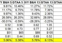
One of the challenges in dealing with modern portfolios like the Permanent Portfolio, the various IVY portfolios, Risk Parity portfolios, etc is the lack of long term historical data. Most of the modern portfolio data for a broad range of asset classes only goes back to 1973. The period from 1973 onward obviously only represents a subset of historical economic and financial conditions. This represents quite a challenge when looking forward and trying to model probable future outcomes for different portfolios. In the context of retirement this fact makes determining SWRs for modern portfolios difficult. The worst case historical 30 year retirement period that determines the SWR for the 60/40 US stock US bond portfolio began in 1966 . Fortunately, 1966 is not that far from 1973 which gave me an idea for estimating SWRs for modern portfolios as if they existed from 1966. Just use the 60/40 return data to for the modern portfolios from 1966 to 1972, then the modern portfolio return data going forward to estimate an SWR for these portfolios. This should give a conservative estimate for historical SWRs form these portfolios which is an apples to apples comparison to the SWR from the classic 60/40 portfolio, aka the famous 4% rule. Let’s see where this process takes us. In previous posts I had presented a variety of statistics for modern portfolios; returns, standard deviations, and SWRs. I also pointed out that the SWRs from these calculations had to be taken with a huge grain of salt. The retirement periods from 1973 onward, when the data for the modern portfolios begins, do not encompass the worst case period in history to retire, the 30 year period starting in 1966. The SWRs for periods starting in 1973 would be significantly higher than for those starting in 1966. In order to get an estimate of what SWRs for modern portfolios would have been going back to 1966 I simply took the historical return series for each of the modern portfolios and used the return data from the 60/40 portfolio from 1966 to 1972 for each portfolio. This will yield a conservative estimate of the modern portfolio SWRs going back to 1996. The assumption here of course is that the modern portfolios would have performed better than the 60/40 portfolios from 1966 to 1972. I think that’s a pretty safe assumption. Below is a table of the results along with the other portfolios stats that I updated through 2014. I did not do this exercise for all the portfolios I track just the ones I discuss the most often on the blog. First, all the portfolio stats in the table are for the period from 1973 to 2014, the actual performance of the portfolios. It is only for estimating the SWRs that I inserted the 1966 to 1972 60/40 return data. I labeled that line 1966 SWRs to make that distinction. As the 1966 SWR line shows, even with the initial 7 year (1966 to 1972) equal performance to the 6o/40 portfolio all of modern portfolios have significantly higher SWRs than the classic 60/40 or even 70/30 US stock US bond buy and hold portfolio. The more broadly diversified buy and hold portfolios, IVY B&H 5, IBY B&H 13, and the Permanent Portfolios have estimated 1966 SWRs ranging from 5.06% to 5.76%. The portfolios that add simple downside risk management (via the 10 month SMA) – the GTAA5 and GTAA 13 portfolios have 1966 SWRs of 5.36% and 6.13% respectively. GTAA 13 also adds value and momentum factors to the mix. Then the portfolios that have diversification, downside risk management, value and dual momentum factors have the highest 1966 SWRs of all. The Antonacci dual momentum portfolios, GEM and GBM, have 1966 SWRs of 5.71% and 5.68%. The aggressive IVY momentum portfolios, AGG6 and AGG3 lead the bunch with SWRs of 7.95% and 8.63% respectively. Pretty impressive all the way around even after handicapping the modern portfolios with 60/40 returns from 1966 to 1972. In summary, modern portfolios have significantly higher SWRs than the classic 4% SWR rule suggests. Even in the forecasted poor return scenarios that I’ve discussed before these portfolios will most likely perform much better than the classic portfolio that the original 4% SWR was based on. Does that mean that these estimated historical SWRs can be used for investors starting to withdraw from portfolios today? Possibly but I wouldn’t go so far as that. As the infamous disclaimer goes, past returns are no guarantee of the future. All we can do is put the odds in our favor. Being the conservative sort, I base my investment allocations on one or more of these modern portfolios but still stick the 4% SWR rule. Then I adjust SWRs accordingly maybe every 3-5 years. Regardless, the superior nature of the modern portfolios, not just in terms of SWRs, should be considered by all investors. Note: There is a lot of information about modern portfolios to glean from all of the portfolio stats in the above table for investors withdrawing from portfolios and even of investors still in the wealth building phase. Just look at the differences in returns/risk and long term wealth for these modern portfolios vs the most often recommended 60/40 buy and hold portfolio. The fact that the 60/40 portfolio is still the most common allocation for US investors is kind of crazy when you see these results.

WisdomTree Plans Another Small-Cap Hedged Europe ETF

WisdomTree Investments (NASDAQ: WETF ), the industry’s fifth largest ETF provider, has been stuffing up its product pipeline with hedged products. Already a reputable issuer with rich experience in rolling out successful currency hedged products, WisdomTree was quick to spot new opportunities latent in the international arena. Presently, WisdomTree dominates the space with the WisdomTree Japan Hedged Equity ETF (NYSEARCA: DXJ ) and the WisdomTree Europe Hedged Equity ETF (NYSEARCA: HEDJ ) having AUM of $13.5 billion and $10.6 billion, respectively. Other issuers like Deutsche Bank and iShares are far lagging the WisdomTree funds. However, the loose money market policies have now encouraged WisdomTree to file for a new hedged ETF targeting the small-cap European space. Newly Filed Product in Focus The passively managed fund looks to provide exposure to small companies across Europe by tracking the performance of the WisdomTree Europe Hedged SmallCap Equity Index. The index has a tilt toward dividends and rules out the weakness in euro against the greenback. To do so, the concerned index takes into account the dividend paying companies in the bottom 10% of the total market cap of the WisdomTree Dividend Index of Europe, Far East Asia and Australasia. Selected stocks trade in euros and are domiciled in a European country. The utmost weight of any single security is sealed at 2%, whereas the ceiling for the maximum weight of any one sector and any one country remains at 25% . The fund looks to charge 58 bps in fees. How Does It Fit in the Portfolio? The newly launched ETF can be a good choice for investors seeking exposure to the small cap companies within the Europe while avoiding current risks. For the U.S. investors, a descending euro affects total returns, when repatriating to dollars. Following the recent QE launch in the Eurozone and negative interest rates prevailing in several economies, the euro has weakened to multi-year lows versus the U.S. dollar. For this reason, investors wanted to consider a hedged euro play while intending to stay exposed in the likely recovery of Europe. This is especially true given that small cap companies are closely tied to the European economy and generate the majority of their revenues from the domestic market. Moreover, they pick up faster than their larger counterparts in a growing economy. Also, focus on dividends will benefit investors as the region is presently seeing an ultra-low interest rate environment. So monetary easing and currency weakness should support European consumption and may in turn boost small cap stocks. This clearly explains why WisdomTree’s recent filing is well timed. ETF Competition The newly launched fund is likely to face competition from other WisdomTree products such as the WisdomTree Europe Small Cap Dividend ETF (NYSEARCA: DFE ), the iShares MSCI Europe Small-Cap ETF (NASDAQ: IEUS ) and the SPDR EURO STOXX Small Cap ETF (NYSEARCA: SMEZ ). Among the trio, DFE emerged as a popular player as it has amassed as much as $734.5 million in assets and tracks the WisdomTree Europe SmallCap Dividend Index, a fundamentally weighted index that measures the performance of the small-capitalization segment of the European dividend paying market. DFE also charges 58 bps in fees. WisdomTree’s prior success in similar themed products should translate into recognition for the recently filed ETF, if approved. Plus, the new product has a hedged treatment unlike others, calling for additional gains in the current environment.

Have Bonds Lost Their Safe Haven Status To Gold?

Summary Price correlations have changed. Bonds no longer trade inversely to stocks. Bonds are no longer the safe haven. Gold is the new market safe haven. Traditionally speaking, bonds and stocks have traded inversely to each other . This is evident if one looks at these charts below. In 2008, the TLT (a bond ETF) went up in value, whereas the Dow crashed. In 2009, the TLT declined in value, whereas the Dow began its new bull market. But in 2011, that traditional correlation changed. In 2011, the bond market started to rise in correlation with the stock market. The bond market didn’t rise in an esclator like fashion such as the stock market, but it did rise in correlation with the stock market. This new correlation can be attributed to foreigners buying US assets , combined with the fact that the Federal Reserve was buying US treasuries, thus suppressing interest rates. Foreigners weren’t just buying US stocks, they have also bought US real estate as well . This form of flight capital and QE, has now made all US assets rise contemporaneously. In 2011, this wasn’t the only correlation that changed, as the two charts below show. As you can see from 2005-07, the price of gold rose in correlation with the stock market. Then in 2008, during the financial crisis, the price of gold declined with the stock market. From 2009-2011, Gold and the Dow, both rose in value. In 2011, however, that correlation changed. Gold started to decline in value, while the stock market keep rising. In my opinion, the one correlation that hasn’t changed, is the one between gold and bonds. Looking at the two charts below, I think they have always traded inversely of each other. From 2005 to 2007, gold rose in value, while the bond market remained relatively flat. During the ’08 crisis, bonds rose almost vertically, while the price of gold declined briefly. After the 08 crisis, the price of gold rose drastically, while the bond market declined. Lastly, in 2011, the bond market started to rise in value, while gold started its decline. Conclusion As stated above, one can see the price correlations have changed, this is likely due to global quantitative easing . If there is another crash, or foreigners loose confidence in the US markets, stocks and bonds will have a high a probability of declining in value at the same time, and unlike previous market panics, gold will be the new safe haven, and not bonds. I am not saying there will be a market crash soon, but if there is, it won’t be bonds that will perform well (like they did in 2008), it will be gold. Disclosure: The author has no positions in any stocks mentioned, and no plans to initiate any positions within the next 72 hours. (More…) The author wrote this article themselves, and it expresses their own opinions. The author is not receiving compensation for it (other than from Seeking Alpha). The author has no business relationship with any company whose stock is mentioned in this article.