Tag Archives: seeking-alpha

Country CAPE Ratios (Part 2): Local Currency Returns

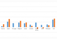
Summary In a previous article, we found that CAPE ratios did an excellent job of predicting country returns in 2013 but did a lousy job in 2014. Several commentators raised the point the analysis should have taken into account currency fluctuations. This article conducts the same analysis as before but uses local currency returns to evaluate the performance of CAPE in 2013 and 2014. Introduction The cyclically-adjusted price-to-earnings [CAPE] ratio is a commonly-used measure of valuation that has had some success in predicting long-term returns. In a chart from recent article by Hussman Funds entitled ” Does the CAPE still work? “, CAPE was found to be a reliable predictor (> 90% accuracy) of actual 10-year returns of S&P 500. The major deviations between the expected and actual 10-year returns occurred when the U.S. markets became very overvalued or very undervalued. In my previous article entitled ” Country CAPE Ratios: Wizard In 2013, Dunce In 2014? “, I mentioned the Cambria Global Value ETF (NYSEARCA: GVAL ), a fund launched in March 2014 by Mebane Faber and Cambria Investments that uses CAPE-like methodologies to invest in the cheapest markets worldwide. The timing of GVAL’s launch coincided nicely with CAPE’s fantastic performance at predicting 2013 country returns. In his “Meb Faber Research” blog , Faber presented data showing that the 5 cheapest and 10 cheapest countries posted average gains of 20.74% and 21.11%, respectively, while the 5 most-expensive and 10 most-expensive countries averaged -17.81% and -5.39%, respectively. This represents a differential of 38.59% for the 5 cheapest versus the 5 most-expensive, and 26.5% for the 10 cheapest versus the 10 most-expensive, a remarkable outperformance. Unfortunately, CAPE did a lousy job in 2014. The data showed a surprising positive correlation between CAPE and 2014 returns, meaning that the more expensive countries actually did better than the cheaper countries. I even ribbed on Faber for keeping quiet about CAPE’s performance throughout 2014, even though in 2013 Faber had enthusiastically proclaimed ” CAPE Country Returns YTD, the Ball Don’t Lie! ” a month before year-end. Perhaps Faber read my article, because he dutifully provided a CAPE update on New Year’s Day, 2015, even joking that the new edition of his book would be entitled “Global More Value.” Both Faber and my own performance data quoted USD returns. However, several astute commentators on my last article suggested that the true way to gauge CAPE should have been to use local currency returns. Therefore, this article seeks to evaluate local currency stock market performances to see if CAPE did any better in 2014 (or any worse in 2013). For the interest of consistency I will be using the same set of countries I did my previous article, even though Faber provided a more comprehensive list of country CAPE numbers in his update, which was posted after my article. 2013 Country CAPE evaluation The following table shows the 2013 return performances the various countries in both local currency [LC] and US dollar [USD] terms. Local currency returns were obtained from stock exchange performance data from the Wall Street Journal while USD returns are based on the ETFs and were obtained form Morningstar . Note that the country ETFs (often based on MSCI or FTSE indices) do not necessarily correspond to their respective stock exchanges. Country ETF CAPE at end-2012 2013LC % 2013USD % Greece GREK 2.6 28.06 24.91 Ireland EIRL 5 33.64 45.58 Argentina ARGT 5.2 88.87 15.04 Russia ERUS 7.2 -5.55 -0.88 Italy EWI 7.4 16.56 19.07 Austria EWO 8.4 4.24 11.48 Spain EWP 8.5 21.42 31.91 Portugal PGAL 9.5 15.60 – Belgium EWK 10.3 18.10 24.6 Israel EIS 11.1 15.12 18.3 Canada EWC 18.3 9.55 5.31 South Africa EZA 18.5 17.85 -7.47 India INDY 19.3 8.98 -3.99 Malaysia EWM 20.1 10.54 7.84 USA SPY 21.1 29.60 33.45 Chile ECH 21.2 -14.00 -23.9 Mexico EWW 21.2 -2.24 -1.58 Indonesia EIDO 24.7 -0.98 -23.14 Colombia GXG 33.5 -11.18 -15.01 Peru EPU 33.7 -23.63 -25.42 I compiled the total return performances into a bar chart. Countries are sorted from left to right, in order of increasing CAPE values. Local currency returns are shown as blue bars whereas USD returns are shown as orange bars. (click to enlarge) The data is also shown as a scatterplot, showing the relationship between CAPE at end-2012 and local currency returns in 2013. As with the 2013 USD returns, we see a negative relationship between CAPE at end-2012 and 2013 LC returns. The R-squared value of 0.3845 is less than the R-squared value for 2013 USD returns presented in the previous article, which was 0.5365. Nevertheless, the correlation was still significant (p-value = 0.0046). 2014 Country CAPE evaluation The following table shows CAPE values for selected countries at end-2013 and their 2014 LC and USD returns. Again, I am using the same countries as I did in my previous article. Country ETF CAPE at end-2013 2014LC % 2014USD % Greece GREK 3.8 -28.9 -38.2 Russia RSX 7.0 -12.1 -45.0 Ireland EIRL 7.3 15.1 1.9 Argentina ARGT 7.4 59.1 2.9 Jordan 8.6 Italy EWI 8.6 0.2 -9.9 Hungary 8.6 Austria EWO 9.0 -15.2 -20.1 Croatia 9.8 Lebanon 10.0 Israel ESI 10.3 10.5 0.7 Spain EWP 10.3 3.7 -4.7 Singapore EWS 11.8 6.2 2.9 Belgium EWK 12.3 12.4 1.8 Norway NORW 13.1 2.8 -22.8 Netherlands EWN 13.4 5.6 -4.7 United Kingdom EWU 13.6 -2.7 -5.9 France EWQ 14.0 -0.5 -9.9 Australia EWA 15.4 0.7 -3.8 Hong Kong EWH 16.3 1.3 4.6 Germany EWG 16.4 2.7 -10.5 Switzerland EWL 18.9 9.5 -0.8 Canada EWC 19.1 7.4 1.4 Japan EWJ 21.1 7.1 -4.4 USA SPY 25.4 11.4 11.4 And as a bar chart: (click to enlarge) We can see that for most of the countries, the 2014 local currency returns (blue bars) are higher than the 2014 USD returns (orange bar). This is likely due to the rising strength of the US dollar throughout 2014. The data are also presented as a scatterplot: As with the 2014 USD returns, we see a counter-intuitive positive relationship between CAPE values and 2014 local currency returns, but this time the correlation is much weaker (R-squared = 0.0192 compared to R-squared = 0.2664). Unlike 2014 USD returns, this correlation was not significant (p-value = 0.55). The difference between the 2014 USD and 2014 local currency results is probably due to currencies such as the Russian rouble and the Argentine peso, which fell off the cliff in 2014. Hence, local Argentine investors would have been ecstatic at their country’s 59.1% performance in 2014, whereas USD investors would be stuck with a measly 2.9% return. While this might seem like an endorsement for foreign currency hedging (particularly when it seems that every analyst and their brother is forecasting the U.S. dollar to continue to rise throughout 2015), keep in mind that predicting foreign currency movements is notoriously difficult, and that the expected value of excess returns on currencies in the long-term is basically zero. Faber himself says that it does not matter whether or not you hedge, as long as you do it fully one way or the other, as to not take a directional view on any one currency. Summary CAPE’s track record in 2014 does not look so bad once currency fluctuations are taken into account. Instead of predicting the opposite trend (more expensive countries did better on a USD basis in 2014), CAPE had no predictive power at all in 2014 for local currency returns. Nevertheless, it should be stressed that CAPE is a long-term measure of valuation, and deviations from the predicted trend should be expected as part of the natural volatility of the markets. In fact, true value investors should embrace these deviations as they might be able to buy the cheapest markets at an even cheaper price.

EWRS Brings Small Cap Exposure And Low Correlations, But Poor Liquidity Hurts It

Summary I’m taking a look at EWRS as a candidate for inclusion in my ETF portfolio. The low correlation is very attractive, but isn’t reliable because of poor liquidity. I’ll have to do further investigation to see if it is real. I’ll keep it on my list for potential exposure to small caps. The internal diversification of holdings within the ETF is excellent and an equal weighting scheme sounds very attractive relative to market cap strategies. I’m not assessing any tax impacts. Investors should check their own situation for tax exposure. How to read this article : If you’re new to my ETF articles, just keep reading. If you have read this intro to my ETF articles before, skip down to the line of asterisks. This section introduces my methodology. By describing my method initially, investors can rapidly process each ETF analysis to gather the most relevant information in a matter of minutes. My goal is to provide investors with immediate access to the data that I feel is most useful in making an investment decision. Some of the information I provide is readily available elsewhere, and some requires running significant analysis that, to my knowledge, is not available for free anywhere else on the internet. My conclusions are also not available anywhere else. What I believe investors should know My analysis relies heavily on Modern Portfolio Theory. Therefore, I will be focused on the statistical implications of including a fund in a portfolio. Since the potential combinations within a portfolio are practically infinite, I begin by eliminating ETFs that appear to be weak relative to the other options. It would be ideal to be able to run simulations across literally billions of combinations, but it is completely impractical. To find ETFs that are worth further consideration I start with statistical analysis. Rather than put readers to sleep, I’ll present the data in charts that only take seconds to process. I include an ANOVA table for readers that want the deeper statistical analysis, but readers that are not able to read the ANOVA table will still be able to understand my entire analysis. I believe there are two methods for investing. Either you should know more than the other people performing analysis so you can make better decisions, or use extensive diversification and math to outperform most investors. Under CAPM (Capital Asset Pricing Model), it is assumed every investor would hold the same optimal portfolio and combine it with the risk free asset to reach their preferred spot on the risk and return curve. Do you know anyone that is holding the exact same portfolio you are? I don’t know of anyone else with exactly my exposure, though I do believe there are some investors that are holding nothing but SPY. In general, I believe most investors hold a portfolio that has dramatically more risk than required to reach their expected (under economics, disregarding their personal expectations) level of returns. In my opinion, every rational investor should be seeking the optimal combination of risk and reward. For any given level of expected reward, there is no economically justifiable reason to take on more risk than is required. However, risk and return can be difficult to explain. Defining “Risk” I believe the best ways to define risk come from statistics. I want to know the standard deviation of the returns on a portfolio. Those returns could be measured daily, weekly, monthly, or annually. Due to limited sample sizes because some of the ETFs are relatively new, I usually begin by using the daily standard deviation. If the ETF performs well enough to stay on my list, the next levels of analysis will become more complex. Ultimately, we probably shouldn’t be concerned about volatility in our portfolio value if the value always bounced back the following day. However, I believe that the vast majority of the time the movement today tells us nothing about the movement tomorrow. While returns don’t dictate future returns, volatility over the previous couple years is a good indicator of volatility in the future unless there is a fundamental change in the market. Defining “Returns” I see return as the increase over time in the value known as “dividend adjusted close”. This value is provided by Yahoo. I won’t focus much on historical returns because I think they are largely useless. I care about the volatility of the returns, but not the actual returns. Predicting returns for a future period by looking at the previous period is akin to placing a poker bet based on the cards you held in the previous round. Defining “Risk Adjusted Returns” Based on my definitions of risk and return, my goal is to maximize returns relative to the amount of risk I experienced. It is easiest to explain with an example: Assume the risk free rate is 2%. Assume SPY is the default portfolio. Then the risk level on SPY is equal to one “unit” of risk. If SPY returns 6%, then the return was 4% for one unit of risk. If a portfolio has 50% of the risk level on SPY and returns 4%, then the portfolios generated 2% in returns for half of one unit of risk. Those two portfolios would be equal in providing risk adjusted returns. Most investors are fueled by greed and focused very heavily on generating returns without sufficient respect for the level of risk. I don’t want to compete directly in that game, so I focus on reducing the risk. If I can eliminate a substantial portion of the risk, then my returns on a risk adjusted basis should be substantially better. Belief about yields I believe a portfolio with a stronger yield is superior to one with a weaker yield if the expected total return and risk is the same. I like strong yields on portfolios because it protects investors from human error. One of the greatest risks to an otherwise intelligent investor is being caught up in the mood of the market and selling low or buying high. When an investor has to manually manage their portfolio, they are putting themselves in the dangerous situation of responding to sensationalistic stories. I believe this is especially true for retiring investors that need money to live on. By having a strong yield on the portfolio it is possible for investors to live off the income as needed without selling any security. This makes it much easier to stick to an intelligently designed plan rather than allowing emotions to dictate poor choices. In the recent crash, investors that sold at the bottom suffered dramatic losses and missed out on substantial gains. Investors that were simply taking the yield on their portfolio were just fine. Investors with automatic rebalancing and an intelligent asset allocation plan were in place to make some attractive gains. Personal situation I have a few retirement accounts already, but I decided to open a new solo 401K so I could put more of my earnings into tax advantaged accounts. After some research, I selected Charles Schwab as my brokerage on the recommendation of another analyst. Under the Schwab plan “ETF OneSource” I am able to trade qualifying ETFs with no commissions. I want to rebalance my portfolio frequently, so I have a strong preference for ETFs that qualify for this plan. Schwab is not providing me with any compensation in any manner for my articles. I have absolutely no other relationship with the brokerage firm. Because this is a new retirement account, I will probably begin with a balance between $9,000 and $11,000. I intend to invest very heavily in ETFs. My other accounts are with different brokerages and invested in different funds. Views on expense ratios Some analysts are heavily opposed to focusing on expense ratios. I don’t think investors should make decisions simply on the expense ratio, but the economic research I have covered supports the premise that overall higher expense ratios within a given category do not result in higher returns and may correlate to lower returns. The required level of statistical proof is fairly significant to determine if the higher ratios are actually causing lower returns. I believe the underlying assets, and thus Net Asset Value, should drive the price of the ETF. However, attempting to predict the price movements of every stock within an ETF would be a very difficult and time consuming job. By the time we want to compare several ETFs, one full time analyst would be unable to adequately cover every company. On the other hand, the expense ratio is the only thing I believe investors can truly be certain of prior to buying the ETF. Taxes I am not a CPA or CFP. I will not be assessing tax impacts. Investors needing help with tax considerations should consult a qualified professional that can assist them with their individual situation. The rest of this article By disclosing my views and process at the top of the article, I will be able to rapidly present data, analysis, and my opinion without having to explain the rationale behind how I reached each decision. The rest of the report begins below: ******** (NYSEARCA: EWRS ): Guggenheim Russell 2000 Equal Weight ETF Tracking Index: Guggenheim Russell 2000 Equal Weight Index Allocation of Assets: At least 80% in assets included in the index Morningstar Category: Small Blend Time period starts: April 2012 Time period ends: December 2014 Portfolio Std. Deviation Chart: (click to enlarge) (click to enlarge) Correlation: 73.45% Returns over the sample period: (click to enlarge) Liquidity (Average shares/day over last 10): 4,379 Days with no change in dividend adjusted close: 42 Days with no change in dividend adjusted close for SPY: Yield: 1.01% Distribution Yield Expense Ratio: .45% Discount or Premium to NAV: .10% premium Holdings: (click to enlarge) Further Consideration: I’ll keep EWRS in my potential list for now Conclusion: There are quite a few things I like about EWRS, but also a few problems will merit deeper analysis. The good things are the low correlation and the equal weighting of the index was very impressive diversification within the ETF. The largest hold at reached a market weight of .30%. That is incredible diversification within the ETF. Even if the ETF is aiming for an exact equal weighting, they can’t reasonably be rebalancing constantly so there should be some deviations. The bad news is that the liquidity is absolutely terrible and the terrible liquidity may have been a driving factor in the 42 days with no change in dividend adjusted closes. This is one of the ETFs where poor liquidity could be reducing the reliability of the statistics. If the correlation is significantly higher than it appears but is being understated because of poor liquidity, it would make the ETF significantly less attractive. The combination of poor liquidity and low yield makes the ETF substantially less attractive for investors that are seeking income or needing liquidity. While I’m willing to cope with those problems if the correlation turns out to be accurate, I still don’t like the expense ratio much. Given that the portfolio is to be equally weighted and has very small exposure to each individual stock, I would be willing to accept the expenses if I was using the portfolio as a small part of my portfolio. This may be a decent option for getting some small cap exposure into my portfolio. If I pick EWRS, I’d only plan on using it for 5% to 10% of the portfolio. If poor liquidity is a major issue when the markets are open, I would consider keeping an eye on NAV and using a (one day) limit order to try to buy up a piece for a 1 to 2% discount to NAV. I would consider the ETF fairly attractive if it could be purchased at that kind of discount to NAV.

How My Value Investing Strategies Performed In 2014

Summary 2014 was a tough year in the markets but there was a strategy that outperformed the market with a gain of 24.5%. Quarterly breakdown of results for the 15 different value investing strategies I follow are provided. A detailed look at the stock portfolio that outperformed in 2014. In ancient Roman mythology, there is a god with two faces. His name is Janus, and with two faces, he looks in both directions representing the past and future. It’s also where the word January came from. Although January 2015 is fully under way, it’s appropriate because we are still at a stage of looking back at 2014, while also looking at what lies ahead in 2015. Now one of the very last tasks of the year (or first of the year) that I do is to go through all the performances of the value stock screeners and see what worked and what didn’t. I don’t bother with gathering results for all different asset classes and sectors because there are plenty of people who are better than me at this. It’s easier to leverage the work of others and to put my value strategies into context. Here’s the best chart I came across showing the performance of the major asset classes. (click to enlarge) Yearly Asset Performance Chart (Credit: awealthofcommonsense.com ) Because my focus has always been on value stocks, the stocks shown on the value screens all fall into the large, mid and small cap boxes above. But most of those stocks should be categorized into the small cap group which managed 3% on the year. So in the grand scheme of things, no matter how good the strategy or quality of the company was, small caps had a rough 2014. It goes to show how difficult it is to beat the market. The market isn’t going to award you easily just because the company has strong fundamentals. What works one year, may not the next and it’s a test of conviction and temperament to see it through. That’s why having a clear process to buy and sell stocks and to focus on creating long term wealth is important over short-term gains. Sure it feels good when you beat the market, but that’s something you can leave to fund managers who are judged based on their quarterly or yearly results. You and I have the luxury of looking 5 or 10 years down the road and comparing performance then. A few bad years after having achieved 200% vs. the market’s 100% over a 10-year period isn’t important. The end goal is to outperform the market over the long run because you aren’t trying to invest for a few months and then call it quits. With that in mind, here are the final 2014 results for each of the Value Screeners . 2014 Value Screener Results Before getting into the results, a very common question that I receive daily is whether the OSV Analyzer will screen for stocks and tell people what to buy and sell. I want to start by clearing up that these strategies are not created with the OSV Analyzer. The OSV Analyzer is a deep fundamental analysis and valuation tool. A tool to drill down deeply into a single company quickly instead of just scratching the surface and looking at basic stats. Screening will come in the future. With that out of the way, here are the results. (click to enlarge) Out of 15 value strategies, only 4 managed to outperform the market at the end of the year. The outperforming strategies ( Altman , Graham , Piotroski ) were the ones that contained a lot of mid and large caps. With the Altman Z value screen leading the pack this year, here’s a look at the 20 stocks that made up the list from the beginning of the year and how each performed. (click to enlarge) There are stocks that I definitely wouldn’t purchase, but that’s the beauty of mechanical investing. It’s simplified down to how well you create a strategy and stick with it. This reduces many of the variables that go into individual stock picking. However, I still find it difficult to give up total control of my portfolio. I prefer to further filter the list with my analyzer because screeners still make mistakes. Manual analysis is also required because there are things like off balance sheet items screens can’t recognize and qualitative events that can’t be simulated. But if this was something that I want to follow with real money, I’ll want to create a new account with at least $20k instead of using money from my existing portfolio. Not the Time to Invest in US Net Nets One sure thing about 2014 was that it wasn’t a good year for net nets. It’s especially clear looking at the Net Net performance. Since the results are all US listed stocks, the horrible performance isn’t surprising. When markets are hot, stay away from employing a pure USA net net investing strategy. You need to expand to international net nets if you want to stick with Graham’s net nets. But right now, there aren’t many US net nets that you should be investing in. The ones you see floating around the stock market have serious issues. The official screeners identified around 5-6 stocks at the start of the year and the minimum that I test with is always 20 stocks. For any mechanical strategy where you have to trust the theory and the system, holding 5-6 stocks is going to get you killed. The full 20 stocks are required for the portfolio to be diversified enough for each strategy to work over the long run. As I showed previously , when the number of net nets increase, it’s definitely a sign that the market is getting cheaper and that’s the time to be loading up on good net nets. Just not now. In the next post, I’ll be listing the official stocks for each screen that will be tracked for 2015. It features a list of 225 value stocks you can download and to get ideas.