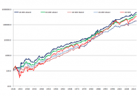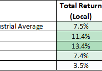
2014 Year in Review Well 2014 turned out to be another interesting year. It was a strong year for investment returns despite numerous issues going on around the world. China is clearly slowing down, Europe is facing deflation, and Russia annexed Crimea. As I said last year, uncertainties are always abound but capitalism continues to unleash human potential. Commodities and oil & gas in particular got slammed again in 2014, following up on steep losses in 2013. I have been recommending that investors avoid commodities for a couple years now ( Canada – Headed for a Crash & Canada: A Storm Brewing in China ). Also I have commented numerous times on how the high oil prices don’t make sense ( Saudi America & US Oil and Gas Drilling ). Before discussing what oil did in 2014 and last year’s market returns, I want to remind readers of what I said last year at this time ( Top Investments for 2014 ). I find it remarkable how oil prices have held up in 2013. US oil production has been off the charts, going up in a parabolic curve. US dependence on foreign oil fell to a 27 year low ( Click Here ). In 2005, the US imported 60.5% of their oil requirements and last year that fell to only 34%. This is a result of the shale oil revolution in the US where oil production is up 46.5% or 2.36 million barrels a day since 2007. If oil prices fall in 2014 that will be another significant headwind for the Canadian economy. Fellow Canadians could have benefited from the fall in commodities by not owning Canadian Dollars. Canadians who invested in the US not only realized out sized gains this year, they also realized foreign currency gains that contributed an additional 7% to their returns. I figured it was only a matter of time before oil fell and boy it did fall off a cliff in 2014. Similarly, the falling Canadian dollar was another theme that continued in 2014. As I have said before, this is a great way to be short commodities since the Canadian dollar is very closely tied to commodity prices. I will be returning to both of these themes throughout this post. 2014 Market Returns Market returns were strong again, making it the sixth straight year of solid gains. Just like 2013, Canadian investors could have benefited from the drop in commodity prices by owning US companies, realizing over a 9% gain from the falling Canadian Dollar. I would still recommend avoiding Canadian dollars as the loonie will likely fall further in 2015 as our economy stalls. Last year I included this chart from JP Morgan that puts market returns into context: (click to enlarge) Commodities As already mentioned commodities got slammed this year. Below is a list of the damage. Oil and natural gas were both down significantly in 2014. Metals also fell as well as agricultural commodities. The only bright spots were the 3Cs – Cattle, Cocoa, and Coffee. For those wondering why oil was down, the answer is shown below. (click to enlarge) Source: Carpe Diem Blog Now if anyone would have said back in 2005 to 2008 that US oil production would rise by over 4 million barrels per day by the end of 2014, everyone would have considered them crazy. Look at that graph again, US oil production has almost doubled in 4 years. Let me say that again, oil production went up 4 million barrels per day in 4 years. That is an economic miracle and we should be thankful for the entrepreneurs who made this happen. To me this is the fantastic part of capitalism, as we all enjoy the benefits of what these entrepreneurs have created. For investors, the above graph shows 4 million reasons to avoid oil investments going forward. Don’t get me wrong there is money to be made in the oil, but just like airlines, it is hard to pick the winners from the losers. We are in the top of the first innings of the shale oil revolution and if you don’t think this isn’t a paradigm shift, you need to look at that graph again. In the words of Henry David Thoreau, “It’s not what you look at that matters, it’s what you see.” 2014 Stock Recommendations So how did the stock recommendations for 2014 turn out? Total returns include dividends and I also included what the total returns were in Canadian dollars (CAD). Overall the results were decent with the exception of Lightstream Resources ( OTCPK:LSTMF ) [TSE: LTS]. I have more to say about Lightstream below. Here is what those yearly returns looked like throughout the year. (click to enlarge) Looking at the graph, Lightstream was up over 40% in May before going on an epic slide erasing nearly all of the equity value of the company. Of course, I pick these stocks for fun and use the year end as arbitrary start and end points but much higher gains can be had for those who sell once the facts change or when the company approaches its intrinsic value. As I said last year, Bank of America (NYSE: BAC ) has been like shooting fish in a barrel. After being up 110% in 2012, it returned 34% in 2013, and returned a respectable 15% in 2014 (with dividends). Like last year, Bank of America is recommended once again for 2015. It is still selling below its intrinsic value. The same can be said for Citigroup (NYSE: C ). Citigroup’s poor returns in 2014 are mostly attributable to failing the Federal reserve’s stress test. That likely won’t happen again this year. Like Bank of America, Citigroup is once again recommended for 2015. POSCO (NYSE: PKX ) and Ezcorp (NASDAQ: EZPW ) are both very cheap and again recommended for 2015. POSCO, a steel producer, is still profitable but struggling to earn decent returns. The steel industry is over-capitalized, iron ore prices have plummeted and the outlook is uncertain. With a book value of $140/share and the current quote of $63.81/share, the stock is cheap. They are a low cost producer so they will be fine. Comments on Lightstream Lightstream was recommended last year but as some readers know I subsequently changed my mind on the company after reading the year end reserve report released in late March (I have made comments elsewhere on an internet investment forum). At the time when I recommended LTS, it was selling for $5.88/share. Looking back at 2012 (the most recent reserve report) they had spent just over $320 million in capital, added 27 million barrels of reserves, and the cost looked very reasonable at around $12 per barrel. I also did a quick and dirty analysis of the company’s proved reserve value and came up with a rough Net Asset Value (NAV) of about $9/share. This has been their NAV for a while, ever since I said it was a poor company back in 2010. (There are several other posts on there about PBN & PBG, If you want some fun reading… do a search on my blog as I had some interesting debates on the company in the past. Click here for an example. ) Anyway, once the reserve report and annual financial statements were released in late March, it became clear LTS had deteriorated significantly. First of all, they spent $719 million in capital in 2013 and added 12.3 million barrels in reserves, This gave them a finding and development cost of over $70 per barrel. That was only the beginning. Obviously, they spent a pile of cash and generated NO value. This can clearly be seen in the annual report where they wrote off the $1.4 billion in goodwill they were carrying. The annual report also revealed to investors how they justified the carrying amount of their assets on their balance sheet. A careful read would have found this comment buried in the details. In addition to discounted cash flows, the Company also considered a range of market metrics in assessing fair value less cost to sell for certain CGUs. Market metric information was obtained from recent transactions involving similar assets.” Ok, so they used “market metrics” to justify the fair value, not the reserve report which is as close to reality as you can get given the assumptions. Anybody looking to acquire a property would do the same analysis and also adjust for drilling opportunities. Market metrics is exactly what most of the people who invest in oil and gas do to justify their overvalued holdings. The problem is every property has different costs and netbacks, so blanket metrics do not work well. Going back to their reserve report, they had a pile of technical revisions and it really makes you question if management was being candid with shareholders. I would also add that the NAV got a 5% boost due to higher commodity prices. They won’t be getting that boost this year. Given the fact that LTS has a very short reserve life, the reserve value will take a huge hit. I have calculated this for LTS and I estimate a 50% haircut to their reserve value. The last thing I determined from the reserve report was that the NAV was less than $2/share after taking into account other assets and all liabilities. This result was based on the over $90 per barrel oil price used in the reserve report. So basically the company destroyed 60-70% of their value with a terrible return on a huge amount of capital. The capital is gone and the equity investors have lost their capital. Anyways, that is what happened to LTS this year. I actually spent a decent amount of time this year analyzing the reserves and asset values for 68 of the 108 oil and gas companies listed on the Toronto Stock Exchange. I didn’t find a single company to invest in. 2014 Other Recommendations For 2014 I also recommended IBM (NYSE: IBM ) in the Safe & Very Cheap category. Here are the results. Clearly the market is still worried about future of IBM. Most of what I have read is concern over IBM’s falling revenue. I really don’t understand what all the fuss is about. IBM has had flat revenue for 10 years. Revenue per share is up 6.5% over the past 10 years and as an owner that is what counts. Also, IBM has been shedding divisions that generate billions in revenue and generate little-to-no profits. That’s right, some lose money. IBM is currently selling one division that generates $7 billion in revenue but loses $500 million per year. I’m looking forward to the higher earnings when that earnings drag isn’t getting in the way. This is a common situation at many companies when you dig into the details. IBM falling 11% does bother me in the least. Revenue and earnings were higher on a per share basis in 2014. It now offers outstanding value. Top Investments for 2015 IBM (NYSE – IBM, $160.44) Ezcorp (NASDAQ – EZPW, $11.75) Bank of America (NYSE – BAC, $17.89) Citigroup (NYSE – C, $54.11) POSCO (NYSE – PKX (ADR), $63.81) If you want investment commentary on these stocks, see what I wrote last year ( Click Here ). For Canadian investors, I believe owning US dollars will once again be advantageous in 2015. I’ll likely discuss a few interested tidbits from the Ezcorp annual report next year. I’ll leave them for you to find. As mentioned last year, be sure to do your homework on any investment. The markets are at all-time highs and while that shouldn’t alarm you, it should invite caution. All of these companies have wide appreciation potential but anything can happen in the short term. All of the recommended companies have short-term headwinds that will clear over time. Cheers to another great year! Disclosure: I own BAC common, BAC Class A warrants, EZPW, & IBM. Editor’s Note: This article discusses one or more securities that do not trade on a major exchange. Please be aware of the risks associated with these stocks.