Tag Archives: undefined

Risk Of Grexit And GLD

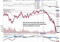
Background of the difficult economic conditions of the eurozone and the threat of Syriza’s victory in Greece. GLD has already priced in the threat of Syriza since November 2014 and has been rising steadily. Those who wants the safe habour of gold has already gone in. Risk of Syriza overtipping its hand for a quick fix to high debt with a primary budget surplus even though there are indications that Syriza will be moderate in power. Time to hold for those with GLD exposure and observe future developments and for those without exposure to initiate it. Difficult Times For The Eurozone Gold has been used been used as a medium of exchange since historic times and especially in times of turmoil. In modern times, with the creation of bank notes and the 1971 closing of the gold window, paper money is the medium of exchange and its power lies in the ‘full faith and credit of’ whichever government that is issuing the note. Now the full faith and credit of the United States Government is still valid in the market especially in a time where the U.S. economy is growing strongly (11 year high of 5% GDP growth in the third quarter of 2014), the U.S. Dollar (USD) is strong and most importantly the state of the union is strong. However the same attributes cannot be said for the eurozone. The eurozone economy is faltering at 0.2% growth for the same third quarter 2014 when the U.S. is growing strongly. The euro, as represented by the CurrencyShare Euro Trust ETF (NYSEARCA: FXE ), has declined by 23% since 05 May 2014 as seen in the chart below and this decline has accelerated since October 2014 which coincided with a dovish European Central Bank (ECB) decision. (click to enlarge) Lastly there is the issue regarding the state of the eurozone. The integrity of the eurozone had been tested in 2012 when Greece almost elected Syriza who came in second into government. This sparks the famous line by ECB President Draghi to ‘do whatever it takes’ to preserve the euro. The Rise and Threat of Syriza on Eurozone Now with the snap General Election on 25 January 2015, Syriza has defeated the previous government New Democracy to form the next government of Greece and its firebrand leader Alexis Tsipras would be youngest Greek Prime Minister at age 40 in 150 years. The whole reason that Syriza poses an existential threat to the whole eurozone project is quite simply because it does not want to pay its huge external debts. Its policy platform is anti-austerity, the repudiation of debt in essence and more social spending. This is what got it in power in the very first place which pleased the Greek population and at the same time send an earthquake to the rest of the eurozone. This whole political instability came about from the failed election of President of Greece. The President of Greece is a largely ceremonial role held currently by the incumbent Karolos Papoulias for 2 terms of 5 years each. His second term is set to end in March 2015. The President of Greece is elected by the Hellenic Parliament in Greece and has to be done latest 1 month before he is set to leave office as decreed by the Greek Constitution. The Prime Minister of Greece Samaras brought it forward to December 2014 but he was unable to secure a 2/3 majority of parliament vote for his candidate on the first 2 rounds of voting on the 17th and 23rd. The third round of voting on the 27th also failed to produce the reduced 3/5 majority of 180 votes which triggered the election for a new parliament on 25 January 2015. The new parliament will have to vote for the new president again by February 2015. Safe Harbor of GLD If you are a rich or middle class citizen (with enough money beyond the hand to mouth existence to be worried) in Europe and you are faced with the possibility that the euro note you hold can either be worthless or in the more optimistic case, be exchanged back at a steep discount to the national currency, what will your natural options be? You will avoid European equities and bonds because they are denominated in euros. You might want to change into a currency like the USD that will hold its value or you might want to buy physical gold which is harder to devalue or you might want to invest into a gold ETF denominated in the USD like GLD to avoid the storage and insurance costs. This is why we can see that the value of gold, as seen in the SDPR Gold Trust ETF (NYSEARCA: GLD ), has rose steadily since 03 November 2014 whenever there is a hint of potential political instability in Greece. (click to enlarge) As we can see, the market is forward looking and has began to price in the Greek instability before the formal vote in the Hellenic Parliament. Gold investors started to buy when the rumor of the a potential change in government given the weakness of the current Greek coalition government. This is why we are unlikely to see a sudden spike up in GLD now because the market has sufficient time to build their long position. Even for those who are less connected, they will have seen in coming last month when the rounds of Presidential election failed in Parliament. History of Debt Concession However now that Syriza has formed the new government,it remains to be seen how far its leader Tsprais will go to fulfill his campaign promises. It is clear that he will want to extract some sort of concession from the Troika. The prior Greek government managed to extend the loan repayment period from the original 7 years to 15 years in July 2011 and interest rates were cut to 3.5% for a mega loan of $109 billion euros loan package. This is the start of the second and ongoing Economic Adjustment Program for Greece after the first program which saw loans of $110 billion euros from May 2010 to June 2011. It is also in this period where we saw a soft default on a debt restructuring deal which concluded on 09 March 2012 on $205.5 billion euro of debt. This caused the ISDA to call a Credit Event which triggered $3.5 billion of credit default swaps and let Fitch to downgrade Greek debt from ‘CCC’ to ‘Restricted Default’. All in all, through this soft default option, Greek debt holders lost a massive $107 billion euros, a record for sovereign debt losses. Is this the calm before or after the Storm? As far as the market is concerned, the eurozone has survived this crisis of soft default with the help of the ECB when other organization were unable to convince the market. This soft default option is therefore unlikely to affect the market drastically. In other words, the extent and pretend scheme coupled with significant haircut works to preserve the eurozone even if it caused dismay to bond holders. Now the market is waiting to see if Syriza will actually dare to defy the Troika and simply walk away from its debt given the consequences. As this Reuters report shows, even as early as 04 November 2014 (coinciding with the rise of gold prices), when Syriza gets closer to power, it has proceeded to soften its stance from the choice of hard default to renegotiation. The German/ Creditor’s position is clear. They are willing to accept a debt restructuring but they will not accept a hard default or any cancellation of debt. This will weaken their position with other debtor countries like Poland, Ireland and Spain. The only risk now is that Syriza will overtip its hand when asking for concessions to the point where it is unacceptable to the Creditors. This is a possibility given the nature of his fiery speech and the expectations of quick relief from the Greek public. (click to enlarge) Source: Google There is a possibility that he will be too engrossed about the quick fix of Greek 175% debt to GDP ratio, which is higher than the rest of Europe. There is also the temptation to turn the Greek’s primary budget surplus of $3.3 billion euros for year 2015 to a current account surplus if they don’t pay off their external debts. The real risk is that Tsprias might then be too willing to leave the eurozone and underestimate the possibility of the hyperinflation tragedy. This might happen when the drachma is reintroduced at a point where the international market has no confidence in it shortly after a massive debt default. Conclusion GLD has appreciated way before the actual victory of Syriza and those who wanted to hold gold already has gold exposure in their portfolio. These are the cautious ones. For the vast majority of the public, it is the fear for systemic unrest on the scale of Lehman Brother collapse that will bring them into gold in doves. This fear will only occur when there are clearer signs of a disorderly Greece Exit (or Grexit). While we believe that Syriza was only posturing to gain power and it might be slightly more aggressive than the outgoing New Democracy government, there is also a serious risk that the inexperienced Syriza will overturn its hand and oversee the expulsion of Greece from the eurozone under its watch. There might be other forces that might tilt the balance inside and outside Syriza towards a cold calculation of benefits and costs that might result in unexpected results. There is still market confidence in the USD and GLD. For those who are upset about the lack of audit for GLD, consider it from the faith and credit angle. Based on the market capitalization of $30.78 billion and last known daily volume of 6.27 million, it is clear that there is market confidence in GLD and you can liquidate it quickly when you need it. However for those in Europe who are worried about capital controls, then it will make sense for them to hold physical gold but they will have to incur cost for storage and insurance. Then there is also the security risk for holding gold against theft or worst. For them, in today’s world without capital controls in Europe, GLD will be a good way to hold their wealth. For investors in general, they would do well to hold onto their GLD holdings especially for those who heeded my earlier advice to buy GLD in my earlier article, The SNB Catalyst For GLD . That article also explored the potential European instability from a different perspective. For those who have nil exposure to GLD, this will be a good time to gain exposure when there will be a brief lull in prices as the market wait and observe the actions of the new Greek government and the official response from the Troika who represent the Creditors.

How To Buy And Hold Leveraged ETFs: The Top 7 Outperforming 3x ETFs Over The Past Year

Summary Leveraged ETFs can be dangerous buy-and-hold vehicles due to their extreme volatility and tendency for many to decay over time. However, leveraged ETFs offer the long-term trader an effective means to make a large investment in a particular sector without risking substantial capital, if the position is chosen properly. Leveraged ETFs that trade linearly with small daily intervals and few reversals tend to track their 1x ETF counterparts very well or even outperform on yearly timeframe. This Top-7 list highlights multiple sectors ranging from bonds and currencies to retail to commodities whose leveraged ETFs have outperformed the returns predicted based on their 1x counterparts. Conventional wisdom holds that the leveraged ETFs are the playthings of daytraders, that their volatility and underperformance versus their underlying indices and unleveraged ETFs makes them unsuitable for long-term investing. And there is certainly an element of truth to this – a large number of buy and holds of the 3x leveraged ETFs will end in disaster. However, these ETFs offer the longer-term trader an effective means to make a large investment in a particular sector without risking substantial capital, if the position is chosen properly. This article discusses the top 7 performing 3x leveraged ETFs Relative To Their Indices and corresponding 1x ETF over the last year. These are not necessarily the top overall percent-returning ETFs – a 3x leveraged ETF can double in a year, but if its underlying index was up 50%, that 100% return has to be pretty disappointing. These are the ETFs that best tracked three-times their underlying index, or even outperformed it. Before I go through the list of ETFs, it is first necessary to understand why a leveraged ETF outperforms or underperforms the index that it is designed to track. A leveraged ETF will underperform for three reasons (and therefore outperform when the opposite is true). First, leveraged ETFs that track commodities with a futures market that frequently trades in contango will underperform. These funds must sell near-term futures contracts prior to expiration and use funds from the sale to purchase more-expensive later-period contracts. Sectors that often trade in contango include natural gas and VIX futures where monthly contangos often range from 0.5% to about 3% on average. A 1x ETF such as UNG or VXX will see monthly losses equaling the contango, which can be unfortunate, but not devastating. But 3x ETFs such as UGAZ see losses equal to the contango multiplied by 3, meaning that some months may see as much as a 10% degradation in value of the fund and 40-50% over the course of a typical year. On the other hand, ETFs whose underlying futures trade with a nearly flat futures strip (or, rarely, in backwardation) will see minimal rollover losses on a monthly basis. Such funds include silver, gold, and occasionally oil. Secondly, leveraged ETFs that trade in a sine curve-like pattern with large rallies followed by large corrections tend to underperform versus their underlying index. On the other hand, leveraged ETFs that track indices that trade linearly with small moves in a single direction tend to outperform. The math behind this is complicated, so, I will illustrate this principle with two graphs. Figure 1 below shows a commodity or sector that moves up and down 5% each and everyday, oscillating between 95 and 100 for eternity. The red line shows the predicted movement of the corresponding 3x leveraged ETF while the green line shows what actually happens. After 28 days, the actual ETF is trading at a 20% discount than if the fund truly tracked the ETF on a longer-term 3:1 basis. (click to enlarge) Figure 1: Sample Underperforming Leveraged 3x ETF. Figure 2 on the other hand, shows another sector or 1x ETF that, for a 30-day period gains 1% per day each and every day. After 30 days, this fund is up 31% percent. The 3x ETF would be predicted to be up 93% if it tracked the index 3:1. However, we find that the leveraged ETF actually gains 122%. (click to enlarge) Figure 2: Sample Overperforming Leveraged 3x ETF. Finally, leveraged ETFs outperform their underlying indices and 1x ETFs when the latter suffers large losses. For example, if ETF XYZ loses 50%, the 3x ETF cannot lose 150% of its value and will probably be down 80-90%. This is sort of like winning the battle yet losing the war, so losing ETFs such as these will not be included in the list. With this in mind, onward to the top 7 outperforming 3x ETFs over the last 12 months. Again, these are not necessarily the top performing ETFs (although it sort of turns out that way), but those that best tracked or outperformed, their 1x ETF counterparts. # 7: Nasdaq: TQQQ and QQQ It was a banner year for the Nasdaq with the tech-heavy index up 13.4% and approaching 5000 for the first time since the dot-com bubble burst. The largest component of the 1x ETF PowerShares QQQ Trust (NASDAQ: QQQ ) – Apple (NASDAQ: AAPL ) which comprises 13.6% of the index – hit a new lifetime high in November and two of the other stalwarts in the top 4 – Microsoft (NASDAQ: MSFT ) and Oracle (NYSE: ORCL ) – hit their highest values since the dot-com bubble. Overall, QQQ is up 19.6% over the past year through January 23, 2015. The 3x ETF ProShares UltraPro QQQ (NASDAQ: TQQQ ), on the other hand, is up 58.6% vs. a predicted gain of 58.9% if it were to match QQQ 3:1. This represents almost perfect tracking with a end-of-period underperformance of just 0.3%. Its greatest underperformance during the year was 4% during the large October correction. Figure 3 below shows the performance of QQQ, the predicted performance of TQQQ, and the actual performance of TQQQ. (click to enlarge) Figure 3: 3x ETF TQQQ Actual Performance vs. Predicted Performance vs. 1x ETF QQQ #6: The US Dollar: UUPT and UUP Throughout 2014, the US dollar surged against foreign currencies, gaining nearly 20% versus the Euro, 10% versus the Pound, and about 15% against the Yen. As a result the PowerShares US Dollar Index (NYSEARCA: UUP ) gained 16.7% over the last 12 months. The 3x leveraged ETF PowerShares 3x Long US Dollar Index (NYSEARCA: UUPT ) gained 54.5% vs. a predicted gain of 50.3% during the same period. Thus, the leveraged ETF actually outperformed its underlying index by 3.8%. This outperformance can be explained by a generally linear trend, particularly during the second half of the year, and small mean daily movement and no major reversals with a mean daily change of a measly 0.9% vs. an average of 1.7% among all 62 eligible 3x ETFs. Figure 4 below shows the performance of UUPT vs. UUP vs. predicted performance. (click to enlarge) Figure 4: 3x ETF UUPT Actual Performance vs. Predicted Performance vs. 1x ETF UUP (Source: Yahoo Finance Historical Quotes) #5: Retail: RETL and XRT It was a banner year for retail as holiday sales increased 4% over 2013. The 1x SPDR S&P Retail ETF (NYSEARCA: XRT ) was up 16.6% over the last 12 months driven by all-time highs in major holding CarMax (NYSE: KMX ), and multi-year highs in The Pantry (NASDAQ: PTRY ) and Rite Aid (NYSE: RAD ). The corresponding 3x leveraged product Direxion Daily Retail Bull 3x (NYSEARCA: RETL ) was up 54.7% during the same period vs. a predicted gain of 49.5%, meaning that the leveraged fund outperformed by 5.2%. Figure 5 below shows RETL vs. XRT vs. RETL predicted performance. Of note, while both RETL and XRT are retail ETFs, they do not track the identical index. RETL tracks the Russell 1000 Retail Index while XRT tracks the S&P Retail Index, so it is possible that the two ETFs may vary unrelated to their degree of leverage. (click to enlarge) Figure 5: 3x ETF RETL Actual Performance vs. Predicted Performance vs. 1x ETF XRT (Source: Yahoo Finance Historical Quotes) #4: Healthcare: CURE and XLV The Healthcare Industry enjoyed yet another fantastic year in what is rapidly becoming a 21st century revolution in the medical and pharmaceutical industries. The 1x Health Care SPDR ETF (NYSEARCA: XLV ) has had three consecutive yearly gains of at least 15% and is up 120% since 2010. The ETF has gained 26.2% over the past 12 months bolstered by major holdings Johnson & Johnson (NYSE: JNJ ) and Gilead Sciences (NASDAQ: GILD ), which both hit all-time highs this past year. GILD is up 350% since 2010 on the heels of its blockbuster Hepatitis C drugs Sovaldi and Harvoni, in addition to its highly profitable HIV and Influenza product line. The leveraged Direxion Daily Healthcare 3X ETF (NYSEARCA: CURE ), on the other hand, is up 85.2% over the same period vs. a predicted gain of 78.9%. This equates to an outperformance of 6.3%. Since the leveraged ETF’s start date in mid-2011, the fund has returned a massive 593% vs. a predicted return of 306% for an outperformance of 287%. Figure 6 below shows the 1-year performance of CURE vs. XLV vs. predicted performance. (click to enlarge) Figure 6: 3x ETF CURE Actual Performance vs. Predicted Performance vs. 1x ETF XLV (Source: Yahoo Finance Historical Quotes) #3: 20-Year Bonds: TMF And TLT Thanks to nosediving yields in the face of the impending end of Quantitative Easing, US 20-year treasury bond ETFs have enjoyed their best year since 2008. The 1x iShares 20+ Yr Treasury Bond ETF (NYSEARCA: TLT ) gained 30.0% over the past 12 months. The 3x leveraged Direxion Daily 30-yr Treasury Bull ETF (NYSEARCA: TMF ), on the other hand, gained 108.7% vs. a predicted gain of just 89.8% for an impressive outperformance of 18.9%. Figure 7 below shows the 1-year performance of TMF vs. TLT vs. predicted performance. This is a textbook case of a leveraged ETF outperforming. TLT traded in a generally linear direction from the very start of the period. The leveraged fund had a small average 1.5% daily move which allowed the fund to trend steadily higher with fewer corrections that would eat up the leverage. Indeed, the fund traded higher on average 58.1% of the days over the past year, vs. an average of just 48.7% for all other ETFs. (click to enlarge) Figure 7: 3x ETF TMF Actual Performance vs. Predicted Performance vs. 1x ETF TLT (Source: Yahoo Finance Historical Quotes) #2: Real Estate: DRN and VNQ Boomtimes continued for REITs in 2014 with the 1x Vanguard REIT ETF (NYSEARCA: VNQ ) up 36.0% over the last 12 months. The fund was led by its largest holding Simon Property Group (NYSE: SPG ) – making up 8.3% of the fund – which was up 32% and hit an all-time high for the fourth consecutive year. On the other hand, the 3x leveraged ETF Direxion Daily Real Estate Bull 3x ETF (NYSEARCA: DRN ) gained 137.9% during the same period vs. a predicted gain of 108.2%, an impressive 29.7% outperformance. Figure 8 below shows this in chart form with the 1-year performance of DRN vs. VNQ vs. predicted DRN performance. You will note that for the first two-thirds of the period, VNQ traded slowly higher with only one real correction to note in September and October and therefore DRN tracked the 1x ETF very well 3:1. From October through January to-date, the sector caught fire and VNQ rocketed higher, gaining nearly 30% linearly. It was at this time that DRN really stretched its legs and the 3x leverage really began to work in its favor. (click to enlarge) Figure 8: 3x ETF DRN Actual Performance vs. Predicted Performance vs. 1x ETF VNQ (Source: Yahoo Finance Historical Quotes) #1: Oil: DWTI and USO The first six ETF pairs were all bullish funds. That is, for every 1% that the underlying index rose or fell, the 1x and 3x leveraged product would rise or fall (approximately) 1% and 3%, respectively. For our champion, we see the first inverse ETF on the list. The falling price of crude has been front-and-center news in both the financial and popular spheres over the last five months or so. After sitting near $100/barrel for the past few years, the price of oil has abruptly been slashed in half since June due to an oversupplied market thanks to US shale production and OPEC remaining steadfast on production quotas. As a result the 1x ETF United States Oil Fund (NYSEARCA: USO ) has tumbled 51.0% during the 12-month period ending January 23. On the other hand, the leveraged ETF VelocityShares 3x Inverse Crude product (NYSEARCA: DWTI ) – which is designed to track 3x the opposite of the price of oil – has surged. The ETF has rallied a massive 444.4% during the same period vs. a predicted performance of just 151.3%. This equates to a 293% outperformance. If you were to have sold short $3000 worth of USO last January, you would have profited $1530. On the other hand, if you were to have purchased just $1000 of DWTI, you would have made $4443 and change. Even if you chose a more apples-to-apples comparison using the United States Short Oil Fund (NYSEARCA: DNO ), which is designed to track 1x the inverse of the price of oil, DWTI still outperformed by 182% given that DNO rose just 86.9% during the 12-month period and predicted only a 260.1% rally in DWTI. Figure 9 below shows the 12-month performance of USO vs. actual performance of DWTI vs. predicted performance of DWTI. (click to enlarge) Figure 9: 3x ETF DWTI Actual Performance vs. Predicted Performance vs. 1x ETF USO (Source: Yahoo Finance Historical Quotes) Why did DWTI so dramatically outperform its commodity and USO? Due to minimal contango/backwardation in the absence of major price swings through June, DWTI tracked its predicted change based on USO very well, never underperforming by more than 10%. And then come September when oil really began to swandive, it did so quickly, relentlessly, and in large intervals which based on the discussion at the beginning of this article, includes all of the ingredients for a major outperformance of the leveraged ETFs. Table 1 Below shows a summarization of the Top 7 Outperforming ETFs discussed above. Table 1: Summary of top outperforming leveraged ETFs. In conclusion, this article is not intended necessarily to be a shopping list for outperforming leveraged ETFs as past performance does not equal future returns – even if several such as DRN, CURE, and TMF have a multi-year history of outperformance. Rather it is intended also to be a 7-part case study in how to invest in leveraged products without suffering the gradual decay seen in many of the 3x ETFs. I do not currently have a position in any of these positions currently, having closed out my DWTI a few weeks ago. I am considering opening a position in CURE on a pullback in the next couple of weeks. Stay tuned next week for a follow-up article discussing the Bottom 10 underperforming leveraged ETFs.

How To Analyze Insider Selling

Summary Insider activity can be an extremely valuable tool when analyzing an investment. Insider buying is typically straight-forward, while insider selling is trickier to analyze. Insider sells should be analyzed by their size and frequency, the number of insiders selling, and insiders’ overall holdings and wealth. First Solar in 2007 – 08 provides a classic illustration of how large amounts of insider selling can be a red flag. If you told me that I had to invest in a portfolio of any 10 American companies for the next 3-5 years and I was only allowed to look at one metric or one data piece to make my decision, the choice would be a simple one. There’s no metric that can tell you more about a company that insider activity. In a world where corporate officers and directors are coached to “spin” their performance like politicians and are often incentivized to exaggerate results, insider activity lets you cut through the bullcrap and see what officers and directors of the company truly believe. Insider activity is often under-utilized by investors. Two likely reasons for this: (1) it’s inconclusive in the vast majority of cases and (2) it’s sometimes difficult to analyze. If you gave me a random sample of 100 companies, it’s likely that we would not be able to form a legitimate preliminary thesis on any more than 20 of these companies. And that’s being generous. In reality, no more than 3-10 will likely have significant activity in either direction. Yet, the few cases where there is significant insider activity provide us more insight than any other metric or data point out there. Analyzing insider buys can be reasonably straight-forward. If you see 2+ officers or directors buying significant amounts of shares at prices similar to the current stock price in the past six months, that’s generally a good sign. It means that these key individuals believe the company’s stock is undervalued and represents a good bargain. Of course, anyone can be wrong even about their own company, so it’s no guarantee of superior performance. Nevertheless, insiders know more about the company than anyone else and while their buying might not tell you much about macro conditions or the future price environment for their products, it does tell you what the insider think about their own company’s relative position. In most cases, that’s quite valuable information. Insider selling, however, is a much trickier piece of data to analyze I’ve heard many individuals discount the idea of looking at it entirely, but I think this is because people often find themselves frustrated with complex data series. Insider sales can be quite meaningful if you know how to analyze them. Diversification of Assets The first thing to note with insider sales is that they aren’t automatically “bad news.” Many insiders sell shares for perfectly legitimate reasons that have nothing to do with the stock’s valuation or company fundamentals. Put yourself in the shoes of an executive that has 90% of his or her wealth invested in one company. No matter how much you believe in your company and no matter how much of a bargain you believe the stock to be, it still makes sense to diversify a bit, so if the worst case scenario does happen, you still have a considerable bit of wealth. For this reason, it should be no surprise that executives at companies that have had good runs sell out of some of their shares in order to diversify wealth. Likewise, many executives and directors simply have other uses for the cash. This could include investments in other potential business opportunities, philanthropy, or real estate purchases. Indeed, it’s fairly common for high-level company stakeholders to sell shares, and that’s why insider selling can be tricky to analyze. This doesn’t mean it’s impossible, however. Insider Dumping There are several pieces of data to analyze when examining insider selling. I focus on: (1) Size of insider sells, (2) The number of insiders selling, (3) Frequency of selling activity, (4) Insider buys, and (5) Insider sells relative to total inside ownership Companies with consistent insider sells of large amounts by at least 3+ officers or directors, with little or few offsetting buys are the ones that give me cause for skepticism. This is particularly true with a company where inside ownership is fairly low to begin with (e.g. 2% – 3% of outstanding shares). That a director might need to take money out now and again is no surprise. Several officers and directors taking out large amounts of money in a short time frame, on the other hand, indicates a general pessimism on the company’s future stock prospects. Even in the odd event that company execs are selling large numbers of shares and the stock is undervalued, it would lead me to question management’s abilities. Management has a greater level of knowledge on a company than anyone else. If management can’t tell when their own stock is a good bargain, I have to suspect that they are also not good at understanding value in their own business, as well. Example #1: American Capital (NASDAQ: ACAS ) The reason this topic was on my mind was an excellent article from Stanislav Ermilov on American Capital . Stanislav’s thesis is that there is considerable hidden value at ACAS. He believes that once they spin off some of their assets, the much of that value will be unlocked. I found Stanislav’s case compelling enough to start looking at it myself. The first thing I did, naturally, was take a look at insider buying activity . I reasoned that if the officers of the company understood the “hidden value”, there would likely be a few that had been buying the hypothetically undervalued shares. Unfortunately, what I discovered was the exact opposite: officers have been dumping shares like mad. (click to enlarge) The screenshot above shows the past couple of months, but the track record of insider selling has been consistent over the past few years. Since December 2012, I estimate that there was a total of over $80 million in insider sales by at least 7 different officers and directors. Almost all of these sales have come at prices close to the current market price. I see no insider buying activity at all. No matter how compelling the thesis for ACAS might seem, I have to think there are some significant risks being missed. Unless Yahoo Finance is inaccurate (and it sometimes is), it also states that there is only 2% inside ownership for ACAS, which has a market cap of about $4 billion. 2% of $4 billion is $80 million. In other words, the insiders have sold off nearly half the shares in the past two years. I’m not necessarily suggesting that ACAS’s management is poor. Given that they make a lot of higher-risk investments, the company’s value would naturally suffer in market downturns. Perhaps, management merely thinks we’re near a cyclical peak. It is worth noting, however, that the stock lost 97% of its value during the last financial crisis. I have no opinion on ACAS and have done little research, but I know that the insider selling alone is enough to keep me away from it, even with a compelling “buy” thesis. Example #2: Zillow (NASDAQ: Z ) I’ve been skeptical of Zillow’s valuation for quite awhile. Indeed, I wrote an article, ” 7 Reasons Why Zillow is Extremely Overpriced ” back in August 2013. At the time I penned the article, Zillow sold for around $91 per share. As I’m writing this, it sells for $103, which is arguably a poor return over that 16-month period (13.1% versus 23.1% for the S&P 500), but hardly disastrous. However, this ignores the wild ride it’s taken in that timeframe, skyrocketing to $160 back in July, before plunging down to its current price. My thesis on Zillow hasn’t changed one bit. It still looks significantly overvalued to me at over 14x revenue, it is at best a break-even company, and its competitive position is weaker than typically imagined by investors (an issue repeatedly hammered on by short-selling outfit , Citron Research). Nevertheless, I’ve never recommended shorting it for precisely the reasons elucidated in the famous J.M. Keynes quote: ” the market can stay irrational longer than you can stay solvent .” While there are numerous reasons I view Zillow’s stock as overvalued, the insider sells paint a story that the officers of the company believe it’s overvalued, as well. Assuming my data is correct, I calculated over $1.4 billion in insider sales over the past 2 years, with a large chunk coming at lower prices than the current one (with the selling spree beginning around $40). The current market cap of Zillow is $4.2 billion, so the total insider selling amounts to 33.3% of the company’s current value. There are some differences between Zillow and ACAS. For one, the officers and directors of Zillow owned a much larger percentage of shares than their equivalents at ACAS. Moreover, it’s likely that many of the major stakeholders had a significant bit of their wealth tied up in Zillow. At the same time, once an officer sells over $20 million in shares in a few years, you have to think they have a pretty sizable cushion of safety and that insider selling becomes a statement on the value of the stock, rather than merely a “diversification strategy.” Even if 50% of your wealth is tied up in one company, that’s not a huge deal when your total wealth exceeds $50 million. I have and continue to view Zillow’s massive insider selling as a signal for long-term shareholders to get out until the price has significantly corrected; below the $50 range at a minimum. I personally wouldn’t even consider it unless the price fell below $35. Example #3: First Solar (NASDAQ: FSLR ) in 2008 Thus far, I’ve given you two current examples of stocks where the insider selling activity raises questions about valuation risks. But I also want to give you a historical example where massive insider dumping was quite predicative of an eventual crash in a stock. First Solar in 2008 is one of the most dramatic examples I can recall. First Solar peaked at over $310 in May 2008. It gave up 72% of its value in six months, plunging all the way to $87 in late November 2008 before rebounding. Since that point, it continued to lose value till bottoming out in June 2012 around $13. Today, it’s trading back at $44 meaning that if you bought at the peak and held, you would’ve lost over 85% of your investment. (click to enlarge) The dramatic insider selling activity in FSLR in 2007 and 2008 was a clear message that the stock was significantly overvalued. From May 2007, when FSLR sold in the $60 – $70 range, till August 2008, before the stock crashed, there were over $1.5 billion in insider sales. While that figure might arguably be inflated due to sales by the Estate of John T. Walton, there was considerable activity amongst the executives, as well, with CEO Michael Ahern selling over $350 million in shares in that 15-month window. When an executive holding a massive stake in his or her own company sells off $5 or $10 million in a year, it’s reasonable in many cases to assume that he or she is diversifying their portfolio. When he sells off $350 million, that’s a statement on the value of the stock! Conclusions In most instances, insider activity doesn’t tell us much about a stock. For the average company, there is little activity, or a handful of small sells. In the few instances, however, where there is a significant amount of insider activity, it can tell us quite a bit about management’s perception of valuation. Insider buying is relatively straight-forward to analyze. Significant buys by multiple insiders show that the people running the company have confidence in their performance and view the stock as undervalued. Insider selling is much trickier to analyze, but an equally valuable tool. In most cases, the activity that you see will be inconclusive at best. However, when there is significant activity, it should be analyzed by the size and frequency of sells, the number of insiders selling, and the overall context (e.g. overall stake in company by insider, portion of total wealth, relationship to company). When you see a clear and consistent pattern of share dumping by officers and directors, this is more often than not, a clear indication that a stock is overvalued.