Tag Archives: undefined

The Best Gold Fund To Own

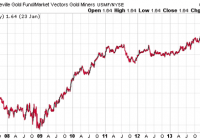
Summary Gold miners have unique situations due to differing geographic, regulatory and currency risk, as well as different ore quality. Gold mining index ETFs are good for trading and short-term exposure. Long-term investors who plan on holding longer than three months should consider TGLDX instead. Investors have flocked to index funds and ETFs due to their low cost, tax efficiency and transparency. The general rise of indexing has helped ETFs grow rapidly, taking market share from mutual funds, particularly actively managed funds. However, there are clear-cut cases of active managers outperforming their indexed competition. One example is the gold mining sector. Gold Funds Since the inception of the Market Vectors Gold Miners ETF (NYSEARCA: GDX ) in 2006, the fund has seen an incredible inflow of funds, to $7.1 billion as of January 23. The small cap edition, Market Vectors Junior Gold Miners ETF (NYSEARCA: GDXJ ) has amassed $2 billion in assets since its inception in late 2009. The actively managed the Tocqueville Gold Fund No Load (MUTF: TGLDX ), which was created back in 1998, has attracted only $1.3 billion in assets. For short-term investors, the ETFs make sense due to TGLDX’s short-term trading fee of 2 percent. The high volume in GDX and GDXJ indicates traders are using the ETFs to speculate on the volatile sector, even after a long bear market in mining shares. However, long-term investors may also be holding shares. Those investors are placing their confidence in the market cap-weighted indexing strategy, but the gold mining industry is one where active management can pay off. The saying “A mine is a hole in the ground with a liar at the top” is attributed to Mark Twain, and it gets to the heart of the difficulty in evaluating mining companies. The track record of TGLDX shows that this assumption is correct. The chart below is a price ratio of TGLDX to GDX – a rising line shows outperformance by TGLDX. (click to enlarge) Since its inception in 2006, TGLDX has generally outperformed GDX. Aside from an 18-month period from summer 2007 to 2009, TGLDX hasn’t spent much time trailing GDX. The total return since May 16, 2006, the inception of GDX, shows that TGLDX has built up a considerable lead: a loss of 4.46 percent versus a decline of 38.13 percent in GDX. (click to enlarge) TGLDX does have an advantage over GDX in that manager John Hathaway can choose to hold more small cap miners than the market cap-weighted index. However, TGLDX also beat GDXJ since the inception of that ETF, a loss of 33.12 percent versus a drop of 68.07 percent for GDXJ. This indicates stock selection is playing a role in TGLDX’s outperformance. (click to enlarge) The strong performance in TGLDX has more than made up for its higher expense ratio of 1.36 percent, versus 0.53 percent for GDX and 0.58 percent for GDXJ. TGLDX Recognized by Lipper as the Best Fund in the Precious Metals category during the last five years, the Tocqueville Gold Fund is co-managed by John Hathaway and Doug Groh. Originally created in 1998 by Mr. Hathaway, the fund was initially designed to take advantage of the negative psychology that surrounded the gold market at that time. The no-load fund is based on a contrarian value investment philosophy, and seeks long-term capital appreciation. The minimum investment is $1000 ($250 IRA). In addition to the 1.36 percent expense ratio, there is a 2 percent fee on shares held less than 90 days. This is not a fund for traders, but for long-term investors who want exposure to gold mining shares. Mr. Hathaway, senior managing director at Tocqueville Asset Management, is the portfolio manager for the Tocqueville Gold Fund. In 1986, he founded Hudson Capital Advisors and managed the firm until 1997, when he joined Tocqueville. Mr. Hathaway earned his B.A. From Harvard University, M.B.A. from the University of Virginia and began his career in 1970 employed as an equity analyst with Spencer Trask & Co. As portfolio manager for the Tocqueville Gold Fund, he searches for companies in the gold sector that have excellent management teams and assets that provide the most value independent of the price of gold. Researchers for the fund follow the entire gold resource and mining industry. Investing in the gold sector from 1998 to 2011 produced record returns. Since then, the sector has been out of favor and has taken quite a hit. Spot gold traded at a high above $1,900 an ounce in 2011, and finally found a bottom below $1,200 an ounce in 2014. Mr. Hathaway believes that the slump may be close to reversing for gold investors, and holds that a bottom in gold is being formed. Mr. Hathaway believes that the price of spot gold has been discounted to a point where most of the negative headlines are priced in. At some point, rates will need to be taken higher, and this could prove to be very disruptive to the markets. Back in November, he saw gold rallying along with the U.S. dollar as a sign of alternative reserve currency risk . The recent performance of gold in euros shows he was on target with this view. (click to enlarge) Finding Winners Aside from a 12 percent position in physical gold, the $1.3 billion fund is mostly invested in equities related to precious metal mining. While this sector can be challenging, Mr. Hathaway has a knack for discovering hidden gems involved with exploration and building up production. Gold mining is a capital-intensive business that takes many years to develop and will see many different issues over those years. An obvious change is in the price of gold, but companies in the gold sector must also deal with change in governments, currency devaluations, central bank policy and both local and global economic conditions. The fund takes a diversified approach and invests in all types of business models, ranging from royalty companies to businesses involved only in exploration. Speaking about the fund’s strategy, Hathaway said: “Our strategy for the Fund has been to find companies that are adding value even in a low gold price environment. As a result, we tend to focus on smaller companies and steer clear of larger companies that have either experienced operational challenges or have lower levels of reserves in their portfolio. We believe having smaller companies in the portfolio has been an important contributor to the Fund’s outperformance relative to its benchmark and the Morningstar Equity Precious Metals Funds Category over time.” The top five holdings behind the 12 percent holding in physical gold are Royal Gold (NASDAQ: RGLD ), Franco-Nevada (NYSE: FNV ), Eldorado Gold (NYSE: EGO ), Goldcorp (NYSE: GG ) and Agnico Eagle Mines (NYSE: AEM ). Allocations in the top ten range from 6.62 percent in Royal Gold to 3.19 percent in Yamana Gold (NYSE: AUY ). Recent underperformance by Eldorado and Yamana have dinged the fund in 2015. The fund is up 11.06 percent through January 23, versus a 15.42 percent return for GDX. Royalty companies play a major role in the fund, with about 12 percent of its assets invested in two of the major players: Royal Gold and Franco-Nevada. The business model that royalty companies are based on has become attractive to gold investors. Gold royalty companies help finance mining construction and receive royalty payments in return. By investing this way, they avoid some of the hazards and costs of exploration or operations. The stream of payments that gold royalty companies receive are based on future sales, and are not as sensitive to spot gold price fluctuations. Mr. Hathaway recognized the inherent value of these type of investments early on and included them in TGLDX. Gold’s price decline in the last 3 years has been devastating for many gold mining companies. While some are specialized in exploration, others have expertise in development. Many in the niche are having to rethink their business models and capital spending plans in order to become profitable. This has led to an increase of mergers and acquisitions in the industry, and presents the fund with the ability to invest in companies that may be targeted acquisitions. In fact, the fund performed well in 2014, beating the category by more than 6 percent, by holding a large position in Osisko Mining Corp. ( OTC:OKSKF ). It became a top-weighted position in the fund until going through its merger . Another possible acquisition target that has been placed in the fund’s portfolio is based in Ontario, Canada. Detour Gold Corp. ( OTCPK:DRGDF ) is expected to become the largest operating gold mine in Canada, with a possible lifespan of 21 years. With Osisko Mining being acquired, investors began looking for the next target for a merger. Mr. Hathaway believes there will be more opportunities such as these, and continues to scour the landscape for possibilities. With around 17 years at the helm of the Tocqueville Gold Fund, Mr. Hathaway has his pulse on the gold sector and possesses a management style that’s been beneficial to its investors. TGLDX has beaten the returns of popular gold ETFs, and investors looking to establish a long-term position in the sector should look to the fund. Outlook for Gold Mining Shares In many foreign currencies, gold is experiencing a strong rally, trading at a 12-18 month high, depending on the currency. Gold is near its all-time high in yen, and at all-time highs in currencies that crumbled last year, such as the Russian ruble. If gold remains an alternative to the U.S. dollar as a reserve asset/safe haven currency, the price could remain elevated even amid a U.S. dollar bull market , since such a bull market will likely be accompanied by a series of financial or currency crises in emerging markets due to the run-up in dollar-denominated debt over the past several years. Falling energy prices, along with other costs for mines located abroad could help miners increase non-dollar profits. For example, in January alone, gold went from $1400 to $1600 in Canadian dollars. A 20 percent combination move in gold and Canadian dollar depreciation would lift the metal to a new all-time high in Canadian dollars. A pullback in gold and rebound in foreign currencies is long overdue, though, at least in the short run. Miners used the recent jump in prices to raise cash as well. The industry diluted shareholders to the tune of more than $800 million in January 2015 alone. The share issuance sent shares of the affected miners lower, and until business conditions for the sector improve markedly, further share issuance is possible. The best-case scenario for mining shares amid a U.S. dollar bull market (leaving aside a new bull market in the U.S. dollar price of gold) is if foreign demand for hard money keeps the price of gold level or even increases it slightly in U.S. dollars. The price in foreign currency could rise substantially as foreign currencies devalue versus the dollar and gold, and since mining shares are leveraged to the price of gold, their earnings could rise significantly. If, instead, the gold price falls, high-cost miners will struggle to remain profitable and the bear market for mining shares will continue.

The SPDR S&P 600 Small Cap ETF: Let’s Analyze It Using Our Scorecard System

Summary Analysis of the components of the SPDR S&P 600 Small Cap ETF (SLY) using my Scorecard System. Specifically written to assist those Seeking Alpha readers who are using my free cash flow system. Compares the results of the SPDR S&P 600 Small Cap ETF to the SPDR S&P 500 ETF. Back in late December I introduced my free cash flow “Scorecard” system here on Seeking Alpha, through a series of articles that you can view by going to my SA profile . My purpose in doing so was to try and teach as many investors as I could, how to do this simple analysis on their own as I believe in the following: “Give a person a fish and you feed them for a day, Teach a person to fish and you feed them for life” I have been very pleased with the positive feedback that I have received so far, but included in that feedback were many requests by those using my system, to see if they did their analysis correctly or not. Since the rate of these requests have been increasing with every new article I write, I decided to concentrate my attention on articles analyzing indices and industry ETF’s covering a broad range of sectors. That way those of you using my system will have something like a “teacher’s edition” that will give you all the correct calculations for each component. Obviously I couldn’t include the financials used to create the results for all my ratios (as I would need to write you a book instead), so instead I will provide just my Scorecard results for each index or ETF and then let everyone go back and analyze each company and see if you get the same answers that I did. My data source will always be Y-Charts . I designed this system for the newbie investor, whom may have limited knowledge of investing, and assure them that with just a little effort, anyone can master the system I have presented here. As I write more articles, my hope in doing so is that everyone will be able to follow my work and then go investigate the stocks that seem interesting to them. Think of this project as sort of like the game show “JEOPARDY”, where I give you the final answers and then you go figure out the questions. Hopefully these articles can be used as reference guides that everyone can use over and over again, whenever the need arises. Again this analysis will just be my final Scorecard for the SPDR S&P 600 Small Cap ETF (NYSEARCA: SLY ) and for those new to this analysis, I suggest that you read my introductory Scorecard article on the SPDR S&P 500 ETF (NYSEARCA: SPY ) by going HERE . That article will send you HERE . There you will find the data on my “Free Cash Flow Yield” ratio which is one of three parts that I use it tabulating my final “Scorecard”. While free cash flow yield is a Wall Street ratio (Valuation Ratio), I also wrote an article that concentrated on my “CapFlow” and “FROIC” Ratios, which are Main Street ratios, which you can read about by going HERE . In this article I will generate my Scorecard results for each component and basically combine all three ratio results to generate one final result. Once completed, my Scorecard should give everyone a clearer understanding on how accurate the valuation is that Wall Street has assigned each company relative to its actual Main Street performance. Before we show you the final results of my Scorecard, here is brief introduction to how it works: Scorecard The Scorecard is the final score for any company under analysis and this is done by combining the three ratio (listed below) final results into one analysis, we grade each company with either a passing score of 1 or a failing score of 0 per ratio where a perfect final score per stock would be a 3. The ideal CapFlow results are anything less than 33%. The ideal FROIC score is any result above 20%. The ideal Free Cash Flow Yield is anything over 10%. So in analyzing Apple (NASDAQ: AAPL ) for example, we get for TTM (trailing twelve months). For the conservative investor: CAPFLOW = 16% PASSED FROIC = 34% PASSED FREE CASH FLOW YIELD = 7.6% FAILED SCORECARD SCORE = 2 (Out of possible 3) For the aggressive or “Buy & Hold” investor, we get a Scorecard score of 3 as Apple’s 7.6% free cash flow yield would be classified as a buy. These are the parameters for the Free Cash Flow Yield. It is important before preceding to determine what kind of investor you are as determined by the amount of risk you are willing to take. Then once you have done that, then pick the parameter list below that fits your risk tolerance. So without further ado here are the final Scorecard results for the components that make up the SPDR S&P 600 Small Cap ETF . What my Scorecard also achieves, besides telling you which individual stocks are attractive and which are not, is that it also allows you in “one shot” to see how overvalued or attractively valued the stock market is as a whole. For example, for the conservative investor now is the time to be extremely cautious as only these fifteen stocks came in with a perfect score of “3” As you can see I only found 15 bargains out of 600 for the conservative low risk investor and that comes out to just 2.5% of the total universe being bargains! As for the aggressive investor, who is willing to take on more risk, we have only 28 stocks that are considered higher risk bargains. That comes out to only 4.6% being attractive and 95.4% being holds or sells. So as you can see as a portfolio manager I have to work extremely hard just to find one needle in the haystack, while in March 2009 there were probably 300 bargains for the conservative investor at that time. Thus this data clearly shows that we are at the opposite extreme of where we were in 2009 and are in my opinion, at an extremely overvalued level. Here is the same analysis using the Dow Jones Index where I actually analyzed that index for 2001, 2009 and 2015. You can view those results by going HERE . In getting back to the main table above, the “TOTALS” you see at the end are the sum of each ratio divided by 600. The totals for both Scorecards are out of 1800 (1 point for each ratio result) as a perfect score were every stock would be a bargain. Therefore the conservative scorecard result is 374/1800 or 20.77% out of 100% and the more aggressive/buy & hold scorecard came in at 476/1800 or 26.44% out of 100%. The beauty of this system is that you can now compare this index result to any other index or ETF in juxtaposition. For example the S&P 500 Index for the conservative scorecard result is 384/1500 or 25.6% out of 100% and the more aggressive/buy & hold scorecard came in at 488/1500 or 32.5% out of 100%. Both clearly are not inspiring and could be a clear sign that the markets are ready for serious correction going forward. Always remember that the results shown above should not be considered investment advice, but just the results of the ratios. The system outlined in this article is just meant to be used as reference material to be included as just “one” part of everyone’s own due diligence. So in other words, don’t make investment decisions based on just my Scorecard results, but incorporate them as part of your own due diligence.

Utilities ETFs – Power To The People

Summary Utilities are a solid income-producing, low volatility plays. Look at utility ETFs as alternatives to one-stock options (Con-Ed, Duke Energy, Dominion) for more geographic and industry diversification. These utilities are largely made in America domestic investment options. Profiling the contenders (unless otherwise stated, market prices, NAV and SEC yield as of 1/23/15) : Vanguard Utilities ETF (NYSEARCA: VPU ) This ETF seeks to track the performance of a benchmark index that measures the investment return of stocks in the utilities sector and includes stocks of companies that distribute electricity, water, gas or that operate as independent power producers. Market price: $106.55 30-day SEC Yield: 3.14% Number of holdings: 78 iShares U.S. Utilities ETF (NYSEARCA: IDU ) This ETF seeks to track the investment results of an index composed of U.S. equities in the utilities sector. Market price: $123.23 30-day SEC Yield: 2.56% Number of holdings: 62 Guggenheim S& P 500 Equal Weight Utilities ETF (NYSEARCA: RYU ) This ETF seeks to replicate as closely as possible, before fees and expenses, the performance of the S&P 500 Equal Weight Index Telecommunication Services & Utilities. Market price: $81.17 30-day SEC Yield: 2.91% Number of holdings: 36 Utilities Select Sector SPDR ETF (NYSEARCA: XLU ) This ETF seeks to provide investment results that, before fees and expenses, correspond generally to the price and yield performance of the S&P Utilities Select Sector Index. Market price $49.14 30-day SEC Yield: 3.04% Number of holdings: 30 1) Diversification Diversification is the process of reducing non-systematic risk by investing in a variety of assets or asset classes that (hopefully) do not move up or down in value at the same time or magnitude. As the 2008 financial crisis taught us , there are certain unforeseeable events (think global recession, world wars) that no amount of diversification can protect us from. With diversification, you are at risk, without it you are doomed. a) Number of holdings An ETF does not need to hold every company of every sector that comprises its benchmark index, but 2 – 3 companies per industry is my subjective minimum to achieve adequate diversification. The utilities sector can be broken up into various industries including: electric utilities, multi-utilities, gas utilities, independent power and renewable electricity providers and water utilities. (click to enlarge) Winner: Guggenheim. While iShares and Vanguard both have more holdings, the concentration of risk with Duke Energy should not be ignored. Every dollar invested in Duke Energy is a dollar that can’t be invested in smaller regional electric and water companies that potentially could provide under the radar value for investors. b) Industry concentration Vanguard Utilities ETF (Courtesy of Vanguard) iShares U.S. Utilities ETF (Courtesy of BlackRock) Guggenheim S&P 500 Equal Weight Utilities (click to enlarge) ( (Courtesy of Guggenheim Investments) Utilities Select Sector SPDR ETF (Courtesy of State Street Global Investors) Winner: Guggenheim. I like that it has three industries that make up 10% or more of total investments, compared to only two for the competition. While diversified telecommunication services sounds a lot like AT&T, Verizon et al, this high barrier-to-entry quasi utility addition adds recurring revenue and relatively higher yield to the mix. 2) Expense ratio The SEC defines expense ratio as the total of a funds operating expenses, expressed as percentage of average net assets. The expenses include management fees, Distribution/service or “12b-1” fees, custodial, legal, accounting, etc. Lower expense ratios, either through larger size or smaller nominal expenses mean higher investment returns. (click to enlarge) Winner: Vanguard. John C. Bogle , founder of Vanguard: The grim irony of investing, then, is that we investors as a group not only don’t get what we pay for, we get precisely what we don’t pay for. So if we pay for nothing, we get everything. Honorable mention: the other three. According to Morningstar data , the average expense ratio for similar funds is 1.28%. 3) Total return (click to enlarge) Winner: Guggenheim. The Guggenheim S&P 500 Equal Weight Utilities ETF has outperformed Vanguard, iShares, and SPDR on both three and five year horizons. Past performance is no indicator of future results, naturally, but I believe this result is indicative of a superior indexing methodology. 4) Valuation multiples Winner: Vanguard. The Vanguard ETF is trading at a slightly lower multiple to TTM earnings, and a reasonable price/book ratio related to its competitors. 5) Liquidity The ability to get out of a great investment is just as important as the ability to get in. While ETFs are generally regarded as having higher liquidity than mutual funds (primarily because they can be traded throughout the day, rather than just at the end), there are reasons to avoid ETFs with excessively low volume. Chief among these are higher bid-ask spreads, which may result in the inability to profitably execute a short-term trade (not a real issue for long-term investors). However, one of the issues that arises from low liquidity (a deviation between price and NAV) can actually be an opportunity. If an ETF is trading slightly below its NAV, but the market is not active enough for it to quickly resume equilibrium, you can shave a few points off your basis by looking for opportune entry points. (click to enlarge) (click to enlarge) Winner: SPDR. Higher volume means tighter bid-ask spreads, full stop. 6) Yield (click to enlarge) Winner: Vanguard. Honorable mention: Everyone else. All four ETF options offer better income producing prospects than a 30 year treasury (2.38%), the S&P 500 (1.97%), and Dow Jones Utility Average (2.40%). 7) Volatility (click to enlarge) Winner: SPDR. Over three and five-year time-frames, SPDR has been less volatile than Vanguard, iShares and Guggenheim, and significantly less volatile than markets as a whole. 8) Dividend history and growth Source: finance.yahoo.com Winner: Tie: SPDR and iShares. The SPDR and iShares ETF have increased their annual dividend each year since 2009. Growing dividend payments is one way to try and keep up with inflation, and based on this 6 year time-frame, SPRD and iShares best accomplish this. So, which Utility ETF should you own? SPDR! The Utilities Select Sector ETF by SPDR is: the most active (liquid), the least volatile, offers the second highest yield, the second lowest expense ratio, and is one of only two of the funds analyzed that has increased dividends each year since 2009. A word of caution Utilities stocks are generally thought of as defensive plays, and could underperform in a rising or bull market. Also, significant sustained changes in the cost of energy production and delivery or interest rates could negatively impact all of these stocks. That is no excuse, however for not considering allocating at least a portion of your portfolio to these low-volatility ETFs. Do your homework, review the composition and risk profile of each of these ETFs and monitor your holdings.