Tag Archives: undefined

For Passive Funds, A Stronger Link Between Fees And Performance

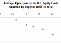
By Michael Rawson When shopping for products of unknown quality, price forms a cue that shoppers can use to differentiate products. It is often a safe assumption that a higher priced product offers better performance than a lower priced product. For instance, the Porsche 911 lists for $93,000 while the Chevy Malibu will set you back $20,000. But this is not always the case, particularly with fund investing. Unlike the Porsche, there is no cachet from buying a high-priced fund. Still, price can be useful when predicting results – though not in the way fund companies would like. Morningstar’s Analyst Rating for funds is based on five pillars: People, Parent, Process, Performance, and Price. The first three of these pillars are somewhat qualitative, while Performance and Price are much more quantitative. Price is the most tangible, both in terms of the impact of price on fund performance and comparability across funds. On average, we find that the higher the price of a fund, the worse its performance tends to be, and the link between fees and performance is stronger for passive funds. The chart below illustrates the relationship between price and performance among U.S. equity funds. It shows the average alpha (excess returns after adjusting for risk relative to the category benchmark) for all funds grouped into five quintiles by expense ratio. The y-axis shows the average alpha and the position on the x-axis indicates the average expense ratio for the group. We included all U.S. equity funds that existed five years ago and survived through today. Because some funds have performance-based fees, we used the 2009 annual report expense ratio rather than the expense ratio during the sample period. This also simulates the results of picking funds based on currently available information and examining future performance. As the chart illustrates, there appears to be an inverse relationship between fees and performance. The lowest-fee quintile has an average expense ratio of 0.64% and an average alpha of negative 0.71%, while the highest-fee quintile has an average expense ratio of 2.02% and an average excess return of negative 1.94%. However, grouping the funds into quintiles masks the tremendous variability in the relationship between fees and performance, which is better illustrated in the following graph. Here, the relationship appears much less precise. In fact, a regression of alpha on expense ratio has an R-squared of just 6%, suggesting that fees explain a small portion of the overall variability in fund performance. However, there are a few issues that may obfuscate this relationship. The chart above includes all U.S. equity funds, even though small-cap funds have higher expense ratios than large-cap funds. It also includes all available share classes despite the fact that low-cost institutional share classes must outperform high-cost retail share classes of the same fund. Also, the relationship between fees and performance might be different for active and passive funds. Because passive funds seek to match an index less fees, the relationship between fees and performance might be stronger among them. In contrast to passive funds, well-run active funds have a better chance of earning back their fees. In order to address these issues, we narrowed our focus to large-cap U.S. equity funds and removed multiple share classes of the same fund to get a cleaner read on the link between fees and strategy performance. We also grouped active and traditional broad passive funds separately and removed most niche index and strategic beta funds (index funds that make active bets in an attempt to outperform traditional indexes). The results are shown in the following chart. In this chart, the relationship between fees and performance is a bit clearer. For active funds, there is still a tremendous amount of variability, but there appear to be more dots in negative territory as we move from lower- to higher-cost funds (from left to right on the chart). Passive funds seem to hew closer to a straight line. Quantifying this relationship with a regression that expresses the expected alpha as a function of the expense ratio highlights the negative slope. For active large-cap funds, the expected alpha is approximately negative 1.21 times the expense ratio. In other words, a fund with an expense ratio 10 basis points above the average would be expected to deliver an alpha 12 basis points lower than average. While the relationship is significant, the R-squared is only 6%. Despite the poor fit of the model linking fees to performance for active large-cap funds, lower-fee funds still had a better chance of outperforming on average. This simply indicates that, while fees are predictive of performance, there are many other factors that matter. For passive large-cap funds, the R-squared is 38%. This means that there is a cleaner relationship between fees and performance for passive funds than active funds. In the sample studied, active funds in the lowest expense ratio quintile had a 28% chance of earning a positive alpha compared with just a 15% chance for those in the highest-cost quintile. But the relationship is even stronger for passive funds. About 52% of passive large-cap funds in the lowest-cost quintile earned a positive alpha (however small), while none of the funds in the highest-cost quintile did. This suggests that investors can increase their probability of success by selecting low-cost funds. Fortunately, there are a lot of low-cost passive and active funds to choose from. Vanguard Total Stock Market ETF (NYSEARCA: VTI ) holds more than 3,000 U.S. stocks and offers similar exposure to iShares Russell 3000 (NYSEARCA: IWV ) . The funds have had similar returns and risks over the past decade. However, the Vanguard fund charges 0.05% compared with 0.20% for the iShares fund. Assuming both funds return 5% annually gross of fees over 10 years, a $100,000 investment in VTI would be worth about $2,300 more at the end of the period than an investment in IWV. Among active funds, Price is one of five pillars taken into consideration in the Morningstar Analyst Rating for funds. When there are multiple funds that offer similar exposure, the lowest-cost option may be the prudent choice. Disclosure: Morningstar, Inc. licenses its indexes to institutions for a variety of reasons, including the creation of investment products and the benchmarking of existing products. When licensing indexes for the creation or benchmarking of investment products, Morningstar receives fees that are mainly based on fund assets under management. As of Sept. 30, 2012, AlphaPro Management, BlackRock Asset Management, First Asset, First Trust, Invesco, Merrill Lynch, Northern Trust, Nuveen, and Van Eck license one or more Morningstar indexes for this purpose. These investment products are not sponsored, issued, marketed, or sold by Morningstar. Morningstar does not make any representation regarding the advisability of investing in any investment product based on or benchmarked against a Morningstar index.

Safe Withdrawal Rates For Retirement Income Portfolios Using Fidelity Select Mutual Funds

Summary Robust investment portfolios with large withdrawal rates can be constructed with Fidelity select mutual funds. From January 1990 to December 2014, a Fidelity portfolio with fixed allocation allowed a safe 6% annual withdrawal rate and achieved 6.19% annual increase of the capital. Same portfolio with rebalancing at 25% deviation from the target allowed a safe 6% annual withdrawal rate and achieved 7.78% compound annual increase of the capital. Radically better performance is achieved using adaptive asset allocation. Same portfolio allowed a safe 6% annual withdrawal rate and 22.05% annual increase of the capital. The Chicago South Suburban Investment Club has been experimenting with a monthly asset rotation strategy applied to a hypothetic IRA account using five Fidelity mutual funds. On the last trading day of each month, the funds are ranked by the previous 3-month return. All equity is invested in the fund with the highest return, as long as that return is positive. If all the assets had negative returns over the previous 3 months, then all equity is moved into CASH. The five mutual funds considered for investment are the following: Fidelity GNMA (MUTF: FGMNX ) Fidelity Select Multimedia (MUTF: FBMPX ) Fidelity Select Chemicals (MUTF: FSCHX ) Fidelity Select Electronics (MUTF: FSELX ) Fidelity Select Health Care (MUTF: FSHCX ) This experiment has been ongoing since July 2014. It extends over a period of 5 months. Within this time interval, the system had been invested 4 months in FSPHX, 1 month in FSELX, and current month in FLBIX. The results are showed in the table below. Table 1. Momentum allocation portfolio August 2014 to January 2015 Month AUG SEP OCT NOV DEC JAN ETF FSPHX FSPHX FSPHX FSPHX FSELX FLBIX BUY 206.52 218.7 218.92 228.7 81.43 13.32 SELL 218.7 218.92 228.7 236.08 84.78 RETURN 5.90 0.10 4.47 3.23 4.11 EQUITY 100.00 105.90 106.00 110.74 114.31 119.02 In this article, three different strategies will be considered: (1) Portfolio is initially invested 50% in the bond fund , and 12.5% each in the four equity funds without rebalancing. (2) Portfolio is initially invested 50% in the bond fund , and 12.5% each in the four equity funds but is rebalanced when the allocation to any fund deviates by 25% from its target. (3) Portfolio is at all times invested 100% in only one fund. The switching, if necessary, is done monthly at closing of the last trading day of the month. All money is invested in the fund with the highest return over the previous 3 months. The data for the study were downloaded from Yahoo Finance on the Historical Prices menu for the five tickers, FGMNX, FBMPX, FSCHX, FSELX, FSPHX. We use the monthly price data from January 1990 to December 2014, adjusted for dividend payments. The purpose of this exercise is to develop a robust strategy for income generation in retirement. The paper is made up of two parts. In part I, we examine the performance of portfolios without any income withdrawal. In part II, we examine the performance of portfolios when income is extracted periodically from the account. Part I : Portfolios without withdrawals In table 2 we show the results of the portfolios managed for 25 years, from January 1990 to December 2014. Table 2. Portfolios without withdrawals 1990 – 2014. Strategy Total return% CAGR% Number trades MaxDD% Fixed-no rebalance 1,463 11.62 0 -49.21 Fixed-25% rebalance 1,395 11.43 28 -22.55 Adaptive 18,015 23.35 126 -33.11 The time evolution of the equity in the portfolios is shown in Figure 1. (click to enlarge) Figure 1. Equities of portfolios without withdrawals. Source: This chart is based on EXCEL calculations using the adjusted monthly closing share prices of securities. Notice that the prices are shown in a logarithmic scale. That allows a better differentiation between the curves. It is apparent that the rate of increase of the adaptive portfolio is very stable and is substantially greater than the rate of the fixed allocation portfolios. One can also see that rebalancing of the fixed allocation portfolio makes its rate of increase much more stable than that of the portfolio without rebalancing. Part II: : Portfolios with withdrawals Assume that we have $1,000,000 to invest for income in retirement. In table 2 we show the results of the portfolios managed for 10 years, from January 2005 to December 2014. Money was withdrawn monthly at a 6% annual rate of the initial investment plus a 2% inflation adjustment. Over the 10 years from January 2005 to December 2014, a total of $664,704 was withdrawn. Table 3. Portfolios with 6% annual withdrawal rate 2005 – 2014. Strategy Total return% CAGR% Number trades MaxDD% Fixed-no rebalance 122.63 2.06 0 -28.82 Fixed-25% rebalance 125.76 2.32 5 -30.11 Adaptive 278.92 10.8 56 -15.92 The time evolution of the equity in the portfolios is shown in Figure 2. (click to enlarge) Figure 2. Equities of portfolios with 6% annual withdrawal rates. Source: This chart is based on EXCEL calculations using the adjusted monthly closing share prices of securities. Conclusion The adaptive allocation algorithm performed substantially better than the fixed allocation algorithms. The fixed allocation strategies allow a safe withdrawal rate of 6% at any time horizon between 1990 and 2014, without a substantial decrease of capital. The adaptive allocation algorithm allows a 6% annual withdrawal rate while assuring a substantial increase of capital. In fact, the momentum-based adaptive allocation strategy allows a safe 10% annual rate of withdrawal without any decrease of capital.

Consider This Before You Sell On Fears Of A Strong Dollar

Markets tumbled Tuesday on a number of weak earnings reports. The strong U.S. dollar was a major culprit. Historically, currency changes are not a good predictor of subsequent stock market returns. Investors may wish to consider rebalancing their portfolios, but there is little evidence to suggest a major change in strategy is warranted. Markets had a turbulent Tuesday with earnings reports from firms like Microsoft (NASDAQ: MSFT ), Caterpillar (NYSE: CAT ) and Procter & Gamble (NYSE: PG ) stoking fears that economic growth is slowing. However, a more critical look into these reports suggests that strength in the U.S. dollar is a major culprit. For example, Procter & Gamble reported core earnings of $1.06 versus $1.15 in the previous year, a reduction of nearly 8%. But looking closer net sales were down 4% nearly mirroring a five percentage point impact from foreign exchange. In fact, adjusting for the effects of foreign exchange, volumes were flat (Table 1). While flat growth may be little reason to cheer, it also seems to be scant reason to overreact. As an investor before you react to currency headwinds it is logical to evaluate the effect of a stronger dollar in its historical context. Table 1: P&G’s Net Sales Drivers Oct. – Dec. 2014 Net Sales Drivers Volume Foreign Exchange Price Mix Other* Net Sales Organic Volume Organic Sales Beauty, Hair & Personal Care -2% -4% 1% 0% -1% -6% -2% -1% Grooming -2% -7% 4% 0% 0% -5% -2% 2% Health Care -2% -4% 0% 3% 0% -3% -2% 1% Fabric Care and Home Care 2% -6% 1% 0% -1% -4% 2% 4% Baby, Feminine and Family Care 0% -6% 1% 3% 0% -2% 0% 4% Total P&G 0% -5% 1% 1% -1% -4% 0% 2% *Other includes the sales mix impact of acquisitions/divestitures and rounding impacts necessary to reconcile volume to net sales. Source: Procter and Gamble Earnings Press Release. The stock market is volatile, but so are currencies. Over the past thirty years the dollar has waxed and waned against a basket of foreign currencies (Figure 1). Sometimes the U.S. dollar and the market move upward in lock step, while other times they diverge. Figure 1: The U.S. Dollar vs. The S&P 500 (click to enlarge) Do you see a correlation between the two? I do not and incidentally neither does Excel. The correlation between the dollar index and the S&P 500 (NYSEARCA: SPY ) is -0.211, most likely any correlation is simply an artifact of the dollar being in general more weak over the past ten years while the market has moved up over time. How about if we think about the situation in a different way? What if a rising dollar is associated with subsequent poor performance in the stock market? In other words, since P&G’s last earnings report stemmed from changes in the exchange rate over the past six months what if there was a correlation between the six month appreciation or depreciation of the dollar and subsequent returns in the stock market? These numbers are very easily manipulated in Excel and the correlation between six month past currency moves and three month forward stock market returns is -0.043. There is almost no correlation between the two. To further emphasize the point I created a scatterplot of the two data sets (Figure 2). The R squared of least squares regression is 0.00186, indicating no correlation. Figure 2: Three Month Subsequent S&P 500 Return Vs. Six Month Prior Appreciation in the U.S. Dollar (click to enlarge) Intuitively, this finding makes a great deal of economic sense. Currency moves are a zero sum game. If the dollar goes down against the Euro then U.S. exports are cheaper for Europeans and the reverse is true for imports. While U.S. companies on the whole may suffer because they sell abroad an appreciating dollar also makes assets denominated in dollars more attractive to foreign investors. In aggregate there is little reason to bet on the dollar causing the U.S. market to move up or down. Some market pundits are calling for a correction or worse in the stock market, however, there is no historical evidence to suggest that strength in the U.S. dollar should be correlated with stock market corrections. The S&P 500 closed at 2029 today, about 3% off its all-time intraday high of 2093. While market prognosticators constantly pitch timing the market, moves of less than 10% are impossible to time accurately. By the time the market opened today we were already down 3% from all-time highs. What if the market goes down a total of 10%? First consider that it is only after a move higher that you would know to reenter the market. Then consider that it is equally likely the market’s next move will be up. In a nutshell this explains why timing short-term corrections is a waste of time and money, although investors never seem to learn that this is the case. At the moment currency changes are still rippling through the market. One way to rebalance your portfolio would be to favor domestic stocks that capitalize on cheaper imports and sell their products within the United States. Foreign stocks that are exporters should benefit from the opposite trend and allow for a portfolio that is still balanced between foreign and U.S. based corporations. For example, some U.S. based companies that should see stronger earnings as the result of dollar appreciation are: AutoNation (NYSE: AN ), Costco (NASDAQ: COST ) and Michael Kors Holdings (NYSE: KORS ). These three companies need to import goods from abroad and sell them in the United States (with each having a minimum of 70% of revenues domestically). Foreign stocks that could benefit from a weaker euro include: Siemens ( OTCPK:SIEGY ) and Unilever (NYSE: UN ). Obviously this list is not all-inclusive and depending on whether you expect a weakening or strengthening economy you could favor more or less cyclical companies. Nearly every day market prognosticators try to convince investors to change their investment strategy. While it is difficult to ignore them when the market swoons that is precisely what most successful investors learn to do. It is more gratifying and ultimately more profitable to view short-term market fluctuations as random noise unless you have a compelling reason to think otherwise. Editor’s Note: This article discusses one or more securities that do not trade on a major exchange. Please be aware of the risks associated with these stocks.