Tag Archives: send-xhr-start

Low Risk And Long-Term Success Portfolio Update 2015

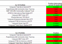
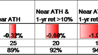
2015 will be a year of minimal returns for broad S&P 500 funds, but will be a good year for international funds and gold. High yielding investments in vehicles such as REITs could see lots of volatility due to interest rate risks. Investors should consider taking some profit off of U.S. equities and diversifying internationally to take advantage of lower valuations and room for P/E expansion. The last few years have been fantastic for exchange-traded funds (ETFs), according to data accessed by ETF.com. In fact, U.S. stock ETFs have surpassed last year’s inflow records, and for the first time ever, U.S. ETFs have surpassed $2 trillion. A popular S&P 500 ETF, the SPDR S&P 500 Trust ETF (NYSEARCA: SPY ), has seen the heaviest inflows at nearly $25 billion in 2014. In contrast, emerging market ETFs (NYSEARCA: EEM ) and gold ETFs (NYSEARCA: GLD ) have seen outflows. This marks a perfect opportunity for a trite quote from Warren Buffet, “Be fearful when others are greedy and greedy when others are fearful.” My theory is that many investors have missed out on the upswing of the market and are now “performance chasing” because they feel left out. I am taking the contrarian position and urging to shift some money out of direct investments in the U.S. equity market, and consider larger allocations to international markets, and even emerging market exposure. The original portfolio I created on April 9, 2013, can be accessed here . My portfolio has underperformed the S&P 500 by a significant extent; however, the portfolio I created also contained 18% allocation to bonds, 17% international exposure, emerging markets, and gold. This diversification has led to lackluster performance as the S&P has surged. Keep in mind this is not a portfolio built for everyone. Based on your tolerance for risk and your investment objectives, the amount of money you allocate to certain asset classes must make sense for your goals. In my asset allocation methodology for this year and beyond, I am making some key assumptions that are worth noting. Firstly, I believe the market is fairly valued to slightly overvalued based on historical price-to-earnings ratios. Due to the low interest rate environment, low inflation rate, and the quantitative easing actions of the Federal Reserve, I believe that inflated price-to-earnings ratios makes sense. With that being said, I feel that rates will increase to some extent in this year and that investors seeking high yield investments should be wary. Instead of riding out the high yield environment, my first action will be to remove the allocation to the Vanguard REIT Index ETF (NYSEARCA: VNQ ), and keep my position in the Vanguard High Dividend Yield ETF (NYSEARCA: VYM ). The reason that I am not recommending a reduction in VYM is because of the amount of high quality value stocks found in this fund. What I am certain many people hear all too often are obscure references to the stock market stating it is too high or too low. What I rarely hear are defined examples of why they believe the market is high or low, or by what measuring stick they are referencing. I tend to favor the simplistic. A quick answer to the “Why?” that many investors ask is an indicator of market valuation by economist and well-known author of Irrational Exuberance – Robert Shiller. The Shiller price-to-earnings ratio is calculated using the annual earnings of the S&P 500 over the past 10 years. The past earnings are adjusted for inflation using CPI, bringing them to today’s dollars. The regular price-to-earnings ratio is just shy of 20, which is right at the historical average. (click to enlarge) Based on this information, I believe the market is fully valued. Most agree with the contention that the price-to-earnings ratio of the S&P isn’t trading at a huge bargain. The actions of the Federal Reserve may push the S&P to further valuations above historical averages. My personal view is that while you cannot time the market, you also should avoid pouring into the market when it appears fully valued as many appear to be doing. In fact, at this point I would be doing the opposite of the crowd. Emerging markets and precious metals offer value, and I believe smart money is moving into these asset classes. Using the proceeds from my sale of VNQ, I would purchase the Schwab International Equity ETF (NYSEARCA: SCHF ). This is an international large blend style ETF, sector weighted in financials at an expense ratio of only .08% that will reward patient investors in the long run. I also like that their top holding is Nestle SA ( OTCPK:NSRGY ). The regional breakout provided by Morningstar is roughly 18% exposure to the United Kingdom, 37% exposure to Europe developed, 20% exposure to Japan, 7% Australia, 8% Asia developed, and 8% to the U.S. Gold and the U.S. dollar are inversely related, as you can see from the chart from Macrotrends . While I do not believe gold will experience incredible growth and I cannot promise grandeur, I do believe gold should be a part of your portfolio. I will trust my judgement to raise my portfolio bet in gold to 4% from 3% in my theoretical portfolio. (click to enlarge) Oil seems to be a hot topic today so I wouldn’t want to ignore it in my portfolio construction. While I cannot predict the future – I tend to bet that things “return to normalcy” over the long haul. Thus, my view is that oil will return to a pricing level around $75-$85. In the passive investing space, I am not making an actionable bet on the price action of oil. However, I do believe an opportunity exists for active investors who are diligent about researching quality businesses that are now discounted due to the fall in oil prices. One example I found was Schlumberger Limited (NYSE: SLB ). In another article , I discuss the benefits of individual selection in the oil and gas space. (click to enlarge) In my original portfolio, I made favorable S&P sector bets in the Utilities (NYSEARCA: XLU ) and Health Care (NYSEARCA: XLV ) sector ETFs. In the sector rotation model, it is clear that these two outperformed in the last year, signaling a potential business cycle decline. I do not live or die by sector rotation investing strategies; however, I do not think they should be ignored completely. I tend to look at the relative valuation of companies by sector and make my own judgments as to whether or not they are fairly valued. Interestingly, the financial sector does seem to be an unloved sector which could provide excess returns. Bill Nygren, a fund manager that I follow from Oakmark, is also overweight financials. With a belief that interest rates will rise, supporting sector rotation modeling, and the support of a successful value investing manager, I can remove the clouds and make a clear decision to shift my sector bet from Utilities to Financials (NYSEARCA: XLF ). I am holding onto Health Care because the long-term outlook remains positive. A close third would be the Technology sector (NYSEARCA: XLK ). In summary, I would sell my position in the high yield REIT ETF and use the sources to purchase SCHF to gain more international exposure. I would sell the Utilities sector ETF and purchase the Financials sector ETF with the proceeds. I would also sell a portion of my position in the Vanguard Short-Term Bond ETF (NYSEARCA: BSV ) and purchase additional amounts of the gold ETF until I reach the 4% of total portfolio allocation mark. Given the facts of today, I can only make what I feel is the best decision possible given a certain risk tolerance and investment objective. I hope you find this article useful as you too adjust your portfolio to the current market conditions. As always, best of luck in the new year!

Ivy Portfolio Year End Update

Scott’s Investments provides a daily Ivy Portfolio spreadsheet to track the 10-month moving average signals for two portfolios listed in Mebane Faber’s book The Ivy Portfolio : How to Invest Like the Top Endowments and Avoid Bear Markets. Faber discusses 5, 10, and 20 security portfolios that have trading signals based on long-term moving averages. I have replaced the Google Docs Ivy and Commission Free portfolio with a new spreadsheet. Please update any bookmarks or links to the newest spreadsheets found here . The Ivy Portfolio spreadsheet tracks the 5 and 10 ETF Portfolios listed in Faber’s book. When a security is trading below its 10-month simple moving average, the position is listed as “Cash.” When the security is trading above its 10-month simple moving average the position is listed as “Invested.” The spreadsheet’s signals update once daily (typically in the late evening) using dividend/split adjusted closing price from Yahoo Finance. The 10-month simple moving average is based on the most recent 10 months including the current month’s most recent daily closing price. Even though the signals update daily, it is not an endorsement to check signals daily or trade based on daily updates. It simply gives the spreadsheet more versatility for users to check at his or her leisure. The page also displays the percentage each ETF within the Ivy 10 and Ivy 5 Portfolio is above or below the current 10-month simple moving average, using both adjusted and unadjusted data. If an ETF has paid a dividend or split within the past 10 months, then when comparing the adjusted/unadjusted data you will see differences in the percent an ETF is above/below the 10-month SMA. This could also potentially impact whether an ETF is above or below its 10-month SMA. Regardless of whether you prefer the adjusted or unadjusted data, it is important to remain consistent in your approach. My preference is to use adjusted data when evaluating signals. The current signals based on December’s adjusted closing prices are below. The spreadsheet also provides quarterly, half year, and yearly return data courtesy of Finviz . However, this data is not currently importing properly so is not included in the screenshot below: (click to enlarge) I also provide a “Commission-Free” Ivy Portfolio spreadsheet as an added bonus. This document tracks the 10-month moving averages for four different portfolios designed for TD Ameritrade, Fidelity, Charles Schwab, and Vanguard commission-free ETF offers. Not all ETFs in each portfolio are commission free, as each broker limits the selection of commission-free ETFs and viable ETFs may not exist in each asset class. Other restrictions and limitations may apply depending on each broker. Below are the 10-month moving average signals (using adjusted price data) for the commission-free portfolios: (click to enlarge) (click to enlarge) Many of you have asked for return data of the Ivy strategy. Below is data for a 10-month moving average system using the Ivy 10 and Ivy 5 portfolio tracked on my site. The test was conducted using ETFReplay.com, so while signals should match mine the returns listed below are strictly hypothetical. The backtest will invest in the chosen ETFs on the close of the LAST DAY of the period. The test was run 2010-2014 and returns have been underwhelming compared to a traditional balanced mutual fund: Ivy 10 (click to enlarge) Ivy 5 (click to enlarge) Disclosure: None

Stock Market Reversal In January: The Potential Effect Of Capital Gain Taxes

The S&P 500 index was up 11% in 2014 and up 64% over the past 3 calendar years before dividends. When the stock market is at or near all-time highs at the end of December the following January has on average posted a negative return. This reversal effect, likely due to delayed selling because of capital gains taxes, is stronger when the recent 1-year and 3-year returns are high. The past three calendar years have been quite good for the US stock market. Using S&P 500 index data from Yahoo Finance we have only seen better returns for three consecutive calendar years in the late 1990s and the mid-1950s. The S&P 500 data we use begins with full calendar year data in 1951, so we have 63 calendar years of data in our sample through 2013. What can we expect going forward for the stock market or more specifically the S&P 500 index ETFs, (NYSEARCA: SPY ), (NYSEARCA: IVV ), and (NYSEARCA: VOO ), after such a great run? It’s hard to come to any significant conclusions with just five data points, so we want to expand the sample size a bit before analyzing the data. One distinction we can make for this year versus the average year is that we are at all-time highs for the S&P 500. On a monthly closing basis the all-time high was in November with the S&P 500 closing at 2067. December’s close of 2058 is basically right there. There are 25 calendar years in our data set where the December closing level is within 2% of the all-time high. That is enough data to start to draw some conclusions. If we filter this some more by removing years where the last calendar year price change (return before dividends) was less than +10% we have 20 data points. Filtering with a +15% price change gives us 16 data points. We use price change rather than total return because returns from dividends don’t affect decisions about whether to take capital gains or not. The results of various filters are shown in the table below. In the filter criteria, “Near ATH” means December close is within 2% of the monthly closing all-time high, “1-yr ret” means the price change over the prior calendar year, and “3-yr ret” means the price change over the prior three calendar years. (click to enlarge) The confidence level in the last row of the table is a statistical measure that tells us the likelihood that the average January return of each subset of years is actually lower than the typical January return and the difference is not just due to statistical noise. In other words looking at the “Near ATH” column in the table we see there is an 89% chance that Januaries that begin near the all-time high for the S&P 500 can be expected to be worse than the typical January. While this doesn’t pass common statistical tests than require 95% or 99% confidence, it is still worth keeping in mind as investors consider what to do with their portfolios in the New Year. The filter that most closely matches the current environment is the far right column. There have been 11 years since 1951 that end near all-time highs, had greater than +10% price change and finish a three-year period with price change greater than 40%. The subsequent Januaries average price return was negative at -1.11%. The standard error on this sample mean estimate is 1.45%, so while the -1.11% seems significantly different from +0.89% (the average of all years), the difference between the two numbers isn’t that much more than the standard error. The eleven years that match this criteria are shown in the following table. Six out of 11 years are down in January and five are up. The best January in the table follows 1998 with a +4.0% return and the worst follows 1989 with a -7.1% return. Clearly the one year variation is fairly wide, so we can’t expect this January to have exactly a -1.11% decline. How should an investor use this information? Here are a few possibilities. If she wants to add to her equity position, waiting until February might be wise. If rebalancing is in order for a portfolio, and that involves reducing equity exposure, do it sooner rather than later. If it involves adding to equity exposure, wait a month. If there are capital gains in a taxable account and there is any need for the cash this year, sell sooner in January rather than later. If this potential January reversal takes place before an investor can act, it’s probably not a good idea to sell equities out of fear of further declines. For the months of February and March following the eleven Januaries in the table above the combined average returns were +4.1%. We can’t expect this January reversal phenomenon to persist into February and March. We attribute this reversal of returns in January to the impact of capital gains taxes, and delayed selling over the recent past to delay the capital gains tax until April 2016. There could always be some other reason for further selling, or for buying that overwhelms the tax impact to give us a positive return in January. There are a lot of possibilities for what happens to markets in January and in all of 2015. This is just another piece of data to consider that we view as important in the next month. Now that you’ve read this, are you Bullish or Bearish on ? Bullish Bearish Sentiment on ( ) Thanks for sharing your thoughts. Why are you ? Submit & View Results Skip to results » Share this article with a colleague