Tag Archives: load

What Do 2014 Winners Say About 2015?
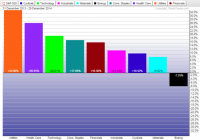
Summary The yield curve flattened in 2014 as short-term rates increased and long-term rates declined. Utilities benefited from lower long-term rates and is set to finish the year as the best performing sector. The U.S. dollar rally in 2014 looks like the early stage of a much larger rally. One of the biggest trends in 2014, for both length of time and the size of the move, was the bull market in long-term government bonds. The 30-year U.S. Treasury bond will finish the year near its highest level in decades. The 10-year treasury yield of nearly 2.2 percent is off the lows set in 2012, but near the levels reached at the depth of the 2008 financial crisis. There may even be room to move lower because that yield looks plentiful next to German and Japanese 10-year government bonds, which yield a paltry 0.55 percent and 0.33 percent, respectively. Investors who purchased iShares Barclays 20+ Year Treasury (NYSEARCA: TLT ) at the start of the year would be sitting on gains of more than 26 percent as of December 29. That is competitive with the best performing S&P 500 sectors in 2014 and gives it a better than 10 percent lead on both the S&P 500 Index and the Nasdaq this year. As for those best performing sectors, utilities and healthcare are set to grab the top two spots. (click to enlarge) In the currency market, a bull rally in the U.S. dollar kicked off in mid-summer against the yen and euro, and this extended to emerging market currencies by the start of autumn. The U.S. dollar heads into 2015 in a widespread bull market against all major currencies, with even the Chinese yuan showing signs of weakness. A Look Back At Interest Rates In 2014 This year started with investors expecting a rise in interest rates after the Federal Reserve began tapering its asset purchases in December 2013. The Fed ended its third round of quantitative easing (QE3) in October, but history proved superior to expectations: each time the Federal Reserve has exited quantitative easing, interest rates moved lower, not higher, and this time was no different. Rates peaked at the start of the year and never looked back, beginning an almost uninterrupted slide that has yet to finish. (click to enlarge) Economic growth failed to spur general rate increases. GDP growth dipped in the first quarter, then picked up strongly in the subsequent quarters, eventually climbing to 5.0 percent annualized growth in the third quarter. Despite these robust growth numbers, long-term bonds will close out 2014 at or near their highs for the year. Interest rates didn’t fall across the board though. The 2-year treasury yield has been rising since the Federal Reserve announced the taper in May 2013. The 5-year treasury yield didn’t gain in 2014, but it didn’t fall either. (click to enlarge) (click to enlarge) Rising short-term rates and stable or falling long-term interest rates makes for a flatter yield curve. A flat yield curve usually occurs in the middle of an economic expansion, when the economy is firing on all cylinders. Sector Performance Utilities and healthcare are the best performing S&P 500 sectors by a wide margin in 2014. Utilities last delivered a sector topping performance in 2011, when long-term interest rates sank to their lowest point in decades and stocks generally struggled-the S&P 500 Index gained only 2.1 percent that year. Going back further, utilities topped the list of S&P 500 sectors in 2006 as well. Investors with good memories will remember many early recession calls at that time due to a flat yield curve. Healthcare and utilities get lumped in with consumer staples as “defensive” sectors, but the strength seen in these sectors doesn’t indicate a weak market ahead. Healthcare has benefited mightily from the performance of the non-defensive biotechnology sector. SPDR Biotechnology (NYSEARCA: XBI ) is up more than 44 percent this year, for example, well ahead of the healthcare sector. If investors were looking for defensive plays, the sector would be led by pharmaceuticals or healthcare providers rather than biotechnology. Utilities are generally a conservative choice for investors, but the utilities sector was in a downtrend from 2009 to 2014. Working in the sector’s favor is a strong economy and lack of exposure to foreign markets. (click to enlarge) Currency Markets The U.S. Dollar Index broke out to a multi-year high in 2014 and will finish the year near its highs. The greenback was aided by six factors. First, the Federal Reserve tightened monetary policy with its exit from QE. Second, the European Central Bank is moving towards loosening monetary policy with its own version quantitative easing. Third, the Bank of Japan did a surprise expansion of QE on Halloween. Fourth, the collapse in oil prices dragged emerging market currencies lower. Fifth, China’s rebalancing has weakened emerging markets by reducing commodities demand. Sixth, the U.S. economy is among the strongest of the developed economies. The chart below is a price ratio of PowerShares DB U.S. Dollar Index Bullish Fund (NYSEARCA: UUP ) versus SPDR S&P 500 (NYSEARCA: SPY ). It shows that since July, investors could have earned more by investing in the U.S. dollar (going short a basket of foreign currencies that make up the dollar index) than from stocks. This is surprising for a bullish phase of the market-since 2008, U.S. dollar rallies have typically come along with stock market corrections. (click to enlarge) There is a lot of positive sentiment around the U.S. dollar, but structurally the global economy is still short the U.S. dollar. Well into 2014, for instance, Chinese property developers were borrowing in U.S. dollars . An extended U.S. dollar rally could be the only fuel needed for an even bigger and longer U.S. dollar rally if borrowers in emerging markets are forced to hedge their dollar exposure or repay debt. Rising interest rates in the United States, a bias towards rate cuts in China, plus easy money in Europe and Japan, puts the greenback in a strong position in 2015. What It All Says for 2015 Although sector performance in 2014 flashes a caution light, the yield curve is flattening, not flat. The yield curve would need to flatten much more before it would signal a possible recession, but the Federal Reserve isn’t going to raise rates enough to flatten out the yield curve in 2015. The U.S. economy continues to expand and the political situation is favorable for stocks. The Republican Congress and President Obama are unlikely to agree on much, but they do agree on trade deals and possibly even some tax reform. If the U.S. dollar rally continues into 2015, the macro environment will bear a striking similarity to the late 1990s. A continued rise in short-term interest rates is coming, at least until the Federal Reserve signals otherwise. It remains to be seen how long-term interest rates behave, but they could remain low whether short-term rates rise or fall. Far lower interest rates in Europe and Japan, in addition to the rising U.S. dollar, could keep a lid on interest rates if foreigners move capital into the U.S. bond market. Weakness in high yield debt, the fallout from low oil prices, will also work in favor of government bonds. Among S&P 500 sectors, utilities are most affected by the 10-year interest rates. This chart shows the 10-year treasury bond yield versus the price ratio of SPDR S&P 500 and SPDR Utilities (NYSEARCA: XLU ). The falling black line indicates XLU beating SPY, which has occurred for most of 2014 as interest rates declined. Utilities are unlikely to lead again in 2015, but as long as the rate environment isn’t a drag on returns, the strong economy and relatively high yield of the sector could keep it among the better performing sectors next year. (click to enlarge) If both short-term and long-term interest rates increase, the sector that stands to benefit the most is financials. Any broad ETF such as iShares US Financials (NYSEARCA: IYF ) or SPDR Financials (NYSEARCA: XLF ) delivers good exposure. The strong dollar and strong economy work in its favor, and if the dollar rally is a major trend in 2015, financials will benefit as foreign capital flows into the U.S. through American financial institutions. Under performing sectors such as energy and materials could rebound in 2015 after a dismal 2014, but if the global economy doesn’t pick up, a rally could be short lived. A major issue that could affect healthcare stocks in 2015 is the Supreme Court ruling on Affordable Care Act subsidies. The law as written does not allow subsidies for states without exchanges and if the Supreme Court were to rule against them, the history of the Obama Administration’s handling of the law suggests a period of confusion will follow. A Republican Congress doesn’t make the administration’s job any easier – if a fix requires Congressional approval, they may not get it. Finally, an important test for the euro will come in January. The European Central Bank meets in January and Greece’s election is at the end of the month. Sentiment is negative right now because the market expects the ECB to implement some type of QE policy and Greece to elect an anti-austerity government. If one or both of those things don’t occur, the U.S. Dollar Index, which has nearly 58 percent of its basket in the euro, could run out of steam at least temporarily. Barring such an outcome, the strong U.S. dollar will continue to weigh on stocks denominated in foreign currency. A QE policy in Europe would likely boost equity markets though, so funds that hedge away currency exposure, such as WisdomTree Europe Hedged Equity (NYSEARCA: HEDJ ), will do better than their unhedged competition.
Selecting An Emerging Markets Value ETF

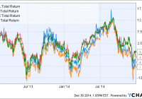
Summary Emerging markets have struggled over the past several years and may deserve a second look today. Value is a validated factor for outperformance that also works in emerging markets. This article analyzes three emerging market value ETFs in comparison to the benchmark EEM. Introduction In a previous article on emerging market low-volatility ETFs, we remarked that emerging markets had performed very well for most of the last decade, but have struggled coming out of the financial recession. This has made emerging markets one of the two cheapest global regions today (the other is Asia ex-Japan). Besides low volatility, “value” is an another factor that has been documented to lead to stock outperformance. In a recent paper from Robeco Asset Management, value, low-volatility, size and momentum premia were (re)confirmed to exist in emerging markets. Therefore, I was also interested to analyze the composition of several emerging market value ETFs to see which would be the best one to include in my own portfolio. Emerging market value funds The emerging market (EM) value funds under consideration are: iShares MSCI Emerging Markets Value ETF (NASDAQ: EVAL ), PowerShares FTSE RAFI Emerging Markets Portfolio (NYSEARCA: PXH ), and FlexShares Morningstar Emerging Markets Factor Tilt Index Fund (NYSEARCA: TLTE ). The benchmark iShares MSCI Emerging Markets ETF (NYSEARCA: EEM ) is also included for comparison. EVAL seeks to track the investment results of an index composed of emerging market equities that exhibit value characteristics. RAFI is fundamental-weighted ETF that selects and weights securities based on book value, cash flow, sales and dividends. TLTE seeks to enhance exposure to emerging markets by tilting the portfolio towards small-cap and value stocks. Fund details Data for EVAL, PXH, TLTE and EEM are shown below (source: Morningstar ). EVAL PXH TLTE EEM Yield 2.12% 3.05% 0.82% 1.69% Expense ratio 0.49% 0.49% 0.65% 0.67% Inception Feb 2012 Sep 2007 Sep 2012 Apr 2003 Assets $21.3M $367M $240M $32.2B Avg Vol. 2.7K 137K 21K 60.6M No. holdings 437 317 2057 817 Annual turnover 25% 24% 20% 22% We can see that PXH and TLTE are both relatively small funds, though their liquidity should still be sufficient for the average investor. EVAL is a tiny fund and has very low liquidity, which would result in higher bid-ask spreads. EEM, the benchmark ETF, is a giant by comparison. The expense ratios for the four EM funds are quite high, ranging from 0.49% to 0.67%, which is much higher than for domestic (US) funds. EVAL and PXH are both tied for the cheapest expense ratio at 0.49%, whereas TLTE has a higher expense ratio of 0.65%. The following table shows the top 10 holdings of the four funds. EVAL PXH TLTE EEM China Mobile 3.77 Gazprom 3.61 Samsung Electronics 2.31 Samsung Electronics 3.18 China Construction Bank 2.82 China Construction Bank 2.89 Taiwan Semiconductor Manufacturing 1.98 Taiwan Semiconductor Manufacturing 2.80 Industrial And Commercial Bank Of China 2.58 China Mobile 2.79 Tencent Holdings 1.44 Tencent Holdings 2.05 Bank of China 2.12 Industrial And Commercial Bank Of China 2.63 China Mobile 1.30 China Mobile 1.87 Hon Hai Precision 2.02 Taiwan Semiconductor Manufacturing 2.40 China Construction Bank 1.09 China Construction Bank 1.36 Gazprom 1.76 Bank Of China 2.34 Industrial And Commercial Bank Of China 0.99 Naspers 1.28 Mtn Group 1.62 Itau Unibanco Holding 2.14 Naspers 0.90 Industrial And Commercial Bank Of China 1.25 CNOOC 1.34 Petroleo Brasileiro 2.13 Itau Unibanco Holding 0.75 Itau Unibanco Holding 1.03 Hyundai Motor 1.27 Hon Hai Precision Ind 2.02 America Movil 0.74 Bank of China 1.02 Sasol 1.20 Reliance Industries 2.00 Bank Of China 0.70 America Movil 0.99 We can see these funds have quite a few of their top 10 holdings in common. Overlap The following table illustrates the overlap between the three EM value funds and EEM. Overlap statistics were obtained from ETF Research Center . EVAL PXH TLTE EEM EVAL – 49% 33% 52% PXH 49% – 35% 49% TLTE 33% 35% – 56% EEM 52% 49% 56% – We can see that there is a significant degree of overlap between the four funds. The three EM value funds have 33%-49% overlap between themselves, and 49%-56% overlap with EEM. In comparison, the low-volatility EM funds only had 2-31% overlap with EEM. The highest overlap is between TLTE and EEM (56%), while the lowest is between TLTE and EVAL (33%). Performance The graph below shows the performance of the three EM value funds and EEM since Dec. 2012 (2 years). EVAL Total Return Price data by YCharts We can see that the performances of the four funds have been relatively similar over the past two years. EEM has had the highest performance of -1.01%, followed by TLTE at -3.53% and EVAL at -4.25%. PXH had the worst return of -7.19%. The similar performances of the funds could be due to their significant amount of overlap between them. The following table shows further performance and risk data for the three EM value funds and EEM. Data are from Morningstar, except for volatility (2Y) and beta (2Y) which are from InvestSpy . EVAL PXH TLTE EEM 1-year return % -3.26 -5.59 -5.64 -3.04 3-year return (ann.)% – 0.01 – 3.22 5-year return (ann.)% – -1.96 – 0.93 Volatility (2Y) % 25.7% 18.2% 15.1% 17.3% Beta (2Y) 0.57 1.09 0.86 1.09 Sharpe ratio (3Y) – 0.15 – 0.37 Sharpe ratio (5Y) – 0.11 – 0.22 Surprisingly, EVAL apparently has a very high volatility compared to the other three funds, but a very low beta. However, I’m not sure if those metrics are reliable because EVAL is quite illiquid. When comparing PXH with EEM, we can see that the two funds have similar volatilities and betas. However, PXH has had a worse long-term performance. Valuation The table below shows various value and growth metrics for EVAL, PXH, TLTE and EEM. Data for all funds are from Morningstar (value metrics including dividend yield are forward looking). The first five rows can be considered as value metrics while the last five rows can be considered as growth metrics. EVAL PXH TLTE EEM Price/Earnings 10.06 9.51 11.78 12.76 Price/Book 1.08 1.02 1.26 1.49 Price/Sales 0.92 0.76 0.9 1.14 Price/Cash Flow 4.96 4.14 4.3 4.92 Dividend Yield % 3.62% 3.66% 2.72% 2.56% Projected Earnings Growth % 10.59 8.47 11.61 11.76 Historical Earnings Growth % -0.08 0.74 -28.77 -1.68 Sales Growth % -19.36 -11.82 -22.17 -13.79 Cash-flow Growth % 1.92 3.08 -3.97 7.85 Book-value Growth % -22.03 -27.25 -26.06 -21.57 We can see from the data above that all of the EM value funds have superior valuation metrics than EEM, as expected. Of the three EM value funds, PXH has the best valuation metrics, followed by TLTE. The funds also appear to have many negative growth metrics, which could be due to the effect of a global slowdown on the growth of many emerging market economies that rely heavily on exports or foreign investment. The EM value funds generally have worse growth metrics compared to EEM. Countries Perhaps the most important factor that would affect the performance of the EM value funds is the distribution of the constituent countries in the fund. The following table shows the top 10 countries in each of the three low-volatility EM funds and EEM (data from ETF Database ). EVAL PXH TLTE EEM China 20.60% China 24.48% China 20.01% China 17.52% Taiwan 12.69% Taiwan 14.54% South Korea 13.10% South Korea 13.64% South Korea 11.86% Brazil 11.30% Taiwan 12.22% Taiwan 12.20% India 7.35% Russia 8.89% India 8.51% Brazil 7.82% South Africa 7.23% South Africa 8.45% South Africa 7.73% South Africa 7.75% Mexico 5.26% India 7.92% Brazil 7.34% India 6.99% Brazil 4.56% Mexico 4.49% Mexico 4.53% Mexico 5.05% Malaysia 3.76% Turkey 3.18% Russia 4.08% Russia 3.94% Russia 3.69% Malaysia 2.54% Malaysia 3.73% Malaysia 3.66% Indonesia 2.70% Thailand 2.51% Indonesia 2.74% Indonesia 2.66% We can see from the above funds that all of them have China as the top holding. Taiwan also ranks prominently in all of the EM funds. South Korea is found as a top holding in all of the EM funds except PXH, probably because the FTSE Emerging Market Index does not include South Korea. I like the country distribution of PXH the most because it has the four cheapest EM countries as the top four holdings: China (PE: 7.1), Taiwan (PE: 13.9), Brazil (PE: 12.4) and Russia (5.5). Size The table below shows the size distribution for the four EM funds (data from Morningstar). EVAL PXH TLTE EEM Giant 49.7 58.6 36.4 50.6 Large 38.0 31.0 28.6 37.0 Medium 11.8 9.6 21.7 11.9 Small 0.5 0.8 13.1 0.4 Micro 0.0 0.0 0.2 0.1 And in graphical form: We can see that TLTE has the most even size distribution, as its investment mandate tilts its exposure towards smaller-cap stocks. EVAL, PXH and EEM have similar size distributions, with giant caps accounting for ~50% weight and large caps accounting for ~30% weight. Sector The final aspect to consider for the EM ETFs is their sector distribution. The following table shows the sector composition of the three EM value funds and EEM. Data are from Morningstar. EVAL PXH TLTE EEM Basic Materials 12.54 9.06 9.45 7.9 Consumer Cyclical 8.96 4.74 10.37 8.46 Financial Services 30.27 32.76 21.87 25.44 Real Estate 2.07 1.2 4.27 2.45 Communication Services 12.63 10.63 5.83 7.77 Energy 11.43 17.33 6.27 7.5 Industrials 5.49 3.85 8.58 5.72 Technology 8.84 13 18.61 20.95 Consumer Defensive 3.91 4.09 7.52 8.28 Healthcare 0.14 0.39 3.01 2.24 Utilities 3.72 2.97 4.23 3.3 And in graphical form: Similar to the low-volatility EM funds described in the previous article, financials again make up the highest allocation of the EM value funds. PXH also has a relatively high allocation towards energy, while TLTE and EEM have higher technology allocations. The following graph shows the sector distribution of the four funds (individual sectors are not marked). We can see that TLTE has the most even sector distribution out of the four funds. Conclusion The three low-volatility funds have had quite similar perfomances over the past two years, which could be due to the relatively high degrees of overlap between the funds. My pick for an EM value fund for my own portfolio was a close call between PXH and TLTE. (Unfortunately EVAL has to be excluded due to its low liquidity). TLTE had better sector and size distributions than PXH, and also exhibited a slightly better performance than PXH over the last two years. However, PXH has a slightly lower expense ratio (0.49%) and superior value metrics compared to TLTE. PXH also pays the highest dividend yield (3.05%) out the four EM funds studied. Finally, PXH contained a greater proportion of its weight in low PE countries. In the end, given that I was looking for an EM value fund, I selected PXH, the more “valuey” of the two funds, for my portfolio.

Leisure, Entertainment ETFs: Consumers Spending On ‘Experiences’

Summary Americans are spending more. However, consumers are putting more money into experiences instead of physical goods. A leisure and entertainment ETF that targets companies like resorts, hotels and restaurants. Americans are getting into the festive spirit and increased spending this holiday season. More notably, consumers were inclined to spend on “experiences,” potentially lifting discretionary-sector exchange traded funds with large exposures to hotels and restaurants. For instance, the PowerShares Dynamic Leisure and Entertainment Portfolio (NYSEArca: PEJ ) targets U.S. leisure and entertainment companies, such as resorts, hotels, cruises and restaurants, and also weights components based on price momentum, earnings momentum, quality, management action, and value. PEJ is up 4.7% year-to-date. In a holiday spending report, MasterCard (NYSE: MA ) found that consumers increased spending on lodging and restaurants during this holiday season, Reuters reports. Sarah Quinlan, a senior vice president at MasterCard, said that casual dining and lodging were among the best areas this season, posting double-digit and nearly double-digit year-over-year sales growth, respectively, from Black Friday through December 24. The data is pointing to an ongoing trend of “the consumer wanting experience” over goods, and the “economy is very strong but they are spending in a different way,” Quinlan said in the Reuters article. PEJ includes large exposure to companies that provide experiences. For instance, among the ETF’s top holdings, Royal Caribbean Cruises (NYSE: RCL ) is 4.4%, Restaurant Brands International (NYSE: QSR) is 5.2%, Carnival Corp. (NYSE: CCL ) 5.0%, The Walt Disney Co. (NYSE: DIS ) is 5.0% and Chipotle Mexican Grill (NYSE: CMG ) is 4.9%. Alternatively, broad consumer discretionary ETFs also include some exposure to the sub-sector. For instance, hotel, restaurants and leisure make up 13.6% of the Consumer Discretionary Select Sector SPDR (NYSEArca: XLY ) , 10.0% of the First Trust Consumer Discretionary AlphaDEX Fund (NYSEArca: FXD ) , 13.0% of Guggenheim S&P Equal Weight Consumer Discretionary ETF (NYSEArca: RCD ) and 10.2% of PowerShares DWA Consumer Cyclicals Momentum Portfolio (NYSEArca: PEZ ) . PowerShares Dynamic Leisure and Entertainment Portfolio (click to enlarge) For more information on the consumer sector, visit our consumer discretionary category . Max Chen contributed to this article . Additional disclosure: Mr. Lydon serves as an independent trustee of certain mutual funds and ETFs that are managed by Guggenheim Investments; however, any opinions or forecasts expressed herein are solely those of Mr. Lydon and not those of Guggenheim Funds, Guggenheim Investments, Guggenheim Specialized Products, LLC or any of their affiliates.