Tag Archives: load

Financial ETF: XLF No. 5 Select Sector SPDR In 2014

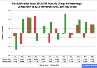
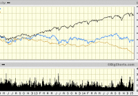
Summary The Financial exchange-traded fund finished fifth by return among the nine Select Sector SPDRs in 2014. Along the way, the ETF had its roughest month of the year in January, when it dipped -3.63 percent. Seasonality analysis indicates the fund could have a tough first quarter. The Financial Select Sector SPDR ETF (NYSEARCA: XLF ) in 2014 ranked No. 5 by return among the Select Sector SPDRs that divide the S&P 500 into nine portions. On an adjusted closing daily share-price basis, XLF blossomed to $24.73 from $21.49, a burgeoning of $3.24, or 15.08 percent. As a result, it behaved better than its parent proxy SPDR S&P 500 Trust ETF (NYSEARCA: SPY ) by 1.61 percentage points and worse than its sibling Utilities Select Sector SPDR ETF (NYSEARCA: XLU ) by -13.66 points. (XLF closed at $23.92 Monday.) XLF also ranked No. 5 among the sector SPDRs in the fourth quarter, when it led SPY by 2.39 percentage points and lagged XLU by -5.89 points. And XLF ranked No. 2 among the sector SPDRs in December, when it performed better than SPY by 2.11 percentage points and worse than XLU by -1.72 points. Figure 1: XLF Monthly Change, 2014 Vs. 1999-2013 Mean (click to enlarge) Source: This J.J.’s Risky Business chart is based on analyses of adjusted closing monthly share prices at Yahoo Finance . XLF behaved a lot better in 2014 than it did during its initial 15 full years of existence based on the monthly means calculated by employing data associated with that historical time frame (Figure 1). The same data set shows the average year’s weakest quarter was the third, with a relatively small negative return, and its strongest quarter was the fourth, with an absolutely large positive return. Generally consistent with this pattern, the ETF had a huge gain in the fourth quarter last year. Figure 2: XLF Monthly Change, 2014 Versus 1999-2013 Median (click to enlarge) Source: This J.J.’s Risky Business chart is based on analyses of adjusted closing monthly share prices at Yahoo Finance. XLF also performed a lot better in 2014 than it did during its initial 15 full years of existence based on the monthly medians calculated by using data associated with that historical time frame (Figure 2). The same data set shows the average year’s weakest quarter was the first, with a relatively small positive return, and its strongest quarter was the fourth, with an absolutely large positive return. Clearly, this means there is no historical statistical tendency for the ETF to explode in Q1. Figure 3: XLF’s Top 10 Holdings and P/E-G Ratios, Jan. 9 (click to enlarge) Notes: 1. “NA” means “Not Available.” 2. The XLF holding-weight-by-percentage scale is on the left (green), and the company price/earnings-to-growth ratio scale is on the right (red). Source: This J.J.’s Risky Business chart is based on data at the XLF microsite and FinViz.com (both current as of Jan. 9). Three massive equity-market bubbles are associated with the 21st century. The technology sector was ground zero when the first one burst, and the financial sector was ground zero when the second one burst. In the former case, the Technology Select Sector SPDR ETF ( XLK ) had double-digit percentage losses in each of three consecutive years (2000-2002). In the latter case, XLF had double-digit percentage losses in each of two straight years (2007-2008). It plunged by more than one-half in 2008 alone, which means the ETF is distinguished by delivering the worst annual performance by any of the sector SPDRs since their launch in December 1998. With the third massive stock-market bubble associated with the 21st century apparently in the early stage of its own bursting, I anticipate XLF will continue to be a middle-of-the-pack performer among the sector SPDRs, with the biggest risk to this expectation in the short term being the Federal Open Market Committee announcement April 29. On the one hand, the valuations of XLF’s top 10 holdings appear unlikely to function as tailwinds for the ETF’s price appreciation in the foreseeable future (Figure 3). On the other hand, numbers on the S&P 500 financial sector reported by S&P Senior Index Analyst Howard Silverblatt Dec. 31 suggested it is not all that overvalued, with its P/E-G ratio at 1.31. Disclaimer: The opinions expressed herein by the author do not constitute an investment recommendation, and they are unsuitable for employment in the making of investment decisions. The opinions expressed herein address only certain aspects of potential investment in any securities and cannot substitute for comprehensive investment analysis. The opinions expressed herein are based on an incomplete set of information, illustrative in nature, and limited in scope. In addition, the opinions expressed herein reflect the author’s best judgment as of the date of publication, and they are subject to change without notice.

How Long Before ‘They’re Raising Rates’ To ‘They’re Considering QE4?’

If foreign economic stagnation and commodity price depreciation is an old story, then why are U.S. equities suddenly responding as though the U.S. economy might be in danger? The daily volatility over the last 10 weeks is primarily attributable to the Federal Reserve terminating its third iteration of “QE” back in October. The central banks of the world have been remarkably successful at repressing the risk of equity market participation. The media are telling us that U.S. stocks have been under pressure this January due to global growth fears and an accompanying rout across the entire commodity space. Yet that only tells a small part of the story. After all, the S&P 500 SPDR Trust ETF (NYSEARCA: SPY ) has performed quite admirably over the past three years, blissfully unresponsive to the global growth woes reflected in ETFs like the Vanguard FTSE Emerging Markets ETF (NYSEARCA: VWO ) and the iPath Dow Jones-UBS Commodity Index Total Return ETN (NYSEARCA: DJP ). If foreign economic stagnation and commodity price depreciation is an old story, then why are U.S. equities suddenly responding as though the U.S. economy might be in danger? Where’s the enthusiasm for the enormous stimulus associated with cheap oil and gas? What happened to the euphoria over the best job growth since 1999? In truth, the daily volatility over the last 10 weeks is primarily attributable to the Federal Reserve terminating its third iteration of “QE” back in October – an electronic money creating, bond-buying program that resulted in the Fed acquiring trillions in U.S. debt. Consider the reality that when the Fed removed a large portion of the supply of treasuries, investors who would have bought those treasuries had to buy assets like corporate bonds instead. This reduced the borrowing costs for corporations and allowed many of them to refinance debts as well as buy back shares of their own stock. Up went the stock market. Similarly, the Fed removed a large portion of the supply of mortgage-backed securities, ultimately lowering the mortgage costs for real estate. Up went the housing market. An increase in the net worth of corporations, small businesses as well as wealthier families did create an atmosphere for greater economic confidence. However, with the Federal Reserve hinting that overnight lending rates might go up as soon as April, butterflies flapping their wings in Rio de Janeiro and Beijing have been creating tremors for U.S. equities. In essence, the stock market is not so sure that our “booming” domestic economy is a self-sustaining wonderland in the absence of central bank stimulus. Nowhere is this more obvious than in the relatively tranquil progress of the FTSE Custom Multi-Asset Stock Hedge Index. In the ten weeks since QE ended (through Jan 14), the index has quietly gained 2.5% while the S&P 500 has fluctuated wildly on its way to being flat. (Note: These results do not yet account for Wednesday’s stock declines.) While the bullish media typically ignore the bulk of what happens with non-equity asset classes, there are specific currencies, commodities and country debt that have historically performed well in moderate-to-severe stock downturns. Asset types like longer-term treasuries, zero-coupon bonds, munis, German bunds, gold, the franc, the yen, the dollar and others fit the bill. The index, often referred to by others as the “MASH Index,” does not short or use leverage like a bear fund; safer haven holdings (ex stocks) often perform better than cash in stock uptrends as well. You can learn more about the FTSE Custom Multi-Asset Stock Hedge Index at StockHedgeIndex.com . Those investors who remain in the bullish camp theorize that the U.S. economy is strong enough to handle modest rate increases. They also anticipate the inevitability of quantitative easing or similar asset-back purchasing measures in the euro-zone as well as China acting to bolster its economic output through a variety of techniques; stock bulls view the troubles overseas as noise and vow to continue buying dips on weakness. In contrast, bears counter with the fact that U.S. stocks are not only at the high end of historical valuations, they may be at the highest levels in recorded history. For instance, Jim Paulsen at Wells Capital explained that U.S. stocks have never been this expensive ever, at least not when one employs the median price-to-earnings ratio. (And Paulsen has been a fixture in the bull camp!) My view? I am neither bullish nor bearish in practice. That said, I am a proponent of applying insurance principles to the investing process. Stop-limit loss orders , trendlines, put options, multi-asset stock hedging – they all minimize the risk of catastrophic loss. Indeed, the reason I partnered with the world’s largest index provider (FTSE-Russell) in developing the FTSE Custom Multi-Asset Stock Hedge Index was to offer a new way to reduce the risks associated with stock market euphoria. The central banks of the world have been remarkably successful at repressing the risk of equity market participation. Throughout the six years of the 2009-2015 bull, whenever there has been a belch (or even a hiccup), the Federal Reserve has come to the rescue with more bond-buying stimulus. On the flip side, if they stick to their guns on raising rates this time, you can expect the uncertainty to fuel even more desire for perceived safe havens. You might look at the iShares 10-20 Year Treasury Bond ETF (NYSEARCA: TLH ) as well as carry trade reversal beneficiaries like the CurrencyShares Japanese Yen Trust ETF (NYSEARCA: FXY ). If the conversation shifts towards “no rate increases until 2016″ or even “a bit more QE is a possibility,” then the unbridled excitement for stock ownership would pump new life into the aging bull. Disclosure: Gary Gordon, MS, CFP is the president of Pacific Park Financial, Inc., a Registered Investment Adviser with the SEC. Gary Gordon, Pacific Park Financial, Inc, and/or its clients may hold positions in the ETFs, mutual funds, and/or any investment asset mentioned above. The commentary does not constitute individualized investment advice. The opinions offered herein are not personalized recommendations to buy, sell or hold securities. At times, issuers of exchange-traded products compensate Pacific Park Financial, Inc. or its subsidiaries for advertising at the ETF Expert web site. ETF Expert content is created independently of any advertising relationships.

Risk-Neutral Vs. The Real World: Wall Street Traders Really Are From A Different Planet

Risk-neutral versus real-world pricing and valuations matter. Risk-neutral traders are less active, leading to trading and investment opportunities. Interest rates drive growth and inflation expectations, not the other way around. Traders at the big Wall Street banks have their own culture, language, idioms and superstitions. They have a peculiar code of ethics, ideals and standards of behavior. Indeed, they even have unique and privileged access to markets and information that both ordinary and sophisticated investors are envious of. It is like they come from and inhabit a different planet from the rest of us. It turns out the traders at the big banks do, in fact, belong to another world. Readers of a quantitative inclination will recall that sell side traders operate in what is called the Q, or “risk-neutral” world, whereas the buy side – that means the rest of us – function in the P, or “real world.” The distinction between the two worlds – the P and Q – is profound, and is also gaining increased importance. That is because the Q World, occupied by the traders at the sell-side banks, is under intense pressure to reduce risk taking activities. There is also a culling of Malthusian proportions going on at Wall Street trading desks, in effect depopulating the Q World. The table below describes the differences between the two worlds: The P World The Q World Goal Predict the future Extrapolate the past Environment Real world probability Risk Neutral probability Process Discrete time series Continuous time martingales Dimension Infinite Finite Tools Econometrics, statistics Ito calculus, SDEs Challenges Parameter estimation Calibration Business Buy Side Sell side Density ratio or ∏ =q/p should be a monotonically decreasing function of market returns. Source: Meucci 2011, CGA Research. The key point to note here is that sell-side traders, or the Q-World, do not really need to worry about future market returns. The sell-side model is based upon a cost-plus replication strategy that simply buys and sells securities at prices where risk is neutralized by various hedging strategies. As long as markets are reasonably complete and liquid, the sell side can isolate itself against future price developments. The sell side only gets into trouble when it moves away from the Q-World and risks its own capital speculating in the P-World. Now that we understand the two worlds, the question becomes what happens when Q-World goes away or its market power is greatly diminished? We have already seen and heard about disruptions and lack of liquidity in various bond markets since Q-World retrenched in the aftermath of the 2008 financial crisis. More recently, we see the effects in the oil markets where an unprecedented exodus from commodity markets by the big banks has contributed to the drastic fall in oil prices. Is it simply a coincidence that headline oil prices have declined by upwards of 50% during the same time that Morgan Stanley (NYSE: MS ), JPMorgan Chase (NYSE: JPM ), Credit Suisse (NYSE: CS ), Goldman Sachs (NYSE: GS ) and others have or are planning to exit the commodity trading business? Maybe, but it is more likely that a reduced number of Q-World commodity traders has facilitated the decline. In years past, large market declines were typically met by sell side traders bundling distressed assets into packages of securitized products that were ultimately on sold to buy side investors. The banks once had a stabilizing influence upon volatile markets. Such activity is no longer profitable for the banks due to stringent capital requirements and some outright prohibitions against warehousing the risk. Unwittingly or not, the world’s central banks, led, of course, by the U.S. Federal Reserve, have supplanted the diminished role of Q-World traders by providing an ample dose of extraordinary monetary accommodation. In other words, secular volatility is set to rise and will be further exacerbated once the world’s central banks move to the side-lines. Few people, including myself, expect the days of hyper activist central banking to end anytime soon. Nonetheless, at the margin, even the U.S. Federal Reserve is a little less active then last year. So what are the implications? Secular volatility will rise in most assets classes, particularly those that trade over the counter e.g. government and corporate bonds Market corrections will be more violent, happen quicker and take longer to reverse than in years past Intrinsic value does not change, although cash flow value may- which will ultimately lead to an abundance of market opportunities Specifically, there are now opportunities to buy the SPDR S&P Oil & Gas Explore & Production ETF (NYSEARCA: XOP ) after it fell 30% in 2014. The PowerShares DB Com Index Tracking ETF (NYSEARCA: DBC ), also off close to 30% in 2014, offers investors greater exposure to a basket of commodities, although the ETF maintains significant exposure to oil. Timing such purchases is always difficult, and the risk of being too early is real. My point here is that such declines have as much to do Q- World inactivity as they do with fundamental changes to the supply demand equilibrium. Hence, a good portion of the recent drop should prove to be transitory. Investment success rests with those that can best understand the phenomenon of markets explained by basic economic mechanisms such as supply and demand and, which can also incorporate agent based models of behavior. There is little doubt that such agent based models such as the need to save for retirement, risk aversion or the savings and consumption patterns of millennials to name just a few, account for a large portion of the variance of asset returns. What has changed recently is the agent based conduct of the Q-World traders rather than any fundamental principle of economics. That leads to opportunities for P-World investors like you and me. The trick is to balance your assessment of both Type I errors – investing in an unprofitable strategy and Type II errors – missing a truly profitable trading opportunity. The likelihood of making a Type II error has increased simply because there are fewer Q-World traders willing and able to take the other side of market overreactions such as the mid October 2014 equity selloff, materially wider U.S. High Yield spreads and the ever lower Euro currency. Looking ahead to 2015, I think it is important to note just how important it is to get your interest rate call right. Last year, Utilities (SPDR ETF, XLU ), REITs (iShares Dow Jones US Real Estate ETF, IYR ), and high-quality, long-duration government bonds (iShares Barclays 20+ Yr Treasury Bond ETF, TLT ) had total returns close to 25% to 30%. These three asset classes benefited enormously from lower nominal and real U.S. interest rates. With interest rates in play again in 2015 (higher or lower), the difference between Q and P world pricing and valuation becomes even more important. It used to be that investors just had to get the growth and inflation call right, and the interest rate view would simply follow. That no longer seems to be the case. It’s a big deal, and it’s a theme that I plan to develop further in a future newsletter. Look at it this way. U.S. growth and inflation readings in 2015 are likely to be quiet supportive of risky assets. Yet the market’s attention is almost wholly captured by a potential rise, however modest, of the Federal Funds rate.