Tag Archives: etf-hub

CMS Energy Has Good Long-Term Prospects But Substantial Short-Term Hurdles

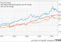
Summary Natural gas and electric utility CMS Energy’s share price has underperformed YTD after several years of outperforming both the utilities sector average and the S&P 500. The company possesses multiple long-term earnings drivers such as a favorable regulatory structure, a rebounding service area economy, and the presence of low energy prices. In the short-term, however, the company is faced with the combination of a heavy debt load and the prospect of rising interest rates. While I believe the company’s long-term drivers outweigh short-term hurdles for investors with lengthy investment horizons, its shares will likely be available for still less in the coming year. The share price of utility holding company CMS Energy (NYSE: CMS ) has been one of the top performers in the utility sector since the beginning of FY 2010, solidly beating both the sector as well as the S&P 500 (see figure). Value investors haven’t been provided with many opportunities in recent years to invest in the firm, however, due to the relative lack of undervaluation resulting from price downturns. The company’s share price has taken its largest tumble since the 2008 financial crisis in recent months, potentially making the company an attractive option for value investors. This article evaluates CMS Energy as a potential value investment in light of its recent earnings performance and current outlook. CMS data by YCharts CMS Energy at a glance CMS Energy is a Michigan-based public utility that provides electricity, nuclear power, uranium, and natural gas to customers throughout the state, including the Detroit metro. Its primary business segment is Consumers Energy, which as a regulated utility provides natural gas and electricity to more than 6 million customers, with coverage including the Upper Peninsula, via 6,000 MW of electricity generation capacity and 2,600 MW of power purchase agreements. The majority of its electric customers are residential, with the combination of residential and commercial customers contributing 84% of its electric gross margin in FY 2014. The utility generates electricity from a variety of fossil and renewable sources. In FY 2014 its portfolio consisted of 34% coal, 32% natural gas, 11% pumped storage, 9% renewables, 8% nuclear, and 6% oil. Recent state and federal regulations discourage the use of coal to generate electricity on environmental and human health grounds have caused CMS Energy to move away from the fuel, and by 2017 it expects Consumers Energy’s portfolio to be comprised of 37% gas, 24% coal, 12% pumped storage, 10% renewables, 8% nuclear, 6% oil, and 3% purchased. CMS Energy also conducts business via CMS Enterprises, which engages in independent power production and natural gas transmission. Consumers Energy generates the overwhelming majority of its parent company’s earnings, or 97% in Q1 2015. CMS Energy suspended its dividend during the financial crisis but reinstated it during the subsequent recovery and has become a reliable dividend generator in recent years, increasing its quarterly amount from $0.15 in FY 2010 to $0.29 today. The most recent increase from $0.27 of 7% was declared at the beginning of this year, bringing its forward yield at the time of writing to 3.6%. The company expects to maintain annual dividend growth of 5% over the next several years which, given its past record, is a feasible goal barring another major economic meltdown in Michigan. Q1 earnings report CMS Energy reported its Q1 earnings report in late April, missing on the top line and beating on the bottom. Revenue came in at $2.1 billion, down 16.3% from $2.5 billion (see table) and missing the consensus analyst estimate by $250 million. The decline was mostly due to the presence of much lower natural gas prices in Q1 2015 than in Q1 2014, which drove the average price charged to customers down by 60% compared to Q1 2005. Operating income fell by only 2.7% YoY to $397 million, however, due to a 19% operating expense decline YoY (again the result of low natural gas prices) almost entirely offsetting the revenue reduction. Q1 net income remained virtually unchanged, declining very slightly from $204 million to $202 million. This resulted in a diluted EPS number of $0.73, down slightly from $0.75 YoY but beating the consensus by $0.05. While the adoption of new mortality tables and a lower discount rate resulted in a hit to EPS of $0.08, the impact of these adjustments was more than offset by a $0.14 gain resulting from a very cold winter, with record natural gas and electricity sales recorded in February, and $0.04 from cost-cutting efforts. The YoY reductions to net income and EPS were largely the result of even colder weather being present in Q1 2014 and its most recent earnings were actually up 7% on a weather-normalized basis; overall Q1 2015 was the company’s 2nd-best result in at least a decade. CMS Energy Financials (non-adjusted) Q1 2015 Q4 2014 Q3 2014 Q2 2014 Q1 2014 Revenue ($MM) 2,111.0 1,758.0 1,430.0 1,468.0 2,523.0 Gross income ($MM) 983.0 852.0 775.0 746.0 948.0 Net income ($MM) 202.0 96.0 94.0 83.0 204.0 Diluted EPS ($) 0.73 0.35 0.34 0.30 0.75 EBITDA ($MM) 626.0 438.0 396.0 380.0 610.0 Source: Morningstar (2015). CMS Energy’s management reaffirmed its FY 2015 EPS guidance of $1.86-$1.89 in the wake of the earnings report’s release given the strength of the quarter. The company ended Q1 with $522 million in cash (see table), less than in Q1 2014 but still substantial in light of its asset growth and dividend increase. Its current ratio remained unchanged YoY at 1.6 while its interest coverage ratio remained solid at 2.8. Its balance sheet remains a concern, however, due to the large amount of long-term debt in the liabilities column. This increased by another $600 million over the previous four quarters to $8.1 billion at the end of Q1. While the debt is rated well, with S&P giving its secured and unsecured debt ‘A’ and ‘BBB’ ratings, respectively, its sheer size alone generated interest expenses in Q1 equal to 20% of the company’s operating income. CMS Energy Balance Sheet (restated) Q1 2015 Q4 2014 Q3 2014 Q2 2014 Q1 2014 Total cash ($MM) 522.0 207.0 493.0 358.0 758.0 Total assets ($MM) 19,198.0 19,185.0 18,381.0 17,719.0 17,924.0 Current liabilities ($MM) 1,599.0 2,014.0 1,648.0 1,563.0 1,801.0 Total liabilities ($MM) 15,396.0 15,515.0 14,711.0 14,074.0 14,306.0 Source: Morningstar (2015). Outlook CMS Energy’s outlook is a mixed bag, with positive long-term drivers being offset by negative short-term hurdles. The first of the positive drivers is the economic rebound that the state of Michigan is currently undergoing following Detroit’s bankruptcy. The state’s unemployment has fallen at a faster pace than the U.S. average rate (see figure) and the two are now equal. Furthermore, Michigan’s construction industry is bouncing back and construction payrolls have grown at twice the rate over the last five years of the U.S. average, signifying new buildings and therefore new utilities customers. The combination of increased electricity demand in particular and restrictions on coal-fired facilities has created a capacity shortfall within the state that is only expected to increase with time. Recognizing that this problem can only be solved via additional capacity, the company is moving forward with regulatory approval for the acquisition of a new natural gas-fired facility, which will in turn strengthen the company’s argument for future rate increases as compensation. There is a risk, of course, that regulators will instead opt to use power purchase agreements from 3rd-party generators, on which CMS Energy recognizes no profit, to cover the shortfall. This is mitigated by the second short-term driver: Michigan’s energy policy. Michigan Unemployment Rate data by YCharts Michigan’s legislature joined many other states earlier in the century by implementing a renewable portfolio standard that, among other things, required the state’s utilities to achieve a retail supply portfolio of 10% renewable electricity by 2015. That year has arrived, however, and Michigan has not extended and increased its RPS target. Instead its legislature is in the process of implementing a new energy policy that will instead utilize Integrated Resource Plans. Under these IRPs utilities propose multi-year forecasts of supply and demand alongside the most cost-effective means of meeting the forecasts. Utilities frequently prefer IRPs to RPSs since the latter are imposed on them whereas the former are largely directed by them. Some regulatory uncertainty can be expected to occur since IRPs don’t have the multi-decade horizons of RPSs, but CMS Energy’s recent investor presentations have supported the former despite this downside. IRPs are important from the perspective of capacity shortfalls since they allow traditional utilities to meet the shortfall via the types of capacity that they are most familiar with, such as natural gas-fired facilities, rather than via less established pathways such as renewables. Michigan already operates under a favorable regulatory system, with regulators recently permitting CMS Energy a ROE of 10.3% (which was admittedly less than the company had requested) and the replacement of Michigan’s RPS with an IRP framework could make this system still more favorable. The continued presence of low natural gas and coal prices can be expected to benefit CMS Energy further still (see figure). The company has already begun to pass its cost savings for both onto its customers in the form of lower retail prices, and regulators will likely view its future rate increase requests more favorably than they otherwise would as a result. Furthermore, low natural gas prices will encourage increased consumption, supporting its transmission and distribution operations. The company already intends to add another 170,000 natural gas customers in coming years via transmission capacity investments, and increased consumption per customer due to low prices will support this further still. The company also intends to increase its owned electricity generating capacity to 8,820 MW over the coming decade as its existing power purchase agreements expire, providing its electricity operations with additional income. CMS Energy should have little difficulty achieving 5% annual EPS growth over the next several years (management hopes to achieve an annual growth rate of up to 7%) based on these investments so long as Michigan’s economy remains steady. Michigan Natural Gas Citygate Price data by YCharts The short-term hurdle that worries me the most, however, is CMS Energy’s heavy long-term debt load and relatively high interest expenses even in the current low interest rate environment. This burden has the potential to grow even heavier in the next few quarters due to the likelihood that the Federal Reserve will increase interest rates for the first time in almost a decade. Shares of dividend stocks, utilities included, have moved broadly lower this year (see figure) in anticipation of higher interest rates as investors prepare to move into government and corporate bonds. While CMS Energy’s share price has underperformed the Dow Jones Utility Average since both peaked in late January, the difference is slight enough to suggest that the second affect of higher interest rates – larger interest payments for firms such as CMS Energy with heavy debt loads – isn’t entirely being factored in yet. The company intends to incur at least 50% more capital expenditures in the coming decade than in the last ten years, suggesting that its debt load will remain large for the foreseeable future. I expect that its share price will fall further when interest rates finally rise. CMS data by YCharts Valuation Analyst estimates for CMS Energy’s diluted EPS in FY 2015 and FY 2016 have remained unchanged over the last 90 days as the company’s management reaffirmed its EPS guidance. The FY 2015 consensus estimate is $1.88 while the FY 2016 consensus estimate is $2.01. Both results would, if achieved, represent the company’s best performance since at least FY 2000, indicating that analysts currently assume the presence of very favorable operating conditions over the next six quarters. Based on the company’s share price at the time of writing of $31.59, it has a trailing P/E ratio of 18.1x. Its FY 2015 and FY 2016 consensus estimates yield forward P/E ratios of 16.8x and 15.7x, respectively. While off of their January highs, all of these ratios are still well above their lows since 2012 (see figure). The company’s shares appear to be fairly-valued, if not slightly overvalued, based on their historical valuation range. CMS PE Ratio (NYSE: TTM ) data by YCharts Conclusion CMS Energy has much to offer to those investors looking for safe, dividend-bearing investments: an impressive share price track record, several years of sustained dividend and EPS increases, and a large presence in a rebounding economy that is overseen by a favorable regulatory system. Those investors with a multi-year investment horizon could certainly do worse than to initiate a long investment in the company at its current share price. I recommend waiting, however, until the first interest rate increase occurs later this year, as I believe that this will cause the company’s share price to decline still further in light of its large debt load and planned capex in the coming years. I expect that patient investors will be able to initiate long positions at 15x the firm’s estimated FY 2016 earnings, or $30.15 based on current forecasts, which would compensate them for the risk borne by the company’s debt load. Disclosure: I/we have no positions in any stocks mentioned, and no plans to initiate any positions within the next 72 hours. (More…) I wrote this article myself, and it expresses my own opinions. I am not receiving compensation for it (other than from Seeking Alpha). I have no business relationship with any company whose stock is mentioned in this article.

Smarter Than Smart Beta?

Summary Fundamental Indexation, one popular “smart beta” equity strategy, handsomely outperformed a market-weighted index during the 40 years to December 2014. There is a very pronounced tilt to value in Fundamental Indexation, which weights stocks according to accounting fundamentals rather than by market capitalization. We find that combining market price-based information with fundamental information in a quantitative multi-factor portfolio produces better risk-adjusted performance than either the market or fundamental index. Smarter than Smart Beta? In recent years, smart beta has entered the lexicon of the mutual fund industry and is used to describe certain quantitative investment strategies that aim to beat passive indexes. One of the most popular smart beta strategies is called fundamental indexation. We recently conducted a comprehensive examination of a fundamental indexation strategy using the last 40 years of data and compared this approach to that of two alternative quantitative approaches. The results from the study were revealing. Key findings are outlined below. Fundamentals and Value So what is fundamental indexation? Whereas a traditional passive index such as the Russell 1000 weights stocks by market capitalization, a fundamentals-based index weights stocks according to their accounting fundamentals. So for example, in a market-cap based system, if Apple accounts for 4% of the market cap of the Russell 1000 Index, then it will be assigned a 4% weight. Then, the manager of a fundamental index will increase or decrease Apple’s weight in his index depending on information drawn from Apple’s balance sheet, income statement and statement of cash flows relative to the same accounting information for the other Russell 1000 companies. Proponents of fundamental indexation argue that market-cap weighting will tend to inherently favor high-priced stocks (recall the effects on market-weighted indexes of the tech bubble of the late 1990s) and discriminate against stocks that might be temporarily undervalued. Indeed, the fundamental indexes we constructed in our study for both small cap and large cap stocks handily outperformed their benchmark market indexes during the 40-year period, with lower volatility than the indexes (see “Fundamental Index” in Exhibit 1 below). For this study we assigned index weights, tilting to high fundamentals-to-price stocks (e.g., high book value-to-price), based on the same four accounting factors typically used by fundamental indexers: book equity, along with five-year averages of revenues, operating income before depreciation, and dividends. When we decompose our fundamental indexes, not surprisingly we find a pronounced tilt to value compared to their market cap-oriented indexes, which (given the historical premium for investing in value stocks) helps to explain the excess returns. (click to enlarge) Listening to the Market So far, so good. Now let’s move on to our two alternative approaches, both of which incorporate not only fundamental information but also valuation- or price-based information from the market. In our mind, one weakness of relying exclusively on accounting fundamentals is that they’re stale information (i.e., reported with a lag time). Typically a few months out of date, they also ignore prices and expectations in the market (see Exhibit 2). For a specific example of what I’m talking about, consider the case of Lehman Brothers in the fall of 2008. Lehman started the fourth quarter of 2007 with about $20 billion of book value and, even on the eve of bankruptcy in the fall of 2008, still had close to $18 billion of book value. But by this time the firm’s stock price had collapsed as Lehman was consumed in the financial crisis. A smart beta strategy such as fundamental indexation would not only ignore information in the market price but, because it’s focused solely on the fundamental of book value, would actually signal to double down and buy more Lehman stock. (click to enlarge) So in constructing our two alternative portfolios, we start with the market index and then tilt towards stocks with high fundamental-to-price ratios. For the modified market index (“Tilt” in Exhibit 1), we start with the market index then make tilts using price-scaled information (i.e., fundamental divided by price) from the same four fundamentals that we used in the Fundamental Index. Note that the return and volatility figures for Tilt are very similar to those of Fundamental Index, but that the tracking error and information ratios (NYSE: IR ) are much improved, particularly in the case of small caps. For this study, we chose the IR to measure risk-adjusted portfolio performance (the formula is IR= (Portfolio return – Index return)/Tracking Error). Briefly, tracking error measures divergence from the market index, which by definition has a tracking error of zero (a lower tracking error is better). The IR essentially captures how intelligently different the portfolio’s return is relative to the index (the higher the IR, the better). One reason many portfolio managers and analysts look closely at tracking errors and IR comparisons is due to investor behavior-investors typically seek to beat a market index consistently (a skill that eludes most active fund managers), but get scared if returns swing around wildly and differ dramatically from those of the index. Finally, we studied a four-factor model (“Tilt 4-Factor” in Exhibit 1) that incorporates information from the following four firm characteristics: value, profitability, asset growth, and momentum (for a quick review of factor-based investing, please see my most recent column: ” The Factor-Based Story behind Successful Growth Funds “). Note that this approach combines three so-called slow-moving factors (value, or book equity-to-price; profitability; and asset growth, to which we assign a negative tilt) derived from financial statements with the fast-moving factor of momentum, which reflects price changes for stocks over trailing 12-month periods. We find that this approach, with better factor diversification (e.g., signals from momentum as well as value), produces the best risk-adjusted performance of all, with slightly better returns and lower volatility than for the Fundamental Index and dramatically higher information ratios-twice as high in the case of the small cap stock portfolio. To us, this speaks of the allure of quantitative multi-factor investing, wherein a portfolio manager can combine multiple quantitative insights and improve on a market-based index over extended investment periods. If you would like to learn more about the research I have described in this column, I invite you to read our original study: ” Decomposing Fundamental Indexation .” Conclusion We decomposed fundamental indexation, a leading smart beta investing strategy, during a 40-year period. We find that this modified index has a strong value bent and does indeed outperform the market index by several measurements. But we also find that two alternative portfolio strategies that incorporate market price information generate even stronger risk-adjusted performance results. Disclosure: I/we have no positions in any stocks mentioned, and no plans to initiate any positions within the next 72 hours. (More…) I wrote this article myself, and it expresses my own opinions. I am not receiving compensation for it. I have no business relationship with any company whose stock is mentioned in this article.

Volatility Surges 35% On Grexit Fears: It’s Time To (Start) Shorting The VIX

The VIX surged 35% on Monday, its largest jump in over 2 years, as US markets shed 2% amidst worries that Greece will leave the Eurozone. This article analyzes Monday’s VIX spike in the context of previous volatility spikes and discusses the advantages, disadvantages, and risk/reward profile of a volatility short position. A short volatility position will earn most of its profits from mean reversion with minimal contango-generated rollover profits, but historically carries a reduced risk for further volatility surges. My positions and trading strategy along with entry and exit criteria are discussed in detail. As Greece teetered on the brink of default and ejection from the Eurozone, volatility surged on Monday, rattling US markets out of the summer doldrums. The Dow Jones fell 350 points or 1.9%, the largest one-day drop in 2 years, leaving the index in negative territory for 2015. The S&P 500 also took it on the chin, slumping 2.1%, and at 2,058 is at its lowest point since April 2. As a result, the CBOE S&P 500 Volatility Index (VIX) surged 34.5% to 18.85, the largest one-day spike since April 2013 and highest close since February 2, 2015. Unsurprisingly, there was fear aplenty on Wall Street on Monday. However, as the saying goes “buy when there is blood in the streets” – or in this case, sell. Due to its tendency towards mean reversion, sudden spikes in the VIX often represent opportune times to bet on the VIX correcting lower. This article discusses the mechanics behind the VIX and analyzes historical surges in volatility to assess the risk & reward of betting against the VIX following Monday’s big move. Before going further, it is necessary to discuss what exactly the “VIX” is. When referenced by journalists and even some investors, there is often confusion regarding its units with some authors putting a “$” and others leaving it as a unit-less number. Rarely, however, is the correct punctuation used – a “%” sign. The VIX is actually a percentage. It implies a 66% chance of the S&P 500 moving the percent value of the VIX over 12 months. This can be converted to 30-day implied volatility by dividing by the square-root of 12. So, based on Monday’s VIX close of 18.85, the S&P 500 has a 66% chance of moving up or down 5.44% over the next 30 days. Thus, the market expects that there is a one-in-three chance that the S&P 500 will close below 1,946 or above 2169 30-days from now, versus Monday’s closing price of 2058. How has VIX implied probability fared over the last year? Quite poorly, actually. Even with Monday’s abrupt drop, the S&P 500, as measured by the SPDR S&P 500 ETF (NYSEARCA: SPY ), has gone 73 days without the VIX’s implied volatility verifying. On May 15 – 30 trading days ago – the VIX was at 12.38 which implied a 30-day move of 3.6% in the S&P 500. As of Monday, we had only seen a 3.4% move. This 73-day streak is the longest since SPY began trading in 1993. Figure 1 below plots implied versus observed volatility over the past year. (click to enlarge) Figure 1: Implied vs. Actual volatility showing that since January, observed volatility has trailed implied volatility [Source: Chart is my own, data from Yahoo Finance] Not that observed movement in SPY exceeded that predicted by the VIX during last Fall’s market turbulence, but since the New Year, it has largely underperformed implied volatility leading to a steady decline. The point is, recent observed volatility has underperformed predicted volatility over an extended period. One of the aspects of the VIX that make it unique as an index is that fear is cyclical. Fear and uncertainty don’t last forever and neither does complacency. Inevitably, uncertainty relaxes – either Greece leaves the Euro or it doesn’t – and volatility pulls back to some mean value. Likewise, when markets become too complacent, inevitably some event – such as the Grexit – occurs resulting in volatility rebounding. In other words, when the VIX climbs too high, it corrects downward, and when it falls too low, it rebounds. Figure 2 below shows median VIX 30-day performance based on initial value for the periods 1993-2015 and 2010-2015. (click to enlarge) Figure 2: 30-day VIX performance based on starting value showing strong tendency to mean revert once the VIX reaches 17-18 over the last 5 years, and 24 since 1993. [Source: Chart is my own, data from Yahoo Finance] Note that at very low VIX levels – such as 12-13 or 13-14 – the VIX has a tendency to climb over the next 30 days, while at higher levels, it tends to decline. The point at which the VIX begins to decline is dependent upon our period of record. During the entire period of record – 1993 to present – the VIX didn’t show significant 30-day declines until it reached about 24. Over the last 5 years, however, it showed significant reversion as low as 17. Based on Monday’s close of 18.85, this simple model would predict a 2% decline over 30 days using 1993-2015 data, but a 6% decline using 2010-to-present data. Let’s examine this more closely. As shown above, mean reversion plays a large role in the VIX. However, this “mean” value can fluctuate depending on the overall market. Figure 3 below shows the VIX over the past six years along with its 1-year average value. (click to enlarge) Figure 3: VIX versus 1-year average since the latest bull market began in 2010. Note that Monday’s VIX is 28% above the 1-year average of 14.75. [Source: Chart is my own, data from Yahoo Finance] During and following the last European Crisis in 2011, the 1-year average VIX value reached as high as 24.50. Since that time, however, the average VIX has declined and was 14.75 as of Monday’s close. Thus, the VIX at 18.85 is 28% above its 1-year average value – but would have been below the 1-year mean back in 2011. Figure 4 below shows a scatterplot of the resulting 30-day performance of the VIX based on initial divergence in the VIX from 1-year average since 2010. (click to enlarge) Figure 4: 30-day performance of VIX based on initial divergence above 1-year average. As the divergence from the 1-year average increases, the VIX tends to decline. [Source: Chart is my own, data from Yahoo Finance] Admittedly, this isn’t the highest quality data set, but it does suggest an element of mean reversion. Using these numbers, the VIX at 28% above its 1-year average would be expected to decline 8.9% over the next 30 days. Let’s narrow our focus and look at VIX performance following large single-day spikes in volatility such as the one we saw on Monday. Since 1993, there have been 16 daily spikes in the VIX greater than 30%. Figure 5 below shows the performance of the VIX following these spikes, sorted by year. (click to enlarge) Figure 5: Implied Vs. Actual volatility showing that since January, observed volatility has trailed implied volatility [Source: Chart is my own, data from Yahoo Finance] Of these 16 occasions, the VIX has declined over the next 30 days in 14 out of 16 episodes, or 88% of the time with a median decline of 19.8%. Further, since the Flash-Crash in May of 2010 triggered a nearly 50% rally in the VIX subsequent to an April 2010 VIX spike, the VIX has fallen following a 30% one-day rally such as Monday’s the last 8 consecutive times with a median loss of 22%. Before discussing how best to invest using this data, I would like to present one final piece of data. Figure 6 below plots every > 10% one-day move in the VIX against the performance of SPY on that day since 2010 (115 occurrences). The red dot shows Monday’s VIX/SPY performance. (click to enlarge) Figure 6: VIX vs. SPY daily performance since 2010 showing that as SPY declines, the VIX tends to rally. However, Monday’s 35% rally in the VIX was much larger than predicted based on the SPY’s 2.1% decline. [Source: Chart is my own, data from Yahoo Finance] Granted, there is not a strictly linear relationship between the two, but, generally, as the magnitude of the loss in SPY increases, so does the jump in the VIX. However, note that the red dot representing Monday lies well above the trendline. This suggests that, based on the last 5 years of data, Monday’s jump in volatility was out of proportion to the decline in SPY. In fact, based on the dataset, a 2.1% decline in SPY would correlate with only a 19% jump in the VIX, nearly half of what verified. There are two possible explanations. First, due to recent tranquil conditions, the VIX was very low last week, below its one-year average of 14.75, at 14.02 as of Friday’s close, meaning that it had a lot of “catching up” to do to reach “market crisis” levels. Second, a nation leaving the Eurozone has never happened before, injecting substantial uncertainty into the mix, especially given the relatively small size of Greek’s economy. Nobody knows what the impact of a nation leaving the Eurozone will have on the other member nations with larger economies, and their trading relationship with the United States. In summary, the VIX shows a strong tendency to mean revert following spikes in volatility. This was evaluated based on the magnitude of VIX value, the divergence from a 1-year mean value, and following large one-day spikes, all of which showed a strong tendency towards mean reversion once values reached Monday’s close of 18.85. Further, Monday’s domestic market declines weren’t all that impressive given the 35% rally in the VIX suggesting that volatility may have gotten away from itself a little bit. If you believe that this is the beginning of a broad market collapse, further spikes in volatility may be to come. However, if you believe that the US will weather the fallout from Europe and markets will settle down as it has following similar spikes over the last few years, betting on a declining VIX following Monday’s surge is a high-probability play. What is the best way to get short the VIX? Unfortunately, there is no direct way to invest, long or short in the spot VIX. The AccuShares Spot CBOE VIX Up (NASDAQ: VXUP ) and Down (NASDAQ: VXDN ) shares were released last month with an objective to track the spot VIX (and inverse spot VIX for VXDN). Unfortunately, as I discussed in my Article Last Week , these ETFs have woefully underperformed. VXUP and VXDN gained 8.0% and lost 7.78% Monday, respectively. The best option is VIX Futures-based ETFs. Investors shorting these products benefit not only from mean reversion, but also from contango-mediated rollover loses. When volatility is low, contango tends to be high, meaning that investors short at that time are likely to benefit from large rollover losses, but will be at risk from sudden surges in volatility, such as what was seen on Monday. Unfortunately, following volatility spikes, contango tends to diminish. Figure 7 below shows VIX futures contracts for the next 4 months. (click to enlarge) Figure 7: VIX futures contracts for July 2015 through December 2015 showing that Monday’s spike in volatility effectively erased the long-standing contango that had dominated to futures market. [Source: Chart is my own, data from Yahoo Finance] The current front-month contango is a negligible 0.3%, down from 6.5% on Friday. Subsequent months are not that much better with total rollover losses over the next 5 months under 6%. As a result, the majority of near-term profits from a short volatility position will be from mean reversion until the VIX declines to a point where contango becomes an issue again. Fortunately, as discussed above, there is a very high probability of mean reversion going forwards. The most popular volatility ETF is the iPath S&P 500 VIX Short-Term Futures ETF (NYSEARCA: VXX ), which holds front-month and T+1 contracts. The ETF gained 17.1% Monday to $20.31 and is now trading at its highest level since early May. Let’s apply the same historical analysis as Figure 5 above, showing the 30-day performance of VXX following > 30% volatility spikes. Figure 8 below shows the median 90-day performance of VXX for 9 events that have occurred since VXX began trading. (click to enlarge) Figure 8: 90-day median performance of VXX following 9 > 30% VIX spikes since 2010. Note a maximum drawdown of 10% for a VXX short position and a 20% profit after 90 days. [Source: Chart is my own, data from Yahoo Finance] Over 90 days, VXX returned a median 18.1%. Note that the return is slower and choppier than the VIX returns seen in Figure 5, but that the trade is ultimately a winning one, despite the fact that 3 of the VIX spikes occurred in 2011, a period of historically elevated volatility during the last European Crisis. To be clear, the objective of this article is to show that Monday’s VIX spike represents an ideal entry point for a volatility short position, not a risk free-one. To evaluate potential losses, let’s imagine that a Greece exit from the Eurozone triggers a repeat of the 2011 European Crisis. After bottoming at 12.5 on 6/23, the VIX has since surged 51% as of Monday’s close. In 2011, the VIX bottomed at 15.3 on July 7, but took nearly 2 months to rally 50%, reaching that point on August 5, 2011. We will use that as a starting point and plot returns of VIX and VXX from there until volatility peaked to evaluate potential losses for a VXX short position initiated on Monday. This data is shown below in Figure 9. (click to enlarge) Figure 9: Summer 2011 returns for VIX and VXX after initial 50% VIX spike – i.e. our current situation – showing maximum 85% VXX drawdown before mean reversion. [Source: Chart is my own, data from Yahoo Finance] As the data shows, should the current crisis blow up to 2011 proportions, VXX short positions have potential to lose in excess of 80% before volatility mean reverts. Ultimately, the trade would be a winning one, but investors would have had to endure large paper losses prior to that point. Note that, in a somewhat unusual occurrence, VXX actually outperformed the VIX, which was likely due to a contribution from backwardation, as rollover losses became rollover profits for a short period of time. For those, anxious about shorting a volatility product into a dangerous market, an alternative investment would be a long position in the VelocityShares Daily Inverse ETF (NASDAQ: XIV ) which declines as the VIX increases, meaning that losses shrink as the VIX increases and are limited to 100% if the product goes to zero. I prefer short VXX to long XIV because, while both mean revert and capitalize on contango, XIV underperforms over the long term as I discussed in This Article due to the process of creating the inverse ETF. For investors looking for a lower volatility ETF than VXX, a short position in the iPath S&P 500 Medium-Term Futures ETF (NYSEARCA: VXZ ) or a long position in the VelocityShares Daily Inverse Medium-Term ETF (NASDAQ: ZIV ), which hold less volatile T+3-T+6 contracts may be more appropriate. Despite the added advantage of leverage-induced decay, I would recommend avoiding the leveraged VelocityShares Daily 2x VIX Short-Term ETF (NASDAQ: TVIX ) due to the potential for > 100% losses should volatility continue to spike before mean reverting. When the VIX eclipsed 18 Monday afternoon, I initiated a small short position in VXX at an average price of $20.25 worth 5% of my portfolio. I believe that this is not a time for bulk purchases and plan to slowly increase my position should the VIX continue to spike. I will add small positions at 10-15% VIX intervals until the position reaches 12% of my portfolio. Should the Greek crisis devolve into a continent-wide crisis that threatens to lead to a long-term increase in volatility, I will plan to exit the position and cut my losses. In conclusion, I believe that Monday’s VIX spike represents an ideal entry point due to the historical high-probability for mean reversion. I recognize that relying on history is not always a sound strategy and will therefore closely monitor market sentiment and will be prepared to cut my losses if need be. That being said, I expect volatility will revert to its recent historical average of 14-15 and will plan to hold my VXX short position to initially capitalize on mean reversion and subsequently rollover-mediated losses. Disclosure: I am/we are short VXX. (More…) I wrote this article myself, and it expresses my own opinions. I am not receiving compensation for it (other than from Seeking Alpha). I have no business relationship with any company whose stock is mentioned in this article.