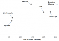
Summary Many of the world’s top hedge funds already utilize strategies based on a new investing concept called “risk parity,” including Bridgewater Associates and AQR. Risk parity is not yet well understood by the mainstream, even though in theory it should significantly improve the Sharpe ratio of a passive portfolio. We present an overview of what risk parity means, and analyze whether the theory makes sense in practice, across various timeframes and environments. We also present initial techniques for building your own risk parity portfolio, using SPY, TLT, and GLD. Introduction to Risk Parity: Re-Thinking Risk and Return Traditional portfolio theory categorizes assets into buckets of risk and return. International equities are higher risk, treasury bonds are lower risk, and so on. Depending on your personal risk profile and time horizon, you are usually recommended some mix of the assets which match. For most people investing over the long-run and seeking an annual return of 6-10%, this usually means a portfolio dominated by stocks. Risk parity advocates believe this approach is fundamentally flawed. By limiting your investments to the asset classes which match your desired return, you wind up with a portfolio overexposed in certain areas and poorly diversified as a whole. As a simple example, let’s say you had a choice of two portfolios. Portfolio A is 80% stocks and 20% bonds. Portfolio B is 50% stocks and 50% bonds. Which portfolio is better diversified? Though Portfolio B is the obvious choice, few would recommend such a mix over the long-run, since bonds do not have a high enough expected return. Suspending disbelief for a moment, suppose that you could manipulate Portfolio B such that it had the same expected annual return as Portfolio A. Would you change your opinion? This is essentially the core premise of risk parity, which breaks down into three principles: An asset’s expected risk and return can be manipulated using modern day financial techniques. Assets can thus be ‘adjusted’ to have the same level of expected risk. A portfolio balanced by risk will be better diversified than the traditional portfolio mix, resulting in a higher Sharpe ratio over the long run. If this is really true, it would have tremendous implications. It would suggest that the majority of passive portfolios are managed incorrectly, and that equities as a whole are oversubscribed. Examining the Risk Parity Theory First, let’s better understand the theory, and how it differs from traditional portfolio management. Typically, investment options are viewed as static points of risk and return. The following exhibits the historical standard deviation (X-axis) and total annual return (Y-axis) across a number of familiar assets, using a variety of publicly available pricing information. These returns account for all dividends and interest. Note that these data points simply represent a span of time, and are not necessarily indicative of future returns and standard deviations. Still, they were true at one point and likely informed a generation of portfolio managers. Historical Annual Return vs. Risk (click to enlarge) Sources: Yahoo Finance , Federal Reserve , The Wall Street Journal , Energy Information Administration , Hedgewise Internal Analysis. If you had a preference for higher risk and were targeting an annual return of 10%, a traditional portfolio mix would primarily include the assets which fall above that line. In this case, domestic and international stocks are the only assets that qualify. Diversification may still be a consideration, but mostly as it relates to equities. For example, perhaps you’d spread your investments across small and mid-cap sectors. Bonds, however, simply don’t meet the return threshold needed. Risk parity poses a new way to view this data. Imagine that you could set the annualized return for every asset class to whatever level you chose, so long as the risk also scales accordingly (i.e., the Sharpe ratio remains consistent). In the example above, let’s say every asset had achieved a 10% annualized return at its corresponding level of risk. Historical Annual Return vs. Risk, at 10% Return Level (click to enlarge) This graph now essentially illustrates the Sharpe ratio of each asset, from highest (at the far left) to lowest (at the far right). While most people would assume that the S&P 500 had the best Sharpe ratio historically, bonds were actually the top performer. Now, if you still had a 10% target annual return, how would you construct the portfolio? Stocks no longer seem like the obvious choice, but it would also be hard to make a case for holding 100% bonds (especially with interest rates near zero). Naturally, diversification seems like the best bet, especially now that you no longer have to exclude certain assets because they have returns that are either ‘too low’ or ‘too high’. This is the key to the ‘Risk Parity’ portfolio, which assumes that constructing a better diversified mix will result in a better Sharpe ratio. Traditional Diversified Portfolio vs. Risk Parity Portfolio, In Theory (click to enlarge) Put another way, risk parity is just an attempt to find the diversified portfolio with the best Sharpe ratio. Strangely, this sounds like exactly the same goal of financial theory for the past 50 years. There’s even a name for it: it’s called the Efficient Frontier, and the concept has been around for ages. So why isn’t the traditional diversified portfolio already ‘efficient’? The Efficient Frontier The Efficient Frontier is a concept core to Modern Portfolio Theory, developed by Harry Markowitz and others in 1952. Its purpose is to help identify the ‘optimally diversified’ portfolio by studying all possible combinations of all individual assets and then isolating the set with the best Sharpe ratio. Applying this concept to the assets initially presented above, the graph would look something like this. Efficient Frontier Illustration (click to enlarge) Again, emphasizing that this is in theory over a particular span of time, the blue line represents all possible diversified portfolios using a varied mix of the individual assets. Inevitably, there will be a single point on the blue line where the Sharpe ratio is maximized, which represents the ‘best’ portfolio during that period. This portfolio provided the maximum return at the minimum level of risk. Risk parity is really seeking this same point. It is just presenting the hypothesis that this point will also be the portfolio in which risk is balanced equally across asset classes. In other words, risk parity agrees with the Efficient Frontier, and just provides a convenient method for weighting a portfolio to get close to the ideal. In theory, this all sounds pretty uninteresting. We should be able to use the Efficient Frontier to find the right way to diversify, and risk parity should recommend something similar. Since the ‘traditional portfolio’ supposedly relies on this same model, you’d expect the portfolio mix of 80-90% stocks and 10-20% bonds to represent the same. In reality, this is where it gets very interesting. Using historical data, either this theory is wrong, or it is being very misapplied in practice. Mapping the Efficient Frontier with Historical Data, 1954-2015 We can use historical data to map the Efficient Frontier and examine how the theory has translated to reality. This exercise ignores nuances like the fact that the Efficient Frontier may change decade to decade, but still provides a broad indicator for an optimally diversified portfolio over the long-run. Initially, we limit the data to just two asset class benchmarks: the S&P 500 and 10 year Treasury bonds. These benchmarks have the longest amount of uninterrupted historical data available, and are also reasonable proxies for the assets generally included in most passive portfolios. We broaden the perspective to additional asset classes later in the article. We constructed nine different portfolios composed of different mixes of these two benchmarks, from 10% stocks / 90% bonds to 90% stocks / 10% bonds. These portfolios are rebalanced monthly and include all dividends and interest payments. Then, we plotted the total return and standard deviation of each of those portfolios, in additional to the individual benchmarks, to present a ‘real version’ of the Efficient Frontier. Historical Efficient Frontier, S&P 500 and 10yr Treasuries, 1954-2015 (click to enlarge) Sources: Yahoo Finance, Federal Reserve, Hedgewise Internal Analysis. There are a few fascinating takeaways from this graph. The Efficient Frontier theory really does exist in reality – the curve is amazingly similar to what you’d expect to find. Diversification clearly has a dramatic effect on the Sharpe ratio of a portfolio. The Sharpe ratios of the above data points range from 0.80 to 1.31. Surprisingly, the maximum Sharpe ratio occurs in the 30% Stocks, 70% Bonds portfolio. This all makes sense so far, except for the incredibly odd fact that almost no one in the world has been holding a portfolio of 70% bonds and 30% stocks for the past 60 years. The traditional portfolio mix is almost exactly the opposite – even though it claims to be a result of the Efficient Frontier, which we just mapped with real historical data! Before analyzing what these results mean, let’s also apply the risk parity approach for comparison. Again with the benefit of hindsight, risk parity would suggest you simply adjust the risk of each asset to be the same. In order to make this adjustment, we need to first define what it means to have the ‘same risk’. Risk can be thought of as the probability that you will make or lose a certain amount of money. To have the ‘same risk’, then, would be a case where you had the same probability of making or losing the same amount of money across each of your investments. To quantify this, we define a new concept called ‘dollars at risk’ for each asset. ‘Dollars at risk’ is equal to the total dollar investment in an asset multiplied by the probability of making or losing money on that investment. We use standard deviation as a reasonable uniform measure of this probability. (Note: this raises lots of additional questions about how to measure risk, whether a standard deviation makes sense, and how to account for assets with a positive expected return, but those are more advanced risk parity topics beyond the scope of this article.) For example, a $100 investment in an asset with a 10% standard deviation would have $10 at risk. With that in mind, we can figure out what percentage weight of the S&P 500 and 10yr Treasuries would result in an equal amount of dollars at risk. Over this period, 10yr Treasuries had a standard deviation of 6.5%, while the S&P 500 had a standard deviation of 14.7%. This means you should have about $2.3 in bonds for every $1.0 dollar you have in stocks. Converting this to a portfolio mix, the result is a recommendation of 30% Stocks and 70% Bonds. That’s right – exactly the same as the result using the Efficient Frontier. In fact, a complex math proof would actually show this was bound to be the case when using historical data and only two assets. (Note: this would no longer be true with multiple assets that have different correlations, but more on that later.) So what’s the deal with the traditional portfolio mix? Applying the Efficient Frontier: Theory vs. Practice At this point, either the assumptions behind the Efficient Frontier are incorrect, or it has been applied incorrectly by the majority of the investing world. This is currently the subject of raging debate in high finance circles, so we will not dare to settle it absolutely. However, most supporters of risk parity point out reasons why the Efficient Frontier has been misapplied. First, there is the problem of matching up aggressive return targets with the Efficient Frontier portfolio. If you have a target return of 10%, equities are the only asset class that qualifies. However, this is only true if you are not using any leverage. Using leverage is another way of saying ‘borrowing money’. In simple terms, say you had $100 and a friend would also lend you $100 at no interest for a year (what a guy!). If you put this full $200 into Treasury bonds, your personal return, and potential risk, would now be double what it would have been without the loan. The Efficient Frontier model already thought of this, too, and defined a portfolio using leverage as something called the ‘Capital Market Line’. It recommends picking the portfolio with the maximum Sharpe ratio, and then using leverage to scale it to your desired return target. The Capital Market Line (click to enlarge) The green line represents a single, optimal portfolio that is levered up or down. ‘Levered down’ means you would lend money to someone (e.g., put it in a savings account) while using the rest to invest in the optimal mix. ‘Levered up’ means you would borrow money so you could increase your exposure to the optimal mix. Thus, you could achieve whatever return you want while retaining the very best Sharpe ratio. This sounds nice, but is not necessarily intuitive. An investment manager that recommended keeping half your money in a savings account would have a hard time justifying his value. Vice versa, an investment manager that told you to go to the bank, take out a loan, and invest it in Treasury bonds would also seem pretty batty. Yet, if Efficient Portfolio theory were really taking place, this should be pretty common. The fact that this isn’t a familiar concept, and that most people don’t consider using leverage in their portfolios, indicates that the Efficient Frontier model is being misapplied. After all, it’s much easier just to pick stocks and invest all your money than to worry about what leverage means and how to use it. Enter Risk Parity: the Efficient Frontier Makes a Comeback In essence, the risk parity movement is just advocating for the correct application of the Efficient Frontier, with a few extra ideas on how to make it easier to construct on a day-to-day basis. For example, one of the classic problems with the implementation of the Efficient Frontier is that you can only build it in retrospect. This isn’t particularly useful. Risk parity introduces the ‘dollars at risk’ concept such that you can use expected standard deviation and correlation to approximate the optimal mix. The risk parity movement has also helped to call out potential inefficiencies in the market, and is beginning to give rise to firms making the ‘real’ Efficient Frontier far more accessible. While in the next section we provide a brief ‘do-it-yourself’ guide, more advanced implementation requires a relatively high degree of financial sophistication and effort. Bridgewater Associates is one of the biggest hedge funds advocating this strategy, but only serves institutions with a minimum $250mm investment. AQR is another firm offering a ‘risk parity’ mutual fund, but has an annual fee of over 1% and a $5mm minimum investment. There isn’t a great reason it should be so expensive or hard to access, though, and a few start-ups are already working on solving that problem. If the next 60 years winds up resembling anything close to the last 60 years of investment performance, there’s good reason to believe risk parity will continue to gather momentum. Building Your Own Risk Parity Portfolio: A Practical Guide and Sample Using SPY, TLT, and GLD As promised, we’ll build a real portfolio using real stocks to test whether risk parity can truly yield a better Sharpe ratio. For the more adventurous among you, we also provide a framework for how you could generate such a portfolio on an ongoing basis. First, a few guidelines on the implementation. To build a risk parity portfolio, you need: A measure for the future risk of each asset. If you use standard deviation, you need to be wary that historical standard deviation may not be predictive of future standard deviation. A prediction for the future correlation between different assets. For example, 10yr bonds and 20yr bonds are naturally highly correlated. A high correlation reduces the benefits of diversification. Also, the same warning as point (1) about using the past to predict the future. The knowledge and ability to generate leverage for your portfolio. At higher levels of return, a risk parity portfolio almost inevitably requires leverage. We’ve provided more information on one way to do this here . As it applies to this example, we are using a few relatively simple assumptions to make this easy to follow. We are using only three assets – the S&P 500, 20yr Treasuries, and Gold. These assets are often uncorrelated to one another for various reasons. We are estimating risk using a historical standard deviation that covers all data available before the year 2000. We are then using that risk estimate to set the portfolio weight for the years 2000-2015. Finally, we are not accounting for live trading costs such as spreads or commissions. As a result, this simulation should be considered a hypothetical only, and does not represent real trading performance. That said, the SPDR S&P 500 ETF (NYSEARCA: SPY ), the iShares 20+ Year Treasury Bond ETF (NYSEARCA: TLT ), and the SPDR Gold Shares ETF (NYSEARCA: GLD ) have closely tracked these benchmarks historically. With these assumptions in mind, creating the risk parity portfolio is relatively simple. Here are the historical standard deviation estimates for each of the asset classes: Gold: 22% 20yr Treasuries: 8% S&P 500: 14% Using the same ‘dollars at risk’ concept discussed earlier, you can determine that you’d want a ratio of $1 gold : $1.57 S&P 500 : $2.75 20yr Treasuries. The equivalent portfolio mix is: Gold: 19% 20yr Treasuries: 52% S&P 500: 29% Now we can study how a portfolio using this exact composition would have performed from 2000 until today, rebalanced monthly with all dividends reinvested. We can also compare this portfolio to the traditional mix, and even plot both on the actual Efficient Frontier over this timeframe. Performance of the ‘Risk Parity’ Portfolio vs. Traditional Mix, January 2000 to January 2015 (click to enlarge) Source: Hedgewise Internal Analysis. ‘Risk Parity’ Portfolio vs. Traditional Mix on the Efficient Frontier, January 2000 to January 2015 (click to enlarge) Source: Hedgewise Internal Analysis. The risk parity portfolio didn’t just outperform, it entirely obliterated the traditional mix. Now, there will be shouts of disagreement. The past 15 years have marked one of the longest bond bull markets in history, so of course stocks look bad relative to bonds right now. But remember, the weighting we used came from data going all the way back to the 1950s, and that whole period wasn’t a bond bull market. (check out this article for more on bond market history and what to expect moving forward) There’s also the fact that this is the simplest implementation of risk parity possible. It doesn’t use any kind of predictive algorithm for standard deviation, and it only accounts for three asset classes. It also uses a very basic idea of correlation, which could be vastly improved to account for different economic environments. Yet, even if you didn’t do any of that, this simple portfolio has still outperformed the traditional mix. If you are currently uncomfortable putting most of your money in the stock market, the composition used in this example provides an immediately available ‘risk parity’ alternative. Conclusion Risk parity has been gaining momentum in the past few years as a new investment philosophy, but may really just be pushing investors towards the same Efficient Frontier that has been around for decades. While many of the concepts are somewhat unfamiliar, like a portfolio using leverage and predictive volatility, modern day financial techniques are making them much easier to implement without great difficulty. The theory has always made sense, and has always recommended these same techniques, but it’s easy to see why investment managers preferred the familiarity of stocks and ‘tradition’. Risk parity is not saying Modern Portfolio Theory is wrong. In some ways, it’s really just affirming that it has always been right, but may be misapplied due to a few bad assumptions. At the very least, investors deserve to question the traditional portfolio mix and to understand that alternatives exist. There’s also no need for these concepts to be shrouded in mystery and hidden behind the closed doors of hedge funds. The implications may be radical, but the concepts are not. Regardless of whether you agree with this strategy, it is raising important questions about portfolio composition that deserve attention. A great amount of theoretical and practical evidence suggests that risk parity will be a big part of our future. Disclaimer: Hedgewise is a start-up making the Risk Parity strategy more accessible to individual investors. This article does not constitute investment advice or an offer to invest or to provide management services and is subject to correction, completion and amendment without notice. Hedgewise makes no warranties and is not responsible for your use of this information or for any errors or inaccuracies resulting from your use. To the extent that any of the content published may be deemed to be investment advice or recommendations in connection with a particular security, such information is impersonal and not tailored to the investment needs of any specific person. Hedgewise may recommend some of the investments mentioned in this article for use in its clients’ portfolios.