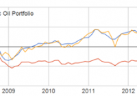
Summary Many investors are making big bets on oil since it bottomed last month. However, the oil futures curve is in extreme contango, making ETFs like USO and USL very costly. Until the curve flattens, non-integrated oil drillers are a much safer play. This article presents a dynamic model for oil investing to better capitalize on an oil turnaround. Note: This article originally appeared on Hedgewise in October 2014. It has been updated with additional data and republished. Introduction Just about everyone is betting on an oil turnaround sometime soon and trying to figure out how to capitalize on it. Unfortunately, most instruments that provide exposure to oil prices are riddled with high long-term holding costs. One of the most popular oil ETFs, The United States Oil ETF (NYSEARCA: USO ), often suffers from paying high premiums on futures contracts (called “contango”). As you can see here , these costs are particularly severe right now. Investing directly in companies which drill, distribute, or sell oil is a reasonable alternative, but these companies often fail to track the spot price of oil very closely. For example, in 2008, when oil went up 200% , Exxon Mobil (NYSE: XOM ) was only up 88%. This article breaks down the nature of this problem, and presents a dynamic methodology for investing in oil that seeks to avoid these pitfalls. A back-tested simulation that applies this logic can be seen in the graph below, under the label “Dynamic Oil Portfolio.” This portfolio is a rule-based index that invests in a single oil futures contract when the market is in backwardation, or a non-integrated oil company ETF when it is not. It significantly outperforms a long-term investment in USO, and has drastically outperformed in the last few months. This methodology can be applied to any portfolio by keeping track of current market conditions, and then choosing the appropriate ETF (or futures contract) accordingly. Comparison of the WTI Oil Spot Price, USO, and the Dynamic Oil Portfolio, May 2006 – February 2015 (click to enlarge) Sources: Energy Information Administration, Yahoo Finance, Hedgewise Internal Research The Problem First, it is worthwhile to do a quick review of the problems with investing in oil. The most direct way to invest is with an oil futures contract, which commits you to buying oil at an agreed upon price at some point in the future. Unfortunately, much of the time there is a premium on the price of oil futures, called “contango,” because people are betting the price of oil will go up. For example, say the current spot price of oil was $50, and you could buy a futures contract for next month at $55. If the price of oil were to stay exactly flat for the next month, you would probably lose about $5 on that contract. If this were to keep happening, you would lose about 10% per month for the entire year! How This Applies to Oil ETFs The effect of this problem can be seen by examining the performance of ETFs that specialize in trading oil futures contracts. For example, USO has a policy of rolling over the nearest oil futures contract every month. This results in significant cost whenever the market is in contango, which explains its underperformance over time. The iPath S&P Crude Oil Total Return ETN (NYSEARCA: OIL ) and the United States 12 Month Oil ETF (NYSEARCA: USL ) are affected in a similar way. Performance of USO, OIL, and USL vs. WTI Oil Spot Price, December 2007 – February 2015 (click to enlarge) Sources: Energy Information Administration, Yahoo Finance You might notice that USL has performed the best. This is because USL invests in 12 different futures contracts at all times while OIL and USO only invest in the futures contract of the nearest month. This has helped to avoid some of the dramatic costs of trading futures in periods of heavy speculation, such as early 2009. However, it is not enough to avoid the problem altogether. Still, the relative performance of USL provides an important insight. Since different oil futures contracts trade at different prices, there is an opportunity to pick the cheapest one at any point in time. This is the mandate of the PowerShares DB Oil ETF (NYSEARCA: DBO ), and, in theory, should lead to improved performance. Unfortunately, in practice, it has not. Performance of USL and DBO vs. WTI Oil Spot Price, December 2007 – February 2015 (click to enlarge) Sources: Energy Information Administration, Yahoo Finance The main reason that DBO has failed to outperform USL is because of the consistency of the futures curve. It is often upward sloping over time, such that the adjusted cost is about the same no matter which contract you buy. It is helpful to zoom in on different time periods to get a better sense of how this works. You might have already observed how well DBO and USL performed from January 2008 to January 2009. We can examine the futures curve over that time period to understand why this was possible. Note that a “2-Month Oil Futures” contract is one that expires 2 months from today, and a “4-Month Oil Futures” contract is one that expires 4 months from today. If the “4-Month” price is higher than the “2-Month” price, this indicates that the market is in contango. WTI Oil Spot Price vs. 2-Month and 4-Month Futures Contract Prices, January 2008 to January 2009 (click to enlarge) Source: Energy Information Administration The important observation is how close the price of both futures contracts was to the spot price over this entire period. In fact, at some points, the price of the futures contracts was actually below the spot price, which is a case of backwardation. This allowed USL and DBO to outperform. However, this trend changed dramatically in 2010. WTI Oil Spot Price vs. 2-Month and 4-Month Futures Contract Prices, January 2010 to January 2011 (click to enlarge) Source: Energy Information Administration Here, the futures curve was upward sloping, with the price of the 4-Month contract consistently above that of the 2-Month contract. As a result, all of the ETFs involved in trading oil futures suffered. This demonstrates the general point that if you are going to get oil exposure using futures (whether directly or via ETFs), you need to be constantly monitoring the futures curve and adjusting accordingly. When the curve is upward sloping, trading futures will cost a hefty sum over the long term. Unfortunately, this has been the case about 60% of the time over the past decade. Thus, it is necessary to identify alternative ways to get oil exposure, such as investing directly in individual companies. Investing Directly in Oil Companies The most obvious candidates for direct investing are the two largest energy ETFs, the Energy Select Sector SPDR ETF (NYSEARCA: XLE ) and the Vanguard Energy ETF (NYSEARCA: VDE ). Both ETFs invest in most of the biggest energy companies in the world. Performance of XLE and VDE vs. WTI Oil price, June 2006 – February 2015 (click to enlarge) Sources: Energy Information Administration, Yahoo Finance This performance is not terrible, but there is a great deal of tracking error. While in this period the overall effect has been positive, it could just as easily have been negative as it was from 2008 to 2009. The nature of this tracking error can be traced back to the fundamentals of the oil market. First, most large energy companies are grouped into the ‘oil & gas’ sector. This is because natural gas is often found alongside oil, and comprises a significant part of their business. However, the price movements of natural gas are often uncorrelated to the price movements of oil. Second, there are three main functions in the oil industry. Exploration and drilling Equipment and transportation Retail sales Many of the big oil players are involved in all three functions, but equipment, transportation, and retail sales don’t really depend on the current price of oil. For example, if you are selling oil equipment, you would not expect short-term oil fluctuations to change your sales outlook. If you are a gas station, you receive a small mark-up on the price of oil after buying it wholesale. Only exploration and drilling companies (a.k.a., ‘non-integrated’ oil companies) have very direct exposure to oil prices since they are the ones who actually own the oil fields. The good news is that there are ETFs which track these non-integrated oil companies. Two of the largest are the iShares U.S. Oil & Gas Exploration & Production ETF (NYSEARCA: IEO ) and the SPDR S&P Oil & Gas Exploration & Production ETF (NYSEARCA: XOP ). Performance of IEO and XOP vs. WTI Oil Spot Price, June 2006 – February 2015 (click to enlarge) Sources: Energy Information Administration, Yahoo Finance Surprisingly, these stocks actually have an even higher tracking error. To understand why, we have to take a look at the largest actual holdings within the ETFs. XOP primarily invests in smaller-sized owner-operators of oil fields, such as Magnum Hunter Resources Corp. (NYSE: MHR ) and Western Refining, Inc. (NYSE: WNR ). Performance of MHR and WNR vs. WTI Spot Oil Price, June 2006 – February 2015 (click to enlarge) Sources: Energy Information Administration, Yahoo Finance The problem is that these small companies are hugely susceptible to swings due to idiosyncratic factors, like their recent discoveries and the prospects for their particular oil fields. As such, they are fairly uncorrelated to the price of oil. It makes more sense to focus on companies which are diversified across many oil sources rather than only a few, which is the focus of IEO. Two of their biggest holdings are the Anadarko Petroleum Corporation (NYSE: APC ) and EOG Resources, Inc. (NYSE: EOG ), both big drilling companies. Performance of APC and EOG vs. WTI Spot Oil Price, June 2006 – February 2015 (click to enlarge) Sources: Energy Information Administration, Yahoo Finance There is still company-specific variance, but it is muted because these companies are better diversified. Because of this, IEO is likely a better play on oil exposure than XOP. However, it remains unclear whether IEO is a better option than the bigger ETFs; XLE and VDE. Unfortunately, there is no way to make a determination on numbers alone. All three of the ETFs hold oil companies that also invest in natural gas. Each of those companies will have independent factors that affect it year to year. It seems logical that non-integrated oil companies would be more directly exposed to fluctuations in the oil price than the bigger players involved in equipment, transportation, and retail sales. Yet, their relative performance suggests the difference thus far has been pretty negligible. All three are probably reasonable alternatives when the futures market is in contango. Performance of IEO, XLE, and VDE vs. WTI Spot Oil Price, June 2006 – February 2015 (click to enlarge) Sources: Energy Information Administration, Yahoo Finance How to Apply the Model The outcome of all this logic is relatively simple. Invest in the cheapest futures contract (optimizing between USO, USL, and DBO if using an ETF) when there is a downward sloping futures curve, and use a general energy ETF like IEO, XLE, or VDE otherwise. While this requires a little extra work, it may drastically reduce the costs of investing in oil over the long run. We’ve also made this a little easier for you by tracking the current state of the futures curve and its estimated impact on each ETF (linked above). Though the outcome of this model is not perfect, it is certainly more compelling than many of the alternatives. Disclosure: Hedgewise is an Investment Advisor that helps clients implement custom strategies like the one described in this article inexpensively and tax-efficiently. This information does not constitute investment advice or an offer to invest or to provide management services and is subject to correction, completion and amendment without notice. Hedgewise makes no warranties and is not responsible for your use of this information or for any errors or inaccuracies resulting from your use. To the extent that any of the content published may be deemed to be investment advice or recommendations in connection with a particular security, such information is impersonal and not tailored to the investment needs of any specific person. Hedgewise may recommend some of the investments mentioned in this article for use in its clients’ portfolios. Disclosure: The author is long IEO, XLE. (More…) The author wrote this article themselves, and it expresses their own opinions. The author is not receiving compensation for it. The author has no business relationship with any company whose stock is mentioned in this article.