Tag Archives: undefined

QJPN Borders On Being Too Good To Be True

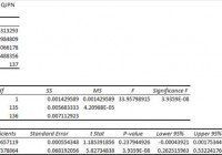
Summary I’m taking a look at QJPN as a candidate for inclusion in my ETF portfolio. The expense ratio is a bit high, but the diversification is moderate. The correlation with SPY appears low, and the overall risk level for a portfolio looks great. However, weak liquidity could be influence results. Despite the relatively short history on QJPN, I’ll keep it on my short list for international exposure. I’m not assessing any tax impacts. Investors should check their own situation for tax exposure. Investors should be seeking to improve their risk adjusted returns. I’m a big fan of using ETFs to achieve the risk adjusted returns relative to the portfolios that a normal investor can generate for themselves after trading costs. I’m working on building a new portfolio and I’m going to be analyzing several of the ETFs that I am considering for my personal portfolio. One of the funds that I’m considering is the SPDR MSCI Japan Quality Mix ETF (NYSEARCA: QJPN ). I’ll be performing a substantial portion of my analysis along the lines of modern portfolio theory, so my goal is to find ways to minimize costs while achieving diversification to reduce my risk level. What does QJPN do? QJPN attempts to provide results which are comparable (before fees and expenses) to the total return of the MSCI Japan Quality Mix Index. QJPN falls under the category of “Japan Stock”. Does QJPN provide diversification benefits to a portfolio? Each investor may hold a different portfolio, but I use (NYSEARCA: SPY ) as the basis for my analysis. I believe SPY, or another large cap U.S. fund with similar properties, represents the reasonable first step for many investors designing an ETF portfolio. Therefore, I start my diversification analysis by seeing how it works with SPY. I start with an ANOVA table: (click to enlarge) The correlation is about 44%, which is phenomenal for Modern Portfolio Theory. The extremely low correlation makes it much easier to mix the ETF into a portfolio and take advantage of the benefits of diversification. My goal is risk adjusted returns, and my method is minimizing risk. Standard deviation of daily returns (dividend adjusted, measured since June 2014) The standard deviation is very reasonable. For QJPN it is .8159%. For SPY, it is 0.7232% for the same period. SPY usually beats other ETFs in this regard, and the low correlation with SPY makes the higher standard deviation acceptable. Short time frame Investors should be aware that this is a substantially shorter time frame than I usually use. I would like to have about 3 years of data on the ETF for running statistics and half of one year is short enough to introduce sampling errors. In statistics, the minimum sample size is generally 30 so over 130 days of trading returns may seem sufficient, but I would caution investors to take this with a grain of salt. Liquidity concern The average volume comes in at just under 2000 shares. That’s a potential problem for investors that need liquidity and for running correlation values. I checked the dividend adjusted closing values for each day and there were very few times that the change was 0.00%, which means the low volume of trades was not the only factor in the low standard deviation. For statistical validity, I’m more concerned about the relatively short time frame that I have available than the number of shares trading each day. For an investor concerned about spreads and liquidity, the low number of shares trading could be the bigger concern. Mixing it with SPY I also run comparisons on the standard deviation of daily returns for the portfolio assuming that the portfolio is combined with the S&P 500. For research, I assume daily rebalancing because it dramatically simplifies the math. With a 50/50 weighting in a portfolio holding only SPY and QJPN, the standard deviation of daily returns across the entire portfolio is 0.6553%. If an investor wanted to use QJPN as a supplement to their portfolio, the standard deviation across the portfolio with 95% in SPY and 5% in QJPN would have been .7063%. While the low correlation makes very large positions look quite appealing, I wouldn’t want to risk my money on those statistics holding. However, the low correlation and reasonable standard deviation make this a strong contender for a position in my portfolio, even if I have to limit the exposure to something much smaller than the statistics would have suggested. Due to the potential for the low trading volumes and short time frame to distort the statistics, I will want more data before making a final decision on the ETF. So far, I am definitely considering it. Why I use standard deviation of daily returns I don’t believe historical returns have predictive power for future returns, but I do believe historical values for standard deviations of returns relative to other ETFs have some predictive power on future risks and correlations. Yield & Taxes The SEC yield is 1.37%. That is too weak for a retiring investor to live off the yield, but the ETF still could merit a small position as part of a rebalancing plan to reduce the overall risk level in the portfolio is the investor was certain he or she would not have liquidity needs that would force them to sell. I’m not a CPA or CFP, so I’m not assessing any tax impacts. Expense Ratio The ETF is posting .30% for an expense ratio. I want diversification, I want stability, and I don’t want to pay for them. The expense ratio on this fund is slightly higher than I want to pay for an equity fund, but it isn’t enough to disqualify the ETF from consideration. Market to NAV The ETF is at a .29% premium to NAV currently. Premiums or discounts to NAV can change very quickly so investors should check prior to putting in an order. I wouldn’t want to pay a premium greater than .1% when investing in an ETF, unless I could find a solid accounting reason for the premium to exist. This premium looks small enough that I think I could enter into a position with a limit buy order that removed the premium. Largest Holdings The diversification within the ETF is moderate. Normally I want more diversification, but if the correlation and standard deviation hold up over a longer time period, I wouldn’t have any problem with the level of diversification in the ETF. (click to enlarge) Conclusion I’m currently screening a large volume of ETFs for my own portfolio. The portfolio I’m building is through Schwab, so I’m able to trade QJPN with no commissions. I have a strong preference for researching ETFs that are free to trade in my account, so most of my research will be on ETFs that fall under the “ETF OneSource” program. QJPN is going to be on my short list (for now) for potential inclusion in my portfolio as part of my international exposure. If QJPN continues to look better than other international ETFs under modern portfolio theory I will extend my analysis to look for other ETFs with similar holdings and a longer trading history so if the data on those ETFs support the statistics so far on QJPN.

Consumer Staples ETF: XLP No. 4 Select Sector SPDR In 2014

Summary The Consumer Staples exchange-traded fund finished fourth by return among the nine Select Sector SPDRs in 2014. Along the way, the ETF had a big up month in November (5.54 percent) and a big down month in January (-5.16 percent). Seasonality analysis indicates the fund could have a tough first quarter. The Consumer Staples Select Sector SPDR ETF (NYSEARCA: XLP ) in 2014 ranked No. 4 by return among the Select Sector SPDRs that chop the S&P 500 into nine morsels. On an adjusted closing daily share-price basis, XLP ascended to $48.49 from $41.90, a climb of $6.59, or 15.73 percent. Accordingly, it led its parent proxy SPDR S&P 500 Trust ETF (NYSEARCA: SPY ) by 2.26 percentage points and lagged its sibling Utilities Select Sector SPDR ETF (NYSEARCA: XLU ) by -13.01 points. (XLP closed at $48.96 Monday.) XLP ranked No. 3 among the sector SPDRs in the fourth quarter, when it behaved better than SPY by 3.36 percentage points and worse than XLU by -4.92 points. And XLP ranked No. 7 among the sector SPDRs in December, when it performed worse than XLU and SPY by -4.52 and -0.69 percentage points, in that order. Figure 1: XLP Monthly Change, 2014 Vs. 1999-2013 Mean (click to enlarge) Source: This J.J.’s Risky Business chart is based on analyses of adjusted closing monthly share prices at Yahoo Finance . XLP behaved a lot better in 2014 than it did during its initial 15 full years of existence based on the monthly means calculated by employing data associated with that historical time frame (Figure 1). The same data set shows the average year’s weakest quarter was the first, with a relatively small negative return, and its strongest quarter was the fourth, with an absolutely large positive return. Generally consistent with this pattern, the ETF had a huge gain in the fourth quarter last year. Figure 2: XLP Monthly Change, 2014 Versus 1999-2013 Median (click to enlarge) Source: This J.J.’s Risky Business chart is based on analyses of adjusted closing monthly share prices at Yahoo Finance. XLP also performed a lot better in 2014 than it did during its initial 15 full years of existence based on the monthly medians calculated by using data associated with that historical time frame (Figure 2). The same data set shows the average year’s weakest quarter was the first, with a relatively small positive return, and its strongest quarter was the fourth, with an absolutely large positive return. Clearly, this means there is no historical statistical tendency for the ETF to explode in Q1. Figure 3: XLP’s Top 10 Holdings and P/E-G Ratios, Jan. 9 (click to enlarge) Note: The XLP holding-weight-by-percentage scale is on the left (green), and the company price/earnings-to-growth ratio scale is on the right (red). Source: This J.J.’s Risky Business chart is based on data at the XLP microsite and FinViz.com (both current as of Jan. 9). It is an article of faith (and statistical interpretation) hereabouts that so-called PUV analysis is better than psychoanalysis in determining Mr. Market’s state of mind. So what is PUV analysis? It is basically the study of the behaviors of XLP, XLU and the Health Care Select Sector SPDR ETF (NYSEARCA: XLV ) in comparison with their sibling Select Sector SPDRs. If the PUV cluster of ETFs ranks in or near the top third of the sector SPDRs by return during a given period, then I believe market participants are in risk-off mode; if the PUV cluster of ETFs ranks in or near the bottom third of the sector SPDRs by return over a given period, then I think market participants are in risk-on mode. Given the relative performances of the low-beta PUV cluster members (aka XLP, XLU and XLV) that led them to finish in three of the top four spots among the sector SPDRs last year, I believe market participants were in risk-off mode. And I think they will continue to be so this year, with changes in policy at the U.S. Federal Reserve the biggest reason why. Despite the long-term sector rotation into the PUV cluster at this late stage of the economic/market cycle, the valuations of XLP’s top 10 and other holdings may be a drag on the ETF’s price appreciation in the foreseeable future (Figure 3). Numbers reported by S&P Senior Index Analyst Howard Silverblatt supported this hypothesis Dec. 31, when he pegged the P/E-G ratio of the S&P 500 consumer-staples sector at 2.12, which is pretty rich for the blood of at least one PUV analyst (i.e., me). Disclaimer: The opinions expressed herein by the author do not constitute an investment recommendation, and they are unsuitable for employment in the making of investment decisions. The opinions expressed herein address only certain aspects of potential investment in any securities and cannot substitute for comprehensive investment analysis. The opinions expressed herein are based on an incomplete set of information, illustrative in nature, and limited in scope. In addition, the opinions expressed herein reflect the author’s best judgment as of the date of publication, and they are subject to change without notice.

Cohen & Steers REIT And Preferred Income Fund: Not Just A Real Estate Offering

Summary RNP is managed by REIT specialist Cohen & Steers. RNP does not, however, have a strict real estate focus. It might be better to look at RNP as a balanced fund of sorts. Cohen & Steers REIT and Preferred Income Fund (NYSE: RNP ) is an interesting animal that tries to combine in one fund two different investment focuses. For investors seeking simplicity, this could be a good option. For those who want more control over their portfolios, you’d be better off buying a real estate investment trust (REIT) fund and a preferred fund separately. Who is Cohen & Steers? I always include a comment about this company’s origin when I write about it because Cohen & Steers isn’t a household name in finance. But it is one if you are remotely connected to the REIT space. That’s because Martin Cohen and Robert Steers were among the first to create a company dedicated to investing in REITs. They basically helped popularize the space for institutional and individual investors. And, more important, the company they created has lots of experience. If you are thinking about outsourcing your REIT investments to anyone, Cohen & Steers should be on your short list. So, from that standpoint, I like anything they do that involves real estate investing. Only half the fund But that’s only half of what Cohen & Steers REIT and Preferred Income Fund does. The other half of the fund invests in preferred shares. While there’s some overlap, since REITs often issue preferred shares, that doesn’t make Cohen & Steers an expert in, say, preferreds issued by insurance companies. That’s not to suggest that they don’t have the ability to do analyze such securities, just that their business has historically been structured around REITs. And this fund, with only about 10% of its preferred portfolio in REIT preferreds, is definitely more than just REITs. But what exactly is in RNP? Roughly 50% of the fund is, indeed, in REITs. The largest holdings are basically top-quality players. It’s fairly diversified across nine major sectors, with offices, apartments, and regional malls accounted for nearly half of its real estate exposure. Nothing exciting here. Preferred stocks and debt make up the rest of the fund. That side is concentrated in four sectors. Banking preferred stocks alone make up nearly 55% of this side of the portfolio. Insurance, real estate, and utility preferreds are the other big areas. This speaks more to the nature of the preferred market than to anything else, since these group of industries tends to make the most use of preferred stock. It’s worth taking note of the real estate sector’s 10% position on this half of the fund, which means that REITs, in some form, make up about 55% of RNP’s overall portfolio. The big takeaway from that is that this is not a pure real estate investment trust fund. It was never intended to be, but you should keep this fact in the back of your mind if you own it and front and center if you are looking for a pure REIT fund. How’s it done? Looking at total return, which includes distributions, RNP’s trailing ten year return through year-end 2014 was roughly 8% based on the share price (a little under 7% based on the CEF’s net asset value) according to Morningstar. That’s not bad for a fund with an income focus and is roughly in line with the S&P 500 Index over that span. That, of course, assumes the reinvestment of dividends. The price of RNP is down roughly 30% over that span if you used the dividends. Note, however, that dividends over the last six years have totaled roughly seven dollars or so. That pretty much makes up for the entire share price decline right there. While it’s true that the shares are worth less, you have been paid reasonably well along the way… With the other four years of dividends providing the bulk of your take-home return over the span. So, overall, this is a fine fund if you want a decently performing REIT and preferred combo offering. But you’ll need to keep another factor in mind. The big problem RNP makes use of leverage. Toward the end of last year, the fund’s leverage was at around 27%. Leverage is a double-edge sword, aiding performance in good markets and exacerbating losses in bad ones. For example, in 2007 the fund’s return was -27%, according to Morningstar. In 2008 it returned -60%. Those are hard losses to watch unfold and include dividend payments. That said, in 2009 RNP was up 90%, including dividends, and in 2010 it advanced another 50%. So while the fund owns what some would consider “safer” investments, this fund is anything but conservative. This is a fact that shouldn’t be taken lightly. Note, too, that the fund’s inherent exposure to financial preferred stocks on the preferred side of the portfolio were a huge drag during the financial-led 2007 to 2009 recession, when the CEF was hard hit in the market. This type of volatility doesn’t make RNP a bad fund, it just means it’s probably not appropriate for conservative investors. Expenses, meanwhile, at around 1.8%, are elevated by the costs of that leverage. Right now the shares trade at about a 12% discount to NAV. That’s roughly in-line with the fund’s five- and 10-year average discounts of roughly 10%, according to the Closed-End Fund Association. So RNP is hardly on sale right now. But you will be picking up a yield of around 6.75%. At the end of the day The question you have to ask is if that amount of income, most of which has recently been dividend income, is worth the share price volatility that Cohen & Steers REIT and Preferred Income Fund can experience. And the fund is really only appropriate if you want a mix of REIT and preferred exposure in one fund. At the end of the day, I’d say this is a specialty fund most appropriate for those with strong stomachs. It would be a good way, for example, to outsource “boring” sectors and asset classes while still staying true to an aggressive overall investment approach.