Scalper1 News
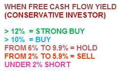
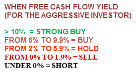

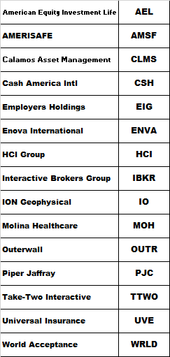
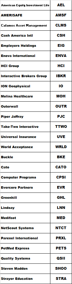 Summary Analysis of the components of the SPDR S&P 600 Small Cap ETF (SLY) using my Scorecard System. Specifically written to assist those Seeking Alpha readers who are using my free cash flow system. Compares the results of the SPDR S&P 600 Small Cap ETF to the SPDR S&P 500 ETF. Back in late December I introduced my free cash flow “Scorecard” system here on Seeking Alpha, through a series of articles that you can view by going to my SA profile . My purpose in doing so was to try and teach as many investors as I could, how to do this simple analysis on their own as I believe in the following: “Give a person a fish and you feed them for a day, Teach a person to fish and you feed them for life” I have been very pleased with the positive feedback that I have received so far, but included in that feedback were many requests by those using my system, to see if they did their analysis correctly or not. Since the rate of these requests have been increasing with every new article I write, I decided to concentrate my attention on articles analyzing indices and industry ETF’s covering a broad range of sectors. That way those of you using my system will have something like a “teacher’s edition” that will give you all the correct calculations for each component. Obviously I couldn’t include the financials used to create the results for all my ratios (as I would need to write you a book instead), so instead I will provide just my Scorecard results for each index or ETF and then let everyone go back and analyze each company and see if you get the same answers that I did. My data source will always be Y-Charts . I designed this system for the newbie investor, whom may have limited knowledge of investing, and assure them that with just a little effort, anyone can master the system I have presented here. As I write more articles, my hope in doing so is that everyone will be able to follow my work and then go investigate the stocks that seem interesting to them. Think of this project as sort of like the game show “JEOPARDY”, where I give you the final answers and then you go figure out the questions. Hopefully these articles can be used as reference guides that everyone can use over and over again, whenever the need arises. Again this analysis will just be my final Scorecard for the SPDR S&P 600 Small Cap ETF (NYSEARCA: SLY ) and for those new to this analysis, I suggest that you read my introductory Scorecard article on the SPDR S&P 500 ETF (NYSEARCA: SPY ) by going HERE . That article will send you HERE . There you will find the data on my “Free Cash Flow Yield” ratio which is one of three parts that I use it tabulating my final “Scorecard”. While free cash flow yield is a Wall Street ratio (Valuation Ratio), I also wrote an article that concentrated on my “CapFlow” and “FROIC” Ratios, which are Main Street ratios, which you can read about by going HERE . In this article I will generate my Scorecard results for each component and basically combine all three ratio results to generate one final result. Once completed, my Scorecard should give everyone a clearer understanding on how accurate the valuation is that Wall Street has assigned each company relative to its actual Main Street performance. Before we show you the final results of my Scorecard, here is brief introduction to how it works: Scorecard The Scorecard is the final score for any company under analysis and this is done by combining the three ratio (listed below) final results into one analysis, we grade each company with either a passing score of 1 or a failing score of 0 per ratio where a perfect final score per stock would be a 3. The ideal CapFlow results are anything less than 33%. The ideal FROIC score is any result above 20%. The ideal Free Cash Flow Yield is anything over 10%. So in analyzing Apple (NASDAQ: AAPL ) for example, we get for TTM (trailing twelve months). For the conservative investor: CAPFLOW = 16% PASSED FROIC = 34% PASSED FREE CASH FLOW YIELD = 7.6% FAILED SCORECARD SCORE = 2 (Out of possible 3) For the aggressive or “Buy & Hold” investor, we get a Scorecard score of 3 as Apple’s 7.6% free cash flow yield would be classified as a buy. These are the parameters for the Free Cash Flow Yield. It is important before preceding to determine what kind of investor you are as determined by the amount of risk you are willing to take. Then once you have done that, then pick the parameter list below that fits your risk tolerance. So without further ado here are the final Scorecard results for the components that make up the SPDR S&P 600 Small Cap ETF . What my Scorecard also achieves, besides telling you which individual stocks are attractive and which are not, is that it also allows you in “one shot” to see how overvalued or attractively valued the stock market is as a whole. For example, for the conservative investor now is the time to be extremely cautious as only these fifteen stocks came in with a perfect score of “3” As you can see I only found 15 bargains out of 600 for the conservative low risk investor and that comes out to just 2.5% of the total universe being bargains! As for the aggressive investor, who is willing to take on more risk, we have only 28 stocks that are considered higher risk bargains. That comes out to only 4.6% being attractive and 95.4% being holds or sells. So as you can see as a portfolio manager I have to work extremely hard just to find one needle in the haystack, while in March 2009 there were probably 300 bargains for the conservative investor at that time. Thus this data clearly shows that we are at the opposite extreme of where we were in 2009 and are in my opinion, at an extremely overvalued level. Here is the same analysis using the Dow Jones Index where I actually analyzed that index for 2001, 2009 and 2015. You can view those results by going HERE . In getting back to the main table above, the “TOTALS” you see at the end are the sum of each ratio divided by 600. The totals for both Scorecards are out of 1800 (1 point for each ratio result) as a perfect score were every stock would be a bargain. Therefore the conservative scorecard result is 374/1800 or 20.77% out of 100% and the more aggressive/buy & hold scorecard came in at 476/1800 or 26.44% out of 100%. The beauty of this system is that you can now compare this index result to any other index or ETF in juxtaposition. For example the S&P 500 Index for the conservative scorecard result is 384/1500 or 25.6% out of 100% and the more aggressive/buy & hold scorecard came in at 488/1500 or 32.5% out of 100%. Both clearly are not inspiring and could be a clear sign that the markets are ready for serious correction going forward. Always remember that the results shown above should not be considered investment advice, but just the results of the ratios. The system outlined in this article is just meant to be used as reference material to be included as just “one” part of everyone’s own due diligence. So in other words, don’t make investment decisions based on just my Scorecard results, but incorporate them as part of your own due diligence. Scalper1 News
Scalper1 News