Tag Archives: seeking

ETB Vs. ETV: What’s The Difference?
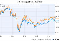
Summary At a quick glance, ETV and ETB look like almost mirror images of one another. ETV’s longer-term performance hasn’t been as good as ETB’s, based on market price. But based on total return, ETV has done a little better over time. If I had to choose, ETB would be my call. A pet peeve of mine is when a fund sponsor has two similar funds available that, on the surface, appear to be clones of one another. That’s exactly the case with the Eaton Vance Tax-Managed Buy-Write Opportunities Fund (NYSE: ETV ) and Eaton Vance Tax-Managed Buy-Write Income Fund (NYSE: ETB ). But when you look just a little closer, the differences are there – they’re just subtle. The same… One of the first things I look at when examining a fund is its objective. In the case of ETV : “The Fund’s primary investment objective is to provide current income and gains, with a secondary objective of capital appreciation.” ETB’s objective is, word for word, the same. And the managers are the same, too. With Walter A. Row and Thomas Seto heading things up since each of the funds’ initial public offerings. Which brings us to one relatively minor distinction between the two funds. ETV IPO-ed on June 30, 2005. ETB IPO-ed on April 29, 2005. This is a virtually irrelevant fact at this point, but it is a difference. Even the standard deviation, a measure of share price volatility, of the two funds is roughly the same. According to Morningstar, both funds have five-year standard deviations of about 9.5 versus a standard deviation for the S&P 500 of around 13. So they aren’t as volatile as the overall market, which can be good and bad. For example, over the trailing five-year period, they each captured around 60% of the market’s advance and 60% of the market’s decline. ETV is a touch better on both sides, gaining a little more and losing a little less. But the variance is tiny. … But different So, in a number of ways, ETV and ETB are virtual clones of each other. For example, over the trailing five-year period through the end of January (neither has 10-year numbers just yet), ETV’s annualized return is 11.4% based on its net asset value, or NAV, and 12.7% based on its share price. ETB’s annualized returns are 11% and 11.2%, respectively, over the same time span. Morningstar’s numbers are total return, which includes distributions, but it’s worth noting that the returns are fairly similar based on NAV. Furthermore, total return since the inception of each fund is only nine basis (0.09) points different based on NAV, according to Eaton Vance, bringing the pair’s performance even closer together. Yield, however, is a noteworthy differences. ETV’s yield is around 9.5%, according to the Closed-End Fund Association, and ETB’s yield is about 8.2%. Right now, ETV’s monthly distribution is $0.1108 and ETB’s distribution is $0.108. ETB’s NAV is a little over a dollar higher than that of its sibling. The biggest difference, however, is probably in the portfolios. At the end of last year, ETV’s largest sector weighting was in technology, at nearly 36% of the portfolio. That was more than double the second- and third-largest sectors combined (consumer discretionary at 14.6% and healthcare at 14%). Technology was materially overweighted relative to the S&P 500, where tech stood at roughly 20% of the index. Technology was ETB’s largest sector weighting, too. But it came in at roughly 18%, a couple of percentage points lower than the index. The financial sector, meanwhile, was the fund’s number two sector, at just a touch under 18%. The consumer discretionary sector came in third, with a weighting of about 14%. The weighting of both the consumer discretionary and financial segments were just slightly above the index. In fact, when looking at the broader portfolios based on sectors, ETB looks far more like the index than its sibling. It isn’t an index clone, but the differences are at the margins. ETV, on the other hand, is clearly making a big bet on technology – that must be where the managers see “opportunity.” The weighting given to each fund’s largest holdings is also worth a comment. ETV, for example, had over 20% of its assets in its top four holdings – all of which were tech names. And eight of the top 10 holdings were tech, with a ninth that could arguably be technology, too. ETB’s top four holdings were closer to 10% of its portfolio. In fact, you’d have to reach out to the top 10 holdings at ETB to get to 20% or so of assets. And the mix in that top 10 was comparatively diverse. “Opportunity” is the key Clearly, the use of the word “opportunity” in the name of ETV is about the fund’s ability to stray quite far from its benchmark. That’s neither good nor bad, but is something investors should keep in mind. Over the longer term (since inception) it doesn’t appear to have done too much to help performance, though over the past five years it looks like it has been a slight benefit. That said, looking at each fund’s distributions, return of capital has been a big component. The use of options strategies virtually guarantees this. However, between 2010 and year-end 2013, ETV’s NAV went from roughly $14.50 to $14.80. The NAV is currently around $14.50 again. So, over last four years, the NAV has gone virtually nowhere. ETV data by YCharts ETB, meanwhile, watched its NAV go from $15.60 at the start of 2010 to $16.25 at the end of 2013. Its current NAV is about $15.85. ETB has been better able to build value for its shareholders than ETV, if only by a little bit. That is likely attributable to the lower distribution and yield – even though ETB’s name includes the word “income.” For my money, I’d recommend ETB over ETV, leaving the upside potential of seeking out “opportunities” to someone else. Slow and steady is more my speed, because the relatively large bets that ETV is taking may pan out, but there’s the chance that they don’t. For example, if you look at NAV back to the start of 2009, ETV actually looks like a better option because of a 39% NAV advance that year, compared to ETB’s 30% increase. That said, go back one more year to 2008, and you see that ETV fell 25% more than ETB in what was a brutal year for the stock markets (ETV fell 28.5%, compared to ETB’s more modest decline of 22.8%). There are always trade-offs in investing and ETV and ETB are no exception. The differences are somewhat minor, and even where they do show up, performance hasn’t been disproportionately impacted over the long term. That leads me to err on the side of caution – the more diversified portfolio and lower distribution of ETB. Disclosure: The author has no positions in any stocks mentioned, and no plans to initiate any positions within the next 72 hours. (More…) The author wrote this article themselves, and it expresses their own opinions. The author is not receiving compensation for it (other than from Seeking Alpha). The author has no business relationship with any company whose stock is mentioned in this article.
Risk Aversion Gains Momentum And Risk Taking Loses It

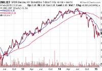
There is little doubt that the appeal of traditional safer havens is on the rise. What may be worthy of debate is whether or not stock assets will find their footing. Whether it is risk aversion, relative value or limited supply, the only thing that will dampen my enthusiasm for treasuries would be remarkable evidence of a worldwide turnaround in growth. The case for investing in riskier assets has often been described as a sensible quest for yield and/or capital appreciation in a world with ultra-low interest rates. That helps to explain why the S&P 500 has defied the odds with respect to corrective activity, garnering double-digit percentage gains in 2012, 2013 and 2014. Yet the preference for risk averse treasuries over higher-yielding debt since July of last year puts a dent in the notion that speculation is still in vogue; rather, investors have been balking at funds like the SPDR Barclays Capital High Yield Bond ETF (NYSEARCA: JNK ) in favor of safer bond funds with similar average maturity data such as the iShares 7-10 Year Treasury Bond ETF (NYSEARCA: IEF ). Note the indisputable shift towards safety that the JNK:IEF price ratio depicts. Of course, there are other ways to interpret widening credit spreads between high yield and U.S. sovereign debt. Struggling oil companies may represent as much as 20 percentage points of junk bond proxies. And, since one cannot sell a fraction of an ETF, investors may feel forced to liquidate baskets in their entirety. There’s some truth in that. What’s more, there is truth in the notion that the popularity of longer-maturity Treasury ETFs – IEF, the iShares 10-20 Year Treasury Bond ETF (NYSEARCA: TLH ), the Vanguard Extended Duration Treasury ETF (NYSEARCA: EDV ), the PIMCO 25+ Year Zero Coupon U.S. Treasury Index ETF (NYSEARCA: ZROZ ) – is a function of relative value ; indeed, foreign money may prefer 1.7% from a 10-year U.S. treasury to a 10-year German bund yielding 0.3%. On the other hand, this downplays the notion that risk aversion has been gaining momentum. For instance, nearly every component of the FTSE Custom Multi-Asset Stock Hedge Index has gained ground since the Federal Reserve ended its QE3 program at the tail end of October, while U.S. stock assets have been relatively flat amid increasing intra-day volatility. What’s more, ETFScreen.com shows the relative strength factor (Rsf) for all ETFs as they change each week across a three-month span. This helps investors get a feel for potential momentum changes in the ETF universe. Risk Aversion Gains Momentum And Risk Taking Loses It Risk (U.S. Stocks and High Yield Bond) 5-Nov 3-Feb SPDR S&P 500 Trust ETF (NYSEARCA: SPY ) 83.5 73.0 iShares Russell 2000 ETF (NYSEARCA: IWM ) 65.5 62.3 JNK 46.7 41.9 Multi-Asset Stock Hedge Components PowerShares DB USD Bull ETF (NYSEARCA: UUP ) 72.1 88.6 iShares 10-20 Year Treasury Bond ETF ( TLH ) 60.6 82.9 SPDR Gold Trust ETF (NYSEARCA: GLD ) 10.8 47.7 In sum, there is little doubt that the appeal of traditional safer havens is on the rise. What may be worthy of debate is whether or not stock assets will find their footing. For what it is worth, I have not given up on them. I continue to favor those ETF assets that should benefit from deflationary global pressures, worldwide stimulus measures and a belief that the Federal Reserve will ultimately push off a token rate hike into Q4 of 2015. Germany should benefit more for the European Central Bank’s QE than the rest of its euro-zone partners. It should also benefit more than the other members from the euro-dollar’s depreciation, as it is the largest exporter to countries outside of Europe. I am favoring the iShares Currency Hedged MSCI Germany ETF (NYSEARCA: HEWG ). The gains have been substantial over a three-month period where mainstay U.S. benchmarks have floundered. By the same token, as I have done for nearly fourteen months, I continue to add to long-duration treasury funds like TLH and EDV, particularly on pullbacks to the 50-day moving average. Whether it is risk aversion, relative value or limited supply, the only thing that will dampen my enthusiasm for treasuries would be remarkable evidence of a worldwide turnaround in growth. For now, however, global growth appears more likely to weaken further. Click here for Gary’s latest podcast. Disclosure: Gary Gordon, MS, CFP is the president of Pacific Park Financial, Inc., a Registered Investment Adviser with the SEC. Gary Gordon, Pacific Park Financial, Inc, and/or its clients may hold positions in the ETFs, mutual funds, and/or any investment asset mentioned above. The commentary does not constitute individualized investment advice. The opinions offered herein are not personalized recommendations to buy, sell or hold securities. At times, issuers of exchange-traded products compensate Pacific Park Financial, Inc. or its subsidiaries for advertising at the ETF Expert web site. ETF Expert content is created independently of any advertising relationships.

Why I’m Buying Gilead And Selling Celgene

Summary Gilead appears very cheap compared to Celgene. In this article I compare growth expectations to valuation for the two companies. I think that a “pair trade” long Gilead and short Celgene makes sense at this time. Today I am starting a new mock portfolio on Seeking Alpha: the Pairs Trade Portfolio. Every transaction made in the portfolio will be a pair of trades of equal value (as close to $20,000 for each stock as can be), one long trade and one short trade. I plan on adding to this portfolio – and readjusting as necessary – over the next months and years and it will probably end up being a rather large study. The first trade is to go long Gilead (NASDAQ: GILD ) and short Celgene (NASDAQ: CELG ). My apologies for the length and description of this article. As it is the first in the series I will define and describe the strategy of pairs trading in detail here and refer to this page in future articles. Those readers familiar with the concept can skip over the next part and begin reading at the “Gilead vs. Celgene” section below. What is a “pair trade” and why would an investor want to do it? Pairs trading takes two highly correlated investment instruments and essentially pits them against each other. What stock will do better, Lowe’s or Home Depot? Pfizer or Merck? The investor goes long on the stock he/she thinks is undervalued relative to the overvalued one. The (relatively) overvalued one gets shorted. The investor is thus hedging bets and isolating a trade that only takes into account the relative value between two stocks. The strategy is often thought of as a very technical, statistics-driven exercise in which an outperforming stock is always shorted and the underperforming one is always the long. “Reversion to the mean” is counted on to make money in the pair trade. However, I feel that approach is short-sighted and I won’t be a slave to it. There are countless examples of stocks that outperform others consistently despite a high degree of correlation in the short term. Those are cases in which a pair trade with the underperforming stock as the long should be avoided. The motivation for making a pair trade is largely due to the fact that the strategy is a market-neutral hedge. It does not matter if the overall market crashes or zooms to new heights; the investor makes money if and only if the long stock pick outperforms the short stock pick. For example, let’s assume we set up a pair trade that is long Gilead at $100 per share and short Celgene at $120 per share and a market crash hits us in 2014. At the end of 2014, Gilead sits at $60 per share and Celgene goes to $60 as well. If the original position was $20,000 in each stock, then our pair trading investor has made $2,000 during 2014 (long GILD loses $8,000, short CELG gains $10,000) – a gain of 5% overall. Pairs trading is potentially a great defensive strategy. The market-neutral aspect of it makes it something to consider when it appears that stocks are overvalued in general. Pairs trading protects the investor from high valuations. Here’s a simplistic example: an investor believes that company A is a great company in a great industry. He/she really wants to invest in company A but the market is in the stratosphere and A sports a P/E of 70 – the risk seems to outweigh the reward. But he/she sees that company B, which has similar prospects to company A has a P/E of 110. The investor can go ahead and invest in company A as a pair trade with B and those P/E ratios might as well be 7 and 11, or 700 and 1100 for that matter. Recently I hear a lot of statements like “there’s nothing to buy”, “money has to be invested somewhere”, or “I’m afraid of valuations, but I don’t know what else to do but buy and hold.” At this point in time, I feel that every investor should consider any and every conservative strategy available. In my opinion, the US markets are in for a correction and I have written about the macro outlook a couple of times recently: One could think of a pairs trade strategy as another “what to do” when a bear market looks likely. Gilead vs. Celgene Both Gilead and Celgene are large biotech companies (market caps of about $157 billion and $96 billion respectively) and therefore it is not surprising that the correlation between the stock prices of the two companies was high during the past year: GILD data by YCharts A major divergence occurred recently – in early November – when Gilead started drifting lower/sideways while Celgene powered higher. On December 22, GILD took a fairly large plunge when Express Scripts (NASDAQ: ESRX ) announced that it would exclusively cover the AbbVie (NYSE: ABBV ) hep C drug. The question is, does that divergence mean that Gilead is undervalued compared to Celgene? The above chart suggests that might be the case and a further look is in order. I think that GILD is a better buy than CELG and the next sections will cover the growth prospects and valuation comparisons. Growth for Gilead The average analyst estimate for sales growth in 2015 is 17.8%. A quick look at where that growth will come from is in order to see if it makes sense. Estimates for worldwide growth in Sovaldi/Harvoni sales in 2015 are all over the map and while it is certainly difficult to guess where that will land, I’d say a conservative estimate is for 5% growth in sales. I’ve seen estimates from -5% to 30% growth. Sovaldi/Harvoni will likely account for more than half of Gilead’s total sales in 2015, but other drugs are growing fast and becoming more important for the company. In a previous article about Gilead, I noted that: According to Thomson Reuters, sales of idelalisib [Zydelig] are forecast to exceed $1 billion by 2017, with consensus sales forecasts of $1.218 billion that year. Zydelig began sales last quarter and it will be interesting to see how well it did in Q4 2014. It should add somewhere between $500 million to $700 million in 2015. In my article referenced above, I also singled out Stribild and noted that it was expected to see sales of over $2 billion in 2016. In 2014, it should easily clear the $1 billion mark. Like Zydelig, Stribild should also add a considerable amount to the top line. My estimate is an additional $700 to $900 million in 2015 sales. Complera/Eviplera is another in Gilead’s best-in-class HIV stable of drugs that is growing fast. In the first nine months of 2014, sales grew over 60% year to year and will eclipse the $1 billion mark for all of 2014. I expect it to add $500 to $600 million in sales to 2015 figures. A look at Gilead’s most recent 10-Q (see part 13. Segment Information) shows that the other drugs will likely be slightly up or slightly down. Add in any new approvals and there should be slight growth in the “other” category of those products that I did not mention above. Adding everything up (and making some assumptions for Q4 2014) puts my rather conservative 2015 revenue growth at about 12% – 14%. So by my back-of-the-envelope reckoning, the analyst expectations for 17.8% revenue growth look reasonable to me. Growth for Celgene Celgene’s growth is much easier to estimate as the company just gave guidance yesterday. Management expects 2015 revenue to grow 22.3% over 2014. Analyst estimates show a number of 21%, so it looks safe to assume something in the low 20s. Valuation I have recently written about Celgene’s GAAP and non-GAAP reporting in an article titled ” Celgene: Could You Be More Like Gilead, Please? ” and because I believe that the non-GAAP numbers inflate EPS, I will use GAAP figures for the P/E calculations below. Gilead should report EPS of about $7.25 for 2014. At a current stock price of $104.80, that equates to a P/E of 14.5. Celgene has reported EPS of $2.39 for 2014. At a current stock price of $119.16, that equates to a P/E of 49.9. Let’s take a look at cash generation: GILD Cash from Operations (TTM) data by YCharts Gilead’s market cap is about 60% higher than Celgene. However, it generates more than 300% cash than Celgene. The above chart shows the trailing 12 months, so once Gilead’s Q4 results are put into it, the figure will likely be something like 400% more cash from operations. Finally, a look at revenue: GILD Revenue (TTM) data by YCharts Again, Gilead’s soon-to-be-released Q4 results are not included. Once they are, the TTM sales number should be around $23 billion, or 200% higher than Celgene. Conclusion When we look at sales, earnings, and cash flow, we can see that Gilead is at a level anywhere from two to four times higher than Celgene. And yet the market cap of Gilead is only 60% higher than Celgene. 2015 growth estimates favor Celgene by 22.3% to 17.8%. Gilead’s incredible growth in 2014 will plateau and we will see good – but not exceptional – growth in 2015. For that reason, Celgene clearly does deserve a higher multiple, but not a multiple that is more than three times that of Gilead. I expect to see the difference in multiples between the two stocks narrow, thus favoring GILD in a pair trade. The Portfolio So here is what the mock portfolio looks like so far after executing the first pair trade: (click to enlarge) Not terribly exciting yet, but there will be more to come. Be sure to click “follow” if you would like to get real-time alerts on my future articles. Disclosure: The author is long GILD. (More…) The author wrote this article themselves, and it expresses their own opinions. The author is not receiving compensation for it (other than from Seeking Alpha). The author has no business relationship with any company whose stock is mentioned in this article.