Tag Archives: seeking-alpha

Vanguard Extended Market Index ETF Analysis

We love the Vanguard S&P 500 ETF (NYSEARCA: VOO ). We have had this index in our portfolios for decades. The Vanguard Extended Market Index ETF (NYSEARCA: VXF ) is the mate to the Vanguard S&P 500 Index. They are a pair, and we recommend taking them together. The Vanguard Extended Markets ETF follows the S&P Completion Index. To understand this index you must first understand the S&P Total Market Index. This is a comprehensive US market index that includes large, mid, small and micro cap stocks. Take the S&P 500 stocks out of the S&P Total Market Index and you end up with the S&P Completion Index. This is why they are a pair that should not be separated. The S&P Completion Index holds all of the other mid, small and micro cap stocks not included in the S&P 500 Index. Our database of 1,500+ ETFs does not show any ETFs that replicate the S&P Total Market Index. Even if there were a great ETF available, we would still buy the Vanguard S&P 500 ETF combined with the Vanguard Extended Markets ETF. These two ETFs move at different rates, and since we apply Opportunistic Rebalancing to our portfolios, we have found rebalancing benefits from buying these two ETFs. The Vanguard Extended Market ETF has a low internal fee of 0.14 percent. Even better, as discussed in the previous spotlight, the actual total holding costs have been lower at 0.11 percent over the past 12 months. Put these costs into perspective. The average mutual funds charge 1.27 percent and the average ETF charges 0.61 percent. Vanguard is able to achieve the lowest total costs in the business because they are formed like a credit union instead of a bank. Vanguard is owned by the funds themselves and, as a result, is owned by investors in the funds. This is why Vanguard rebates all of the income from lending securities while most companies rebate a much smaller share. There’s a reason turtle doves come in pairs in “The Twelve Days of Christmas.” Much like the turtle dove, if you are going to use the Vanguard S&P 500 ETF, then consider combining this great holding with the Vanguard Extended Market ETF. Share this article with a colleague

Eureka! A Valuation-Based Asset Allocation Strategy That Might Work

By Wesley R. Gray, Ph.D. We’ve had a few posts showing that asset allocation systems relying on market valuation indicators (e.g., Shiller CAPE ratios) as a timing signal may end up in disappointment… Nonetheless, we’ve continued on the quest to improve tactical asset allocation using market valuation data. The data speaks clearly when it comes to the association between valuations and long-term realized returns – high valuations are associated with low long-term realized returns. However, as Michael Kitces highlights, tactically allocating using valuation information is challenging . Moreover, there are arguments that the association between CAPE and LT returns may be more complex than was previously thought. In short, valuation-based asset allocation strategies haven’t been that exciting, but… The folks at Gestaltu inspired us with a unique twist on basic valuation-based timing methodologies: … we chose the cyclically adjusted earnings yield as the valuation metric, which is just the reciprocal of the Shiller PE. We then adjusted the yield value for the realized year-over-year inflation rate to find the real earnings yield. Finally, we used an ‘expanding window’ approach to find the percentile rank of the real earnings yield to eliminate as much lookahead bias as possible. Note that because we are using real earnings yield rather than nominal earnings yield, markets can get cheap or expensive in three ways: changes in inflation changes in earnings changes in price Gestaltu’s post used 1/CAPE as the valuation metric, or the “earnings yield,” as a baseline indicator; however, they “adjusted the yield value for the realized year-over-year (yoy) inflation rate” by subtracting the year-over-year inflation rate from the rate of 1/CAPE. To summarize, the metric looks as follows if the CAPE ratio is 20 and realized inflation (Inf) is 3%: Real Yield Spread Metric = (1/20)-3% = 2% Fairly simple. Strategy Background: We performed our own replication of the first two strategies from the post: Average Valuation-based asset allocation: Own S&P 500 when valuation < long-term average, otherwise hold cash. In other words, if last month's CAPE valuation is in the 50 percentile or higher, buy U.S. Treasury bills (Rf); otherwise stay in the market. 80th Percentile Valuation-based asset allocation: Own S&P 500 when valuation < 80th percentile, otherwise hold cash. In other words, if last month's CAPE valuation is in the 80 percentile or higher, buy U.S. Treasury bills (Rf); otherwise stay in the market. Some adjustments are applied in the replication: The Bureau of Labor Statistics (BLS) publishes the CPI on a monthly basis since 1913; however, the data is one-month lagged (possibly longer). For example, the CPI for January won't be released until February. So, when we subtract the year-over-year inflation rate from the rate of 1/CAPE, we do a 1-month lag to avoid look-ahead bias. We use the S&P 500 Total Return index as a buy-and-hold benchmark. Our back test period is from 1/1/1934 to 12/31/2014, while the article looks over the period from 1/1/1934 to 12/31/2012. The results are gross of any fees. All returns are total returns and include the reinvestment of distributions (e.g., dividends). Indexes are unmanaged, do not reflect management or trading fees, and one cannot invest directly in an index. Our Replication Results The first table shows the results from the Gestaltu post: The results are hypothetical, are NOT an indicator of future results, and do NOT represent returns that any investor actually attained. Indexes are unmanaged, do not reflect management or trading fees, and one cannot invest directly in an index. Additional information regarding the construction of these results is available upon request. Our backtest results show similar CAGRs, but higher volatilities than the results from Gestaltu. This could be due to changes in experiment design. Overall, the "Abs Return 80%" strategy outperforms buy-and-hold, while the "Abs Return 50%" strategy underperforms buy-and-hold. We include a long-term moving average rule for reference (S&P 500 if above the 12-month MA, risk-free if below the 12-month MA). Summary statistics are below: (click to enlarge) The results are hypothetical, are NOT an indicator of future results, and do NOT represent returns that any investor actually attained. Indexes are unmanaged, do not reflect management or trading fees, and one cannot invest directly in an index. Additional information regarding the construction of these results is available upon request. Bottom line: The system looks promising. Robustness Tests: Adjusting the Starting Point for the Look-Back Window Gestaltu set 1/1/1924 as the starting date, and then uses an expanding window as the look-back period. We investigate how changing the start date affects the results. The results shown are from 1/1/1934 to 12/31/2014. The table below shows the results of the "Abs Return 80%" strategy using different starting dates for the expanding window: 1924, 1900, and 1881. The starting date for the expanding window calculation can create marginal differences in the results. For example, the Sharpe ratios vary from 0.57 to 0.63. Overall, the results appear robust to the expanding look-back window start date. (click to enlarge) The results are hypothetical, are NOT an indicator of future results, and do NOT represent returns that any investor actually attained. Indexes are unmanaged, do not reflect management or trading fees, and one cannot invest directly in an index. Additional information regarding the construction of these results is available upon request. Bottom line: The system looks promising. Robustness Tests: Rolling Look-Back Window In this section, we try a 10-year rolling look-back period calculation. For example, we measure the percent rank of CAPE on 12/31/2014 relative to the past 10 years (12/31/2004 to 12/31/2014); while an expanding window (results already shown above) would measure the percent rank of CAPE on 12/31/2014 relative to the whole time period (from the start date to 12/31/2014). The results below highlight that a rolling-window technique yields similar results to the expanding-window technique. (click to enlarge) The results are hypothetical, are NOT an indicator of future results, and do NOT represent returns that any investor actually attained. Indexes are unmanaged, do not reflect management or trading fees, and one cannot invest directly in an index. Additional information regarding the construction of these results is available upon request. Bottom line: The system looks promising. Robustness Tests: Inflation-Adjusted P/E Ratio In this section, we use the old-fashioned price-to-earnings ratio in place of the CAPE ratio. We use a rolling 10-year window look-back method and adjust inflation with a 1-month lag. Full Sample Results: 1/1/1934 to 12/31/2014 Inflation-adjusted P/E strategies work better than simple Moving Average rules and buy-and-hold. They also work better than CAPE-based strategies. (click to enlarge) The results are hypothetical, are NOT an indicator of future results, and do NOT represent returns that any investor actually attained. Indexes are unmanaged, do not reflect management or trading fees, and one cannot invest directly in an index. Additional information regarding the construction of these results is available upon request. Bottom line: The system looks promising. First-Half Results: 1/1/1934 to 12/31/1974 Inflation-adjusted P/E strategies work well in the first half. (click to enlarge) The results are hypothetical, are NOT an indicator of future results, and do NOT represent returns that any investor actually attained. Indexes are unmanaged, do not reflect management or trading fees, and one cannot invest directly in an index. Additional information regarding the construction of these results is available upon request. Bottom line: The system looks promising. Second-Half Results: 1/1/1975 to 12/31/2014 Inflation-adjusted P/E strategies work well in the second half. (click to enlarge) The results are hypothetical, are NOT an indicator of future results, and do NOT represent returns that any investor actually attained. Indexes are unmanaged, do not reflect management or trading fees, and one cannot invest directly in an index. Additional information regarding the construction of these results is available upon request. Bottom line: The system looks promising. Robustness Tests: Different Thresholds In this section, we look at different percentile thresholds to determine the timing signal. For example, the results are strong when the timing signal is based on the average or the 80th percentile, but what happens if we use different signals? We use a rolling 10-year window look-back method and adjust inflation with a 1-month lag. Full Sample: 1/1/1934 to 12/31/2014 Higher thresholds increase maximum drawdowns (relative to lower thresholds, such as the 50th and 80th percentiles). The results are better than pure buy-and-hold, but this does highlight a potential robustness issue. (click to enlarge) The results are hypothetical, are NOT an indicator of future results, and do NOT represent returns that any investor actually attained. Indexes are unmanaged, do not reflect management or trading fees, and one cannot invest directly in an index. Additional information regarding the construction of these results is available upon request. Bottom line: The system may have robustness issues. Robustness Tests: Staggered Allocations In this robustness test, we vary holding percentages based on the percentile rank of earnings yield - realized inflation. For example, if last month's E/P - CPI is in the 12th percentile based on the past, then we allocate 12% to stock and 88% to T-bills. We use a rolling 10-year window look-back method and adjust inflation with a 1-month lag. Full Sample: 1/1/1934 to 12/31/2014 Staggered allocations strategies are better than buy-and-hold. (click to enlarge) The results are hypothetical, are NOT an indicator of future results, and do NOT represent returns that any investor actually attained. Indexes are unmanaged, do not reflect management or trading fees, and one cannot invest directly in an index. Additional information regarding the construction of these results is available upon request. Bottom line: The system looks promising. Robustness Tests: Changing the Real Inflation Component of the Signal In the post, " Market Valuations based on CAPE - A Deeper Dive ", we take the 1/CAPE and subtract the inflation adjusted 10-year U.S. Treasury yield, so that we can examine how expensive the market is relative to real returns available via a bond alternative (a stock investor would prefer a higher spread, all else being equal). To summarize, the metric looks as follows if the CAPE ratio is 20, realized inflation (Inf) is 3%, and the 10-Year Treasury is 5%: Real 10-Year Spread Metric = (1/20)-(5-3)% ~ 3% Full Sample: 1/1/1934 to 12/31/2014 This new measure doesn't work - at all. Understanding why a seemingly small change in technique destroys the results is puzzling and worthy of more investigation... (click to enlarge) The results are hypothetical, and are NOT an indicator of future results, and do NOT represent returns that any investor actually attained. Indexes are unmanaged, do not reflect management or trading fees, and one cannot invest directly in an index. Additional information regarding the construction of these results is available upon request. Bottom line: The system may have robustness issues. Conclusion After enduring years of frustration trying to identify a valuation-based asset allocation technique - that actually worked - I think the team at Gestaltu is on to an interesting concept. By simply looking at real spreads between equity valuations and realized inflation (high spreads are good for equity; low spreads are bad for equity), one can devise a timing rule that captures most of the upside, but protects on the downside. Of course, this is all historical data and could very well be an exercise in data mining. That said, the concept of buying equity assets when they have much higher yields than current inflation is intuitively appealing. We'll continue our investigations into the subject, but we wanted to give a quick view into some of our high-level research on the subject. Original Post

3 Top REIT ETFs Battle It Out, With Some Surprising Results

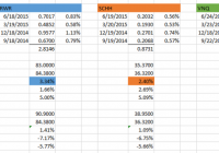
Summary REITs can enhance your core portfolio by helping you diversify into an added asset class. In this article, we will examine three worthy competitors, examining both their similarities and differences. Along the way, the author will have a preconceived notion disturbed, and discover some surprises with respect to recent performance. Now that I have spent a little time covering some basic core ETFs with which to build a simple, though well-diversified, portfolio , I thought I would branch out into an asset class that you may wish to consider as an added component. That asset class is REITS. For a little background on REITS, as well as a link to further reading if desired, feel free to check out this article on my personal blog. Presenting The Competitors In doing some research in preparation for this article, I consistently encountered information featuring three ETFs as preeminent contenders in this space; the Vanguard REIT Index ETF (NYSEARCA: VNQ ), the SPDR Dow Jones REIT ETF (NYSEARCA: RWR ), and the Schwab U.S. REIT ETF (NYSEARCA: SCHH ). I listed them in the order I did based on some commonalities I encountered in my research. VNQ is often described as sort of the pre-eminent player in the field, the “big daddy” if you will. With an inception date of 9/23/04, 145 REITs in the portfolio, $23.7 billion in Assets Under Management (AUM) , a low .12% expense ratio, and great daily trading volume leading to a wonderful average price spread of .01%, there are many reasons this ETF has been described using terms such as “the king” and “top of the charts.” RWR , in contrast, might be termed the “grand old man.” This venerable ETF is the oldest of the three, with an inception date of 4/23/01. RWR features 94 REITs in its portfolio. It has approximately $3.1 billion in AUM , an expense ratio of .25% and an average price spread of .03%. SCHH might be thought of as the “new, but competitive, kid on the block.” With an inception date of 1/13/11, it has only been around a little over 4 years. It features 95 REITs in its portfolio. It is also the smallest of the three, with $1.3 billion in AUM . Due to its smaller size and lower daily volume, it has a price spread of .05%. But here’s the kicker. Though it tracks the same index as RWR, it does so with an incredibly low .07% expense ratio. That’s right, not only does it handily beat out RWR in this area, but it also beats the much larger VNQ! Similarities and Differences As you might quickly gather, VNQ is the obvious winner in terms of greatest diversification. VNQ tracks the MCSI US Reit Index , which contains 144 constituents, whereas both RWR and SCHH track the Dow Jones U.S. Select REIT Index , which contains 92 constituents. One similarity is that the Top-10 holdings are almost exactly the same in all 3 ETFs; with General Growth Properties (NYSE: GGP ) just slipping out of the 10th spot in VNQ, replaced by Vornado Realty (NYSE: VNO ). However, here are two data points that highlight VNQ’s greater diversification. Simon Property Group (NYSE: SPG ) is the top-weighted holding in each ETF. However, while it comprises 9.83% of both RWR and SCHH, it only comprises 8.39% of VNQ. Clearly, how SPG performs will have a greater effect on RWR and SCHH. As of the latest published data, the total weight of the Top-10 holdings in RWR and SCHH is 44.63% and 44.61%, respectively. In contrast the total weight of the Top-10 holdings in VNQ is a lower 36.4%. In terms of sectors, all three track fairly closely, with a slightly higher percentage of residential REITs being featured in RWR and SCHH; approximately 20.2% vs. 17.3% in VNQ. This is offset by a slightly higher weighting in specialized REITs in the index tracked by VNQ. Recent Performance – And A Few Surprises To be honest, I came into this evaluation with somewhat of a preconceived notion. Perhaps you are already sensing it, from what you read above? I sort of felt like VNQ was going to be the runaway winner. I mean, its size, better diversification (including smaller REITs), great expense ratio, what could be better? The fact that I own VNQ in my own portfolio perhaps contributed to my viewpoint (bias?) as well. But then I started to dig into some numbers over the past year. I looked at the dividend distributions for each fund and compared them against the respective share prices. Something interesting leaped out at me right off the bat. Have a look at the picture below: (click to enlarge) First of all, you might note that VNQ (highlighted in green) is the winner as far as dividend distributions over the past year, at 4.08%. “Yep, pretty much confirms that VNQ is the king,” I proudly thought to myself. But then something caught my attention with respect to RWR (in blue) and SCHH (in brown). Both ETFs track the same index, yet RWR returned almost a full percentage point more in dividend distributions! How could that be? I next started wondering how the comparative share prices had performed over that period? In other words, was there a greater increase in the share price of SCHH that would offset the higher dividend paid by RWR? And that’s when the surprises started. Have a look at this 1-year chart: RWR data by YCharts The first item that jumped out at me was that SCHH’s share price had appreciated by 2.69% over that year, compared to 1.66% for RWR. Not only did that offset the larger dividend, in terms of total return it meant that SCHH outperformed RWR, 5.09% to 5.00% (you can see that back on the spreadsheet). That didn’t necessarily surprise me so much, as SCHH carries a lower expense ratio. You’re probably already noticing the second surprise, aren’t you? VNQ’s share price performance substantially trailed the other two; losing .20% over the period. Surely the greater dividend compensated for this? Sorry, it didn’t. To my great surprise, VNQ came in dead last in terms of total return. “Perhaps,” I thought, “this was just an aberration, something about the timing.” So I ran the same chart, but YTD through June 30. Here it is: RWR data by YCharts The first thing you will likely note is that the entire REIT sector took a pretty big hit between approximately February and June. The second thing you might note, though, is that the order of performance is the same. SCHH actually performed the best (in this case, losing the least), followed by RWR, with VNQ once again bringing up the rear. Have another look back at the spreadsheet. Even with its larger Q1 and Q2 distributions, VNQ still trails the pack in total YTD return. OK, last picture, I promise. The REIT sector has actually staged a nice comeback in July, so I thought I would see how this has played out for our 3 competitors: RWR data by YCharts Interestingly, this time the order is precisely reversed. VNQ is the strongest, with RWR in the middle and SCHH bringing up the rear. Summary & Conclusion Along the way, this became quite the interesting exercise for me, and reminded me to take nothing for granted, but instead to dig into the numbers, ask questions about details that did not appear to make sense, and follow the trail wherever it lead. At the end of the day, I’m going to call this one a tie between VNQ and SCHH. Ironically, during this latest downturn, it would appear that the smaller REITs in VNQ’s portfolio actually hurt its performance. Still, I like VNQ’s extra diversification, size and tradeability, low .12% expense ratio, and lengthy track record. At the same time, SCHH is a worthy competitor. Though not having as extensive a track record, it sure appears that Charles Schwab has succeeded in offering a quality, competitive ETF in the REIT space. That low .07% expense ratio is not to be ignored, particularly if one is a long-term investor and the slightly higher price spread is not a concern for you. And, with 95 REITs in the portfolio, it certainly offers solid diversification. RWR comes in last in my view simply because it appears clear that SCHH’s lower expense ratio is giving it a slight edge in performance. Still, if one currently holds RWR, I don’t see any particular need to sell it in favor of either VNQ or SCHH, particularly if this would create a tax impact due to unrealized gains. One last thing, if at all possible it is preferable to hold REITs in tax-deferred accounts. Since REITs receive preferred tax status as entities, their dividends are deemed non-qualified to the investor, meaning they do not benefit from the lower “qualified” dividend tax rate granted to firms that are double-taxed. As an investor, this means that you would pay tax at your highest marginal tax rate . Disclosure: I am/we are long VNQ. (More…) I wrote this article myself, and it expresses my own opinions. I am not receiving compensation for it (other than from Seeking Alpha). I have no business relationship with any company whose stock is mentioned in this article. Additional disclosure: I am not a registered investment advisor or broker/dealer. Readers are advised that the material contained herein should be used solely for informational purposes, and to consult with their personal tax or financial advisors as to its applicability to their circumstances. Investing involves risk, including the loss of principal.