Tag Archives: portfolio

GURU And ALFA: Are Hedge Fund ETFs Worth Your While?
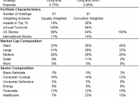
Summary There has been a great deal of interest in ‘hedge fund cloning’ ETFs of late. Despite exhibiting decent performance, a closer look reveals a different story. We remain skeptical of their alpha potential, after a detailed analysis of their track record. There has been significant interest in recent years in “cloning” the equity investment ideas of hedge funds, leading to the launch of several ETFs and indices that track their stock picks. In this article we provide an assessment of the two longest running ETFs, the Global X Guru Index ETF (NYSEARCA: GURU ) and the AlphaClone Alternative Alpha ETF (NYSEARCA: ALFA ). GURU and ALFA At a Glance Despite both being “copy-cat” funds, GURU and ALFA are actually two quite different propositions. Key Features From an investment strategy perspective, the GURU is designed to be 100% long, while the ALFA has the flexibility to go short by 50% subject to market technicals. In other words, one is a long-only equity fund, while the other aims to mimic long/short equity hedge funds by altering its market exposure over time. Due to its hedging ability, the ALFA appears to charge more for this feature, with the expense ratio close to 1%. Portfolio Characteristics A key difference between the two ETFs is their stock weighting methodology. GURU weights its positions equally, and has fewer positions in total. The ALFA applies variable weighting, with higher weights assigned to higher conviction names based on a proprietary scoring methodology. It is more concentrated than GURU in the top holdings, but has a long tail of smaller positions. It is difficult to say which method is more effective, only time will tell. Both portfolios comprise mainly of U.S. stocks, which is intuitive as hedge funds do not disclose their overseas holdings in 13F filings – unless they are U.S.-listed securities, such as ADRs. In terms of portfolio churn, both ETF portfolios have fairly high turnover ratios. For GURU, this is at a staggering 128%. We believe a high turnover is only justified if it results in superior performance, otherwise it typically cranks up excessive trading costs and impacts long-term returns. Portfolio Composition According to Morningstar classifications, both ETFs have a pronounced mid/small-cap bias, as evidenced by their high allocation to SMID cap stocks. The ALFA has a more aggressive tilt than the GURU. From a sector perspective, we would note the high allocation to the tech sector of both funds, although it is not too far from market index weights, as defined by the Russell 1000 Index. Performance Benchmark As both ETFs are essentially U.S. equity funds and exhibit a mid-cap orientation, we believe the Russell 1000 Index (“R1000”) is an appropriate performance yardstick. The Vanguard Russell 1000 ETF (NASDAQ: VONE ) tracks this benchmark and charges a 0.12% fee. Quantitative Analysis – Last 31 Months (1 Jul 2012 – 31 Jan 2015) Below is a summary table of key MPT statistics for the past 31 months, based on monthly data. Investment Results Both the GURU and ALFA have done well over the past 31 months (since common inception date), posting modest outperformance versus the Russell 1000 Index. Risk Both ETFs have exhibited higher volatility than the R1000 (as measured by the standard deviation). At ~11%, this is some 30% higher than the market index. From a beta perspective (sensitivity to equity market movements), both are also higher, at 1.20 and 1.08 respectively. Alpha Alpha is a measure of manager skill on a risk-adjusted basis, in other words it reconciles return and volatility to provide an indication of stocking picking skill. After accounting for volatility, the GURU’s alpha is negative, and the ALFA’s is mildly positive. GURU’s outperformance over the R1000 appears to have been achieved with higher risk. At 1.2 beta, it is akin to R1000 running on steroids, but less efficient. To illustrate this point, if we levered the R1000 to a similar level (beta of 1.2x), this would have yielded better returns at lower volatility. Tracking Error GURU and ALFA are both high tracking error products, meaning their performance pattern can diverge significantly from the R1000 from time to time (both positive and negative) — and benchmark-aware investors should be prepared to stomach this performance divergence. Risk Adjusted Returns Both ETFs have posted identical and good risk-adjusted returns in terms of Sharpe Ratio. However, the slightly levered R1000 once again leaves both ETFs in the dust. Taking It All Together Despite outperforming the R1000 Index in the past 31 months, the alpha of these ETFs are not significant (and negative for GURU), after taking into account their volatility. A Longer Term Perspective For better understanding of the performance pattern of these ETFs, we can look at the indices that they track, which has been back-tested over longer periods. However, one must note that these are “back-tests” and must be treated with a degree of caution. After all, a back-tested index must demonstrate favorable results before a ETF provider is willing to wrap it into an investment product. We do not know how conservative the index producers have been with their assumptions, so we will look no further back than the past 60 months (or five years). 60 Month Statistics (1 Feb 2010 – 31 Jan 2015) The longer term stats paint a similar picture. Guru Index Alpha is again negative over the past five years. Its higher return is explained by higher beta. A similar version (1.1x) of the R1000 would have achieved higher returns at lower levels of volatility. AlphaClone Index Alpha is high at 4.6. This number is a result of a) lower volatility than the R1000 and b) similar level of return. Its 60-month beta is 0.66, a third of the market index. This implies that its market hedge mechanism must have kicked in during this 60 month period, which has provided some protection in down months of the R1000. Despite the existence of alpha, we would note the following: In the period since the ALFA ETF has been live, hedging has not been used, as indicated by its beta of 1.1 to the R1000. It would be interesting to see how it works in practice in the future. In absolute return terms, the back-tested performance of ALFA over the past 60 months is still inferior to the R1000 (15.2 vs. 15.8). A skillful equity long/short hedge fund manager would typically be able to capture less downside, but a similar level of upside, resulting in better returns than the market index over time. This indicates that AlphaClone’s market hedge (think of it as the manager’s skill in shorting the market) have not helped drive extra returns over this 60 month period. A Closer Look at Alpha Patterns We believe outperformance from stock selection comes in waves, and is not constant. There will be extended periods when a portfolio performs well, and extended periods less well due to the existence of style biases (i.e. growth, value, size effect etc). These biases can be in, or out of favor with the market from time to time. To assess alpha patterns we look at the rolling 2-year excess returns versus the R1000. Our assessment period is the last 60 months, as above. Interestingly, the Guru Index has been losing altitude of late, with its margin of outperformance vs. the R1000 dropping fast. This points to a deterioration in its stock selection — possibly due to style biases, a decline in the performance of hedge funds they track, the efficacy of their cloning process, or a combination. Meanwhile, the AlphaClone Index has lagged the R1000 for years (on a rolling 2 year basis), before taking a positive turn in late 2013. This is most likely because the index has very much been long-only and not market hedged since then. Tracking Quality One final factor to consider is the quality of index replication. The good news is that both ETFs appeared to have tracked their underlying indices well after fees in real life. The tracking error is marginally higher for the GURU in the past two calendar years, despite having a lower fee than the ALFA. Our Verdict Over the past 31 months, the GURU and ALFA ETFs have performed well in absolute terms, although if one takes a closer look, reveals a different story. For GURU, we are concerned of its high beta, high portfolio turnover, and stock selection efficacy which has been decreasing recently. For ALFA, we are not big fans of its higher fees and market hedge, which has not been tested in real life. As long-term equity investors interested in maximum capital appreciation, we do not believe that market timing adds value. This is confirmed by the ALFA’s subpar returns to the R1000 over the period under review. Based on our analysis, we remain skeptical of both ETFs’ alpha potential. Disclosure: The author has no positions in any stocks mentioned, and no plans to initiate any positions within the next 72 hours. (More…) The author wrote this article themselves, and it expresses their own opinions. The author is not receiving compensation for it (other than from Seeking Alpha). The author has no business relationship with any company whose stock is mentioned in this article. Additional disclosure: For research purposes, Real Return Partners LLP compile the RR Partners AlphaEquity® Index (Bloomberg: RRALPHA). This is a long-only equity index that tracks the performance of a portfolio of 20 US-listed, 13F equity positions representing the best ideas of an elite group of institutional money managers. The Index is independently calculated and is published as a net total return index. There are no investment products linked to this index.
Got DIA? Got DJIA Stocks? Which Is Better?

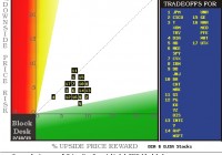
Summary Very few Exchange-Traded Funds get analyzed in detail, down at the individual holdings level. The DIA lends itself to that by its few, prominent components. The diverse nature of the 30 stocks in the DJIA Index, by design, raises the question of how to rate a CAT in comparison to a PG or a MSFT. And who’s doing the rating? What’s their bias? How do they define risk, and how is that balanced against reward? We get the Market-Making [MM] community to tell us daily, how far up and down the prices of the 30 stocks, and the DIA ETF, are likely to go next. Not voluntarily. But MM capital is regularly put at risk, protected by hedging transactions, helping big-$ funds adjust their portfolio holdings. The hedges’ cost and structure provide price range forecasts. Market-Makers never saw a profit they didn’t like or a risk they did Their principal customers, big-money institutional investment funds, work hard constantly, trying to stay employed at sweet-salary jobs by getting the capital in their charge to perform competitively. That takes shuffling around a lot of “chips” on their “poker table”. The size of their bets often stretches the capacity of markets’ ordinary way, every-day trading. To try to get their volume trade orders of 10,000 shares or sometimes millions of shares “filled” without chasing the issue’s price away from what they want to get, they often use trusted investment bank block-trade services. The kinds of stocks in the DJIA Index are just the ones most likely to see this sort of activity, which often dominates their price movement. The block trade house “makes the market” some 95% of the time by putting its own capital at risk temporarily, positioning that stub end of the “other side of the trade” that the other players in the Street will not accommodate right now, at the desired price. But the MM’s risk is always hedged by side bets in derivative securities – at a cost. Because of the cost, such protection is rarely overbought, because the fund originating the block order has to absorb the cost in the single price per share for the entire transaction. When the cost is too high, the fund balks, and the trade proposition is killed, along with its juicy (to the MM) transaction spread. So all the motivations are there to keep that game honest since the sellers of the price change protection insurance are often the proprietary trading desks of other MM firms. They are as equally well-informed on the future prospects of the subject as the house handling the block trade. And the competitive nature of the community is reminiscent of the seagull dock scene in the film “Finding Nemo”. Mine! Mine! Our Behavioral Analysis of the intelligent actions of the market professionals produces for each subject a price range MMs consider worth protecting against, either as a buyer or a seller of the protection. The change from current market quote to the upper end of the range is a forecast of possible, even likely, price gain, or reward. The opposite direction is a forecast of the kind of price drawdown risk that could be encountered. That risk may not have to be accepted and recognized as a loss, if in time the price rises. But the period the investment is “under water” is an emotionally disturbing condition, one that often leads investors to loss-taking to prevent the present from getting worse. Sometimes their fears are justified, and worst-case price drawdowns increase the emotional stress to the breaking point where investors accept what appears to be “inevitable”, but could have been avoided. Knowing what the worst has been and the odds of recovery to a profitable position from there minimizes that mistake. We have an established, Time-Efficient Risk Management Discipline [TERMD] procedure of portfolio management that enables us to evaluate the odds of a subject investment’s recovery from a price drawdown, back to a profitable transaction experience. That procedure, applied to all prior forecasts with upside to downside forecast proportions, usually gives a history from hundreds of actual market experiences. Figure 1 is a reward-to-risk map of the 30 DJIA stocks showing their current hedging-derived upside forecasts (on the green horizontal scale) and their worst-case price drawdowns (on the red vertical scale) following prior forecasts like today’s. Figure 1 (used with permission) The advantage of diversification is apparent in DIA [4], with worst-case price drawdowns no worse than all but one of the 30 stocks – at today’s market quotes and upside forecasts. The cost of that diversification is also apparent in the DIA’s upside prospect now being about +3%, compared to the average of the individual stocks of some +5% higher, around +8%. To get the odds for price recovery and a profitable transaction from today’s market prices, we need to check out column (8) of figure 2, today’s appraisals by MMs for the 30 stocks. Figure 2 (click to enlarge) Whoa! There’s a mess of numbers here. The MMs’ price range forecasts for the 30 stocks are in the first two data columns of Figure 2, followed by their separate forecasts for the SPDR Dow Jones Industrial Average ETF (NYSEARCA: DIA ), and as an additional market average index, the SPDR S&P 500 Trust ETF (NYSEARCA: SPY ). The upside percent price change potential is in (5), and the worst-case prior price drawdowns are in (6). These are the coordinates used in Figure 1. The odds of a price recovery from worst-case price drawdowns are in column (8). For example, down at the bottom of the table are DIA and SPY, which have histories of 111 days and 215 days out of the last 5 years, 1,261 market days, in which 84 or 83 out of every 100 produced a profitable transaction using our standard TERMD portfolio management discipline. That is about 5 out of every 6 trades. The average gain by DIA (column 9) from all 111 such positions was only +1.9%. That compares to Disney (NYSE: DIS ) up near the top of figure 2, with a similar 84/100 odds, but it has an achieved gain of twice that of DIA at +3.8%. Further, it took (column 10) only 29 market days – 6 weeks – to reach its sell targets or 3-month holding time limits while DIA took 35 days, or 7 weeks. For the investor most concerned with safety of principal and averse to investing choices, the difference is trivial, inconsequential. But for the investor attempting to build wealth, the compounding of 3.8% gains more than 8 ½ times a year, compared to 1.9% compounded 7 times makes the difference in investment growth of +38% a year vs. +14% (column 11). We have ranked the 30 stocks held in DIA by their forecast price growth per day held (in prior like forecasts) weighted by their prior odds of profit, net of worst-case losses weighted by their odds of loss, with some other minor adjustments, to get an odds-weighted (reward vs. risk) figure of merit for each of these stocks in (15). It is a useful means of setting preferences between investment alternatives for investors concerned with growing their investment wealth. For those concerned with safety or income, it is far less useful. Comparing (15) data for the top ten such ranked DJIA stocks in the upper blue row so labeled, with the next blue row, averaging all 30, shows that at current market prices the top ten are 9 times (14.8 vs. 1.6) as beneficial to the DIA as the other two-thirds of the holdings. Comparing DIA to SPY finds the broader market average is more than twice as strong by this measure, (6.3 vs. 2.7). That may be a suggestion that the DJIA Index is now higher priced temporarily than the S&P 500. Other comparisons, not shown, lead to the same conclusion. The more interesting comparisons are between the average of nearly 2,500 stocks and ETFs, and the market indexes, DIA and SPY. Upside price change forecasts are twice as large for the population as for SPY and 3+ times as large as for DIA. But history shows them to be far riskier (6) at -9.4% price drawdowns than either ETF. That difference, plus far lower odds of capturing a profit (66 out of 100 in column 8), combine to create a net negative figure of merit in (15). Both ETFs provide the security of positive measures. Conclusion DIA at its current market quote offers investing prospects far less attractive than the principal market-average-tracking alternative SPY. An examination of the DIA holdings individually puts over a third of them in the category of a negative influence on the DJIA Index, and thus on DIA. While the ETFs S&P and DIA do provide safety from large price drawdowns encountered by individual stocks, they may give that reward at a high cost to future wealth growth from selective use of specific index holdings. Disclosure: The author has no positions in any stocks mentioned, and no plans to initiate any positions within the next 72 hours. (More…) The author wrote this article themselves, and it expresses their own opinions. The author is not receiving compensation for it (other than from Seeking Alpha). The author has no business relationship with any company whose stock is mentioned in this article.

3 ETFs Propelled By Japan’s Recession Recovery

Japan has emerged from its recession following good but not great economic data from the last quarter of the year where the economy expanded at an annualized rate of 2.2. Many economists forecasted an expansion of 3.7 percent; however emerging from its recession is undoubtedly a step in the right direction for Japan. The two-year stimulus package currently underway has started to bring life back into a struggling Japanese economy and will likely continue to propel it forward in 2015. By Matthew McCall Japan has emerged from its recession following good but not great economic data from the last quarter of the year where the economy expanded at an annualized rate of 2.2 percent. The gain comes after contracting the two previous quarters, which sent the county into a recession (by definition). Many economists forecasted an expansion of 3.7 percent; however emerging from its recession is undoubtedly a step in the right direction for Japan. Prime Minister Shinzo Abe implemented his ‘Abenomics,’ which has consisted of the Bank of Japan injecting large amounts of money into the economy as well as buying government bonds and other assets to spur spending within the economy. Corporate profits are at record highs and the continued devaluation of the Japanese yen will help the country’s largest manufacturers increase exports. The two-year stimulus package currently underway has started to bring life back into a struggling Japanese economy and will likely continue to propel it forward in 2015. Highlighted below are three ETFs that have been affected by the positive news out of Japan in recent weeks. The iShares MSCI Japan ETF (NYSEARCA: EWJ ) follows 311 publicly-traded Japanese companies across 11 industries. The top sectors consist of consumer discretionary at 23 percent, industrials at 19 percent, and financials also making 19 percent. The top individual holdings include: Toyota Motor Corp (NYSE: TM ) with a 6.6 percent weighting, Mitsubishi Financial Group Inc (NYSE: MTU ) at 2.8 percent, and Softbank Corp ( OTCPK:SFTBY ) coming in at 2.1 percent. The ETF is down up 4 percent over the last 12 months and up 1 percent over the last six months. Since bottoming out in the first week of the New Year it is up almost 11 percent. EWJ has an expense ratio of 0.49 percent. The WisdomTree Japan Hedged Equity ETF (NYSEARCA: DXJ ) consists of 324 Japanese companies as well as 25 short currency contracts on the yen against the U.S. dollar. The strategy eliminates the exposure to fluctuations between the yen and greenback while providing exposure to Japanese equities. The top holdings in the ETF are: TM at 5.7 percent, MTU with a 5 percent holding, and Canon Inc. (NYSE: CAJ ) coming in at 3.8 percent. DXJ is up 10 percent over the last 12 months, and 5 percent over the last six months. Since bottoming out in the first week of January the ETF has rallied 11 percent. The ETF has an expense ratio of 0.48 percent. Investors should be aware that a hedging strategy could be a doubled-edged sword. The ETF will capitalize on both the rising equities and the falling yen in Japan, but on the flip side the ETF will be negatively affected by falling equities and a rising yen. The WisdomTree Japan SmallCap Dividend ETF (NYSEARCA: DFJ ) is made up of 605 small cap Japanese companies across eight sectors; with industrials at 25 percent and consumer discretionary at 24 percent being the most weighted sectors. The top individual holdings include: Kaken Pharmaceuticals Co Ltd with a 0.8 percent holding, Sanrio Co Ltd ( OTCPK:SNROF ) making up 0.7 percent of the ETF, and Nishi-Nippon City Bank Ltd coming in at 0.7 percent as well. DFJ is up 3 percent over the last 12 months and down 4 percent over the last six months. Since early January the ETF has gained 9. The ETF has an expense ratio of 0.58 percent. Disclaimer: Neither Benzinga nor its staff recommend that you buy, sell, or hold any security. We do not offer investment advice, personalized or otherwise. Benzinga recommends that you conduct your own due diligence and consult a certified financial professional for personalized advice about your financial situation. Disclosure: The author has no positions in any stocks mentioned, and no plans to initiate any positions within the next 72 hours. (More…) The author wrote this article themselves, and it expresses their own opinions. The author is not receiving compensation for it. The author has no business relationship with any company whose stock is mentioned in this article.