Tag Archives: nreum

Lipper Closed-End Funds Summary: December 2014

By Tom Roseen In December the U.S. market took investors on a wild ride. Toward month-end the Dow Jones Industrial Average and the S&P 500 Index posted their thirty-eighth and fifty-second record closes for the year, respectively. A strong nonfarm payroll report at the beginning of the month pushed up U.S. equity markets, and the Dow flirted with the 18,000 mark for the first time. However, concerns about the health of the global economy the following week fueled one of the largest one-week drops in two and half years and sent the VIX to its highest level since October 17. Investors shrugged off a better-than-expected consumer sentiment report and focused on volatility in oil prices and the possibility of the global economy succumbing to deflation. Despite a Federal Reserve-fueled Santa Claus rally toward month-end, U.S. stocks finished the good year on a down note, with the Dow witnessing a triple-digit loss on the last trading day of the month. Both equity and fixed income CEFs posted negative NAV-based returns (-1.43% and -0.24% on average, respectively) for the first month in three, while market-based returns were also in the red for both equity CEFs (-2.51%) and fixed income CEFs (-0.02%). Treasury yields declined at all maturities ten-years or greater in December, with the twenty-year yield declining the most, 15 bps to 2.47% at month-end. The rising dollar and slowing growth overseas made U.S. Treasuries more attractive to foreign investors. The Treasury yield curve rose in most of the lower-dated maturities, with the three-year rising the most-22 bps to 1.10%-by month-end. The one-month yield witnessed a small decline, dropping 1 bp to 0.03%. For December the dollar once again gained against the euro (+2.69%), the pound (+0.32%), and the yen (+0.88%). Commodities prices were mixed, with near-month gold prices rising 0.73% to close the month at $1,184.10/ounce. Meanwhile, front-month crude oil prices plunged a whopping 19.60% to close the month at $53.27/barrel. That equated to a quarterly decline of 40.41% and a one-year decline of 45.87%. For the month 47% of all CEFs posted NAV-basis returns in the black, with 33% of equity CEFs and 58% of fixed income CEFs chalking up returns in the plus column. The slide in oil prices and concerns over Greece’s inability to elect a favored presidential candidate, rekindling fears of another European crisis, weighed on Lipper’s World Equity CEFs macro-classification (-2.43%), pushing it to the bottom of the equity CEF universe. On the equity side (for the fourth consecutive month) mixed-asset CEFs (-0.73%) mitigated losses better than the other macro-groups, followed by domestic equity CEFs (-1.15%). Once again, the municipal bond CEFs group (+1.13%) was the only fixed income macro-classification posting a return on the plus-side for the month, with all of its classifications experiencing returns in the black. The muni CEFs group was followed by domestic taxable bond CEFs (-1.47%) and world bond CEFs (-4.17%). For December the median discount of all CEFs widened just 19 bps to 9.28%-deeper than the 12-month moving average discount (8.55%). Equity CEFs’ median discount widened 115 bps to 9.46%, while fixed income CEFs’ median discount narrowed 53 bps to 9.13%. To read the complete Month in Closed-End Funds: December 2014 FundMarket Insight Report, which includes the month’s closed-end fund corporate events, please click here .

Why I’m Not Closing My Position In Columbia Seligman Premium Tech Fund

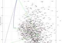
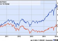
Summary I first noted STK in autumn 2013 when it had a -7.6% discount and a tax-advantaged 12.8% distribution yield. In the time since STK has had excellent performance. It’s moved from discount to premium valuation with a decrease in distribution yield. Is it time to sell? The fund is among the best of the option-income, closed-end funds and remains, in my view, a solid holding. An Update on Columbia Seligman Premium Tech Fund I first opened a position in Columbia Seligman Premium Tech Fund (NYSE: STK ) in September 2013 and wrote about it here in October 2013 . At the time the fund was moving up after mediocre performances in 2011 and 2012. It was paying a 12.8% distribution yield and sported a -7.6% discount. Four months later, after a rough patch at the year’s end, I followed up with a second look at the fund . By that time both discount and yield had given up a bit, and I suggested that the fund was ready to move up. The first chart, which shows market price and total return for the fund’s life, illustrates what happened next. As we see, at the end of 2013 STK began a sharp move up on a market price basis, earning back a good chunk of its losses from the previous years. More telling is the upswing for its total return: Remember it started the year with a distribution yield close to 13%, so distributions added nicely to the already-respectable market-price gain. (click to enlarge) Figure 1 . Market price and total return of STK for the life of the fund. Next. Let’s look at a chart showing the fund’s premium/discount status, especially looking at moves since the time of those articles. I put this at the beginning because it’s important to consider these dynamics in evaluating one’s present position in STK. (click to enlarge) Figure 2 . STK Premium/Discount History. (Source: cefconnect.com ) Note that discount has turned into a premium over the year since I last looked at STK. Premium territory is not a place STK is accustomed to finding itself as Fig. 2 shows, so I’ve begun to ask if it’s time to exit this position. I’m not alone it seems, as I have had inquiries from several readers asking my opinion on holding the fund. Before answering that question (ok, the title is a spoiler, but bear with me) let’s look the fund and how it has performed since I first brought it to your attention. The Fund STK is an unleveraged, technology, closed-end fund with an inception date of 25 November 2009. Its investment objective is to produce income and capital appreciation using a covered-call options strategy in the technology sector, a sector that lends itself especially well to that strategy. The fund maintains a managed distribution policy based on returning a 9.25% rate for IPO investors. In accord with that policy, it has paid $0.4625 quarterly since its inception. The top holdings (from cefconnect.com) are not much different from what they were a year ago: Figure 3 . STK top ten holdings. (Source: Fund Website ) One of the things that attracted me to STK in the first place was the tax status for its distributions. While generating tax-advantaged distributions is not an explicit priority for the fund, managers appear to be factoring this into their decision-making. When it first came to my attention, a large portion of its distribution was return of capital, which is tax-deferred until the fund is sold. I noted last February that I considered this run of RoC likely to end, and that prediction proved correct. May’s quarterly distribution had only $0.06 RoC and the following two quarters had none. The bulk of those distributions have been long-term capital gains, so the distributions remain attractively positioned from a tax perspective. It is sufficiently tax-advantaged (after-tax yield is better than 8.5%) as to be competitive with highly leveraged, long-duration, high-yield, tax-free, muni-bond closed-end funds on an after-tax basis for all but those in the highest marginal brackets. Performance In the next set of charts I’m going to look at performance since I first noted the fund on Seeking Alpha a few weeks after my first purchase. Let’s begin with performance of market and NAV prices. (click to enlarge) Figure 4 . Market and NAV (MUTF: XSTKX ) price performance from October 2013. The market value of STK is up about 30% in this time. Note, however, that NAV has grown only 12%. This differential illustrates one effect of the expansion of the discount to premium valuation the fund has seen over the time course indicated. How does that compare to the fund’s peers. I’ve chosen the NASDAQ index fund, PowerShares QQQ Trust (NASDAQ: QQQ ), and the Technology Select Sector SPDR (NYSEARCA: XLK ) as representative peers. Fig. 5 shows comparisons for price performance. The yellow-brown line is NAV value of STK (ticker XSTKX). (click to enlarge) Figure 5 . Market and NAV price performance for STK compared with QQQ and XLK from October 2013 through 9 Jan 2015. The market price has kept pace with both QQQ and XLK. There is a marked lagging of the peers at the end of 2013, but at today’s market the funds’ performances are essentially identical for the full time frame. Both of these charts track price performance. But, in addition to its gain in price, STK pays that hefty distribution. The yield percentage varied from 12.8% in October 2013 to 10.2% at today’s market price. If we factor those distributions into the results, a quite different picture emerges. The colors make it hard to sort QQQ and XLK; QQQ is the 34.65% line and XLK is the 31.72% line. (click to enlarge) Figure 6 . Total return from October 2013 for STK (market), QQQ, XLK. As we see, STK has been a standout for the time under consideration. One would have to look long and hard to find another technology fund that turned in as impressive a performance for these 15 months. After that stutter-step at the close of 2013 — a year-end dip that is all-too-common for closed-end funds — STK took off and continued to climb with only a brief timeout for the fall mini-correction. Note, too, that unlike last year’s situation, STK closed 2014 with a surge. Clearly, no one was taking year-end tax losses from STK in 2014, although some may have been taking profits after the new year. Outlook for 2015 An interesting aside here is that when I reiterated my confidence in STK in Feb 2014, I did so in the context of considering an uncertain market ahead for the year. I liked the prospects for technology, but I also felt that 2014 was certainly not set to repeat 2013, so I was looking for something a bit more defensive. Option-income funds are widely considered appropriate for such conditions, and I was loading up on option-income CEFs at the change of last year. In many ways, I feel similarly about 2015. I’m not one for making predictions, but I will say that I consider that it’s going to be a bit of a bumpy ride: Once again, conditions that favor option-income strategies over, say, leveraged equity CEFs. From that perspective STK looks like a solid hold. On the other hand, I’m well aware that a fair portion of STK’s 2014 outperformance is attributable to the disappearance of its discount and the expanding premium. Z-scores for 3 mo, 6 mo, and 1 yr are 1.17, 1.74 and 1.96, respectively. This puts numbers on what we see qualitatively in Fig. 1 above: STK’s P/D valuations are well above its means for this metric, nearly two standard deviations ahead for the year. Taking the 6 mo Z-score for a reference, that 1.74 value indicates a valuation that would be expected only about 4% of the time for a normally distributed population. However, a close look at Fig. 2 shows that STK’s premium discount is anything but normally distributed over the recent past. If one considers reversion to the mean to be an important driver in CEF premium/discount status, that could lead to a prediction of a decline in the premium in the coming months. The temptation then is to grab the gain created by the current 6.2% premium and move on. One problem is replacing the income. A distribution yield of 10.2% coupled with a recent history of impressive capital appreciation does not come easily. Several option-income funds gave up some ground at the end of the year (see Stanford Chemist’s thoughts on this subject), so there are possibilities, but few that will return that 10%+ and none with a year like STK’s to boost one’s confidence. The list of candidates that do yield 10%+ yields focus on global equity, a category that I’m inclined to skip at this time. For anyone less averse to increasing global exposure, the list includes Alianz GI NFJ Div Inter & Prem (NYSE: NFJ ), Eaton Vance Global Buy-Write Opps (NYSE: ETW ) (55% USA), and Eaton Vance Tax-Managed Global Fund (NYSE: EXG ). All have distribution yields greater than 10%. Another is Voya Global Advantage and Premium (NYSE: IGA ) which has 40% foreign exposure and weighs in with a yield that’s just a squeak short of 10%. But of the four only IGA was in the green for 2014 and none approached the performance of STK. I’m not looking for 2015 to be a better year for global funds than 2014. I’m much more inclined to look to tech for outperformance again this year. (click to enlarge) Figure 7 . 2014 performance of STK and some comparable global-equity option-income funds. What about the pure domestic-front funds? Eaton Vance Tax-Managed Buy-Write Opps (NYSE: ETV ) is a long-time favorite of mine. It, too, saw a run up of its perennial discount into premium territory. It is now back to a modest discount, is paying 9.3%, and may be ripe for entry. Its sibling fund, Eaton Vance Tax-Managed Dividend Equity (NYSE: ETY ), with a -8.14% discount and 9.0% distribution yield, is another prospect. However, even keeping in mind the lack of predictive value in past performances, the 2014 comparison of these funds with STK is worth pondering. (click to enlarge) Figure 8 . 2014 performance of STK and some comparable domestic-equity option-income funds. I see no good reason to anticipate a change in direction relative to STK by either at this time. Discount/Premium It does seem unlikely that STK will sustain the excellent performance of 2014 going into the near future. The premium valuation is not familiar territory for the fund and one has to wonder how stable that premium will be. But let me argue in favor of the fund retaining a modest premium, or at least not sinking back into a deep discount. This thesis is based on STK’s exceptional distribution yield, which is fixed and stable at its current level. When the fund was underperforming on NAV the yield percentage on NAV increased as the discount grew. But NAV performance has turned around and is only an impediment to investors who place high value on several-years’ old performance records (from comments I’ve received on CEFs, I realize that some do, but I’m not among them). I submit no one should be bearish on STK as long as it is keeping pace with its bogies. Furthermore, with the managed pay-out as high as it is, the NAV is less likely to climb sufficiently to lead to a much decreased yield percentage (notice how flat the NAV price line is in Fig. 4). This matters because CEF investors are primarily attracted to the space for income. There is a clear tendency by investors to price closed-end funds with regard to their market yield (sometimes to a point that investors’ logic becomes difficult to comprehend). Thus as long as NAV performance is reasonable, we should expect the market to continue to price the fund at a level that pays something not far from that 10%. Case in point: When it was paying 12-13% it attracted investors sufficiently to drive it to a premium and take the yield down to near 10%. I would argue that we’re now at equilibrium: as long as the yield percentage does not move much away from that 10%, the premium will not move much either. Thus, with the payout fixed, and no real reason to anticipate a run up of NAV that overwhelms a run up in market price and reduces the yield percentage, I would expect a fairly stable discount/premium at or near its present level. It will wander, of course, but I’m guessing we’ll not see a sharp change unless there is a problem with distribution yield. If it starts to slip, the discount/premium will go down; if it goes up, D/P will rise. Summary STK has been the star performer of the option-income category of closed-end funds. It continues to pay a tax-advantaged distribution in excess of 10%. Nothing at that distribution yield level even comes close to the overall performance of the fund over the past 15 months. Although it currently has a premium valuation, there’s a solid argument for its retaining that valuation for at least the near-term future. More importantly, I do not see an appealing alternative at this time. None of the funds that provide equivalent (and equivalently tax-advantaged) income show any indication that they are set to outperform STK significantly going forward. I think this fact helps contribute to the premium STK now holds. I am, therefore, holding my position in STK. The question for many readers will not be whether or not to hold the fund, but is it a buy?I am currently shopping this space and the only thing that might keep me away from buying more is the premium. I’m generally reluctant to buy any closed-end fund at a premium. In this case I could make an exception, for the reasons I outlined above. If, however, there is some movement away from the current premium, I would be strongly inclined to add to my position. As always, I note that I have no professional expertise on finance or taxation issues. I’m a self-schooled individual investor passing on the results of my research. I make mistakes. My situation is mine alone, and my research if focused on my portfolio and my investing priorities. Anyone who is intrigued by or finds value in my thoughts will certainly want to do his or her own due diligence to determine if my conclusions are appropriate for their unique situations.

What To Find Before Seeking Alpha: Minimum Volatility Domestic Equity Allocation

Summary Minimum volatility strategies have outperformed in the U.S. markets. A minimum volatility portfolio may make a good “skeleton” for a concentrated equity allocation. USMV appears to be a good implementation of the strategy. In my last article , we looked at several types of portfolios for U.S. domestic equity. We saw that broad-based static allocations limit alpha , and tend to track the wider market in terms of returns. Nevertheless, we did see that momentum-value, minimum variance, as well as stock-based portfolio with slack had an edge over the market portfolio (as proxied by the Vanguard Total Stock Market ETF (NYSEARCA: VTI )) in terms of returns, inverse beta, drawdown, and mean-variance efficiency. The minimum variance strategy, as proxied by the iShares MSCI USA Minimum Volatility ETF (NYSEARCA: USMV ), scored especially well. We also saw how some allocation slack in the concentrated stock portfolio allows investors to potentially capture some alpha . In this article, we expand on the minimum variance strategy within the context of U.S. domestic equity, but extend the strategy to small-cap stocks in a more concentrated stock portfolio, which should be more conducive to generating potential alpha whilst maintaining some of the structure of a quantitative strategy. Data and Methods The S&P 1500 stocks were assembled from State Street’s SPDR S&P 500 Trust (NYSEARCA: SPY ), SPDR S&P MidCap 400 Trust (NYSEARCA: MDY ), SPDR S&P 600 Small Cap (NYSEARCA: SLY ) ETFs holdings disclosures. The S&P 1500 was chosen because it’s both familiar and covers most of the market; it also weeds out many less investable parts of the market by using liquidity, float, and financial considerations. The price and return data then were obtained from the data facility of Yahoo! Finance. Only stocks with about 7.5 years of history were retained so as to include the financial crisis in 2008. This full sample requirement was to make the estimates more comparable, and left 1348 equities. The market benchmark portfolio, as proxied by VTI, was calculated for the same period, along with the ETF implementation of the strategy, USMV. The continuous logged total returns for the portfolios are computed from their split and volume-adjusted prices using the quantmod package for R . The dividends are accrued daily over the observed period. The daily return and standard deviation statistics are then made monthly using 21 trading days. The 1-year forward earnings estimates stem from Thomson Reuters fundamentals; a few missing estimates were complemented with either numbers from Yahoo or last year’s earnings. The real risk-free rate is assumed to be 1.62% comparable to some margin rates offered. The data were then imported into MATLAB in order to use the well-documented financial toolbox (The same exercise is possible in R, just much less comfortable). The minimum-variance portfolio from the sample is then computed using quadratic programming, no short-selling, no leverage, and constrained to ensure that no fewer than 10 stocks are chosen. Figure 1 gives an overview of both the assets and the minimum variance portfolio, visible in green at the nadir of the blue radial curve. Green lines emanate from the market portfolio, VTI, to the risk-free rate, minimum variance, and the mean-variance efficient portfolios. (click to enlarge) Figure 1: Risk vs. Return Efficiency Frontier for S&P 1500 Figure 1 reveals that the minimum variance portfolio has vastly outperformed the market in the last 8 years as evidenced by the upward sloping angle that connects its risk/return with that of the market portfolio in the swarm of assets. One might expect that the performance ought to be below that of the market return and above that of the risk-free rate, i.e. somewhere near the lower line segment that connects the risk-free rate with the market return where the equal weighted portfolio now lies (green point). I’m not versed in the financial literature on volatility, but I am skeptical whether such outperformance can continue – my pet theory is that the phenomenon is attributable to an uncompetitive bond market. Central banks have artificially lowered the discount rate by about half since the beginning of this sample period. This would approximately double the discounted present value of the company even with static earnings. Since the market return of 8.4% is essentially in line with historical averages (7-10% depending on the period and methods), I thus also suspect the momentum has drawn in participants from the other more volatile segments of the market. Beyond my empirical musings, many of you are most likely interested in the component stocks. Table 1 compares the holdings of the solution with those of the USMV. Note that the weights do not quite tally to 100% as many of the miniscule positions (i.e. < 0.5%) were omitted. Table 1 shows the weights of the solution compared with the USMV ETF. Table 1: Large/mid-Cap Minimum Volatility Portfolio (S&P1500) Symbol Company Index Index Weight Sector MinVol{SP1500} Weights USMV Weights Ratio of Portfolio Weights FW Earnings Yield JNJ Johnson & Johnson SP500 1.62% Health Care 5.1% 1.4% 3.63 5.8% PEP PepsiCo Inc. SP500 0.79% Consumer Staples 2.8% 1.4% 1.97 5.0% WMT Wal-Mart Stores Inc. SP500 0.76% Consumer Staples 5.3% 1.5% 3.47 5.9% MO Altria Group Inc. SP500 0.54% Consumer Staples 2.0% 0.8% 2.51 5.5% MCD McDonald's Corporation SP500 0.50% Consumer Discretionary 5.2% 1.4% 3.64 5.8% SO Southern Company SP500 0.25% Utilities 10.0% 1.4% 7.30 6.0% GIS General Mills Inc. SP500 0.18% Consumer Staples 10.0% 1.3% 7.67 5.2% BDX Becton Dickinson and Company SP500 0.15% Health Care 1.8% 1.6% 1.11 4.8% ED Consolidated Edison Inc. SP500 0.11% Utilities 6.9% 1.3% 5.45 6.0% CAG ConAgra Foods Inc. SP500 0.08% Consumer Staples 5.5% 0.0% - 6.3% DLTR Dollar Tree Inc. SP500 0.08% Consumer Discretionary 0.9% 0.2% 3.83 4.5% BCR C. R. Bard Inc. SP500 0.07% Health Care 3.2% 0.7% 4.81 5.4% CLX Clorox Company SP500 0.07% Consumer Staples 8.5% 0.3% 25.13 4.3% LH Laboratory Corporation of America Holdings SP500 0.05% Health Care 1.4% 0.5% 2.61 6.8% CPB Campbell Soup Company SP500 0.04% Consumer Staples 1.9% 0.3% 7.73 5.5% HRL Hormel Foods Corporation SP500 0.04% Consumer Staples 8.6% 0.3% 29.85 4.8% CHD Church & Dwight Co. Inc. SP400 0.65% Consumer Staples 5.4% 0.6% 8.59 4.2% AJG Arthur J. Gallagher & Co. SP400 0.47% Financials 1.7% 0.0% - 5.9% RGLD Royal Gold Inc. SP400 0.27% Materials 3.0% 0.0% - 2.0% TECH Bio-Techne Corporation SP400 0.21% Health Care 0.9% 0.0% - 4.2% LDOS Leidos Holdings Inc. SP400 0.16% Information Technology 1.5% 0.0% - 5.9% FCN FTI Consulting Inc. SP400 0.10% Industrials 1.9% 0.0% - 5.3% BOFI BofI HOLDING INC. SP600 0.15% Financials 2.8% - - 6.1% HSTM HealthStream Inc. SP600 0.09% Health Care 1.1% - - 1.5% SENEA Seneca Foods Corporation Class A SP600 0.03% Consumer Staples 1.8% - - 4.7% Expected Earnings Yield: 5.2% As expected, the resultant portfolio has many of the same members as USMV. It is, however, much more focused than USMV, which operates under several other sector and weight constraints. Nevertheless, this tighter collection of stocks would be more manageable for an individual investor's portfolio. The stocks are not exactly cheap trading at 19.23x forward earnings vs. about 14.67 historical average for the S&P 500. Including the small-caps does reveal some interesting small-caps like Leidos, which is a specialized IT outfit with government contracts, or Royal Gold, which owns a variety of stakes in precious metals. The latter has an interesting business model that assembles cash-flow stakes in precious metal interests, but is not exposed to the operational risk like a miner would be. In this sense, the minimum volatility portfolio solution might help to identify unique stocks that might otherwise pass through a standard stock screen. I suspect that many of you may already have either large-cap funds or stocks within your portfolio, so I performed the same exercise by looking at just the S&P 1000, which would complement those putative holdings. Figure 2 reveals that limiting the equity space reduces the efficiency of the portfolio as evidenced by the frontier shifting right in the (horizontal) risk space, and down in the (vertical) return space. The magenta line connects the moments of the S&P 1000 volatility portfolio to those of the market portfolio. The orange dotted line is a regression of risk, as measured by the annualized standard deviation of returns, versus annualized total returns; the negative slope counter-intuitively is telling us that more risk equates to fewer returns in the recent equity market. (click to enlarge) Figure 2: Minimum Volatility Portfolios and Risk versus Return Table 2 displays the weights and holdings of that minimum variance portfolio, we see a fair amount of overlap in the portfolios with health care, staples, and utilities playing a large role. Interestingly, we see a few more of the pro-cyclical industrials, financials, and technology firms represented. As prime example, Synopsys is a small engineering and development outfit that looks like an interesting, reasonably priced tech-play if U.S. capital expenditures pick up. Table 2: Mid/Small-cap Minimum Volatility Portfolio (S&P1000) Symbol Company Index Index Weight Sector MinVol{SP1000} Weights FW Earnings Yield CHD Church & Dwight Co. Inc. SP400 0.65% Consumer Staples 10.00% 4.2% AJG Arthur J. Gallagher & Co. SP400 0.47% Financials 7.55% 5.9% SNPS Synopsys Inc. SP400 0.41% Information Technology 2.01% 6.2% UTHR United Therapeutics Corporation SP400 0.37% Health Care 1.41% 6.9% ATO Atmos Energy Corporation SP400 0.34% Utilities 4.34% 5.5% WCN Waste Connections Inc. SP400 0.34% Industrials 1.46% 4.6% GXP Great Plains Energy Incorporated SP400 0.27% Utilities 2.85% 6.2% RGLD Royal Gold Inc. SP400 0.27% Materials 4.33% 2.0% CPRT Copart Inc. SP400 0.26% Industrials 0.56% 4.7% ATK Alliant Techsystems Inc. SP400 0.23% Industrials 2.00% 10.4% RNR RenaissanceRe Holdings Ltd. SP400 0.23% Financials 3.50% 8.8% VVC Vectren Corporation SP400 0.23% Utilities 0.54% 5.5% FLO Flowers Foods Inc. SP400 0.22% Consumer Staples 5.90% 5.1% THS TreeHouse Foods Inc. SP400 0.22% Consumer Staples 6.35% 5.1% TECH Bio-Techne Corporation SP400 0.21% Health Care 8.57% 4.2% HE Hawaiian Electric Industries Inc. SP400 0.21% Utilities 10.00% 5.1% LDOS Leidos Holdings Inc. SP400 0.16% Information Technology 6.52% 5.9% FCN FTI Consulting Inc. SP400 0.10% Industrials 3.00% 5.3% HAE Haemonetics Corporation SP600 0.28% Health Care 4.81% 4.9% MGLN Magellan Health Inc. SP600 0.24% Health Care 2.20% 3.9% ICUI ICU Medical Inc. SP600 0.16% Health Care 0.79% 3.3% BOFI BofI HOLDING INC. SP600 0.15% Financials 3.68% 6.1% HSTM HealthStream Inc. SP600 0.09% Health Care 0.91% 1.5% ANIK Anika Therapeutics Inc. SP600 0.08% Health Care 0.80% 3.9% SENEA Seneca Foods Corporation Class A SP600 0.03% Consumer Staples 3.23% 4.7% Expected Earnings Yield: 5.03% Having seen the content of the portfolios, we now compare their performance attributes. Portfolios are evaluated using: annualized returns, Sharpe ratio (return efficiency), Calmar ratio (drawdown efficiency), and inverse beta (systemic risk). These four statistics are then computed relative to the market portfolio, and their geometric mean is taken to arrive at a general score (last column). Table 3 reports the results. Table 3: Portfolios Compared PORTFOLIO* DATA (years) Portfolio Stats Benchmark Relative Stats (stat_portfolio/stat_benchmark) R SD Sharpe Calmar Beta R SD Sharpe Calmar R Sharpe Calmar Beta^-1 Score MinVolSP1500 7.4 14.4% 13% 1.141 0.353 0.648 8.4% 22.3% 0.38 0.11 1.72 3.03 3.30 1.54 2.27 MinVolSP1000 7.4 11.0% 14% 0.757 0.353 0.648 8.2% 22.0% 0.37 0.11 1.35 2.04 3.30 1.54 1.93 MinVolSP900 7.4 16.7% 13% 1.312 0.353 0.648 8.1% 21.9% 0.37 0.17 2.06 3.55 2.08 1.54 2.20 Mid-Cap 8.0 9.7% 25% 0.394 0.119 1.076 8.4% 22.2% 0.38 0.11 1.17 1.05 1.06 0.93 1.05 Market 8.0 8.4% 22% 0.376 0.113 1 8.4% 22.2% 0.38 0.11 1.00 1.00 1.00 1.00 1.00 S&P500 8.0 7.9% 22% 0.358 0.106 0.989 8.4% 22.2% 0.38 0.11 0.95 0.95 0.95 1.01 0.96 Dividend 8.0 8.4% 24% 0.348 0.104 1.041 8.4% 22.2% 0.38 0.11 1.01 0.93 0.92 0.96 0.95 Sectors 8.0 8.1% 23% 0.353 0.104 1.014 8.4% 22.2% 0.38 0.11 0.96 0.94 0.92 0.99 0.95 Market Cap 8.0 8.4% 24% 0.345 0.099 1.079 8.4% 22.2% 0.38 0.11 1.01 0.92 0.88 0.93 0.93 "Cramer" 8.0 8.5% 26% 0.325 0.096 1.073 8.4% 22.2% 0.38 0.11 1.02 0.86 0.85 0.93 0.91 Random Stock 7.2 1%^ 32% 0.032 -0.036 1.25 8.2% 23.0% 0.36 0.11 0.13 0.09 -0.33 0.8 NaN^ *The other portfolios are explained in my previous article . ^Due to the slight difference in how returns are calculated between the method outlined and the Calmar ratio in the performance analytics package for R, an imaginary solution is produced when the geometric mean is taken. We see that the annualized returns of the minimum variance portfolios have dominated the other domestic portfolio strategies in recent years, not only with double digit returns, but they also score much better in terms of risk-efficiency as measured by the Sharpe and Calmar ratios. Furthermore, the portfolios exhibit considerably less systematic risk as measured by beta , which implies they could be significantly leveraged to reach even higher returns without taking more aggregate systemic risk than the other portfolios. We now compare the focused do-it-yourself portfolio to the benchmark ETF USMV over a common period. Table 4: Portfolios vs. USMV Parent Index S&P 1500 S&P 900 S&P 1000 Period (years) 2.644 2.644 2.644 Portfolio Stats R 0.177 0.167 0.11 SD 0.127 0.127 0.145 Sharpe 1.396 1.312 0.757 Calmar 0.353 0.353 0.353 Beta 1.025 1.025 1.025 Benchmark R 0.191 0.191 0.191 SD 0.097 0.097 0.097 Sharpe 1.982 1.982 1.982 Calmar 3.074 3.074 3.074 Relative Stats (port/bench) R 0.923 0.873 0.574 Sharpe 0.704 0.662 0.382 Calmar 0.115 0.115 0.115 Beta^-1 0.976 0.976 0.976 Score 0.519 0.504 0.396 A bit to my own surprise, we see that USMV outperformed the other minimum variance stock portfolios. I would have thought the S&P 1500 and S&P 1000 portfolios would outperform in that the former incorporates more equities, and the latter is optimized on a class of equities, which have traditionally exhibited larger risk premia. Even optimized on a similar large and mid-cap space, USMV outperforms. Moreover, USMV has more constraints on its portfolio construction, such as turnover restrictions or an upper bound of 1.5% on any given asset. Furthermore, it has an expense ratio. It does have three advantages that spring to mind. The first is that it dynamically adjusts every 6 months, whereas the results presented here are computed as an ab initio allocation held for the entire period. The second is that as money pours into the strategy, the stocks in the ETF rise in the price - since the holdings are somewhat distinct, this might give the ETF an edge as money flows into it (but this also may run in the other direction…). Third, is the fact that the index providers may have a bit of secret sauce for how the index is constructed - this is not to say they are hiding something, merely that they may know what constraints provide a slight edge over my "dumb" optimization. That is to say, some smart quant on MSCI's index team may have a keen, but undisclosed, rationale for why no stock may be more than 20x the allocation in its parent index provides a slight edge. In this article, we have seen that minimum volatility strategies have outperformed in the recent period, but that both on a fundamental and theoretical level, this outperformance may be transitory. Nevertheless, the strategy does have some conceptual merit, and might be a good initial skeleton for retail investors who are known to choose riskier higher beta and smaller cap stocks. Beyond a basic industry diversification, retail investors are unlikely to be in a position to exploit the covariance amongst the assets. Some of these correlations are not immediately obvious - for example, my miner, Vale (NYSE: VALE ), is linked to my utility by virtue of the fact that they are both Brazilian. My Australian stocks seem subservient to the whims of Chinese GDP reports, and my gold miner tracks my iron stock. In short, unless you have done the work ahead of time it is fairly easy to inadvertently put together a very volatile portfolio that looks on paper to be very diversified, but trades very wonky. As we saw in Figures 1 and 2, the advantage of the minimum volatility approach is that it at least should keep your equity portfolio somewhere in the triangle between the risk-free-rate, risk-optimal return, and the market portfolio; staying out of the dangerous southern hemisphere and wild eastern reaches of the risk-return chart should prevent your portfolio from getting totally wracked on the low-return high-variance shoals of the equity markets. If you are less-risk averse and do not want to use margin, the strategy at least leaves you with some risk-budget to squander, err.., "deploy" on high-octane biotechs or Internet IPOs. For those who do not seek the venerated alpha or who do not want to do-it-yourself, USMV looks like a good implementation of the allocation strategy where its expense ratio vs. VTI might be just good value, rather than a wealth-destroying violation of the Bogleheads' sacred low-fee doctrine.