Tag Archives: alternative

Lumber Is The Canary In The Homebuilders’ Coal Mine
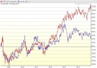
Summary Lumber prices have historically tracked quite well with homebuilder stocks. Homebuilders have also recently surged past the S&P in recent months. With the deceleration in price gains still going on and Fed support quickly evaporating, there is nothing left to prop up this industry. While I have been generally skeptical of the supposed recovery in homebuilder stocks, I have limited my analysis to trends in home prices and the ability of the American consumer to handle a mortgage at current prices. For me, this analysis is sufficient to show that homebuilder stocks are in a pretty large bubble. In the following article, though, I plan to show the value of homebuilder stocks relative to lumber prices, which themselves are a good economic indicator, but also tend to follow the valuation of homebuilder stock. The Tight Relationship of Lumber and Homebuilders (click to enlarge) In the preceding chart, I have plotted the SPDR S&P Homebuilders ETF (NYSEARCA: XHB ) and spot lumber prices. A clear correlation emerges from before 2009 to around 2013. What we also see is that around 2013, while lumber prices crashed, homebuilder stocks continued onward, and more recently have even seen some gains. Generally lumber prices are thought to track the economy quite well. While many economic analysts have been bullish on the future of the US economy, commodity and bond markets have been showing for more than a year now signs of languish. A plot of corporate bond prices would show much the same thing as lumber prices in this graph, as they also have stalled starting around the beginning of 2014. More interestingly, other commodities have started to follow along in this weakening trend, with oil recently showing a spectacular fall and copper following along. Commodity markets are showing signs of warning about the future of the economy. Lumber especially has shown a historical tight relationship with the value of homebuilder stocks, and given what has happened over the past two years, we ought to be worried about the future prospects for share prices. The next plot that I have shown is the past 6 months of the relationship between lumber and XHB. (click to enlarge) What we see from this chart of the relative valuation of XHB to lumber prices is that they have traded in a relatively tight range. Starting in 2015, however, we notice a sharp spike upwards that was quickly corrected. Over the past few days this relative valuation has shot up again. Given the last swift correction in this ratio, we can probably expect homebuilders to go down in the near-term. The homebuilder rally seems to be losing steam, as the market reacted violently to this push above historical highs. Future Prospects for Timber (click to enlarge) In order to predict future movements in the price of wood, shown above is a graph of the iShares S&P Global Timber & Forestry Index Fund (NASDAQ: WOOD ). Chaikin Money Flow analysis shows strong price growth ending around the middle of September, interrupted by a strong selloff in October, corresponding quite nicely with the overall stock market. Interesting is that since then there was a brief rise in money flow, but even while this has slowed noticeably, the price appreciation has still continued. This seems like price gain without much support, and so even timber prices themselves may be unsustainable in the medium term. What is more worrying for timber prices is the state of the overall economy. Consistently low oil will likely result in slowed economic activity as oil exploration companies drastically reduce capex spending. With decreased capital spending, we can assume downward pressure on GDP growth, which is an ominous sign for timber, as well as for housing. Technical Analysis of XHB (click to enlarge) Technical analysis of XHB itself shows signs of weakness. At the end of November XHB reached a value of about 33.50, at which point momentum was lost and the stock began to fall. While XHB has been higher since then, it also has not been able to make any real progress. Volatility in XHB has drastically increased since that time, and perhaps a greater source of worry is the Chaikin Money Flow, which turned definitely negative throughout December and has not been solidly positive since then. The market seems to find the current valuation as high enough. Summary and Action to Take XHB has seen to lost momentum, as it has not been able to have a solid increase in value since the end of November. In addition, the trend of homebuilders with XHB is approaching historic highs, and this has been met with swift correction in XHB. The long term trend shows definite signs of worry, as lumber has not agreed with the high current valuation of XHB. Now would be a great time to sell any shares of XHB, as the stock is not likely to go any higher from here on. For a more speculative investment, shorting XHB would likely be a good idea. A long time horizon is probably needed for that trade to play out, though, as XHB has been able to keep this high relative valuation for more than a year now, and only time will tell how long it will be able to keep this up. In addition, if you want to play on the underlying weakness of the US economy, shorting the WOOD ETF may be the way to go. If GDP is unable to sustain itself, then timber prices will go down along with it. This is a very speculative move, however, since timber itself does not show signs of being overbought like the homebuilders. Still, timber is going to hurt if the economy slows. I still take shorting homebuilders as the safer option since not only will they fall if the economy stumbles, but they are also presently overvalued and due for a correction even if GDP does not change much. Disclosure: The author is short XHB. (More…) The author wrote this article themselves, and it expresses their own opinions. The author is not receiving compensation for it (other than from Seeking Alpha). The author has no business relationship with any company whose stock is mentioned in this article.
Updating The Baker’s Dozen Portfolio: A Slight Modification Of The IVY 10

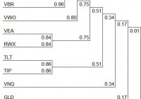
Constructing a portfolio with as few as 13 ETFs. Reduce risk by introducing a “circuit breaker” ETF. Finding low correlated ETFs. A slight modification to the IVY 10 Portfolio. The Baker’s Dozen Portfolio was first presented approximately three months ago. This is an update of that momentum model which is a slight modification of the IVY 10 Portfolio. While the Baker’s Dozen includes 12 ETFs plus SHY , the cutoff ETF, it could easily be paired down to 10 as VOE and VBR are highly correlated with VTI . As with the IVY 10 Portfolio, it does not take many ETFs to provide global diversification. In this portfolio VEA is selected as the Developed International Equity instead of VEU since VEU also contains emerging market stocks. The asset class, Emerging Markets is covered by using VWO . This removes a little duplication that shows up in the IVY Portfolio. PCY is part of the Baker’s Dozen in an effort to spread the risk from domestic to international securities. Gold (NYSEARCA: GLD ) is included in the Baker’s. Otherwise the holdings compared to the IVY 10 are similar. The following thirteen ETFs were selected for their diversity and low correlations. Vanguard Total Stock Market ETF VTI – This ETF covers the entire U.S. Equities market and therefore should be part of any portfolio that uses ETFs for core investments. Vanguard Mid-Cap Value ETF VOE – As a mid-cap value ETF, this security is highly correlated with VTI, but is included to provide a value tilt to the portfolio as recommended in the Fama-French five factor model (FF-5). Vanguard Small-Cap Value ETF VBR – In keeping with the FF-5, this ETF is added even though it too is highly correlated with VTI. If one were to simplify this portfolio, VOE and VBR are the two ETFs to eliminate from the Baker’s Dozen. Vanguard FTSE Developed Markets ETF VEA – For our developed international equities ETF we select VEA. Vanguard FTSE Emerging Markets ETF VWO – VWO is our emerging market ETF of choice. If one wishes to further simplify the portfolio it is possible to merge VEA and VWO and use only VEU as that ETF includes emerging market stocks. Vanguard REIT ETF (NYSEARCA: VNQ ) – Domestic Real Estate is included as an inflation hedge and it provides a good source of income. SPDR Dow Jones International RelEst ETF (NYSEARCA: RWX ) – International Real Estate provides an additional hedge to inflation and it adds another asset class with good income. PowerShares Emerging Markets Sov Dbt ETF PCY – Emerging markets sovereign debt is a different type of security and is added for both diversification and high yield. PowerShares DB Commodity Tracking ETF (NYSEARCA: DBC ) – Commodities is another asset class and serves as a low correlation asset when compared with VTI. SPDR Gold Shares GLD – Precious metals is yet another asset class that has a low correlation with our equity holdings such as VTI, VOE, and VBR. iShares 20+ Year Treasury Bond (NYSEARCA: TLT ) – This 20+ Treasury instrument provides backing from the U.S. Government and adds additional diversity to the portfolio. iShares TIPS Bond (NYSEARCA: TIP ) – TIPs are included as another inflation hedge. This ETF also has a low correlation with equity securities. iShares 1-3 Year Treasury Bond SHY – This Treasury ETF is our cutoff or “circuit breaker” security as this management model seeks ETFs that are performing above SHY and sells ETFs that are under-performing SHY. These ETFs were selected for low correlations as shown in the cluster diagram below. As mentioned above, VOE and VBR are highly correlated with VTI and are the first places to simplify this portfolio. ETF Rankings: The following ranking table contains many risk reducing clues. The primary one is to stay away from ETFs that are ranked below SHY. Currently, that includes Commodities and Gold . A secondary risk reducer is to sell the security when it is price below its 195-Day Exponential Moving Average. VEA and DBC would be sold on that basis. Back-testing indicates better returns are obtained when one concentrates the portfolio in a few ETFs rather than spreading out investments over a larger number of holdings, even if they are performing above SHY. For a number of weeks, VNQ and TLT have been the stars of the Baker’s Dozen. (click to enlarge) Performance Graph: The following performance graph is a recent example of how a portfolio made up of just a few well-diversified ETFs performed since early October of 2014. This graph is from the Rutherford Portfolio and readers can click on the link to learn more about the management of this portfolio. Portfolios are reviewed every 33 days and in the case of the Rutherford, rebalancing moved equal percentages of the portfolio into the top two holdings. If this were to be rebalanced today, we would hold 700 shares in VNQ and 450 shares in TLT in this $125,000 portfolio. These figures are rounded. (click to enlarge) Disclaimer: The above graph will not likely continue this wide divergence from the VTTVX benchmark. 1) The time period is very short for this “live” portfolio. 2) I do not expect TLT to continue its excellent performance. Over the last month there were days when TLT was running in the opposite direction of the market and this aided the overall performance of the Rutherford. It is expected that these momentum managed portfolios will outperform the market when the next severe bear market strikes. That will be the real test of this risk reducing model. Disclosure: The author is long VNQ, TLT, VTI, RWX. (More…) The author wrote this article themselves, and it expresses their own opinions. The author is not receiving compensation for it (other than from Seeking Alpha). The author has no business relationship with any company whose stock is mentioned in this article.

What To Do About Poor Future Returns

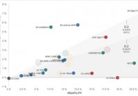
There’s been a lot of chatter recently about asset valuations, in particular U.S. stocks and U.S. bonds, and their impact of future returns. This is nothing new. It just seems to get louder at the start of every new year. I’ve discussed this topic before on the blog. Last time here . Basically, my point was that we may indeed, in fact it’s probable, be facing poor future returns – a least for the next 10 years, but that doesn’t mean that the 4% SWR rule is dead. In fact the 4% SWR implies even worse returns than people are forecasting now. For those building towards retirement it probably means a longer time to hit one’s goals And maybe that’s the worst part of it. In this post I wanted to discuss what the options are for investors if we take the forecasts of poor future returns as a fait accompli. First, some discussion of definitions is in order. Most of the the time when you hear forecasts of poor future returns you hear about the potential for poor U.S. stock returns, and poor U.S. government bonds returns, and the predominant 60% U.S. stock 40% U.S. bond allocation. The 60/40 portfolio is the dominant benchmark used in the U.S. by the finance industry partially due to the fact that they are the asset classes with the best and longest historical data. That is why you hear about it so much. Part of the problem with this of course is that today there are far more assets classes than just these basic two. But for this type of analysis it serves the purpose well enough. Just something to be aware of. Let’s move on. In this post, I’m going to use a recent forecast analysis done by Research Affiliates at the beginning of the year that forecasts future 10yr real asset class returns and the 60/40 portfolio return. You can find that analysis here . They also maintain an updated forecast of 10 yr expected real returns at their asset allocation website . A must visit in my view. Here is a graphical view of their current 10 yr real return forecasts and risk. The classic 60/40 portfolio is way down there. Almost at the bottom left corner with a 10 yr projected real return of 0.4% annualized. Not so great. They forecast U.S. large stocks at 0.4% as well, so that basically leaves 0.4% for bond returns, the benefits of re-balancing, etc. Not exactly outstanding. Just for reference, over the last 10 year period from 2005 to 2014, the 60/40 portfolio has returned 4.8% per year on a real basis, not too far from it’s historical average of 5.2% per year. Let’s take these forecasts as a given and discuss what options an investor has going forward. The most obvious option is to do nothing. If these forecasted returns do come to represent reality then, at least for those withdrawing from their portfolios, the historical 4% SWR will probably be just fine. As the Kitces blog post I linked to in the first paragraph discusses in detail these forecasts of poor future returns would turn out to be an upside surprise to the 4% SWR. In fact, for the worst case retiree in history, starting in 1966, the first 10 year return for a 60/40 portfolio was -1.85% real per year! That’s a lot lower than what is currently being forecasted. In the modern portfolio era, since 1973, there have been four 10 yr periods where the real return was less than 1% per year. Those were the 10 yr periods beginning in 1973, 1999, 2000, and 2001. Sometimes you get the impression that the realization of these poor forecasted returns would be some unprecedented event. Not even close. We’ve been there before and in not the too distant past either. A slight variation to the do nothing option is just to change the allocation between stocks and bonds. If stocks are not offering any higher real returns than bonds then why allocate to them. For example, an investor could go to a 40% stock 60% bond allocation (or 50/50, 30/70, etc…), that has the same forecasted real return but with a lot lower volatility and lower drawdowns. The lower volatility and drawdowns in and of themselves will lead to higher SWRs. The next option is to allocate to assets classes with higher forecasted returns. Obvious, right? The tough part is deciding how to break up that allocation and to into what asset classes. It is much better to simply choose a long standing portfolio allocation that has stood the test of time. I’ll use two examples here that I talk about often on the blog; the Permanent Portfolio, and the IVY 5 asset class buy and hold portfolio. Taking the asset allocations for the portfolios and plugging in the forecasted returns from the Research Affiliates forecast you get the forecasted 10yr returns for the strategies shown below. The Permanent Portfolio’s forecasted 10 yr real return is 0.9%. That’s much better than 60/40 but still a lot less than it’s average 10yr real return since 1973 of 5%. However the Permanent Portfolio comes with a lot less volatility (30% less) than 60/40 and a lot lower drawdowns which leads to a higher SWR than implied just by the return alone. The IVY5 Portfolio’s forecasted 10 yr real return is 2.2%, compared with it’s 7% average since 1973. I didn’t forecast the IVY13 portfolio because there were no forecasts for certain key factors, like value and momentum, but assuming historical relationships, lets say the IVY13 forecasted 10yr real returns are in the 2.5% to 3% per year. As you can see, going global and diversifying more enhances the projected returns. Now, lets see how some of the tactical asset allocation models may perform in the future under these poor future return forecasts. For this part of the discussion, I’ll be comparing the GTAA5, GTAA13, GTAA AGG3, and GTAA AGG6 portfolios to the buy and hold portfolios discussed above. The first thing I’ll do is compare the performance of the tactical asset allocation portfolios over all 10 yr periods to the buy and hold portfolios; 60/40, IVY5, and Permanent. Then we’ll compare the performance over only the worst 10 yr periods. That will give us a gauge of their relative performance during these bad return periods we are interested in. Below is the key table. The first line in the table shows the average real 10 yr period performance for each of the portfolios for all 10 yr periods since 1973 (1973 to 1982, 1974 to 1983…through 2005 to 2014). The 60/40 portfolio returned on average 5.82% real per year, the IVY5 7.06%, the AGG6 portfolio 14.15%, etc… The next row shows the spread between the particular portfolio and the 60/40 classic buy and hold portfolio. For example, GTAA5 outperforms 60/40 on average about 1.82% per year. Now it gets interesting. The next row shows the average 10 yr period performance only for those 10 yr periods where the 60/40 return was less than 1% per year real. The performance for all the portfolios is lower as one would expect but look at the next row, the spreads to the 60/40 portfolio during these poor return periods. The outperformance of all the portfolios is better during bad periods. For example, GTAA5 only outperforms 60/40 by 1.82% per year during all periods but during bad periods it outperforms by 6.8% per year! That is pretty astonishing. The TAA portfolios have risk reduction built in automatically and keep the investor out of long down markets, exactly what is being forecasted for the buy and hold portfolios. Sounds like a pretty good portfolio approach to me especially if the forecast of poor returns comes to be. If similar spreads hold true in the future the TAA portfolios would be looking at 10 yr real performance ranges of 6-8% per year for the GTAA5 and GTAA13 portfolios and 13-15% per year for the GTAA AGG3 and AGG6 portfolios. Sounds to good to be true but even if the performance ranges are half of what they’ve been an investor will be a lot better off than in a traditional 60/40 portfolio. The structure of the portfolios stacks the odds in the investor’s favor during bad markets. In summary, I’ve shown that if forecasts of poor returns come true the portfolio outcomes for investors are no worse than the past. An investor doesn’t need to do anything different. But there are better options that stack the odds in the investor’s favor in poor return environments. The most basic option is better diversification as exhibited in the IVY5 and the Permanent Portfolio as examples. And then there are even better options by using tactical allocation models that protect to the downside and in aggressive versions tilt the portfolio toward the best performing asset classes. While all returns for all portfolios will be lower in a low return environment the outperformance of better constructed portfolios will still allow investors and especially retirees to outperform and meet their long term goals.