Tag Archives: alt-investing

TBT Is The Best Inverse Bond ETF On The Market
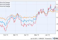
Summary TBT has the most volatility. TBT provides additional exposure through 2X leverage. TBT has more net assets than its competitors. Introduction In an economic environment where Interest rates are bound to rise in the coming months, a well performing inverse ETF is a good tool for any investor to have prepared. The best inverse bond ETF on the market is the ProShares UltraShort 20+ Year Treasury ETF ( TBT). TBT has over 2.70 Billion in net assets, and it seeks a return that is -2 times the return of the Barclays U.S. 20+ Year Treasury Bond Index for a single day. Inverse exposure is used to hedge against declines, seek profit from declines, and underweighting exposure to a market segment. I believe that TBT is the best inverse bond ETF on the market. Why TBT is the Best When interest rates rise, bond and bond index holders suffer. Inverse bond ETFs are valuable for investors with portfolios that are bond heavy or for investors trying to capitalize on rising interest rates. TBT has a 0.92% expense ratio and a 9.40% increase year to date. The industry average expense ratio hovers around 0.9%, and is comparable to TBT’s main competitors: the ProShares Short 20+ Year Treasury ETF (NYSEARCA: TBF ), the Direxion Daily 20+ Year Treasury Bear 3x Shares ETF (NYSEARCA: TMV ), and the ProShares UltraPro Short 20+ Year Treasury ETF (NYSEARCA: TTT ). What differentiates TBT is its 2x leveraged volatility, and its total assets. TMV has performed the best with returns of 12.80% YTD. TMV’s performance can be attributed to its 3X leverage which exposes it to the market more, but can also produce unwanted and potentially harmful volatility. TBF is 1x short and is less volatile, but TBF has only returned 5.84% YTD. Returns To show how TBT, TBF, and TMV move relative to each other, Included a comparison chart of returns year to date. Each index moves in a correlated manner, but the returns are different based on how leveraged each ETF is. Analysis Like its competitors, TBT shows a strong inverse (-.99) correlation to the 20 year index. Additionally, I compared TBT (in orange) and its competitors to the 10 year treasury. I did this to show how it correlates to, and can be utilized to hedge, 10-Year Treasury Bonds. The 10- and 20-Year Treasury move almost identically. As you can see, all four ETFs have a nearly perfect correlation to 10-Year yields. TBT and TBF, however, appear to be the most correlated. Yields and bond prices are inversely correlated, which allows one to hedge against rising interest rates. Each Inverse ETF accomplishes its goal of providing the investor with inverse exposure. Graph of 10-Year Treasury Yields This graph shows the relative performance of each aforementioned ETF relative to 10-Year Treasury Yields. I included this chart to show how each ETF produces different returns, yet each is correlated to the relative movement of the 10-Year. Analysis Continued TBT is the most heavily traded Inverse Bond ETF. TBT has an average volume of 3,364,979 while the second most traded is TBF with an average volume of only 785,380. Specialty 7-10/10 year inverse ETFs like the i Path U.S. Treasury 10-Year Bear ETN (NASDAQ: DTYS ) and the ProShares Short 7-10 Year Treasury ETF (NYSEARCA: TBX ) have average volumes of 53,418 and 11,371 respectively. A highly traded ETF like TBT avoids liquidity risk better than all of its competitors. Additionally, for investors wanting to move high volumes of equity in a short time period of time (without strongly affecting the price) TBT is your best bet. TBT is leveraged 2X to produce 2 times exposure to daily volatility. Some investors may not want to expose themselves to 2X leverage because it exposes them to additional risk than a direct 1X inverse ETF like TBF. For this reason, TBT is a better option for investors who are able to stomach risk well. I believe TBTs 2X exposure is hugely beneficial to long term performance. 3X exposure can be too volatile and unpredictable to trade effectively. 1X exposure does not provide adequate daily returns or hedging opportunity for those attempting to capitalize on market conditions. Finally, TBT has over 3 billion in total assets which allows TBT to track its underlying index more thoroughly than its competitors. TBT’s closest competitor, TBF, has only 1.1 Billion in total assets, while the average assets of its competitors fall closer to 100 million. Conclusion TBT is the best inverse bond ETF on the market. TBT provides high levels of exposure to yields while reducing additional risk that plagues its competitors. TBT has a fair expense ratio, and high correlation to its underlying index. For investors looking for ways to hedge against rising interest rates, TBT is clearly the superior ETF. Disclosure: I/we have no positions in any stocks mentioned, and no plans to initiate any positions within the next 72 hours. (More…) I wrote this article myself, and it expresses my own opinions. I am not receiving compensation for it (other than from Seeking Alpha). I have no business relationship with any company whose stock is mentioned in this article.
Is GREK Today’s Least Competitive Wealth-Builder ETF Investment?

Summary Days ago our article identified an ETF ranked at the best end of the scale posed in the title above, drawing Seeking Alpha reader attention. The ongoing EU vs. Greece drama now reaching a moment of (possible) truth has as one (or more) possible outcome(s) capable of defining an immediate tragedy. Hence the question being raised. And if this is not the worst possible choice of a long ETF position, is (are) there more threatening one(s)? Market-makers have to appraise them all, to do their jobs. We use their hedging actions to tell us what they think. It’s beyond our ken. Way beyond. Value analysis requires comparisons. Without appraisal of the bad, how do we know good? Yin and Yang are both essential. How does GREK look to market-makers? The Global X FTSE Greece 20 ETF (NYSEARCA: GREK ) presents market-makers with a challenging task of appraisal. In our recent article we posed the question this way: From a population of some 350 actively-traded, substantial, and growing ETFs is this a currently attractive addition to a portfolio whose principal objective is wealth accumulation by active investing? We daily evaluate future near-term price gain prospects for quality, market-seasoned ETFs, based on the expectations of market-makers [MMs], drawing on their insights from client order-flows. Following that article’s format where possible, let’s look at their appraisal of GREK. Yahoo describes it this way: The fund currently holds assets of $310 million and has had a YTD price return of -9.1%. Its average daily trading volume of 899,906 produces a complete asset turnover calculation in 29 days at its current price of $11.77. (The Bank of Piraeus may wish it had as long on withdrawals.) Behavioral analysis of market-maker hedging actions while providing market liquidity for volume block trades in the ETF by interested major investment funds has produced the recent past (6 month) daily history of implied price range forecasts pictured in Figure 1. Figure 1 (used with permission) The vertical lines of Figure 1 are a visual history of forward-looking expectations of coming prices for the subject ETF. They are NOT a backward-in-time look at actual daily price ranges, but the heavy dot in each range is the ending market quote of the day the forecast was made. What is important in the picture is the balance of upside prospects in comparison to downside concerns. That ratio is expressed in the Range Index [RI], whose number tells what percentage of the whole range lies below the then current price. Today’s Range Index is used to evaluate how well prior forecasts of similar RIs for this ETF have previously worked out. The size of that historic sample is given near the right-hand end of the data line below the picture. The current RI’s size in relation to all available RIs of the past 5 years is indicated in the small blue thumbnail distribution at the bottom of Figure 1. The first items in the data line are current information: The current high and low of the forecast range, and the percent change from the market quote to the top of the range, as a sell target. The Range Index is of the current forecast. Other items of data are all derived from the history of prior forecasts. They stem from applying a T ime- E fficient R isk M anagement D iscipline to hypothetical holdings initiated by the MM forecasts. That discipline requires a next-day closing price cost position be held no longer than 63 market days (3 months) unless first encountered by a market close equal to or above the sell target. The net payoffs are the cumulative average simple percent gains of all such forecast positions, including losses. Days held are average market rather than calendar days held in the sample positions. Drawdown exposure indicates the typical worst-case price experience during those holding periods. Win odds tells what percentage proportion of the sample recovered from the drawdowns to produce a gain. The cred(ibility) ratio compares the sell target prospect with the historic net payoff experiences. Figure 2 provides a longer-time perspective by drawing a once-a week look from the Figure 1 source forecasts, back over (almost) two years. Figure 2 (used with permission) What does this ETF hold, causing such price expectations? Figure 3 is a table of securities held by the subject ETF, indicating its concentration in the top ten largest holdings, and their percentage of the ETF’s total value. Figure 3 (click to enlarge) Well, maybe that’s what is causing such price expectations, but it seems more likely that international politics has more to do with it. So let’s depart from GRKZF, the Greek Organization of Football Prognostics SA, and turn to the Wall Street organization of stock price prognostics, or market-makers [MMs]. Sport is where you find it. Just how bad is the GREK outlook? We use the MMs forecasts for stock and ETF prices, implied by their self-protective hedging actions, plus the accumulated actuarial history of market price events following such prior forecasts as are seen today, to rank each subject. Figure 4 is a table of how the worst-ranking ten ETFs appear. Please remember, our ranking interest is in wealth-building, not wealth destruction. What works well in one direction may not work in the opposite. Shorting is not recommended. Figure 4 (click to enlarge) When we compare the wealth-building prospects for GREK (ranked 270th out of 340) it doesn’t come close to the terrors inherent in these last ten. Remember, the MMs role is to build a balance between buyers and sellers in every trade, so they have to find acceptable expectations at each end of an actionable array of prices. The actions produce the trade, the expectations are what produce the actions. Check the row of data beneath the top illustration of Figure 1. Its forecast upper end is 23.7% above the then-current price of $10.58. That compares to the ten-ETF average of Figure 4 of +29.4% in column (5). What of the risk exposure? When GREK in the past has been seen by MMs to have an outlook like today’s (a Range Index of 33, meaning twice as much upside as downside) its typical worst-case price drawdown experienced was but -16.3%. The worst-ten ETFs of Figure 4 managed -19.7% — a fifth of their capital gone, not just less than a sixth. And on top of that GREK had 42 out of 100 chances of seeing its price recover back into profit territory, while those other ETFs had but one chance in four of that happening (column 8 blue average). And they started, on average, from prior forecasts with Range Indexes of 26, with three times as much upside as down. See? GREK could be worse. ‘Course it could (needs to) be better. The average equity today offers a 29 Range Index with +12.5% upside. There is real credibility to that population forecast, since prior similar forecast hypothetical positions produced gains of +3.9% (net of 35/100 losses, not 58/100). GREK actually had prior net losses of -6.5% and negative credibility ratio (like the other worst ten ETFs) comparing upside forecasts to actual TERMD payoffs. Conclusion But those are historical comparisons. The past may not be prologue. Buyers must hope so. Besides, there is less than two years of GREK pricing for us to work with. Maybe Greece has just had a bad recent two years. We keep a ten-foot long pole at hand for just such occasions. Hope we don’t have to use it, not sure we would. Disclosure: I/we have no positions in any stocks mentioned, and no plans to initiate any positions within the next 72 hours. (More…) I wrote this article myself, and it expresses my own opinions. I am not receiving compensation for it (other than from Seeking Alpha). I have no business relationship with any company whose stock is mentioned in this article.

China Grabs A Bigger Share Of The Indexes

Traditional international index funds assign a weight to each country based on the size of its stock market. But in the case of China, that’s a bit misleading. Despite having the world’s second-largest economy, China has a relatively small number of publicly traded companies. Moreover, many of those publicly traded companies have been off-limits to foreign investors. As a result, the Vanguard Total World Stock ETF (NYSEARCA: VT ) allocates just 2.5% to China—considerably less that than the share allotted to much smaller economies such as Canada, Switzerland and France. This is about to change: during the coming months and years, index investors will be able to access more of China’s vast economy. Vanguard recently announced that its flagship emerging markets ETF, the Vanguard FTSE Emerging Markets (NYSEARCA: VWO ), will soon be adding China A-shares to its benchmark index. This development will also affect Canadian-listed ETFs that include this fund as an underlying holding. Taking the A-train Let’s look at what this means for indexers. Right now, most foreign investors can buy public companies in mainland China only through share classes denominated in foreign currency and traded on exchanges outside the country, particularly in Hong Kong and the US. These are the shares included in the emerging markets funds that North Americans own today. A-shares, by contrast, are denominated in renminbi and are listed on China’s national stock exchanges in Shanghai and Shenzhen. They are generally available only to Chinese nationals and a small number of highly regulated foreign institutional investors. But this regime is changing as China begins to loosen its control over foreign investment. That has prompted index providers to consider adding A-shares to their popular emerging markets indexes. FTSE (the index provider for many Vanguard funds) has already done so , and MSCI (whose indexes are tracked by iShares and BMO funds) seems likely to do so this year. As the index changes unfold, ETFs tracking these benchmarks will be compelled to add Chinese A-shares as well. The upshot is that China will get an increasingly large share of cap-weighted indexes. It won’t happen overnight: Morningstar estimates the changes will bump up China’s allocation in the FTSE Emerging Markets Index by a modest three percentage points in the near term, from about 29% to 32%. But over time it seems likely that share will grow considerably as additional A-shares become available to foreign investors. This evolution will affect the Canadian-listed Vanguard FTSE Emerging Markets (VEE) , since this fund uses VWO as its underlying holding. It will also have a modest effect on the Vanguard FTSE All-World ex Canada (VXC) , which gets its emerging markets exposure from VWO . It seems likely that emerging markets index funds from other providers will also see similar changes in the future, including the iShares MSCI Emerging Markets (XEM) and BMO MSCI Emerging Markets (ZEM) , which both track the same benchmark. What’s it all mean? So what’s the takeaway message for Couch Potato investors who have some emerging markets in their portfolios? At this point, it’s hard to know what effect the addition of Chinese A-shares will have, but it’s likely to be very small. It should not prompt you to make any changes in your portfolio. Let’s remember that the allocation to Chinese A-shares in a balanced portfolio will be trivially small—Vanguard estimates they will make up 0.55% of VXC , which itself is less than half of a balanced ETF portfolio. Taking a longer view, passive investors should generally applaud any index changes that better represent the global markets. As Forbes puts it, including China’s A-shares in widely used emerging markets indexes is “acknowledging that the Chinese mainland stock market has matured and is ready for serious, long term investors.”