Tag Archives: alt-investing

Inside Guggenheim’s New High Income Infrastructure ETF

The income ETF space remains a favorite among investors as evidenced by the incredible level of interest seen in many of the products in the space. In fact, many issuers have lined up with several new funds focused on income strategies to tap into this sentiment (read: 3 ETFs Yielding Over 6% to Watch as Market Speculates Rising Rates ). This trend continues with Guggenheim which has just launched a fund with global coverage, focusing on the high income space, but with a slight tilt as the fund has a specific sector exposure i.e. infrastructure. In fact, the global footprint made the fund more attractive given the ultra-low interest rate backdrop prevailing in most developed economies. Below, we have highlighted the newly launched fund – Guggenheim S&P High Income Infrastructure ETF ( GHII ) – in greater detail. GHII in Focus This product tracks the S&P High Income Infrastructure Index, focusing on 50 high-yielding global infrastructure companies. These companies are engaged in several infrastructure-related sub-industries, such as energy, transportation and utilities. The individual stocks are moderately diversified as no single security forms more than 5.09% of the total fund assets. Sydney Airport (5.09%), Williams Companies, Inc. (4.99%) and Jiangsu Express Co. Ltd-H (4.79%) are the top three holdings of the fund. As far as geographic allocation is concerned, the U.S. takes the top spot with about one fifth of the basket followed by Australia (14.45%) and China (9.37%). Overall, the fund is spread across 15 countries. Utilities hold the lion’s share followed by Industrials (33.15%) and Energy (16.70%). The fund charges 45 bps in fee. How Could it Fit in a Portfolio? The ETF could be well suited for income-oriented investors seeking higher longer-term returns with low risk. Utilities and infrastructure related stocks are interest rate sensitive and recession resistant in nature. With interest rates being low in most developed nations, the appeal of utilities stocks has increased as these offer steady and strong yields (read: 3 Utility ETFs Surging to Start 2015 ). However, investors looking for a high-growth vehicle may not be satisfied with this product as infrastructure is generally a slow-growth business. Competition The main competitor of GHII is the established iShares S&P Global Infrastructure Index Fund ( IGF ) . This product also focuses in on global utilities ranging from transportation to electricity services, and it has already seen a great deal of interest from investors, as evidenced by its $1.18 billion in assets under management. This iShares fund charges 47 bps in fee. The U.S. takes about 32.8% of the basket followed by Canada (8.33%) and Australia (8.17%). The fund holds 75 stocks in total. The fund yields yielded about 2.98% as of February 19, 2015. The newly launched ETF will also face stiff competition from iShares S&P Global Utilities Index Fund ( JXI ) , which has amassed about $338.3 million in assets. The fund charges 48 bps in fees and yields about 3.67% annually (as of February 19, 2015) (read: FlexShares Launches Global Infrastructure ETF ). Another potentially sound player in the space is SPDR FTSE/Macquarie Global Infrastructure 100 ETF ( GII ) though the fund was behind the newly launched GHII in terms of assets within such a short span. Notably, within just seven days of launch, GHII has amassed about $189 million in assets while GII has garnered $112 million in AUM. So, though competition may be intensifying in the global infrastructure ETF world, GHII is definitely worth a closer look. The product charges reasonably in the space and has an attractive yield, which is drawing investors’ attention. We expect its winning trend to continue in the days to come. Also, most other global infrastructure ETFs have put a large weight on the U.S. unlike GHII. A lower focus on the U.S. market might earn GHII an extra advantage over its peers as the U.S. economy will likely see a rise in rates.

ETG And ETO: What’s The Difference Between This Pair Of Confusingly-Named Eaton Vance CEFs

Summary Eaton Vance has a bad habit of using similar names for its CEFs; ETO and ETG are yet another example. The difference appears to come down to a different investment focus that may not be meaningful right now. Performance, meanwhile, has been vastly different. What’s in a name? When it comes to Eaton Vance closed-end funds, or CEFs, a single word or number is sometimes the only thing – but it can mean a lot… or sometimes a little. In the case of the Eaton Vance Tax-Advantaged Global Dividend Income Fund (NYSE: ETG ) and the Eaton Vance Tax-Advantaged Global Dividend Opportunities Fund (NYSE: ETO ), the switch of “income” and “opportunities” has meant a lot to performance though it’s tough to see how it changes the two portfolios at a high level right now. Seen this story before So ETG and ETO share a lot of the same traits as other Eaton Vance CEF pairs I’ve looked at, including ETB and ETV . For example, ETG and ETO both came public within the same three-month span in early 2004. The management team is identical. And the two funds have, word for word, the same objective: “The Fund’s investment objective is to provide a high level of after-tax total return.” That said, ETG, the older of the two funds, is a much larger fund with around $1.4 billion in assets to ETO’s around $350 million or so. On the surface, this suggests that ETG’s IPO went a little more smoothly than ETO’s IPO, which wouldn’t be surprising since coming back to the same customers a second time with a similarly named fund would probably be a hard sell for brokers. However, there’s also the issue of “opportunity.” Look at that performance When I looked at previous pairs of Eaton Vance CEFs, their performance was different, but fairly similar. One fund would have an edge over the other, but not a commanding lead. That’s not the case with ETG and ETO. For example, according to Morningstar’s total return figures, which include reinvesting of distributions, ETV and ETB’s trailing five-year annualized returns through the end of January were 11.4% and 11%, respectively. The edge goes to ETV, but just slightly. For EOS and EOI , the trailing 10-year annualized returns were 7.2% and 6.4%, respectively. A wider lead with EOS getting the edge, but still fairly close. ETO and ETG, on the other hand, had trailing 10-year annualized returns of 8.6% and 5.8%, respectively. That’s a much wider margin that clearly favors ETO, the smaller of the two CEFs. Interestingly, the two other pairs I’ve examined each outperformed the Morningstar categories in which they were placed over the time periods noted above. However, this pair was split. ETO outperformed while ETG trailed the World Allocation Morningstar category over the trailing ten years through January, and both had roughly similar standard deviations, a measure of volatility, over the trailing decade. That said, over the trailing one, three, and five-year periods through January, ETG is the better performer. Although it’s hard to attribute ETG’s short-term outperformance and ETO’s long-term outperformance to any one thing, the last few years have been relatively bad for natural resources while the years before that were extremely good ones for that segment of the market as China’s growth fueled huge demand for commodities. Which brings us to a major difference. What gives? The biggest difference I could find was in the fund highlight sections of the funds’ fact sheets. For ETO, “The Fund employs a value style, and may emphasize investments in common stocks of issuers whose business are related to ‘hard assets,’ such as energy, other natural resources during periods of high inflation or rising concerns about inflation.” ETG’s fund highlight provided the more bland: “The Fund employs a value investment style and seeks to invest in dividend-paying common stocks that have the potential for meaningful dividend growth.” While that could easily explain the short-term/long-term performance difference, the two portfolios are fairly similar today. For example, the two have roughly similar allocations to U.S. stocks, foreign stocks, and preferred stocks. Their global allocations are pretty close. And seven of their top ten holdings are the same. Looking at their sector allocations, both funds are both materially overweight in the financial sector (largely a result of their preferred holdings), with ETG appearing to stick closer to the benchmark overall. Both have about the same amount of leverage (neither uses an option strategy). And their yields based on market price are around the same area, with ETO offering an 8.1% yield and ETG a 7.8% yield, according to the Closed-End Fund Association. Another notable difference, however, arises with regard to discounts. ETO is trading at around 3% discount versus ETG’s about 8.5% discount. ETO’s discount is well below its 5-year and 10-year averages of around 9%. ETG is about in line with its 10-year average discount, but wider than its 5-year average of around 6%. Hard to call I can give a convincing argument to the fact that ETO is the better long-term performer with a higher yield. And, based on that, it’s a better option, but you should wait for a pullback. I could also go with the argument that ETG is trading at a wider discount and has been a better performer of late, so despite its slightly lower yield, it’s a better option right now. In the end, I think the difference should come down to the different focus on natural resources. In the current environment, ETO’s ability to focus on this sector isn’t particularly helpful. However, if natural resources pick up again, it could be. That would likely lead it to outperform ETG again. However, if you prefer a global offering that sticks a little closer to its benchmark, ETG would probably be the better call. Disclosure: The author has no positions in any stocks mentioned, and no plans to initiate any positions within the next 72 hours. (More…) The author wrote this article themselves, and it expresses their own opinions. The author is not receiving compensation for it (other than from Seeking Alpha). The author has no business relationship with any company whose stock is mentioned in this article.

Bond Fund Choices For Retiree Portfolios

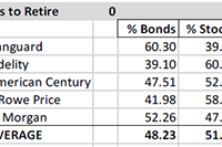
Summary Most retirees need/want some of their portfolio allocated to bond funds. For those with “about right” total assets for retirement, institutions recommend bond allocation of 40% to 60%. Numerous factors will tend to keep intermediate and long-term interest rates “lower for longer”. The middle of the bond yield curve is probably the best place to be. Corporate bonds and municipals make more sense than Treasuries for most individual accounts. Many retirees or near retirees need help deciding how to allocate between bonds and stocks, or how to prepare for a productive discussion about allocation and security selection with their advisor. This is intended to help those investors with the bond fund element of the decision. Fund Allocations: This table shows institutional recommendations for asset allocation for investors in the withdrawal stage of their financial lives, and with assets approximately sufficient for their needs (not great excess assets and not great deficiency – relative to lifestyle costs). Adjusting for Your Circumstances: According to the experts, retirees should be at or between these bond/stock allocation limits: 60/40 and 40/60. That allocation makes the global assumption that retiree assets are “just about right” – not way too little, or “way more than needed”. If assets are “way too little”, then retirement postponement, part-time work, and/or proportional reductions in standard of living is probably necessary; and the 60/40 to 40/60 allocation probably still makes sense. If assets are “way more than needed”, there are two reasonable alternatives to the 60/40 to 40/60 allocation. One alternative is to be more conservative, because the gradual loss of earning power in a heavy fixed income portfolio is seen as an acceptable trade-off to have a smoother ride. The other alternative is to be more aggressive – probably by investing “sufficient” assets in the 60/40 to 40/60 allocation, and then investing the balance in equities to grow the overall portfolio. Historical Results of 11 Bond/Stock Allocation Risk Levels: Using our 11 levels of allocation, experts recommend that you be in what we have labeled “Balanced-Conservative”, “Balanced Moderate” or “Balanced Aggressive”. This chart shows the 39-year historical returns for all 11 allocation levels, including mean return, best return and worst return, as well as the returns statistically expected at +/- 1, 2 and 3 standard deviations from the mean (roughly representing these probability ranges: 67%, 95% and 99.7%). This chart shows the returns of each allocation over multiple short and long-term periods. This chart shows the calendar year returns for 2008 through 2014 for each allocation. US Bond Funds Don’t Come In Just One Flavor, or Have One Outcome: Once you decide on the bond allocation level that makes sense, you might then want to consider what type, duration and quality of bonds to use. The allocation data above assumes aggregate US bonds (which has morphed over time as the relative level of government and corporate issuance changed, and as the relative levels of maturities have changed). You may wish to lock-in more predictably to a type or duration or quality for your portfolio, or to manage the mix as you see fit, instead of taking whatever the aggregate provides. You can do that with funds. Given that, let’s look at some of your choices: Corporate and Municipal Bonds Typically Best For Individuals: Corporate bonds or muni bonds are most likely to be suitable for you. Treasuries are generally best for tax-exempt investors (pensions, foundations, and foreign governments), while corporate and municipal bonds, with higher after tax returns are generally best for individuals. Corporate high yield did very well after the crash, but that party is over, and they have been faltering as of late, since the yield spread to Treasuries had reached a very low level. High-yield bonds have a high correlation with stocks and are not good counter cyclical diversifiers. Long-term corporates have done best as rates fell, and will continue to do well if interest rates decline, but will do poorly if rates increase. Short-term corporates have contributed least to return, and probably have more downside risk than normal, due to the Fed planning to exit QE by gradually raising short-term rates. Intermediate-term bonds are probably best bet. The muni charts are for nominal returns, which you have to gross up for your tax bracket. They have been more consistent in their returns, and their high-yield bonds have not suffered as corporate high yields have done – making them less correlated with stocks than high-yield corporate bonds. Yield, Duration and Quality Metrics for Bond Fund Types: Here are some metrics for the specific bond funds shown in the charts above. These two tables show yield, duration, quality, and quality composition of each representative fund. How Interest Rate Changes Impact Bond Prices: Here is how changes in interest rates impact bond values: Which Way Are Rates Likely to Go Near-Term? Some big names expect intermediate and long rates to decline, and short rates to rise, but not to historical “normal” levels. The inflation crowd expects rates to rise due to inflation. The anti-Fed crowd expected rates to rise when Fed bond buying ceased, but that did not happen. Most experts last year forecasted rising rates (I bit on that), but we were wrong. The “lower for longer” crowd (including Bill Gross, Jeff Gundlach and Robert Shiller) point out these factors: US Treasury rates are the highest among major developed market issuers – creating demand for our bonds, which raises prices and lowers yields. US currency is the strongest at this time among major currencies – creating demand for our bonds, which raises prices and lowers yields. Aging Baby Boomers, who have most of the money, are net savers (formerly net borrowers) reducing demand for loans, which tend to reduce bank offered rates, and they want to own bonds, raising prices and lowering yields. Aging Baby Boomers, are reaching for yield, and will rotate out of dividend stocks into bonds as rates rise, dampening rate increases. US corporations approach saturation debt, with lower net issuance, reducing supply vs. demand, which raises prices and reduces rates. Federal deficits are declining, which lowers Treasury issuance, reducing supply vs. demand, which raises prices and reduces rates. Municipal issuance is down, lowering supply vs. demand, raising prices and reducing rates. Why Foreign Money Will Flow to US Bonds: Here is data showing how much higher US rates are than German and Japanese rates, for example: Speculators, who believe the dollar will remain strong, can borrow in Germany or Japan in local currency, and use the money to buy US bonds and make a nice spread similar to the spread that banks make on their deposits. That increases Treasury prices and lowers yields. What Does The Treasury Yield Look Like Now? Here is where the US Treasury yield curve stands today (the black line). You can see that the yield on the long end of the curve has been declining, while the short end of the curve has been rising. Rates are far below the 2007 level (gray line), but are not expected to get back to that level any time soon. How Are The Pros Viewing The Path of Very Short-Term Rates? How far will the short end rise? Here is the Fed Funds futures curve, which forecasts a 1.9% short end 2 years from now. If the intermediate-term Treasuries stay as they are, the yield curve above would be flat, but that is some time away. It is unknown whether intermediate rates will rise to keep the curve steep or whether it will go flat. This forecast suggests that short-term bonds are probably not good opportunities. They do little good if rates stay the same, and they suffer if rates rise. Conclusion: Even for aggressive investors, some small allocation to bonds has historically improved total return and risk/reward. Knowing about the range of bond fund options, and how various bond allocations relate to your specific circumstances is an important step in setting up a retirement portfolio. There is a lot more to think about than what is presented in this short article, but for a huge number of retirees or near retirees, this is something they still have to get under their belt before they manage their own money, or prepare themselves for a productive discussion with their investment advisor. Disclosure: The author and clients have some of these funds in their portfolios in varying degrees based on individual specific circumstances. General Disclaimer: This article provides opinions and information, but does not contain recommendations or personal investment advice to any specific person for any particular purpose. Do your own research or obtain suitable personal advice. You are responsible for your own investment decisions. This article is presented subject to our full disclaimer found on the QVM site available here . Disclosure: The author has no positions in any stocks mentioned, and no plans to initiate any positions within the next 72 hours. (More…) The author wrote this article themselves, and it expresses their own opinions. The author is not receiving compensation for it (other than from Seeking Alpha). The author has no business relationship with any company whose stock is mentioned in this article. Additional disclosure: Disclosure: The author and clients have some of these funds in their portfolios in varying degrees based on individual specific circumstances.