Scalper1 News
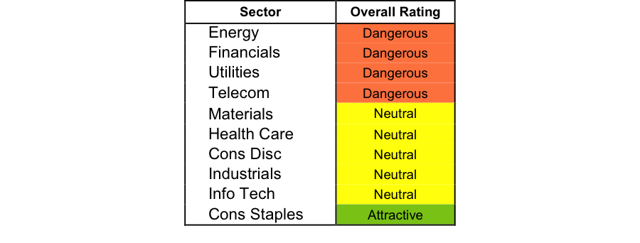
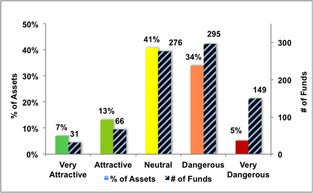
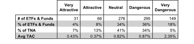
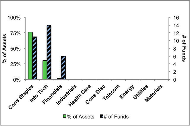
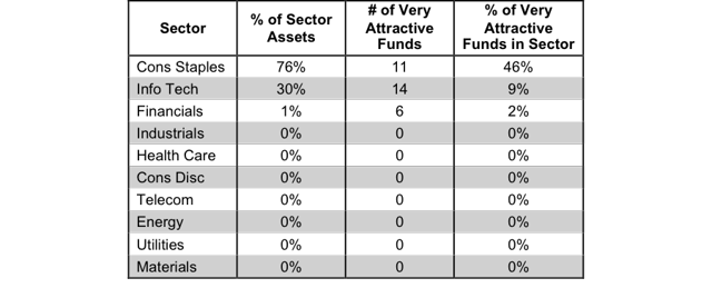
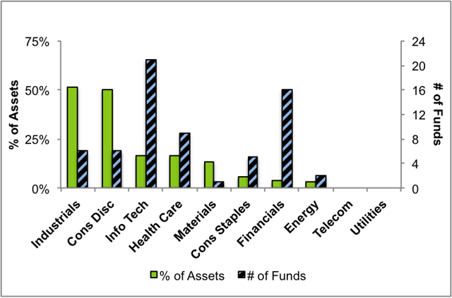
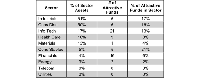
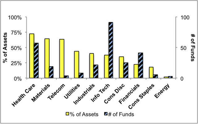
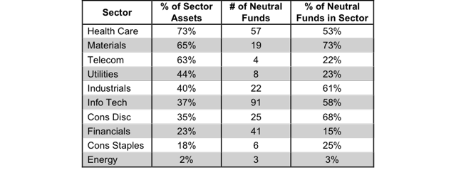
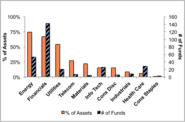
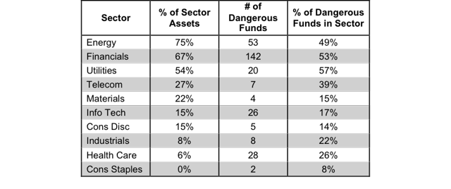
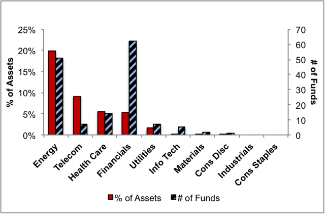
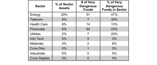 Summary Our sector ratings are based on the aggregation of our fund ratings for every ETF and mutual fund in each sector. The primary driver behind an Attractive fund rating is good portfolio management (stock picking) combined with low total annual costs. Cheap funds can dupe investors and investors should invest only in funds with good stocks and low fees. At the beginning of the third quarter of 2015, only the Consumer staples sector earns an Attractive-or-better rating. Our sector ratings are based on the aggregation of our fund ratings for every ETF and mutual fund in each sector. Investors looking for sector funds that hold quality stocks should look no further than the Consumer Staples and Information Technology sector. These sectors house the most Attractive-or-better rated funds. Figures 4 through 7 provide more details. The primary driver behind an Attractive fund rating is good portfolio management , or good stock picking, with low total annual costs . Attractive-or-better ratings do not always correlate with Attractive-or-better total annual costs. This fact underscores that (1) cheap funds can dupe investors and (2) investors should invest only in funds with good stocks and low fees. See Figures 4 through 13 for a detailed breakdown of ratings distributions by sector. Our fund rating methodology is detailed here . All of our reports on the best & worst ETFs and mutual funds in every sector are available here . Figure 1: Ratings For All Sectors (click to enlarge) Source: New Constructs, LLC and company filings To earn an Attractive-or-better Predictive Rating, an ETF or mutual fund must have high-quality holdings and low costs. Only the top 30% of all ETFs and mutual funds earn our Attractive or better ratings. The Fidelity Select Consumer Staples Portfolio (MUTF: FDFAX ) is the top rated Consumer Staples mutual fund. It gets our Very Attractive rating by allocating over 38% of its value to Attractive-or-better-rated stocks. PepsiCo Inc. (NYSE: PEP ) is one of our favorite stocks held by FDFAX and earns our Attractive rating. Over the last decade, PepsiCo has grown its after-tax profits ( NOPAT ) by 6% compounded annually. The company currently earns a healthy return on invested capital ( ROIC ) of 10%. Furthermore, PepsiCo has consistently generated positive economic earnings in every year of our model, which dates back to 1998. At its current price of $95/share, PEP has a price to economic book value ( PEBV ) of 1.2. This ratio implies that the market expects NOPAT growth of only 20% for the remainder of PepsiCo’s corporate life. These are low expectations considering that the company grew profits by 6% compounded annually for the past ten years. If Pepsi can continue to grow NOPAT by 6% compounded annually for the next decade , the stock is worth $127/share- a 34% upside from current valuations. The S aratoga Energy & Basic Materials Fund (MUTF: SBMBX ) is the worst rated Energy mutual fund. It gets our Very Dangerous rating by allocating over 45% of its value to Dangerous-or-worse-rated stocks. Making matters worse, it charges investors annual costs of 5.96%. Exxon Mobil (NYSE: XOM ) is one of our least favorite stocks held by SBMBX and earns our Dangerous rating. Since 2011, Exxon’s NOPAT has declined by 27% compounded annually. Exxon’s ROIC has fallen from 13% to a bottom quintile 5% in 2014. On a trailing twelve-month basis, ROIC has fallen even further to only 3%. Despite the issues Exxon has faced, the stock still remains overvalued. To justify its current price of $83/share, Exxon must grow NOPAT by 10% compounded annually for the next 13 years. This expectation seems optimistic given the current market landscape and Exxon’s inability to grow NOPAT at all over the last four years. Investors would be wise to steer clear of this oil & gas giant. Figure 2 shows the distribution of our Predictive Ratings for all sector ETFs and mutual funds. Figure 2: Distribution of ETFs & Mutual Funds (Assets and Count) by Predictive Rating (click to enlarge) Source: New Constructs, LLC and company filings Figure 3 offers additional details on the quality of the sector funds. Note that the average total annual cost of Very Dangerous funds is more than five times that of Very Attractive funds. Figure 3: Predictive Rating Distribution Stats (click to enlarge) * Avg TAC = Weighted Average Total Annual Costs Source: New Constructs, LLC and company filings This table shows that only the best of the best funds get our Very Attractive Rating: they must hold good stocks AND have low costs. Investors deserve to have the best of both and we are here to give it to them. Ratings by Sector Figure 4 presents a mapping of Very Attractive funds by sector. The chart shows the number of Very Attractive funds in each sector and the percentage of assets in each sector allocated to funds that are rated Very Attractive. Figure 4: Very Attractive ETFs & Mutual Funds by Sector (click to enlarge) Source: New Constructs, LLC and company filings Figure 5 presents the data charted in Figure 4. Figure 5: Very Attractive ETFs & Mutual Funds by Sector (click to enlarge) Source: New Constructs, LLC and company filings Figure 6 presents a mapping of Attractive funds by sector. The chart shows the number of Attractive funds in each sector and the percentage of assets allocated to Attractive-rated funds in each sector. Figure 6: Attractive ETFs & Mutual Funds by Sector (click to enlarge) Source: New Constructs, LLC and company filings Figure 7 presents the data charted in Figure 6. Figure 7: Attractive ETFs & Mutual Funds by Sector (click to enlarge) Source: New Constructs, LLC and company filings Figure 8 presents a mapping of Neutral funds by sector. The chart shows the number of Neutral funds in each sector and the percentage of assets allocated to Neutral-rated funds in each sector. Figure 8: Neutral ETFs & Mutual Funds by Sector (click to enlarge) Source: New Constructs, LLC and company filings Figure 9 presents the data charted in Figure 8. Figure 9: Neutral ETFs & Mutual Funds by Sector (click to enlarge) Source: New Constructs, LLC and company filings Figure 10 presents a mapping of Dangerous funds by fund sector. The chart shows the number of Dangerous funds in each sector and the percentage of assets allocated to Dangerous-rated funds in each sector. The landscape of sector ETFs and mutual funds is littered with Dangerous funds. Investors in Energy have put over 75% of their assets in Dangerous-rated funds. Figure 10: Dangerous ETFs & Mutual Funds by Sector (click to enlarge) Source: New Constructs, LLC and company filings Figure 11 presents the data charted in Figure 10. Figure 11: Dangerous ETFs & Mutual Funds by Sector (click to enlarge) Source: New Constructs, LLC and company filings Figure 12 presents a mapping of Very Dangerous funds by fund sector. The chart shows the number of Very Dangerous funds in each sector and the percentage of assets in each sector allocated to funds that are rated Very Dangerous. Figure 12: Very Dangerous ETFs & Mutual Funds by Sector (click to enlarge) Source: New Constructs, LLC and company filings Figure 13 presents the data charted in Figure 12. Figure 13: Very Dangerous ETFs & Mutual Funds by Sector (click to enlarge) Source: New Constructs, LLC and company filings D isclosure: David Trainer and Max Lee receive no compensation to write about any specific stock, sector or theme. Disclosure: I/we have no positions in any stocks mentioned, and no plans to initiate any positions within the next 72 hours. (More…) I wrote this article myself, and it expresses my own opinions. I am not receiving compensation for it. I have no business relationship with any company whose stock is mentioned in this article. Scalper1 News
Scalper1 News