Tag Archives: yahoo

Investing For Retirement Using American Century Mutual Funds
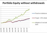
Summary American Century offers a set of diversified mutual funds which can be successfully used for construction of investment portfolios with good withdrawal rates. A set of just three mutual funds, a bond, an equity growth, plus an equity value fund generates good returns with relatively low risk. From January 2005 to December 2014, an American Century portfolio with fixed allocation could produce a safe 5% annual withdrawal rate and 2.15% annual increase of the capital. Same portfolio with rebalancing at 25% deviation from the target allowed a safe 5% annual withdrawal rate and achieved 2.21% compound annual increase of the capital. Same portfolio with momentum-based adaptive allocation could have produced a safe 12% annual withdrawal rate and 3.51% annual increase of the capital. This article belongs to a series of articles dedicated for investing in various mutual fund families. In previous articles we reported our research on Fidelity , Vanguard , and T Rowe Price mutual fund families. The current article does the same for American Century family of mutual funds. The series of these articles is aimed at a broad spectrum of investors. They may be useful to small individual investors as well as to any large institution managing retirement accounts. We report the performance of the portfolios under two scenarios: (1) no withdrawals are made during the time interval of the study, and (2) withdrawals at a fixed rate of the initial investment are made periodically. Since this is the fourth family of mutual funds for which we are building an investment portfolio for retirement, we elaborate here upon the general methodology we use. The set of funds selected for building the portfolio should satisfy the following criteria: (1) It should include at least one bond fund. (2) It should include a few equity funds, generally between two to five. Those funds should have enough similarity and diversity. As an example, we may select one value and one growth fund. (3) Historically, the funds selected should have performed better than most other funds in their category. Applying these principles, we selected three mutual funds for inclusion in a portfolio of American Century mutual funds. They are the following: American Century Government bond fund (MUTF: CPTNX ) American Century Heritage fund (MUTF: TWHIX ) American Century Value fund (MUTF: TWVLX ) As in the previous articles, three different strategies are considered: (1) Fixed asset allocation. The portfolio is initially invested 50% in the bond fund and 50% equally divided between the two stock funds, without rebalancing. (2) Target asset allocation with rebalancing. The portfolio is initially invested 50% in the bond fund and 50% equally divided between the two stock funds and is rebalanced when the allocation to any fund deviates by 25% from its target. (3) Momentum-based adaptive asset allocation. The portfolio is at all times invested 100% in only one fund. The switching, if necessary, is done monthly at closing of the last trading day of the month. All money is invested in the fund with the highest return over the previous 3 months. The data for the study were downloaded from Yahoo Finance on the Historical Prices menu for three tickers: CPTNX, TWHIX, and TWVLX. We use the monthly price data from January 2005 to December 2014, adjusted for dividend payments. The paper is made up of two parts. In part I, we examine the performance of portfolios without any income withdrawal. In part II, we examine the performance of portfolios when income is extracted periodically from the accounts. Part I: Portfolios without withdrawals In table 1 we show the results of the portfolios managed for 10 years, from January 2005 to December 2014. Table 1. Portfolios without withdrawals 2005 – 2014. Strategy Total increase% CAGR% Number trades MaxDD% Fixed-no rebalance 103.55 7.30 0 -24.61 Target-25% rebalance 109.82 7.63 4 -22.03 Momentum-Adaptive 330.90 15.73 35 -13.97 The time evolution of the equity in the portfolios is shown in Figure 1. (click to enlarge) Figure 1. Equities of portfolios without withdrawals. Source: This chart is based on EXCEL calculations using the adjusted monthly closing share prices of securities. From figure 1 it is apparent that the rate of increase of the adaptive portfolio is substantially greater than the rate of the fixed and target allocation portfolios. Part II: Portfolios with withdrawals Assume that we invest $1,000,000 for income in retirement. We plan to withdraw monthly a fixed percentage of the initial investment. That amount is increased by 2% annually in order to account for inflation. In table 2 we show the results of the portfolios managed for 10 years, from January 2005 to December 2014. Money was withdrawn monthly at a 5% annual rate of the initial investment plus a 2% inflation adjustment. Over the 10 years from January 2005 to December 2014, a total of $535,920 was withdrawn. Table 2. Portfolios with 5% annual withdrawal rate 2005 – 2014. Strategy Total increase% CAGR% Number trades MaxDD% Fixed-no rebalance 24.03 2.15 0 -28.78 Target-25% rebalance 22.68 2.21 4 -27.04 Momentum-Adaptive 210.05 11.98 35 -16.41 The time evolution of the equity in the portfolios is shown in Figure 2. (click to enlarge) Figure 2. Equities of portfolios with 5% annual withdrawal rates. Source: This chart is based on EXCEL calculations using the adjusted monthly closing share prices of securities. To illustrate the effect of the withdrawal rates on the evolution of the capital we report simulation results for two strategies: fixed target with rebalancing and momentum-based adaptive asset allocation. In Table 3 we report the results of simulations of the fixed target portfolio with the following withdrawal rates: 0%, 5%, 6%, 8%, and 10%. The time evolution of the equity in the portfolios is shown in Figure 3. To illustrate the advantage of the adaptive allocation strategy and the effect of withdrawal rates on the evolution of the capital, we give in Table 3 the results of simulations for the following withdrawal rates: 0%, 5%, 10%, and 12%. Table 3. Adaptive Portfolios with various annual withdrawal rates 2005 – 2014. Withdrawal rate % Total increase% CAGR% MaxDD% 0 330.90 15.73 -13.97 5 210.05 11.98 -16.41 10 89.54 6.60 -20.24 12 41.20 3.51 -22.23 The time evolution of the equity in the portfolios is shown in Figure 3. (click to enlarge) Figure 3. Equities of momentum-based portfolios with various annual withdrawal rates. Source: This chart is based on EXCEL calculations using the adjusted monthly closing share prices of securities. Conclusion The set of three American Century mutual funds, selected for this study, perform well for all three strategies and generate sustainable returns at relatively low drawdowns. Between 2005 and 2015, the fixed target allocation with rebalancing was able to sustain withdrawal rates of up to 6% annually. The adaptive allocation algorithm was able to sustain withdrawal rates up to 13% annually without any decrease of capital. We must admit here that the performance of the portfolio selected in this article is by no means the best possible. Without doubt, there may be other selections that would have performed better. On the other hand, past performance does not guarantee future results. Finding the best portfolio even for a specified past time interval is a great undertaking. All we can do is to strive toward finding one of the best, not really the best. Same philosophy applies into selecting the family of funds. In an article at the end of the series we will present a comparative study of their relative performance. Disclosure: The author has no positions in any stocks mentioned, and no plans to initiate any positions within the next 72 hours. (More…) The author wrote this article themselves, and it expresses their own opinions. The author is not receiving compensation for it (other than from Seeking Alpha). The author has no business relationship with any company whose stock is mentioned in this article. Additional disclosure: This article is the fourth in a sequence on investing in mutual funds for retirement accounts. To help the reader compare the past performance of various mutual fund families, I selected a benchmark 10-year time interval starting on 1 January 2005 and ending on 31 December 2014. The article was written for educational purposes and should not be considered as specific investment advice.
SPY And U.S. Economic Index Move In Sync For Third Straight Month

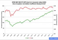
Summary The SPDR S&P 500 ETF and my U.S. Economic Index in January reversed their roles of a month earlier, as the former dropped and the latter dipped. The exchange-traded fund and my economic indicator moved in the same direction in each of the past three months. The correlation coefficient between them over the lifetime of their relationship held steady at 0.67. The SPDR S&P 500 Trust ETF (NYSEARCA: SPY ) and my U.S. Economic Index both headed south in January for the second straight month, but, as was the case in December, the magnitudes of their moves were quite different. SPY’s (quarterly) adjusted closing monthly share price slid to $199.45 from $205.54, a decline of -$6.09, or -2.96 percent, while the USEI’s (annually) adjusted level slipped to 56.31 from 56.33, a decline of -0.02 points, or -0.03 percent. Combining Institute for Supply Management manufacturing and nonmanufacturing figures with a special sauce, I assembled the USEI in an effort to capture all American economic activity in a single monthly number I can employ in guiding my investing and trading, as I mentioned when introducing the metric at J.J.’s Risky Business . Readers with an interest in my articles about the SPY-USEI relationship published during the past year are probably aware the SPY data series I employ historically has been adjusted quarterly. However, they are possibly unaware the three underlying USEI data series I use to calculate the index reading historically have been adjusted annually. Thanks to our ISM droogies bringing up-to-date their manufacturing and nonmanufacturing statistics this week, I was able to slather them with my special sauce, so the USEI’s annual adjustment in 2015 is complete. The most noticeable effect of this adjustment centers on the index’s value at its all-time high. Before the adjustment, the USEI peak was the 59.53 calculated for August 2014, followed by the 59.23 calculated for November 2014. After the adjustment, the index peak is the 58.65 calculated for last November, followed by the 58.54 calculated for last August. All the below data reflect the annual adjustment. Figure 1: SPY, USEI Monthly Values, January 2008-January 2015 (click to enlarge) Note: The SPY adjusted closing monthly share-price scale is on the left, and the USEI monthly value scale is on the right. Source: This J.J.’s Risky Business chart is based on proprietary analyses of ISM data and Yahoo Finance adjusted closing monthly share prices. ISM published its latest manufacturing data Monday and its latest nonmanufacturing data Wednesday. It has reported the relevant figures in the former series since January 1948, but the relevant numbers in the latter series since just January 2008. Thus, the complete data set for the USEI covers only 85 months (Figure 1). I calculate the SPY-USEI correlation coefficient as 0.67 during this period, the same as in each of previous two months. The comparable statistics were 0.66 for October, 0.65 for September, 0.64 for August, 0.63 for July and 0.61 for each of the four months between March and June. Therefore, the coefficient rose five months in a row until December. Figure 2: SPY-USEI Correlations, January 2009-January 2015 (click to enlarge) Note: My baseline conceptually consists of the first 12 SPY-USEI correlation coefficients, which are excluded here. Source: This J.J.’s Risky Business chart is based on proprietary analyses of ISM data and Yahoo Finance adjusted closing monthly share prices. For the USEI’s first 57 months (i.e., before the dawn of the U.S. Federal Reserve’s most recent quantitative-easing program, aka the Age of QE3+ ), I calculate the SPY-USEI correlation coefficient as 0.75. I interpret this number as evidence of a positive correlation between the equity market and the economy that was both stable and strong. For the index’s last 28 months (i.e., after the dawn of the Fed’s Age of QE3+), I calculate the SPY-USEI correlation coefficient as 0.57. I interpret this number as evidence of a breakdown in their relationship, indicating a disruption in the continuous feedback loop between the stock market and the economy. However, this disruption’s effects have been fading since the Fed began to significantly taper QE3+, as documented by the SPY-USEI correlation coefficient’s movement during the past seven months (Figure 2). This lengthy trend suggests substantial progress in the normalization of the relationship between the market and the economy. Figure 3: USEI Monthly Mean And Median Values, 2010-2014 (click to enlarge) Note: The current expansion began in June 2009, according to the Business Cycle Dating Committee of the National Bureau of Economic Research . Source: This J.J.’s Risky Business chart is based on proprietary analyses of ISM data. Neither the first quarter in general nor February in particular historically has been a great time for SPY, as documented elsewhere . Consistent with the ETF’s behavior and the interlocking nature of the SPY-USEI relationship, analysis of the seasonality of the USEI likewise indicates the same two periods have been among the weakest time frames of the annual cycles during the initial five full years of the current economic expansion from 2010 to 2014 (Figure 3). Figure 4: USEI Monthly Values, 2015 Versus 2010-2014 Mean (click to enlarge) Source: This J.J.’s Risky Business chart is based on proprietary analyses of ISM data. The USEI was an overachiever to a significant degree in January when compared with the relevant mean value compiled for the same month during the initial five full years of the current expansion (Figure 4). From January to February in this period, the index fell thrice and rose twice, once by a little (0.02 percent) and once by a lot (1.75 percent). Figure 5: USEI Monthly Values, 2015 Versus 2010-2014 Median (click to enlarge) Source: This J.J.’s Risky Business chart is based on proprietary analyses of ISM data. The USEI also was an overachiever to a significant degree in January when compared with the relevant median value compiled for the same month during the initial five full years of the current expansion (Figure 5). Statistically, the preponderance of the evidence suggests it is probable the index will be lower in February than it was in January. Figure 6: USEI Monthly Values With 3-Month And 12-Month SMAs (click to enlarge) Source: This J.J.’s Risky Business chart is based on proprietary analyses of ISM data. The conditions underlying the USEI’s current status should do nothing to create a roadblock for a Federal Open Market Committee on its way to announce its first interest-rate increase in eight-plus years as soon as April 29, six months after the Federal Reserve concluded asset purchases under QE3+ (Figure 6). And I suspect such an event would be a big deal, not only for the economy, as represented by the USEI, but also for the large-capitalization segment of the market, as represented by SPY. Disclaimer: The opinions expressed herein by the author do not constitute an investment recommendation, and they are unsuitable for employment in the making of investment decisions. The opinions expressed herein address only certain aspects of potential investment in any securities and cannot substitute for comprehensive investment analysis. The opinions expressed herein are based on an incomplete set of information, illustrative in nature, and limited in scope. In addition, the opinions expressed herein reflect the author’s best judgment as of the date of publication, and they are subject to change without notice. Disclosure: The author has no positions in any stocks mentioned, and no plans to initiate any positions within the next 72 hours. (More…) The author wrote this article themselves, and it expresses their own opinions. The author is not receiving compensation for it (other than from Seeking Alpha). The author has no business relationship with any company whose stock is mentioned in this article.

11 Stocks Plus Cash Saw $24,000 Grow To Over $1 Million

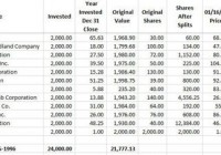
Summary Start in 1985 with a $2,000 investment in cash. Make one $2,000 investment at the end of the year from 1986 through 1996. Investments are assumed to be made in an IRA to shelter from taxes. The first $2,000 was invested in cash to pay for commissions and other fees. The average investor can save a tidy sum for retirement. It takes some luck, perseverance, and a buy and hold approach. The portfolio constructed would generate $22,400 in dividends for 2015. The portfolio was constructed by entering stock symbols into a spreadsheet in random order. The model assumed a $2,000 a year investment from 1985 through 1996 or 12 years. The first – year investment of $2,000 was invested in cash to account for commissions and other fees. The results are not actual results, but hypothetical results. Dividends that would have been earned on investments have been ignored or assumed to have been invested in stocks that blew up and went to zero ($0.00). The results generated most likely are influenced by a survivor basis. Nevertheless, the exercise proved useful. Data was obtained from company websites and or Yahoo Finance. The performance results are handicapped by not accounting for dividends paid since purchase nor assuming they are reinvested. The portfolio results presented are conservative to consider a worst case rather than an unrealistic best case. This is part one. The second part will cover the years 1998 through 2014. The model portfolio is shown below. (click to enlarge) Chart of the stock performance since inclusion into the model portfolio is shown below. Kellogg (NYSE: K ) K data by YCharts Archer Daniels Midland (NYSE: ADM ) ADM data by YCharts Starbucks (NASDAQ: SBUX ) SBUX data by YCharts The Home Depot (NYSE: HD ) HD data by YCharts Exxon Mobil (NYSE: XOM ) XOM data by YCharts Stryker (NYSE: SYK ) SYK data by YCharts Caterpillar (NYSE: CAT ) CAT data by YCharts Charles Schwab (NYSE: SCHW ) SCHW data by YCharts JPMorgan (NYSE: JPM ) JPM data by YCharts Wal-Mart (NYSE: WMT ) WMT data by YCharts Microsoft (NASDAQ: MSFT ) MSFT data by YCharts Bottom line: With a little luck and experience, it is possible for a modest investment to grow into a nice nest egg. What do you think? Disclosure: The author is long ADM, SYK, SCHW, JPM, MSFT. (More…) The author wrote this article themselves, and it expresses their own opinions. The author is not receiving compensation for it (other than from Seeking Alpha). The author has no business relationship with any company whose stock is mentioned in this article. Are you Bullish or Bearish on ? Bullish Bearish Neutral Results for ( ) Thanks for sharing your thoughts. Submit & View Results Skip to results » Share this article with a colleague