Tag Archives: undefined

There Is Great Diversification For SPHB, But It Still Carries Some Major Risks

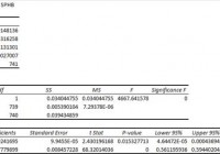
Summary I’m taking a look at SPHB as a candidate for inclusion in my ETF portfolio. The risk level makes me uncomfortable for anything over 5%. The ETF is very well diversified, just not into the kind of companies I want to hold. I’m not assessing any tax impacts. Investors should check their own situation for tax exposure. Investors should be seeking to improve their risk adjusted returns. I’m a big fan of using ETFs to achieve the risk adjusted returns relative to the portfolios that a normal investor can generate for themselves after trading costs. I’m working on building a new portfolio and I’m going to be analyzing several of the ETFs that I am considering for my personal portfolio. One of the funds that I’m considering is the PowerShares S&P 500 High Beta Portfolio (NYSEARCA: SPHB ). I’ll be performing a substantial portion of my analysis along the lines of modern portfolio theory, so my goal is to find ways to minimize costs while achieving diversification to reduce my risk level. What does SPHB do? SPHB attempts to track the total return of the S&P 500® High Beta Index. At least 90% of funds are invested in companies that are part of the index. SPHB falls under the category of “Mid-Cap Blend”. Does SPHB provide diversification benefits to a portfolio? Each investor may hold a different portfolio, but I use (NYSEARCA: SPY ) as the basis for my analysis. I believe SPY, or another large cap U.S. fund with similar properties, represents the reasonable first step for many investors designing an ETF portfolio. Therefore, I start my diversification analysis by seeing how it works with SPY. I start with an ANOVA table: (click to enlarge) The correlation is about 86%. It is low enough to provide some diversification benefits relative to holding SPY, but the benefits won’t be huge so if the standard deviation of returns is too high it may still be difficult to fit SPHB into a portfolio. Standard deviation of daily returns (dividend adjusted, measured since January 2012) The standard deviation is terrible. For SPHB it is 1.1739%. For SPY, it is 0.7300% for the same period. SPY usually beats other ETFs in this regard, but that is a very high standard deviation. Granted, it should be assumed that a high beta portfolio would have a high standard deviation of returns. Under CAPM (Capital Asset Pricing Model) the level of expected return should be easily determined by the beta of the stock. I think high beta stocks frequently more risk than they compensate for with returns. Therefore, I have a bias towards lower levels of beta. In the context of an entire portfolio, I can see the potential for benefits from using a small position in higher beta ETFs with free rebalancing to limit the amount of risk being created. Mixing it with SPY I also run comparisons on the standard deviation of daily returns for the portfolio assuming that the portfolio is combined with the S&P 500. For research, I assume daily rebalancing because it dramatically simplifies the math. With a 50/50 weighting in a portfolio holding only SPY and SPHB, the standard deviation of daily returns across the entire portfolio is 0.9359%. If we drop the position to 20% the standard deviation goes down to .8068%. In my opinion, that’s still too high. Once we drop it down to a 5% position the standard deviation is .7484%. I think 5% is about the largest position I’d consider here. Why I use standard deviation of daily returns I don’t believe historical returns have predictive power for future returns, but I do believe historical values for standard deviations of returns relative to other ETFs have some predictive power on future risks and correlations. Yield & Taxes The distribution yield is 0.88%. The ETF isn’t designed to cover the living expenses of retirees and in my opinion the risk level of the ETF combined with the low yield should encourage retirees to only consider positions even smaller than 5%. With the right level of diversification the ETF can still be used, but it isn’t built to meet those needs. I’m not a CPA or CFP, so I’m not assessing any tax impacts. If I were using SPHB, I would want it to be in a tax exempt account to remove any headaches associated with frequent rebalancing. Expense Ratio The ETF is posting .25% for an expense ratio. I want diversification, I want stability, and I don’t want to pay for them. In my opinion, a .25% expense ratio is higher than I want to pay for equity investments. It’s still low relative to many other methods of investing, but I’m looking for long term holdings and I don’t want to give my investments away. Market to NAV The ETF is at a .03% premium to NAV currently. In my opinion, that’s not worth worrying about. It is practically trading right on top of NAV. However, premiums or discounts to NAV can change very quickly so investors should check prior to putting in an order. Largest Holdings The portfolio is very well diversified. Despite my lack of interest in holding higher beta portfolios, I still appreciate the great level of diversification. The top holding is barely over 1.5% of the portfolio. That is great. Check out the chart below: (click to enlarge) Conclusion I’m currently screening a large volume of ETFs for my own portfolio. The portfolio I’m building is through Schwab, so I’m able to trade SPHB with no commissions. I have a strong preference for researching ETFs that are free to trade in my account, so most of my research will be on ETFs that fall under the “ETF OneSource” program. At this point I’m a little skeptical, but I’ll have to test the impacts of the ETF in a heavily diversified portfolio. If I do include SPHB, it will probably be a position of 5% or less. The most likely result is that I will decide to exclude SPHB from my portfolio.

Putting Together Quant Portfolios

One of the more overlooked areas of quantitative investing is how to integrate quant strategies into a diversified portfolio. Let’s look at a few of the issues involved and some possible solutions. I’ve discussed the big allocation decision already, i.e. how much to put into quant strategies vs. bonds already. I think this decision should be primarily driven by how much risk one is willing to take. I use maximum portfolio drawdown as the primary metric to judge how much risk I’m willing to take. Here is the max drawdown table from that post. For example, to limit annual drawdowns to less than 10% and 30% quant portfolio 70% bond portfolio would be the appropriate allocation. If a 15% max DD is more suited to your risk tolerance then you can go up to a 70% quant portfolio 30% bond portfolio allocation. Of course, this is dependent on the type of quant strategies used but surprisingly it doesn’t matter as much as you may think. The XLP/XLU quant strategy is one of the most conservative strategies while TV is one of the most aggressive and best performing, yet in terms of max DD there is not that big a difference. OK, now for some of the subtle details of building quant portfolios. First, why pick more than one quant strategy? Shouldn’t you just pick the best one with respect to whatever metric you want? I would argue no, mainly due to behavioral factors. Investors have a hard time with underperformance, no matter what the long term track record of a strategy may be. Let’s take this year as an example and compare one of the best performing quant strategies over time, a value and momentum microcap stock quant portfolio, to a conservative utility value strategy. The micro cap quant strategy has returned over 22% a year since the late 60s as compared to 16% a year for the utility value strategy. In 2014, the micro cap strategy is up 3% while the utility strategy is up over 29%! That kind of divergence is hard to swallow for most investors and leads to performance chasing. The best way to avoid this is to choose multiple strategies and choose strategies with high base rates . At the simplest level using more strategies increases the odds that at least one is outperforming and thus lessens the odds of making behavioral mistakes. OK, now that we’re going to choose multiple quant strategies, we need to avoid a few pitfalls. The two big ones for me are over-diversification and excessive fees. The quant strategies I’ve presented on the blog usually have 25 individual stocks in a portfolio. If you’re going to go with 3 quant strategies then we’re talking about 75 individual stocks. Besides paying way more in fees by holding too many stocks we reduce the power of the quant strategies. Two great post on this subject are, Avoid Diworsification , and You need to Dare to be Great . Here is the money pic. (click to enlarge) 10-15 individual stocks gives about the best bang for the buck for any one of the individual quant systems. So let’s say we go a bit crazy and choose 5 different quant systems that we’d like in our overall portfolio. We’ll choose the TV2 systems, the EDY system, the Large stock SHY system, the XLP system, and the XLU system. I’ve posted all of these systems before. See here for a list of all my quant posts. 10 stocks each. Yearly holding period and go back as far as we can, Dec 2008, for the P123 book simulation tool that I use. I’ll call this the Quant 5. Results of the overall quant portfolio are below. (click to enlarge) Pretty impressive results. Over the full period, all of the quant systems beat the market handily. But there have been significant periods of underperformance for several of the systems. For example, over the last 3 years, the EDY systems and the XLU system have underperformed the market and the other systems. The top quant system over the full period from 2008 turned out to be the large stock SHY system even though going back further to 1999, other systems have performed better. Of course, how could you know that before hand? You can’t. Bottom line: It pays to diversify, but not too much. Not just in terms of risk adjusted returns but probably more importantly in terms of an investor being able to stick with quant investing over the long term.

GDX – The Way To Play Gold In 2015

Summary I anticipate gold will stabilize and turn higher during 2015. Over the near-term, the factors weighing against gold remain capable of hampering its price appreciation. I would avoid the risk inherent in owning individual miners, save for the most stable, and instead seek the leverage of the miners through GDX. Gold’s great fall of the past two years has been well-documented, and many experts see good enough reason for it to continue a while longer. However, I see the dynamics around the price of gold shifting. Given the greater swing lower of gold miners versus the price of gold, they may be priced right to benefit in a greater way from a turn in trend. Many of the miners are small and some are over-levered and vulnerable to further decline in the price of the commodity. So for the wherewithal to survive any further downswing while still availing capital to benefit from an upward move in gold, I suggest investors consider the Market Vectors Gold Miners ETF (NYSE: GDX ) here. I think that it’s one of the best ways to play for a turn in gold. Gold Past and Present I just published my expectations for gold in 2015 in a report formally marking my change in opinion about its direction. It is required reading for those studying this report, but I am summarizing it again here for those of you who might not get a chance to look at it. Then we can move forward to why I believe the Market Vectors Gold Miners ETF is a prime way to play gold in 2015. Gold prices came down significantly in 2013 and 2014, and gold relative securities followed. I believe it is popular opinion now that anticipation about the change in Federal Reserve monetary policy from expansionary to hawkish is what drove the start of the decline in gold prices in 2013. 2014 proved to be choppy for reasons discussed in my outlook report, but gold finally also found ultimate direction lower in 2014 as well. The key catalyst for that decline was the strengthening dollar, which anticipated and reacted to Fed action to halt quantitative easing. The dollar remains strong against relatively weaker currencies globally due to American economic strength and Fed monetary direction versus economic difficulties in Europe, Japan and elsewhere, and dovish central bank policy at the Bank of Japan (BOJ) and European Central Bank (ECB). To start 2015, and beginning already, I see capital flows out of better performing securities finding gold as investors seek to guard wealth again from the tides of tax relative flows. Before long, I expect a new question to be raised about the status of the dollar as a safe haven for wealth. Despite strong economic growth in the U.S. and relatively weaker activity overseas, I see geopolitical conflict somehow infecting our shores, and possibly our economy and currency in 2015. That risk alone already has sovereigns flirting with moves toward a gold standard. Some are making the change out of necessity, like Russia and Iran, but others will do so out of preference. I see this as a prelude to a future trend. The key catalyst for the dollar is likely tiring at this point. I believe the dollar has already greatly priced in the start of Fed rate hikes coming in 2015. So, a sell the news type of scenario could play out with the dollar shedding value and gold and other commodities seeing renewed price strength in 2015, especially if the dollar’s safe haven status is placed into question as I expect. Please read my report for more detail on my view for gold. Gold Miners Decline and Position Gold Relative Securities YTD SPDR Gold Trust ETF (NYSE: GLD ) -4.4% iShares Silver Trust ETF (NYSE: SLV ) -19.4% Market Vectors Gold Miners -15.4% Goldcorp (NYSE: GG ) -17.9% Newmont Mining (NYSE: NEM ) -21.7% Barrick Gold (NYSE: ABX ) -42.3% Kinross Gold (NYSE: KGC ) -39.7% Randgold Resources (NASDAQ: GOLD ) +0.4% Yamana Gold (NYSE: AUY ) -55.4% You can see how gold miners have exaggerated the price decline of gold in the comparison of the miners’ performance to the SPDR Gold Trust ETF, which tracks the price of gold. The miners are off by a significantly greater margin this year-to-date; the miner-encompassing Market Vectors Gold Miners ETF is down 15.4% versus the 4.4% slide in the GLD this year. However, the declines of most of the individual gold miners’ shares have been far greater. Even the industry leaders are off by a greater margin than the GDX. This illustrates how levered the gold miners are to the price of gold, both individually and as a group, but it also shows how risk can be reduced by using the GDX versus individual miners. Why GDX Over Miners Yamana Gold is down more than 55% this year, versus the 15.4% drop of the GDX. That’s because Yamana has 29X more debt than equity, and threshold where it becomes unfeasible for it to produce gold. It’s thereby vulnerable to swings in the price of gold and bears company specific liquidity and solvency risk. This would be the case across a swath of miners, and individual exploration and production results could disappoint as well. However the Market Vectors Gold Miners ETF allows the investor to eliminate company specific risk, or at least minimize it. The ETF seeks to match the performance of the NYSE Arca Gold Miners Index. While the GDX may hold the shares of small cap miners, its holdings are part of a diversified portfolio of firms within the mining industry. Therefore, if one miner goes bankrupt or produces poor results, the GDX will not see much price impact. It allows investors to bet on the leverage inherent in gold miners to the price of gold but to reduce the risk that exists in holding one company. Similarly to the year-to-date performance shown in the table above, the five-year charts of the GLD and the GDX show that gold miners have exaggerated the move downward in gold. I believe this reflects a sort of inverse bubble in the miners, where downside has been overdone and the shares are oversold. If we were to put the two charts together, we would see that a wide gap has opened between the struggling GDX and the valuation of the GLD. I expect it to close that gap once gold prices begin a sustainable move higher. Given my view that gold prices will stabilize and begin to move higher in the coming year, I favor long-term investment in gold relative securities. As there remain risks to the price of gold, I would refrain from investment in individual gold miners due to company specific risks, save for the largest and most stable of the firms. Instead, I suggest the Market Vectors Gold Miners security as the way to best lever the turn in gold I see, without bearing the risks inherent to individual miners.