X-Raying CEFL (Part 3): Interest Rate Sensitivity
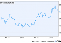
Summary Previous articles in this series investigated the leverage, expense ratio and geographical statistics of CEFL, a 2X leveraged CEF fund-of-funds. This article seeks to analyze the interest rate sensitivity of CEFL by comparing the performance of different classes of CEFs during the interest rate spike of 2015. How sensitive is CEFL to rising interest rates? Introduction This is Part 3 of a series of articles designed to “X-ray” into the holdings of the ETRACS Monthly Pay 2xLeveraged Closed-End Fund ETN (NYSEARCA: CEFL ) to allow investors to better understand the characteristics of the fund. CEFL tracks twice the monthly return of the ISE High Income Index [YLDA], an index that is comprised of high-yielding close-ended funds [CEFs]. The methodology used to construct YLDA has been summarized here . The YieldShares High Income ETF (NYSEARCA: YYY ) tracks the same index as CEFL. In the first article , the equity/debt, leverage and expense ratio of CEFL was analyzed. In the second article , the geographical allocation of CEFL was discussed. In the comment streams of the first two articles, I received a number of comments asking about the interest rate sensitivity of CEFL. This is an especially pertinent question given the mini-“Taper tantrum” that has occurred in early 2015. As the chart below shows, the U.S. 10-year treasury rate has increased from around 1.70% to a peak of 2.50% over short span of less than 6 months. 10 Year Treasury Rate data by YCharts Over the same time period, CEFL has dropped by -3.87% in price, although its total return has been +3.13% after dividends are accounted for. This suggests that CEFL has been holding up quite well despite the recent spike in interest rates. CEFL data by YCharts In this third article, I seek to analyze the debt holdings of CEFL to see how individual classes of CEFs fared during the recent interest rate spike. Methodology CEFL contains 30 CEFs, of which 7 are equity funds, 21 are debt funds and 2 are mixed funds. For this analysis, I only included the 21 debt funds as bonds are more sensitive to fluctuations in interest rates compared to stocks. For each debt CEF, I assigned it a primary classification for its largest type of debt holding (usually 40-100% of the total fund assets). I also assigned the CEF a secondary classification if its second-largest type of debt holding was at least 20% of the total fund assets. The classification types are: [i] corporate bonds [corp], [ii] government bonds [gov], [iii] securitized bonds [sec], which include various agency/commercial mortgage or asset-backed bonds, [iv] senior loans [loan], [v] convertible bonds [CB], and [vi] preferred shares [PF]. Note that this classification does not distinguish between U.S. and foreign bonds. The primary and secondary classifications of the 21 debt funds are shown in the table below. Fund Ticker Assets Primary Secondary DOUBLELINE INCOME SOLUTIO (NYSE: DSL ) 4.38% Corp Sec FIRST TRUST INTERMEDIATE (NYSE: FPF ) 4.28% Pref EATON VANCE LIMITED DURAT (NYSEMKT: EVV ) 4.26% Loan Sec MFS CHARTER INCOME TRUST (NYSE: MCR ) 4.24% Corp Gov BLACKROCK CORPORATE HIGH (NYSE: HYT ) 4.20% Corp WESTERN ASSET EMG MKT DBT (NYSE: ESD ) 4.18% Gov Corp PRUDENTIAL GL SH DUR HI Y (NYSE: GHY ) 4.11% Corp Gov PIMCO DYNAMIC CREDIT INCO (NYSE: PCI ) 4.11% Sec Corp MORGAN STANLEY EMERGING M (NYSE: EDD ) 3.88% Gov ABERDEEN ASIA-PAC INCOME (NYSEMKT: FAX ) 3.43% Gov Corp PRUDENTIAL SHORT DURATION (NYSE: ISD ) 3.15% Corp MFS MULTIMARKET INC TRUST (NYSE: MMT ) 2.84% Corp BLACKSTONE/GSO STRATEGIC (NYSE: BGB ) 2.65% Loan Corp ALLIANZGI CONVERTIBLE & I (NYSE: NCV ) 2.42% CB Corp WESTERN ASSET HIGH INC FD (NYSE: HIX ) 2.19% Corp BLACKROCK MULTI-SECTR INC (NYSE: BIT ) 1.89% Sec Corp WELLS FARGO ADV MULTISECT (NYSEMKT: ERC ) 1.56% Corp Gov ALLIANZGI CONV & INCOME I (NYSE: NCZ ) 1.35% CB Corp WELLS FARGO ADVANTAGE INC (NYSEMKT: EAD ) 1.33% Corp NUVEEN PFD INC OPP FD (NYSE: JPC ) 1.12% Pref INVESCO DYNAMIC CREDIT OP (NYSE: VTA ) 0.96% Loan Corp The performance of each class of debt CEF during the current interest rate spike (Feb. 1, 2015 to date) is compared with a benchmark ETF as identified using the correlation tool from InvestSpy . Corporate bonds 9 of the debt CEFs have corporate bonds as their primary holding, while 8 CEFs have corporate bonds as their secondary holding. All 9 debt CEFs that have corporate bonds as their primary holding are most correlated with the iShares iBoxx $ High Yield Corporate Bond ETF (NYSEARCA: HYG ). The following chart illustrates the 1-year correlation coefficients for these 9 funds arranged from highest to lowest correlation. The following chart shows the total return performance of the 9 debt CEFs with corporate bonds as their primary holding during the most recent interest rate spike compared to HYG from Feb. 1, 2015 to date. HYG Total Return Price data by YCharts We can see from the chart above that DSL has had the best total return performance of +4.98%, while GHY had the worst performance of -4.33% since Feb. 1, 2015. The average of the 9 CEFs was +0.28%, while the benchmark index HYG returned +1.14%. This indicates that the 9 debt CEFs with corporate bonds as their primary holding slightly underperformed the benchmark HYG over this time period. Government bonds 3 of the debt CEFs have government bonds as their primary holding, while 3 CEFs have government bonds as their secondary holding. Of the 3 debt CEFs that have government bonds as their primary holding, ESD and EDD are most correlated with the iShares J.P. Morgan USD Emerging Markets Bond ETF (NYSEARCA: EMB ), with 1-year coefficients of 0.51 and 0.60, respectively, while FAX is most correlated with HYG, with a coefficient of 0.29. Note that all three CEFs are actually either emerging market (ESD, EDD) or Asia-Pacific bond funds. The following chart shows the total return performance of the 3 debt CEFs with government bonds as their primary holding during the most recent interest rate spike compared to EMB and HYG from Feb. 1, 2015 to date. ESD Total Return Price data by YCharts We can see from the chart above that ESD has had the best total return performance of +0.67%, while EDD had the worst performance of -12.80% since Feb. 1, 2015. The average of the 3 CEFs was -6.22%, while the benchmark indices EMB and HYG returned +0.23% and +1.14%, respectively. This indicates that the 3 debt CEFs with government bonds as their primary holding significantly underperformed the benchmarks EMB and HYG over this time period. Senior loans 3 of the debt CEFs have senior loans as their primary holding. All 3 debt CEFs that have senior loans as their primary holding are most correlated with HYG. EVV, BGB and VTA have 1-year correlation coefficients to HYG of 0.40, 0.40 and 0.28, respectively. The following chart shows the total return performance of the 3 debt CEFs with senior loans as their primary holding during the most recent interest rate spike compared to HYG from Feb. 1, 2015 to date. The PowerShares Senior Loan Portfolio (NYSEARCA: BKLN ) is included for comparison. EVV Total Return Price data by YCharts We can see from the chart above that VTA has had the best total return performance of +5.35%, while EVV had the worst performance of +1.65% since Feb. 1, 2015. The average of the 3 CEFs was +3.53%, while the benchmarks HYG and BKLN returned +1.14% and +0.66%. This indicates that the 3 debt CEFs with senior loans as their primary holding significantly outperformed the benchmarks HYG and BKLN over this time period. Preferred shares 2 of the debt CEFs have preferred shares as their primary holding. JPC is most correlated with HYG (0.36), whereas FPF is, somewhat strangely, most correlated with the PowerShares Emerging Markets Sovereign Debt Portfolio (NYSEARCA: PCY ) (0.33). Therefore I have replaced PCY with the iShares U.S. Preferred Stock ETF (NYSEARCA: PFF ) in the following chart. JPC Total Return Price data by YCharts We can see from the chart above that JPC has had the best total return performance of +2.47%, followed by FPP at +0.26% since Feb. 1, 2015. The average of the 2 CEFs was +1.37%, while the benchmarks HYG and BKLN returned +1.14% and +0.11%. This indicates that the 2 debt CEFs with preferred shares as their primary holding slightly outperformed the benchmarks HYG and PFF over this time period. Convertible bonds 2 of the debt CEFs have convertible bonds as their primary holding. NCV and NCZ are both most correlated with the SPDR Barclays Convertible Securities ETF (NYSEARCA: CWB ), with 1-year correlation coefficients of 0.40 and 0.34, respectively. The following chart shows the total return performance of the 2 debt CEFs with convertible bonds as their primary holding during the most recent interest rate spike compared to CWB from Feb. 1, 2015 to date. NCV Total Return Price data by YCharts We can see from the chart above that NCV has had the best total return performance of -1.00%, followed by NCZ at -5.89% since Feb. 1, 2015. The average of the 2 CEFs was -3.45%, while the benchmark CWB returned +5.22%. This indicates that the 2 debt CEFs with convertible bonds as their primary holding significantly underperformed the benchmark CWB over this time period. Securitized bonds 2 of the debt CEFs have securitized bonds as their primary holding, while 2 CEFs have securitized bonds as their secondary holding. The 2 debt CEFs that have securitized bonds as their primary holding as both most correlated with HYG, with PCI and BIT having 1-year correlation coefficients of 0.54 and 0.44, respectively. The following chart shows the total return performance of the 2 debt CEFs with securitized bonds as their primary holding during the most recent interest rate spike compared to HYG from Feb. 1, 2015 to date. The iShares MBS ETF (NYSEARCA: MBB ) and the iShares CMBS ETF (NYSEARCA: CMBS ), which hold agency and commercial mortgage-backed bonds, respectively, are shown for comparison. PCI Total Return Price data by YCharts We can see from the chart above that PCI has had the best total return performance of +2.06%, followed by BIT at -0.33% since Feb. 1, 2015. The average of the 2 CEFs was +0.87%, while the benchmarks HYG, MBB and CMBS returned +1.14%, -0.50% and -1.32%, respectively. This indicates that the 2 debt CEFs with securitized bonds as their primary holding slightly outperformed the benchmark HYG over this time period. Discussion What does this all mean for investors? One major finding that resulted from this analysis is that most of the CEF debt classes in CEFL (including corporate bonds, senior loans, preferred shares and convertible bonds)* are most correlated with the high-yield ETF HYG. This bodes well for investors in CEFL who are worried about rising interest rates since high-yield debt is less interest-rate sensitive compared to investment-grade debt. (*Note that BKLN and PFF did not show up in the top-10 ETFs most correlated with the senior loans or preferred shares CEFs, respectively, indicating that InvestSpy might have for some reason excluded these ETFs from its correlation tool.) Indeed, inputting CEFL into the Investspy’s correlation tool indicates that has been the most correlated with HYG, EMB, JNK, PCY and CWB over the past 1-year, as shown in the chart below (but note that the past 1 year includes the final six months of 2014 which are before the rebalancing of CEFL to its present constituents). Encouragingly, all five of these ETFs and CEFL have outperformed the iShares iBoxx $ Investment Grade Corporate Bond ETF (NYSEARCA: LQD ) (-4.75%), the iShares 7-10 Year Treasury Bond ETF (NYSEARCA: IEF ) (-3.46%) and the iShares 20 Year Treasury Bond ETF (NYSEARCA: TLT ) (-12.7%) during the interest rate spike of 2015. This is not surprising because investment-grade debt and treasuries are much more sensitive to interest rates, as mentioned above. The total return performances of these ETFs are shown in the chart below. CEFL Total Return Price data by YCharts In terms of the individual debt classes of CEFL, CEFs with corporate bonds (as their primary holding) averaged +0.28%, government bonds averaged -6.22%, senior loans averaged +3.53%, preferred shares CEFs +1.37%, convertible bonds -3.45%, and securitized bonds +0.87% since Feb. 1st, 2015. The strongest performance of senior loan CEFs (+3.55%) may be rationalized by the fact that these are normally floating-rate instruments that may benefit as interest rates rise, although it should also be noted that the benchmark ETF BKLN was essentially flat over this time period. A quick check on CEFConnect shows that the premium/discount of the three senior loan CEFs (EVV, BGB, VTA) was steady over this time period, suggesting either that the CEF managers were able to outperform the benchmark or that the other components in the CEFs were responsible for the outperformance. Conversely, the weakest performance of the government bond CEFs (-6.22%) may also be understood on the basis that this debt is relatively interest rate-sensitive, although again the benchmark index EMB was actually also flat over this time period. This time, however, the discounts for the three CEFs in question (FAX, ESD, EDD) actually widened by about 2 to 4 percentage points over this time period, indicating that the discount expansion could account for a significant fraction of the underperformance of these CEFs. Moreover, this observation indicates investor pessimism regarding these CEFs, which are actually all emerging market or Asia-Pacific bond funds. The total return performance of the six classes of debt CEFs within CEFL since Feb. 1st, 2015 are summarized in the chart below. Conclusion Based on this analysis of CEF performances during the interest rate spike of 2015, I conclude that CEFL is not very interest rate-sensitive, and investors therefore do not have to unduly worry over the effect of increasing interest rates on CEFL. The main findings supporting this conclusion are: Most of the holdings of CEFL are most-correlated with high-yield debt, which is not very interest rate-sensitive. The five ETFs that are most correlated with CEFL all outperformed investment-grade bonds LQD and treasuries IEF and TLT since Feb. 1, 2015. CEFL itself outperformed LQD, IEF and TLT over the same time period. CEFL contains three senior loan CEFs, which are typically floating rate instruments, and these may provide protection against increasing interest rates. The main limitations of this analysis are: The premium/discount of the individual funds were not studied. Seeking Alpha contributor Lance Brofman has calculated the overall discount of CEFL to be 9.5% on Jun. 1, 2015, an increase compared to 8.6% a month prior, but the overall discount on Feb. 1, 2015 was not determined. The 10-year treasury rate increased from 1.70% to a peak of 2.50% over the past 5 months. Therefore, this analysis may not be valid for interest rate increases that are much greater in magnitude or velocity (although this seems to be an unlikely scenario at the present time). This analysis is only valid until Dec. 31, 2015, when CEFL becomes repopulated with different CEFs due to rebalancing. Finally, as a 2X leveraged fund, the cost of maintaining the leverage of the CEFL (based on 3-month LIBOR) would go up as interest rates rise. While not having an immediate effect on NAV, this effectively increases the total expense ratio of the fund, leading to a drag on NAV over time. I hope this information will be helpful for investors in or considering investing in this fund. Disclosure: I am/we are long CEFL. (More…) I wrote this article myself, and it expresses my own opinions. I am not receiving compensation for it (other than from Seeking Alpha). I have no business relationship with any company whose stock is mentioned in this article.