Tag Archives: transactionname

Tough Times Ahead For REC Silicon ASA

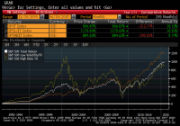
REC Silicon posted yet another abysmal quarter with no respite in sight. As predicted, the company’s inventory build plan backfired, and the company raised capital through debt and equity offerings in the last 24 hours. We believe the management is too optimistic, and as such do not see much joy for shareholders for quite some time to come. REC Silicon ( OTCPK:RNWEF ), as we forecasted , reported horrendous second quarter results on Tuesday. While revenues of $93M is an improvement over $74.4M from Q1, they come at a steep cost to the company in terms of plummeting ASPs. As a result of the plummeting ASPs, EBITDA declined again from $24.8M in Q1 to $5.8 million in Q2. The process-in-trade loophole, through which the company has been shipping polysilicon to China in the recent past is no longer available to the company, and effectively a big part of the company’s customers disappeared overnight. Against this backdrop, the company built another 1248 MT of inventory as it was unable to sell its poly production in the market. This inventory build in a downward pricing environment sapped the company’s cash flow, and the company has now come to the realization that its current business vector is not sustainable. However, as we wrote earlier, this handwriting was on the wall when the company decided to build inventories instead of selling product due to low ASPs in Q1. In the face of further declining prices and balance sheet stress, the company opted to sell product at distressed prices. While the FBR poly produced by REC Silicon has typically commanded lower ASPs than Siemens poly that most of the industry produces, the gap between the prices has increased dramatically in the recent quarters. This gap opened up further at the end of Q2 (see chart below). We believe there are two reasons for this widening gap. The first is that instead of withholding selling at the low prices as the company did in Q1, the company sold product at artificially low price to raise some much-needed cash. Secondly, customers sensing the upcoming changes to Process-in-Trade, and the company’s financial position, appear to have negotiated hard and gotten steeper discounts than usual. While the company sold a significant amount of polysilicon at low prices in the quarter, the production continued to be ahead of sales. The resulting 1248 MT inventory build in the quarter has now increased the company’s inventory to approximately 6000 MT – approximately 4 months of sales. Finally, the company decided that it cannot keep building inventory and has decided to cut its production at its Moses Lake facility. This reduced the company’s manufacturing capacity by about 2000 MT. The company also decided to put on hold its expansion plans. REC Silicon had previously planned 3000 MT of new capacity using its updated FBR-B process. This new process could have helped the company further improve cost structure but is now being halted with an eye towards a future restart. The company is conducting an orderly shutdown process and expects to be able to bring the facility to production within a year once it decides to restart the work. With these production moves, the company is dramatically reducing its capacity and expects that it will deplete its current inventory by 1500 MT in Q3. This would help generate some much needed cash flow for the company. The company also made an equity offering last night and sold about 10% of the company shares. REC Silicon allocated 230,000,000 new ordinary shares at a price of NOK 1.55 per share in the Private Placement to existing shareholders and new investors, with gross proceeds of NOK 356.5 million (approx. $43M). The company also announced Thursday morning that it also has sold or agreed to sell a nominal value of NOK 155,000,000 (approx. $19M) of bonds held in treasury to investors to raise additional money. These moves dramatically strengthen the company’s balance sheet and reduce the fears of possible default of debt payments coming up in 2016. In the earnings call this morning , management commented that the adversity is temporary and caused by the tariff war between US and China, and that the company expected the trade situation to be resolved by early 2016. Over the short term, the company sees Korean manufacturers supplying 60% of China import needs, German manufacturers supplying 30% of the needs, and the US poly manufacturers essentially shut out of the market. With the tariffs, the company expects that Korea production will mostly go to China leaving the US producers to chase Malaysia, Taiwan and other countries. REC management contends that the current low polysilicon prices are due to tariffs and Chinese government subsidies will not prevail in the long term. The company’s worst case plan involves shipping product to countries outside of China and continuing with interim measures such as tolling until the Company’s Yulin JV enters production, at which time, the company expects to be able to serve the China market. REC sees polysilicon becoming the choke point in PV production and expects poly prices to recover. The company, with over a billion dollars in assets, is not taking any impairment charges in spite of these developments because it expects the trade situation to be resolved by the beginning of 2016. We see the management’s view, even the most pessimistic version, as likely too optimistic. We do not see any indication that the tariffs are likely to go away quickly and we do not see an end to production from China’s SOEs and other heavily subsidized Chinese manufacturers. We also do not buy the commentary that a long-term shortage of poly will develop and that the poly prices will move up meaningfully. Even a more moderate set of assumptions would suggest that the company’s thesis that the current market economics will not work and the prices will go up over time is highly speculative. Unfortunately for the company, the reduction of production means the fixed cost absorption will be a problem and the company will have an inferior cost structure going forward. The company’s manufacturing roadmap, which relied on the lower cost FBR-B production, is now problematic. Because of these factors, we believe it is highly likely that the company’s assets are severely impaired. The company’s silicon gas sales, which do not depend on the polysilicon business, provide a respite to the company. However, this product line offers no significant long-term growth benefit to the company’s story. While the management presents itself as planning for worst case, we believe the company is far too optimistic. Given the tariff uncertainty, likely low polysilicon prices, impending new capacity, and commodity nature of the industry, investors in the company may not have much to celebrate for a long time to come. Our view on RNWEF: Avoid. Editor’s Note: This article covers one or more stocks trading at less than $1 per share and/or with less than a $100 million market cap. Please be aware of the risks associated with these stocks. Disclosure: I/we have no positions in any stocks mentioned, and no plans to initiate any positions within the next 72 hours. (More…) I wrote this article myself, and it expresses my own opinions. I am not receiving compensation for it (other than from Seeking Alpha). I have no business relationship with any company whose stock is mentioned in this article.

Capitalizing On The Low Volatility Anomaly: An Introduction

Summary Introduces readers to a series on the Low Volatility Anomaly, or why lower risk investments have outperformed higher risk investments over time. Sets the stage for a more academic approach to detailing Low Volatility strategies. Breaking this thesis down into fundamental pieces could provide for a more consumable narrative for readers and provide an opportunity for real-time feedback as the study is completed. The alpha we are collectively seeking in this community is investment outperformance on a risk-adjusted basis. As a contributor, describing to readers a readily implementable strategy that has consistently and meaningfully outperformed the broader market over the history of modern finance should be a chief goal. I have referenced such a strategy, the Low Volatility Anomaly, in a litany of articles over the years, including in my well received recent series on 5 Ways to Beat the Market . Given the long-run structural alpha generated by low volatility strategies, I want to dedicate a more detailed discussion of the efficacy of this style of investing. Providing a detailed theoretical underpinning of the strategy or detailing multiple examples of its outperformance can prove challenging in a single blog post. In a series of articles, I am going to describe the theoretical underpinning for the Low Volatility Anomaly and empirical evidence of its existence across markets, geographies, and long-time intervals. For most readers, this will not be a summer blockbuster. I am going to attack this series of articles in a more academic approach, linking to scholarly articles by authors who are wiser than me for support of my thesis. By breaking this series into themed segments, I hope it is more consumable for readers wishing to explore the merits of this strategy. I previously had good success with a more long-form academic undertaking through the post, A Lecture on Yield , and I hope readers enjoy this series even more. Before we delve into an introduction on the Low Volatility Anomaly, I want to pictorially demonstrate the strategy. Since pictures are worth a thousand words (and I am preparing to write several thousand of them in this effort), a couple of pictures should be a good place to start. Below is the cumulative total return profile (including reinvested dividends) of the S&P 500 (NYSEARCA: SPY ), the S&P 500 Low Volatility Index (NYSEARCA: SPLV ), and the S&P 500 High Beta Index (NYSEARCA: SPHB ) over the past twenty-five years. The volatility-tilted indices are comprised of the one-hundred lowest (highest) volatility constituents of the S&P 500 based on daily price variability over the trailing one year, rebalanced quarterly, and weighted by inverse (direct) volatility. Pictorial Depiction of the Low Volatility Anomaly (click to enlarge) Below I capture annual total returns of the Low Volatility, High Beta, and broad market indices, and provide summary return and risk statistics, illustrating the risk-adjusted outperformance of Low Volatility stocks. Note: Index data is available back to November 1990. Index data is back-tested based on this methodology, which is hypothetical and not actual performance. While this is not the only example of Low Volatility strategies outperforming their higher beta cohorts or the market in general, it provides a good jumping off point for this discussion based on the broad domestic equity market benchmark. In the graph and chart, one can see that the Low Volatility Index produced higher absolute returns with only three-quarters of the market risk and less than half of the risk of the High Beta Index as measured by variability of returns. We will examine both longer-time interval samples of outperformance and greater alpha in other examples throughout this series, but I hope these historical returns frame the Low Volatility Anomaly at the outset. Why has this anomaly persisted for so long? The next article in this series will begin to discuss the theoretical underpinning for the Low Volatility Anomaly, combining elements of market structure and a touch of behavioral economics. The next section will also feature expansive market studies of the persistence of the Low Volatility Anomaly. Disclaimer My articles may contain statements and projections that are forward-looking in nature, and therefore inherently subject to numerous risks, uncertainties and assumptions. While my articles focus on generating long-term risk-adjusted returns, investment decisions necessarily involve the risk of loss of principal. Individual investor circumstances vary significantly, and information gleaned from my articles should be applied to your own unique investment situation, objectives, risk tolerance, and investment horizon. Disclosure: I am/we are long SPLV, SPY. (More…) I wrote this article myself, and it expresses my own opinions. I am not receiving compensation for it (other than from Seeking Alpha). I have no business relationship with any company whose stock is mentioned in this article.

Diverse Momentum – Can We Do Better?

A Diverse Momentum System Using Vanguard Allocation Funds generated a plethora of feedback. Can we improve or simplify the system? And does it hold up well if variables are changed? The systems tested in the original article rarely held the Moderate Growth (MUTF: VSMGX ), which allocate 60% stocks/40% bonds, or Conservative Growth (MUTF: VSCGX ), with a 60% bonds/40% stock allocation. The majority of returns were generated by the Growth (MUTF: VASGX ), Income (MUTF: VASIX ), and the S&P 500 Fund (MUTF: VFINX ). VASGX’s objective is to hold 80% equities and 20% bonds and VASIX’s objective is to hold 80% bonds and 20% equities. For example, you can see below the returns of the dual momentum 12-month system without VSCGX or VSMGX. The system rotated between VFINX, VASIX, VASGX, and cash: Portfolio Initial Balance Final Balance CAGR Std.Dev. Best Year Worst Year Max. Drawdown Sharpe Ratio Sortino Ratio Timing Portfolio $10,000 $60,384 9.66% 10.46% 33.21% -6.73% -17.29% 0.71 1.09 Equal Weight Portfolio $10,000 $40,025 7.37% 10.71% 23.23% -27.31% -38.97% 0.5 0.71 S&P 500 Total Return $10,000 $48,177 8.40% 15.47% 33.36% -37.00% -50.95% 0.45 0.64 These returns are largely in line with the original test, which included all 5 funds and cash: Portfolio Initial Balance Final Balance CAGR Std.Dev. Best Year Worst Year Max. Drawdown Sharpe Ratio Sortino Ratio Timing Portfolio $10,000 $59,952 9.62% 10.45% 33.21% -6.73% -17.29% 0.71 1.09 Equal Weight Portfolio $10,000 $38,242 7.12% 9.85% 21.35% -25.59% -36.63% 0.51 0.73 S&P 500 Total Return $10,000 $48,177 8.40% 15.47% 33.36% -37.00% -50.95% 0.45 0.64 Thus, we are left with a system which largely generated returns based on an 80/20, 20/80, 100% equity, or, with the dual momentum systems, cash (which does not generate a return, but improved risk-adjusted performance by avoiding crashes). I found similar results with the 5-month relative strength and dual momentum systems – dropping the 2 moderate funds had minimal impact on results. However, another option is to employ a volatility adjusted momentum system to the strategy. This gets us closer to the Hoffstein paper referenced in the first article , which compares on a monthly basis, the Sharpe Ratio over a look-­back period and invested in the option with the greatest risk-adjusted return. Portfolio Visualizer allows users to make a “volatility adjustment” to momentum tests, whereby the “performance number can be volatility adjusted, in which case the model adjusts the asset return performance by calculating the average daily return over the timing period divided by the standard deviation of daily total returns over the volatility window period.” When adding a volatility adjustment to our momentum strategy, we would expect a more diverse source of returns in our 5-fund model. Since we are no longer ranking the funds based purely on momentum and instead on their risk-adjusted returns, the moderate funds should have a greater representation in our back tests. Moderate funds will tend to generate lower pure momentum because they are less concentrated in either stocks or bonds, but their risk-adjusted returns may score higher at times because they have greater balance and potentially lower volatility than the funds more concentrated in stocks or bonds. In addition to adjusting for volatility, we can also add a 100% bond fund, the Vanguard Intermediate-Term Treasury Fund (MUTF: VFITX ) to our tests, to offset our ( potential ) exposure to 100% stocks via VFINX. In addition, this gives us the full spectrum of stock/bond allocation, from 0-100%. A relative momentum system with a 5-month look-back period for returns and volatility adjustment (essentially a Sharpe ratio calculation, excluding the risk-free rate, which is a mute point since we are ranking funds relative to each other) in our 6 fund portfolio of VFINX, VASIX, VASGX, VSMGX, VSCGX and VFITX generates the following: Portfolio Initial Balance Final Balance CAGR Std.Dev. Best Year Worst Year Max. Drawdown Sharpe Ratio Sortino Ratio Timing Portfolio $10,000 $49,837 8.59% 6.82% 24.77% -1.70% -11.01% 0.89 1.49 Equal Weight Portfolio $10,000 $37,503 7.01% 8.08% 19.13% -19.10% -29.10% 0.59 0.86 S&P 500 Total Return $10,000 $48,177 8.40% 15.47% 33.36% -37.00% -50.95% 0.45 0.64 A 12 volatility adjusted momentum system on the same portfolio generates the lowest standard deviation and drawdown of any system tested yet: Portfolio Initial Balance Final Balance CAGR Std.Dev. Best Year Worst Year Max. Drawdown Sharpe Ratio Sortino Ratio Timing Portfolio $10,000 $49,085 8.50% 6.48% 23.09% 0.36% -4.88% 0.92 1.64 Equal Weight Portfolio $10,000 $37,503 7.01% 8.08% 19.13% -19.10% -29.10% 0.59 0.86 S&P 500 Total Return $10,000 $48,177 8.40% 15.47% 33.36% -37.00% -50.95% 0.45 0.64 (click to enlarge) In both the 5 and 12-month volatility adjusted system, we also see much greater representation of all funds, unlike the momentum-only system. We could test variations of this strategy almost indefinitely. However, two final tests are relevant for today’s article. What if we exclude the conservative growth and moderate growth funds in our volatility-adjusted system? Can we simplify things without impacting results? A 5-month volatility adjusted system and a portfolio of VFINX, VFITX, VASIX, and VASGX generates comparable returns to the 6 fund portfolio: Portfolio Initial Balance Final Balance CAGR Std.Dev. Best Year Worst Year Max. Drawdown Sharpe Ratio Sortino Ratio Timing Portfolio $10,000 $50,103 8.62% 7.00% 22.79% -1.49% -11.01% 0.87 1.46 Equal Weight Portfolio $10,000 $38,487 7.16% 7.86% 19.66% -17.15% -27.12% 0.62 0.91 S&P 500 Total Return $10,000 $48,177 8.40% 15.47% 33.36% -37.00% -50.95% 0.45 0.64 And the 12 month system and 4 fund portfolio also generates comparable returns to the 6 fund portfolio: Portfolio Initial Balance Final Balance CAGR Std.Dev. Best Year Worst Year Max. Drawdown Sharpe Ratio Sortino Ratio Timing Portfolio $10,000 $51,111 8.73% 6.67% 27.77% 0.36% -6.12% 0.93 1.67 Equal Weight Portfolio $10,000 $38,487 7.16% 7.86% 19.66% -17.15% -27.12% 0.62 0.91 S&P 500 Total Return $10,000 $48,177 8.40% 15.47% 33.36% -37.00% -50.95% 0.45 0.64 (click to enlarge) In both cases, the 4 fund system had only slightly higher volatility but comparable risk-adjusted returns. Hopefully, these tests, while not intended to be exhaustive, provide some insight into the potential for a Diverse Momentum strategy. My initial thoughts are that a momentum system of asset allocation funds has merit. Diversification within the assets themselves appears to improve risk-adjusted returns, but the bulk of the returns is in the extremes and not in the moderate allocation funds. In addition, using risk-adjusted returns to select assets generates superior returns compared to purely momentum systems like the ones in our first article. Areas of further exploration could include additional asset allocation funds, such as The Permanent Portfolio (MUTF: PRPFX ), or other alternative allocation models, changes to the look-back period, modifications to the 100% stock and bond funds, and/or additional trend filters. Disclosures: None