Beware: SRF Is Likely To Cut Its 23.5% Distribution
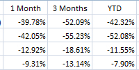
Summary SRF has been punished by falling oil prices. The market price hasn’t fallen as much as the underlying asset value driving the CEF to trade at a 23.12% premium to NAV. SRF has an indicated distribution yield of 23.53%. This distribution is unsustainable if oil prices remain stay at current levels. Overview: Oil has fallen dramatically, pressuring the stocks of energy producers. Highly levered companies have been hit especially hard due to their risk of defaulting if energy prices don’t rebound. The Cushing Royalty & Income Fund (NYSE: SRF ) is a closed end fund that has been hit particularly hard by falling oil prices. SRF invests in energy related royalty trusts, exploration and production master limited partnerships (MLPs), and Canadian royalty trusts. Many of these investments have been hit hard by the falling oil price driving the fund’s net asset value down by 49.97% so far this year. SRF’s market price has held in a little better falling 37.21% likely supported by the fund’s large 23.53% distribution. The divergence in performance between the market price and the NAV has driven the fund to trade at a 23.12% premium. However, the large distribution and the 23% premium to NAV are likely unsustainable. Investors in the fund are likely to see a significant drop in value unless oil prices rebound dramatically. Key Investment Highlights: Premium to NAV: SRF is currently trading at a 23.12% premium to NAV. This is significantly higher than its 1 year average premium of 3.21%. Evidence of the wider than normal premium the Z-Statistic of 2.36 showing the current premium is more than 2 standard deviations wider than normal. Leveraged Exposure to Energy Prices: SRF invests in energy related royalty trusts and exploration and production MLPs. These investments are highly correlated with energy prices. Additionally, many of the holdings have taken on significant leverage to acquire drilling acreage. If energy prices remain depressed for long these investments will likely be forced to cut distributions and could face covenant violations or default. SRF itself has a leverage ratio of 20.76%. If the fund’s holdings have issues due to their high leverage ratios, SRF could also face issues with its regulatory leverage limits forcing the fund to sell assets. Unsustainable Distribution: SRF currently pays a 23.53% distribution. This distribution is unlikely to be sustained. Underlying holdings will likely have to cut their dividends due to lower energy prices which hurt their cash flow. SRF will likely need to follow suit so it wouldn’t be surprising to see a significant distribution cut from the fund. Key Investment Risks: Energy Prices: As mentioned above, SRF’s investment portfolio is highly correlated to energy prices. If energy prices rebound significantly, the underlying holdings should appreciate and the dividends may be sustainable. Company Acquisitions: It is in the downturn of market cycles that the strong players make their investments for long term growth. In this case, there is the risk that some of the oil majors my purchase smaller companies that have attractive assets. If holdings in SRF’s portfolio are purchased at premiums than it would support the share price and negate the downside case. Key Portfolio Metrics: Premium/Discount: 23.12% Z-Statistic 2.36 Market Distribution Rate: 23.53% Current Quarterly Distribution: $0.50 UNII Per Share: $0.1389 Effective Leverage: 20.76% Performance: Using ETFs with a similar investment objective can give a good comparison to evaluate management’s performance. I was unable to find ETFs that have a similar focus as SRF so I chose to look for ETFs that would give similar exposure to energy. I chose to use the iShares U.S. Oil & Gas Exploration & Productions ETF (NYSEARCA: IEO ), based on its similar focus on upstream energy production. The Energy Select Sector SPDR ETF (NYSEARCA: XLE ) is also included in the analysis to give a picture of the broader energy sector performance. SRF has significantly underperformed both ETFs during its relatively short life. The recent dramatic underperformance highlights the risk of SRF. Data as of 12/23/2014 Source: Morningstar Premium/Discount: (click to enlarge) Source: CEFConnect The fund closed 12/22/2014 at a 23.12% premium to the NAV, or underlying value of the portfolio. This is above the 52 week average premium of 3.34%. The dramatic fall in NAV over the past month may have contributed to the increase in premium as the market has not had a chance to respond to the lower value. Additionally the reported 23.53% distribution may have enticed some investors though the distribution doesn’t appear sustainable if oil prices remain low. The market price will likely adjust lower over time. A distribution cut could be a catalyst for the premium to erode. Expense Ratio: SRF pays 1.50% of weekly average managed assets to Cushing Asset Management for investment management. The annual expense ratio for AWF as of 11/30/2014 was 2.15%. This is a relatively high fee for investment management. The specialization and uniqueness of the portfolio are likely part of the high cost. However, investors have received a lot of risk without significant reward recently. Distribution: SRF pays a quarterly distribution of $0.50/share. Based on current market prices this equates to a 23.53% distribution. Nearly all of the distribution has been categorized as return of capital. Not entirely surprising due to the MLP structure of many of the fund’s investments. The distribution appears unsustainable and may need to be cut if energy prices don’t rebound significantly. Even with higher oil prices, SRF’s income received only covered 70% of its distribution after accounting for the advisory fee and operating expenses. The slide in oil prices will put additional pressure on this ratio. Leverage: SRF employs leverage gained through a margin account at Bank of America Merrill Lynch. The interest rate charged on margin borrowings is LIBOR plus 0.65%. The use of a margin account is a concern as margin could be pulled or the rate increased due to the fall in the margin collateral. Also, if interest rates were to increase, the cost of borrowing would increase putting upward pressure on an already high expense ratio. Liquidity: SRF is a small CEF with $116 million in net assets. Trading volume is thin with 73,000 shares traded on the average day. This represents $625 thousand in daily volume at current prices. This is thin liquidity for a CEF and large orders could cause wide swings in the market price. It is always wise to use limit orders to purchase or sell shares of closed-end funds, as the bid/ask spread can be wide. Management: SRF is managed by Cushing asset management, a subsidiary of Swank Capital. The management team is seasoned with managers averaging over 24 years of industry and investment experience. The management team is located in Dallas Texas close to the major players in the energy sector. Portfolio: Portfolio Allocation (click to enlarge) Source: Cushing Asset Management as of 9/30/2014 The fund is invested in upstream energy MLPs and trusts. The majority of the fund is invested in the United States with some exposure to Canadian royalty trusts. The focus on these high assets that have high distributions has increased they distribution the fund is able to pay but also comes with a significant amount of risk. The underlying value of the fund will be significantly influenced by energy prices. Top 10 Holdings Source: Cushing Asset Management as of 8/31/2014 SRF has a focused portfolio with 40 positions. The top ten holdings represent 76.2% of the total portfolio. The turnover rate has been relatively high, with 94.34% turnover in FY 2013. This concentration can be attractive when times are good, however, it increases the portfolio risk. A closer look at some of the top holdings reinforces the concern about the portfolio distribution. For example, Linn Energy, LLC (NASDAQ: LINE ) represents 9.4% of the total portfolio. LINE has an implied yield of 24.43%. However, LINE has $11 billion in long term debt vs. $4.9 billion in shareholder’s equity. If energy prices don’t rebound LINE will likely have to cut the dividend and use the cash to pay interest and repay debt. This would reduce the amount of cash available for SRF’s distribution. This is one of the starker examples in the portfolio, but many other holdings face similar issues. Strategy: SRF’s primary investment objective is to seek high total return with an emphasis on current income. Under normal conditions the fund will invest at least 80% of net assets in securities of energy related U.S. royalty trusts, Canadian royalty trusts, and exploration and production MLPs. Conclusion: The drop in energy prices has pressured SRF’s net asset value and share price. The net asset value has fallen faster than the share price driving SRF to trade at a large premium to the portfolio value. Additionally, SRF shows a 23.53% implied distribution. This distribution is likely to be cut if oil prices don’t rebound significantly. A lower distribution and a reduction in the premium price has the potential to drive the share price over 20% lower. Further, if energy prices don’t stabilize there is significant risk of additional downside. Investors should make sure they understand the risks before allocating capital to this fund.