Scalper1 News
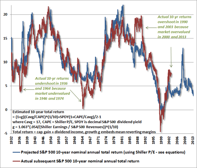
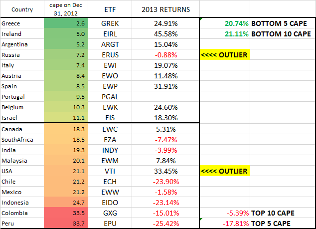
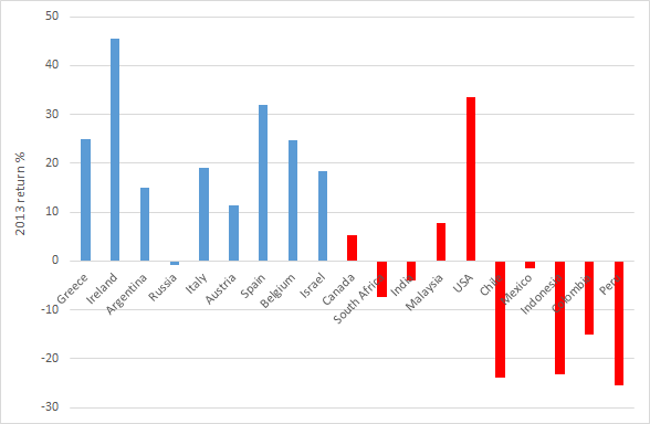
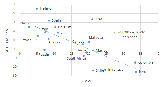
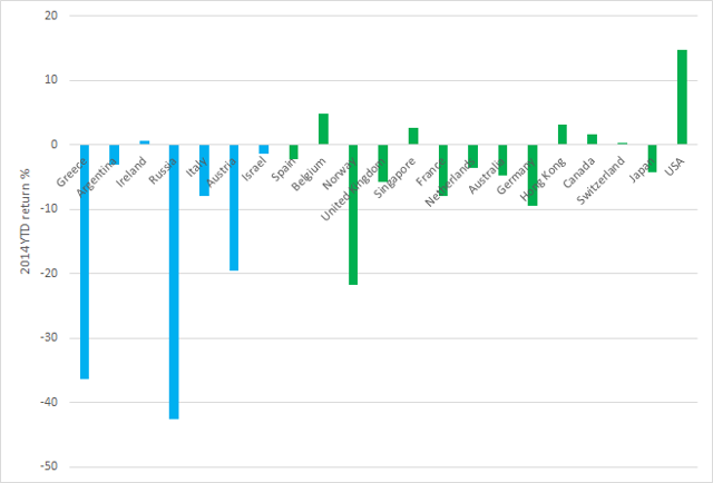
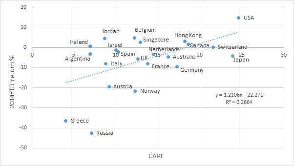
 Summary The CAPE ratio was a fantastic predictor of country returns in 2013. In March 2014, Mebane Faber and Cambria Investments launched GVAL, which uses CAPE-like methodologies to buy the cheapest global markets. How did CAPE and GVAL do in 2014? Introduction As followers of my Buy-the-Dip High-Yield portfolio would know, I am a value investor at heart. The fact that value stocks outperform growth stocks has been proven by ample academic research, and is also attested to by the legendary value investor Warren Buffett’s remarkable track record over the years. One commonly used measure to determine market valuation is the cyclically-adjusted price-earnings [CAPE] ratio, also known as the Shiller P/E ratio. This metric was developed by U.S. economist and Nobel laureate Robert Shiller, and is defined as price over 10-year average earnings adjusted for inflation. By using 10-year average earnings rather than one-year trailing (or forward) earnings, fluctuations in net income caused by variations in profit margins over a typical business cycle can be reduced. The use of CAPE as a valuation indicator does have its limitations. While high CAPE values have been associated with lower future long-term returns, and lower CAPE values with higher future long-term returns, the CAPE ratio does not reliably predict near-term tops and bottoms. In a chart from a December 2013 article by Hussman Funds entitled ” Does the CAPE still work? “, the projected 10-year returns predicted by CAPE was found to correlate nicely (> 90%) with actual 10-year returns, except when markets became very overvalued or very undervalued . (click to enlarge) (Image from Hussman Funds) The current CAPE ratio of the U.S. market (27.33) is significantly higher than both its historical average (16.58) and median (15.95), suggesting moderate overvaluation of the market, and thus, low future returns. However, the above commentary from Hussman Funds states that actual returns can exceed CAPE forecasts when stocks become overvalued (“Actual 10-yr. returns overshoot in 1990 and 2003 because market overvalued in 2000 and 2013”). My own interpretation of this is that if the U.S. market were to remain overvalued for the next couple of years, then the subsequent returns could be greater than what is currently predicted by CAPE. However, Hussman Funds is seemingly confident that would not be the case: The CAPE Ratio is doing exactly what it has always done, which is to help investors anticipate the investment returns they should expect over the next decade. Those returns will very likely be in the low, single digits. Country CAPE Does value investing work for countries? According to Mebane Faber, co-founder and Chief Investment Officer at Cambria Investments, the answer is a resounding “yes”. In a January 2, 2014 posting on his “Meb Faber Research” website, Faber points out that the countries with the cheapest CAPE ratios massively outperformed those with the highest CAPE ratios in 2013. The bottom-5 and bottom-10 CAPE countries averaged 20.74% and 21.11% returns, respectively, in 2013, while the top-5 and top-10 CAPE countries averaged -17.81% and -5.39%, respectively. This represents a differential of 38.59% for the top-5 versus bottom-5, and 26.5% for the top-10 versus bottom-10, a remarkable outperformance. (Image from Meb Faber Research ) I compiled the total return performances into a bar chart. Blue bars represent the cheapest countries, red bars represent expensive countries. Countries are sorted from left to right, in order of increasing CAPE values. I have also compiled the data into a scatterplot, to show the relationship between CAPE on the December 31, 2012 and 2013 returns. On the face of it, the divergence between the most expensive and the cheapest stocks in 2013 was pretty dramatic. Even with the outliers (Russia and USA) present, a statistical test conducted on this data revealed that the negative correlation was highly significant (p-value = 0.00018). In other words, countries with high CAPE values showed lower 2013 returns, while countries with low CAPE values showed higher 2013 returns. These results, therefore, suggested that CAPE was an excellent metric for identifying cheap markets to obtain outsized returns. Three months later, Cambria debuted the Cambria Global Value ETF (NYSEARCA: GVAL ), an ETF fund (with a relatively high 0.69% expense ratio for a passive fund) that uses CAPE-like methodologies to invest in the cheapest markets globally. Coincidence? Maybe. How good was CAPE as a valuation measure in 2014? Last year, Faber had actually pre-empted his new year’s article with a December 5, 2013 posting that showed the impressive performance of the CAPE indicator through the first 11 months of 2013. Unfortunately, he had chosen not to do so again this year. Therefore, I took it upon myself to obtain data for CAPE ratios for countries from the start of the year and compare those with their YTD performances. 2014 Country CAPE Evaluation Meb Faber updated his CAPE ratios at the start of the year. As reported by Seeking Alpha : Mebane Faber updates countries’ cyclically-adjusted price-earnings ratios for the start of the year, and Greece, Russia, Ireland, Argentina, Hungary, Jordan, Austria, and Lebanon make the list of the cheapest – all under 10. How did the CAPE do in 2013? If you bought the 5 highest-priced countries – Peru, Colombia, Indonesia, Mexico, and Chile – you would have lost 17.8%. If you bought the 5 cheapest – Greece, Ireland, Argentina, Russia, and Italy – you would have gained 20.7%. Unfortunately, I do not have a subscription to The Idea Farm, Faber’s subscription service, and so could not access Faber’s updated list of CAPE ratios. Therefore, bits and pieces of data were instead obtained from StreetAuthority and from StarCapital . In the table below, CAPE ratios for countries marked with (^) are from StreetAuthority, and are from 12/11/2013. CAPE ratios for the remaining countries are from StarCapital, and are from 1/31/2014. Although the two sets of CAPE data originate from time points nearly two months apart, I reasoned that it should not have a large effect on the analysis, because CAPE is a long-term measure of valuation. 2014 YTD return data are from Morningstar . Country ETF CAPE 2014 YTD % Greece (NYSEARCA: GREK ) 4.03 -36.35 Argentina^ (NYSEARCA: ARGT ) 6.91 -3.12 Ireland^ (NYSEARCA: EIRL ) 6.94 0.67 Russia^ (NYSEARCA: RSX ) 7.11 -42.54 Jordan^ 8.64 Italy (NYSEARCA: EWI ) 8.8 -7.98 Austria^ (NYSEARCA: EWO ) 9.16 -19.47 Hungary^ 9.46 Croatia^ 9.81 Lebanon^ 9.97 Israel^ (NYSEARCA: EIS ) 9.98 -1.39 Spain (NYSEARCA: EWP ) 10.3 -2.22 Belgium (NYSEARCA: EWK ) 12.2 4.81 Norway (NYSEARCA: NORW ) 12.3 -21.68 United Kingdom (NYSEARCA: EWU ) 12.6 -5.77 Singapore (NYSEARCA: EWS ) 12.9 2.6 France (NYSEARCA: EWQ ) 13.8 -7.97 Netherlands (NYSEARCA: EWN ) 14.5 -3.53 Australia (NYSEARCA: EWA ) 16.2 -4.73 Germany (NYSEARCA: EWG ) 17.3 -9.51 Hong Kong (NYSEARCA: EWH ) 18.2 3.15 Canada (NYSEARCA: EWC ) 18.6 1.57 Switzerland (NYSEARCA: EWL ) 21.6 0.28 Japan (NYSEARCA: EWJ ) 23.9 -4.22 USA (NYSEARCA: SPY ) 24.6 14.68 The 2014 YTD total return performances have also been compiled into a bar chart. Blue bars represent the cheapest countries (CAPE Scalper1 News
Scalper1 News