Tag Archives: seeking-alpha

SPY’s 2015 2nd-Quarter Performance And Seasonality

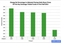
Summary The SPDR S&P 500 ETF in the first half ranked No. 3 among the three most popular exchange-traded funds based on the S&P Composite 1500’s constituent indexes. In the second quarter, the ETF’s adjusted closing daily share price advanced by a rather small 0.22 percent. In June, the fund’s share price declined by a rather large -2.01 percent. The SPDR S&P 500 ETF (NYSEARCA: SPY ) during 2015’s first half was third by return among the three most popular ETFs based on the S&P Composite 1500’s constituent indexes, which encompass the SPDR S&P MidCap 400 ETF (NYSEARCA: MDY ) and the iShares Core S&P Small-Cap ETF (NYSEARCA: IJR ). SPY edged higher to $205.89 from $203.64, an increase of $2.25, or 1.11 percent, but it behaved worse than MDY by -2.98 percentage points and IJR by -2.91 percentage points. Figure 1: Change In Share Prices Of Five Key ETFs In First Half (click to enlarge) Source: This J.J.’s Risky Business chart is based on analyses of adjusted closing daily share prices at Yahoo Finance . Market day in and market day out, I analyze in multiple ways 13 ETFs through my Risky Business Daily Market Seismometer : These funds are SPY, MDY and IJR, as well as the nine Select Sector SPDRs and the small-capitalization iShares Russell 2000 ETF (NYSEARCA: IWM ). I also assess the large-cap (and technology-dominated) PowerShares QQQ (NASDAQ: QQQ ), albeit on a comparatively infrequent basis. Thanks to this monitoring, I anticipate being shocked by market events on occasion, but I do not expect being surprised by them. Anyway, SPY in the first half of the year was the worst performer among the five key ETFs I employ to evaluate equity classes by market cap (Figure 1). Figure 2: Change In Share Prices Of Five Key ETFs In Second Quarter (click to enlarge) Source: This J.J.’s Risky Business chart is based on analyses of adjusted closing daily share prices at Yahoo Finance. SPY was neither the best behaved nor the worst behaved of my five key ETFs last quarter, as these distinctions were claimed by QQQ in the former case and MDY in the latter case (Figure 2). I believe SPY’s lackluster performance, not only in Q2 but also in 2015, is associated with the bias divergence in monetary policy at big central banks around the world whose effects I have discussed ad nauseam at Seeking Alpha, most recently in “NYSE Margin Debt Remains Near All-Time High In May: Risk Rank At No. 53.” Figure 3: Changes In Share Prices Of Five Key ETFs In June (click to enlarge) Source: This J.J.’s Risky Business chart is based on analyses of adjusted closing daily share prices at Yahoo Finance. Greece’s failure to make its payment to the International Monetary Fund Tuesday was preceded by a protracted period of silly shilly-shallying uncommon even by the standards of the eurozone, which is really saying something. The headline risk clearly had an impact on the U.S. stock market, with the beatdown victimizing larger caps more than smaller caps (Figure 3). This disparity in outcomes makes sense because the S&P 500 index firms that provided the data required to paint a complete picture of their global sales in 2012 indicated they booked 53.4 percent of their sales inside the U.S. and 46.6 percent of their sales outside the U.S., as discussed elsewhere . The comparable numbers for S&P 600 index firms the same year were 61.0 percent and 39.0 percent, in that order. As a result, SPY is more exposed to conditions around the world than is IJR. Figure 4: SPY Monthly Change, 2015 Vs. 1994-2014 Mean (click to enlarge) Source: This J.J.’s Risky Business chart is based on analyses of adjusted closing monthly share prices at Yahoo Finance . SPY behaved a lot worse in the first half of 2015 than it did during the comparable periods in its initial 21 full years of existence based on the monthly means calculated by employing data associated with that historical time frame (Figure 4). The same data set shows the average year’s strongest quarter was the fourth, with an absolutely large positive return, and its weakest quarter was the third, with an absolutely small positive return. Figure 5: SPY Monthly Change, 2015 Vs. 1994-2014 Median (click to enlarge) Source: This J.J.’s Risky Business chart is based on analyses of adjusted closing monthly share prices at Yahoo Finance. SPY also performed a lot worse in the first half of 2015 than it did during the comparable periods in its initial 21 full years of existence based on the monthly medians calculated by using data associated with that historical time frame (Figure 5). The same data set shows the average year’s strongest quarter was the fourth, with an absolutely large positive return, and its weakest quarter was the third, with an absolutely small positive return. Disclaimer: The opinions expressed herein by the author do not constitute an investment recommendation, and they are unsuitable for employment in the making of investment decisions. The opinions expressed herein address only certain aspects of potential investment in any securities and cannot substitute for comprehensive investment analysis. The opinions expressed herein are based on an incomplete set of information, illustrative in nature, and limited in scope. In addition, the opinions expressed herein reflect the author’s best judgment as of the date of publication, and they are subject to change without notice. Disclosure: I/we have no positions in any stocks mentioned, and no plans to initiate any positions within the next 72 hours. (More…) I wrote this article myself, and it expresses my own opinions. I am not receiving compensation for it (other than from Seeking Alpha). I have no business relationship with any company whose stock is mentioned in this article.

3 Sectors To Watch In The Second Half Of 2015

Summary The tepid return in the major averages was generated by weakening in interest rate sensitive areas and continued strength in high growth leadership categories. Healthcare stocks were once considered a defensive area of the market, yet have transitioned to a more growth oriented phase. Conversely, utility stocks have been torched by rising interest rates that have eaten away at their returns. The S&P 500 Index was nearly unchanged in the first half of 2015, yet the divergences in underlying sectors told a very different tale. The tepid return in the major averages was generated by weakening in interest rate sensitive areas and continued strength in high-growth leadership categories. This tug-of-war style market has created a relative valuation chasm between several important sectors that warrants close attention. Leader: Healthcare Healthcare stocks were once considered a defensive area of the market similar to consumer staples and utilities because of their inelastic business models. After all, medical services and drug companies operate with little cyclical burden to their bottom line. Nevertheless, some believe that these stocks have transitioned to a more growth-oriented phase that has been driven by the biotech boom and continued advancements in the medical field. The Health Care Select Sector SDPR ETF (NYSEARCA: XLV ) has been a top performing area of the market over the last three- and five-year time frames and continues to lead as the No. 1 sector so far this year. There’s no doubt that this ETF has shown tremendous momentum and activity has been robust as XLV has gained 9.51% through June 30. While this area of the market has been one of the most resilient, I would be hesitant to chase performance and add near its recent highs. If XLV or a similar healthcare fund has been on your radar, I would be patient with respect to any future entry points and look to pick up shares on at least a modest dip. In addition, this sector should serve as a benchmark of momentum leadership. If we see XLV start to fall out of favor, it may signal that investors are looking to pair back on risk and potentially rotate into a more defensive stance. Healthcare stocks currently make up over 30% of the iShares MSCI USA Momentum Factor ETF (NYSEARCA: MTUM ), which screens its underlying holdings for recent performance characteristics. Laggard: Utilities On the flip side of the coin, utilities have been torched this year as a result of rising interest rates. Coming off a strong performance in 2014 where rising rates acted as a tailwind, the Utility Select Sector SPDR (NYSEARCA: XLU ) is down 10.70% through the first half of 2015. The price of XLU peaked at virtually the same time as interest rates bottomed and has been on a steady course lower ever since. For the moment, it appears that the fate of utility stocks is going to be closely tied to the price action of U.S. Treasury yields. This traditionally defensive sector has been eschewed for more growth-oriented positions in healthcare, consumer discretionary and technology stocks. From a relative value standpoint, I believe that utilities look attractive at these levels given the thesis that interest rates will remain stable or head lower over the next six months. The recent drop in price also has boosted the yield on XLU to a healthy 3.80%, which makes it the highest yielding sector in the S&P 500. Income investors should note that diversified dividend funds such as the iShares Select Dividend ETF (NYSEARCA: DVY ) and First Trust Morningstar Dividend Leaders Index Fund (NYSEARCA: FDL ) have outsized utility sector exposure. This asset allocation acted as a drag on returns in the first half of the year and should be noted as a key driver moving forward as well. Tweener: Financials Financial stocks have long been touted as the cure to beat rising interest rates, yet the Financial Select Sector SPDR (NYSEARCA: XLF ) has been mired in a sideways malaise since the beginning of the year. XLF posted a net return of -0.61% through the first six months of 2015 and has failed to show inspiring price action to back up its reputation. XLF is an interesting fund because of the wide designation of financial-centric companies. This ETF includes large banks, REITs, brokerages and even diversified holding companies such as Berkshire Hathaway Inc (NYSE: BRK.A ) (NYSE: BRK.B ). REITs are currently the third largest industry group within XLF at 14.20% and have dragged on returns since the beginning of the year. The iShares U.S. Real Estate ETF (NYSEARCA: IYR ) has experienced the same interest rate sensitive drag as utility stocks and is down 5.5% in 2015. Conversely, indexes that focus solely on banking stocks such as the SPDR S&P Bank ETF (NYSEARCA: KBE ) have gained 8.87% this year. Clearly these stocks are the true beneficiaries of the rising interest rate theme as it relates to a fundamental driver of industry returns. Ultimately, XLF appears to be experiencing its own internal tug-of-war based on this bifurcation between sub-sectors that has caused it to drift aimlessly for the last six months. The Bottom Line The information presented above can be applicable to both broad-based indices and individual sector investing. Investors that own diversified equity ETFs need to be cognizant of the underlying asset allocation and sector positioning as it relates to future risk and returns. Those who prefer to select more targeted ETFs may choose to shift their positions in order to take advantage of a specific theme or pair back on an overbought area of the market. Making small tactical changes of this nature can have a big impact on your performance and risk profile as we make our way into the second half of the year. I spoke in-depth about these topics and more in our recent mid-year teleseminar: Four Components Of A Successful Income Portfolio . Click here for the presentation . Disclosure: I am/we are long DVY. (More…) I wrote this article myself, and it expresses my own opinions. I am not receiving compensation for it. I have no business relationship with any company whose stock is mentioned in this article. Additional disclosure: David Fabian, FMD Capital Management, and/or clients may hold positions in the ETFs and mutual funds mentioned above. The commentary does not constitute individualized investment advice. The opinions offered herein are not personalized recommendations to buy, sell, or hold securities.

How To Find The Best Sector ETFs: Q2’15 In Review

Summary The large number of ETFs hurts investors more than it helps as too many options become paralyzing. Performance of an ETFs holdings are equal to the performance of an ETF. Our coverage of ETFs leverages the diligence we do on each stock by rating ETFs based on the aggregated ratings of their holdings. Finding the best ETFs is an increasingly difficult task in a world with so many to choose from. How can you pick with so many choices available? Don’t Trust ETF Labels There are at least 43 different Financials ETFs and at least 188 ETFs across all sectors. Do investors need that many choices? How different can the ETFs be? Those 43 Financials ETFs are very different. With anywhere from 20 to 556 holdings, many of these Financials ETFs have drastically different portfolios, creating drastically different investment implications. The same is true for the ETFs in any other sector, as each offers a very different mix of good and bad stocks. Consumer Staples ranks first. Energy ranks last. Details on the Best & Worst ETFs in each sector are here . A Recipe for Paralysis By Analysis We firmly believe ETFs for a given sector should not all be that different. We think the large number of Financials (or any other) sector ETFs hurts investors more than it helps because too many options can be paralyzing. It is simply not possible for the majority of investors to properly assess the quality of so many ETFs. Analyzing ETFs, done with the proper diligence, is far more difficult than analyzing stocks because it means analyzing all the stocks within each ETF. As stated above, that can be as many as 556 stocks, and sometimes even more, for one ETF. Any investor worth his salt recognizes that analyzing the holdings of an ETF is critical to finding the best ETF. Figure 1 shows our top rated ETF for each sector in Q2’15. Figure 1: The Best ETF in Each Sector Sources: New Constructs, LLC and company filings How to Avoid “The Danger Within” Why do you need to know the holdings of ETFs before you buy? You need to be sure you do not buy an ETF that might blow up. Buying an ETF without analyzing its holdings is like buying a stock without analyzing its business and finances. No matter how cheap, if it holds bad stocks, the ETF’s performance will be bad. PERFORMANCE OF FUND’S HOLDINGS = PERFORMANCE OF FUND If Only Investors Could Find Funds Rated by Their Holdings The PowerShares KBW Property & Casualty Insurance Portfolio ETF (NYSEARCA: KBWP ) is the top-rated Financials ETF and the overall best ETF of the 188 sector ETFs that we cover. The worst ETF in Figure 1 is the SPDR S&P Telecom ETF (NYSEARCA: XTL ), which gets our Dangerous rating. One would think ETF providers could do better for this sector. Disclosure: David Trainer and Max Lee receive no compensation to write about any specific stock, sector, or theme. Disclosure: I/we have no positions in any stocks mentioned, and no plans to initiate any positions within the next 72 hours. (More…) I wrote this article myself, and it expresses my own opinions. I am not receiving compensation for it. I have no business relationship with any company whose stock is mentioned in this article.