Tag Archives: nysearcaicf

U.S. REIT ETFs: Correlations

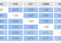
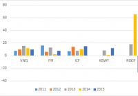
REIT ETFs appear to offer an improvement to the overall portfolio performance. Correlations to the S&P 500 were in the low to mid 0.50s in the last 12 months. The largest U.S. REIT ETFs are fairly homogeneous with correlation coefficients of 0.98-1.00 between themselves. Real estate is often mentioned as a stand-alone asset class next to equities, fixed income and commodities. This notion prompts investors to allocate a portion of their portfolios to the real estate investment trusts (“REITs”) in pursuit of diversification benefits. In this article, I review how the U.S. REIT ETFs fit into the overall portfolio and whether they help to improve the performance. The analysis focuses on the five largest U.S. REIT ETFs that have been around for at least 5 years and manage over $1 billion of assets each (in descending order by size): Vanguard REIT Index ETF (NYSEARCA: VNQ ), iShares U.S. Real Estate ETF (NYSEARCA: IYR ), iShares Cohen & Steers REIT ETF (NYSEARCA: ICF ), SPDR DJ Wilshire Global REIT ETF (NYSEARCA: RWR ), and iShares Mortgage Real Estate Capped ETF (NYSEARCA: REM ). All the calculations were carried out on the freely available investor resource InvestSpy. To start with, let’s look at the correlation matrix of these ETFs plus the SPDR S&P 500 Trust ETF (NYSEARCA: SPY ), utilizing 5 years of historical data: The table above presents us with two important insights. Firstly, all REIT ETFs had a correlation coefficient with the broad equity market no higher than 0.78. Although such a reading indicates a relatively close co-movement, it is low enough to offer diversification benefits. Secondly, the four largest REIT ETFs (VNQ, IYR, ICF, and RWR) had almost perfect correlation of 0.99-1.00 between themselves. This means that from an investor’s standpoint, these are pretty much identical securities, thus it is worthwhile paying more attention to expense ratios and bid-ask spread when making a selection. The only standout is REM, which demonstrates a lower correlation both with SPY and with the remaining REIT ETFs. This is due to the fact that REM is a mortgage REIT, thus it behaves somewhat differently from equity REITs. Five years is fairly long period of time and it is useful to investigate correlations in the more recent past. Below is the same correlation matrix, utilizing daily data for the last 12 months only: It appears that the close co-movement between the four equity REIT ETFs persisted to the same degree whilst REM deviated even further from the traditional REIT class with its correlation coefficients no higher than 0.70. Interestingly, correlations with the broad U.S. equity market dropped across the board to as low as 0.49 in the case of ICF. As all of these ETFs except for REM posted positive total returns similar to the S&P 500 over the last year, it is clear that investors that had allocation to REITs in this period achieved an improved risk/reward performance. Just to illustrate the difference a 20% allocation to REIT ETFs would have made, consider a standard 60% equities/40% bonds portfolio where 20% of equity allocation is replaced with a REIT ETF. A portfolio with 60% invested in the Vanguard Total Stock Market ETF (NYSEARCA: VTI ) and 40% in the iShares Core Total U.S. Bond Market ETF (NYSEARCA: AGG ) would have brought the following results in the last year: (click to enlarge) Meanwhile, with 20% allocated to VNQ, the dynamics change a little bit: (click to enlarge) The key metric I am looking at here is the annualized volatility. Note that even though we have replaced VTI with a riskier VNQI (12.1% vs. 14.4% volatility), the overall portfolio volatility has decreased from 7.0% to 6.8%. This is the diversification benefit in its purest sense. In addition to that, the total return and maximum drawdown figures are the same for both portfolios whilst the second one is substantially less dependent on the broad equity market with a beta below 0.50. It is also clear that risk contributions are largely skewed away from fixed income, but this a classical case in most of traditional portfolios as I have covered here , and this topic requires a separate discussion. Summing up, U.S. REIT ETFs appear to offer an improvement to the overall portfolio performance. The largest ETFs in this space are extremely highly correlated, thus an investor needs to look more closely at ETF features such as expense ratio and bid-ask spread to identify the most efficient option. Finally, correlations change over time and so does the diversification benefit. Therefore, one has to monitor periodically if their asset class allocation is delivering performance as anticipated. Please share your thoughts and feedback on the insights above. In the next article later this week, I will present a similar analysis for international REITs. Disclosure: I/we have no positions in any stocks mentioned, and no plans to initiate any positions within the next 72 hours. (More…) I wrote this article myself, and it expresses my own opinions. I am not receiving compensation for it (other than from Seeking Alpha). I have no business relationship with any company whose stock is mentioned in this article.

Which U.S. REIT ETF Has The Best Dividend Growth?

Summary REIT ETFs have attracted investor interest in the prevailing low interest rate environment. This article studies the dividend growth history of four U.S. REIT ETFs. Data are analyzed to identify the REIT ETF with the highest yield, the highest dividend growth rate and the highest “Chowder number”. Introduction The current low-interest rate environment has stimulated interest in income-generating securities such as real estate investment trusts [REITs]. Investors uncomfortable with picking individual stocks may prefer to invest in REIT ETFs. The Vanguard REIT Index Fund (NYSEARCA: VNQ ) is the largest REIT ETF, with over $25B in assets. Besides providing a relatively high yield, REITs can also grow their distributions. This article seeks to compare the dividend growth history of five U.S. REIT ETFs to determine which fund has the best dividend growth characteristics. The funds The funds chosen were VNQ, the iShares U.S. Real Estate ETF (NYSEARCA: IYR ), the iShares Cohen & Steers REIT ETF (NYSEARCA: ICF ), the KBW Premium Yield Equity REIT Portfolio (NYSEARCA: KBWY ) and the IQ US Real Estate Small Cap ETF (NYSEARCA: ROOF ). VNQ, IYR and ICF were chosen as these were the three largest REIT ETFs by assets under management [AUM]. KBWY and ROOF were chosen as these represented small/mid-cap REIT ETFs. Note that ROOF also contains some exposure to mortgage REITs [mREITs] such as New Residential Investment Corp (NYSE: NRZ ), which is currently its top holding. Details for the five REIT ETFs are shown in the table below (data from Morningstar ).   VNQ IYR ICF KBWY ROOF Yield [ttm] 3.86% 3.69% 3.20% 5.21% 5.18% Expense ratio 0.12% 0.45% 0.35% 0.35% 0.69% Inception Sep 2004 Jun 2000 Jan 2001 Dec 2010 June 2011 Assets $25.9B $4.43B $3.20B $113M $92.6M Avg Vol. 4.0M 10.2M 333K 23.7K 22.3K No. holdings 144 115 30 30 68 Avg. Cap $8.8B $11.6B $17.6B $1.8B $1.5B Annual turnover 8% 21% 8% 27% 17% Morningstar rating *** *** ** ***** ***** As can be seen from the chart above, VNQ, IYR and ICF are very large REIT funds, with billions of dollars in AUM. By comparison, KBWY and ROOF are much smaller, with around $100 million in assets. Additionally, the average market capitalization of VNQ, IYR and ICF range from $8.8B to $17.6B, while KBWY and ROOF, being mid/small-cap REIT ETFs, have much smaller average market capitalizations of $1.8B and $1.5B, respectively. In terms of expense ratio, VNQ is the cheapest at 0.12% while ROOF is the most expensive at 0.69%. Finally, KBWY has the highest yield of 5.21%, while ICF has the lowest yield of 3.20%. Dividend grow th history Only three of the funds in this study, VNQ, IYR and ICF, existed before the financial crisis in 2008-2009. Moreover, all three funds cut their distributions in the recession. Therefore, only the last six years of dividend history will be considered. Year-on-year dividend growth The following chart shows the year-on-year dividend growth for the five funds since 2011. Since only the first two quarters of dividends of 2015 have been declared thus far, the dividend growth % shown for “2015” actually represents the growth of the dividend from the previous 8th to 5th quarters (i.e. 2013 H2 + 2014 H1) to the last 4 quarters (i.e. 2014 H2 + 2015 H1). The same calculation applies to the other years in the chart. The chart above shows that the distribution history for ROOF is extremely lumpy, with a 65% increase in distribution for 2014, followed by a -27% decrease in distribution for 2015. Hence, ROOF was removed from subsequent analysis so that the differences between the other four funds can be more clearly observed. The following chart is the same as the previous one, but with ROOF removed. The chart above shows that all of the ETFs have had quite robust dividend growth over the past 5 years. 3 or 5-year average dividend growth For further comparison, I have computed the average year-on-year dividend growth percentages for each of the funds over either the past 3 or 5 years. We can see from the chart above that VNQ has had the highest dividend growth over both 3-year and 5-year periods, with average year-on-year dividend growth rates of 12.2% and 10.7%, respectively. KBWY had the lowest average 3-year dividend increase of 7.04%. Another way to compare dividend growth rates is the cumulative increase in dividend. The following chart shows the cumulative 3-year and 5-year annualized dividend growth rates of the four funds. Presenting the data in this way shows a similar story. VNQ still has the highest annualized cumulative 3-year and 5-year dividend growth rates of 12.2% and 10.7%, respectively. Chowder numbers The ” Chowder number ” is determined by adding the current yield of a security to the historical dividend growth rate. The Chowder number can be considered as a proxy for the expected total return of a security, assuming that the dividend yield of the asset stays the same. The following chart shows the Chowder numbers of the four funds using the annualized 3-year DGR. We can see from the chart above that VNQ has the highest Chowder number of 16.0%, while IYR has the lowest Chowder number of 11.20%. This suggests that going forward, VNQ might be the best investment from the total return perspective. However, one caveat is that, Chowder numbers are backward-looking and one could question whether or not dividend growth rates of REIT ETFs can be reliably extrapolated into the future. Performance The following chart shows the total return performances for VNQ, IYR and ICF over the past 5 years. The data shows that all three REIT ETFs move closely together, with VNQ leading the pack at 83.6% (12.9% annualized). The following chart shows the total return profiles for the four REIT ETFs over the past 3 years. We see that KBWY has had the best 3-year total return of 40.3% (11.9% annualized), followed by VNQ at 32.7% (9.9% annualized). IYR had the worst performance over both 3-year and 5-year periods. Conclusion This article explored the dividend growth history of three large-cap U.S. REIT ETFs, namely VNQ, IYR and ICF, as well as the mid/small-cap REIT ETF KBWY. However, the “best” REIT ETF may depend on each investor’s personal preference. Looking for the highest dividend growth rate? VNQ had the highest annualized 3-year and 5-year dividend growth rates of 12.1% and 10.7%, respectively. Looking for the highest current yield? KBWY has the highest current yield of 5.21%. Looking for the highest “Chowder number”? Using 3-year dividend growth rates, VNQ has the highest “Chowder number” of 16.0% (3.9% yield + 12.1% DGR). Looking for the best past performance? KBWY had the best total return performance (40.3%) over the past 3 years out of the four REIT ETFs, while VNQ had the best total return performance (83.6%) over the past 5 years out of VNQ, IYR and ICF. Interestingly, the “winner” of each of these categories was either VNQ or KBWY. Another reason to pick VNQ is its cheap expense ratio of 0.12%, which is the lowest out of the four funds. VNQ’s combination of 3.9% yield and 12.1% 3-year dividend growth rate makes this fund my top pick for a U.S. large-cap REIT ETF. On the other hand, KBWY provides exposure to the mid/small-cap segment of U.S. REITs, which offers diversification benefits as well as the potential for higher returns (accompanied by higher volatility). I would pick KBWY over ROOF due to KBWY’s lack of mREIT exposure as well as its more consistent dividend history. Additionally, KBWY pays monthly, which could be a plus for some investors, whereas all of the other REIT funds pay quarterly. Finally, the prevailing worries over interest rate rises has caused the REIT ETFs to drop by about 10% from their recent highs, providing more attractive entry points to income investors. VNQ Total Return Price data by YCharts Disclosure: I/we have no positions in any stocks mentioned, and no plans to initiate any positions within the next 72 hours. (More…) I wrote this article myself, and it expresses my own opinions. I am not receiving compensation for it (other than from Seeking Alpha). I have no business relationship with any company whose stock is mentioned in this article.

Does Diversifying Damage Performance?

By Ronald Delegge During the 1849 California Gold Rush people sold all their possessions to chase gold. A small minority hit the jackpot, but most did not. Back then, the few people that did get wealthy by not diversifying were the hyper-extreme exception, not the rule. And it’s the same today. In retrospect, investors that overstuffed their portfolios on stocks like Amazon.com (NASDAQ: AMZN ), Netflix (NASDAQ: NFLX ), and other high-flyers have done well. Nonetheless, they’ve taken great financial risk that could’ve turned out to be catastrophic. The truth is that far more people have been damaged than helped by not diversifying their investment risk. History books are filled with people that lost everything by not diversifying. Of course, the history books are also filled with people that gained great wealth by not diversifying, but again, they are the hyper-extreme super rare exception – not the rule. And trying to join their ranks by risking everything you own is theoretically cute but drenched with hazard. Done Right An adequately diversified portfolio never concentrates market exposure to one or two asset classes, but rather spreads risk by maintaining exposure to the five core asset classes: stocks, bonds, real estate, commodities, and cash. Like a thermostat that remains on at all times, a core portfolio will always have exposure to these five major asset classes. Investors can dial up or dial down their exposure to each of these core asset classes based upon their investment goals, liquidity needs, and comfort level. Sadly, certain financial institutions and advisors – even so-called fiduciaries – operate under the false pretext they are “diversifying” client portfolios by overloading customers in “alternative investments” like illiquid securities and highly leveraged funds with juicy dividend yields. Furthermore, many of these same advisors habitually construct undiversified investment portfolios built entirely upon non-core assets like individual stocks, hedge funds, and other narrowly focused high risk securities. A Hedge for Ignorance? It’s been said that portfolio diversification is a hedge for ignorance. For anybody with this misinformed view, I’d like to familiarize you with Yale University’s endowment. Yale’s endowment returned 11% per annum over the 10 years ending June 30, 2014. Over that period, Yale’s return surpassed broad market results for U.S. stocks, which returned 8.4% annually along with U.S. bonds, which gained 4.9% annually. Even more impressive is how Yale’s endowment generated returns of 13.9% over the past two decades compared to the estimated 9.2% average return of college and university endowments. How did Yale do it? By diversifying investment risk across a variety of different assets like commodities, real estate, and stocks! Here’s the lesson: What worked for Yale can work for you. The table shown above, courtesy from our friends at Dollarlogic, further cements the point that diversification after a strong period of equity returns enhances rather than hurts a portfolio’s investment returns. Although a diversified portfolio underperformed the S&P 500 during the sizzling hot bull market from 1997 to 1999, a $10,000 diversified portfolio was worth more ($12,643) at the end of 2002 compared to just $9,710 for an all stock portfolio. In summary, portfolio diversification that is properly executed does not hinder but enhances risk-adjusted investment returns. Disclosure: No positions Link to the original post on ETFguide.com