Tag Archives: figure

Leveraged Long ETFs: Active Investment Now Best Long-Term Strategy

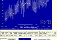
Summary Price sensitivity of these ETFs provide profitability guidance in portfolio asset allocation guidance, using prior experiences of current-level Market-Maker forecasts. Current overall market apprehensions offer heightened near-term price gain opportunities, using imbalances in ETF upside-to-downside price potentials. These are tactical opportunities for investors pursuing active investing strategies, not for passive buy&hold long-term index investors. Active investment strategy permits subsequent retreat to defensive posture when that is indicated by behavioral analysis of market-maker hedging activity. The current price outlook environment Market-makers [MMs] unintentionally signal their upside and downside price expectations by the hedging deals they accept in protecting firm capital put at risk while filling volume “block” orders from big-$ fund-management clients. We collect their expectation proportions and convert them into Range Index [RI] measures, where the value of each RI tells what percentage of the overall price range forecast lies below the current market quote. Here is today’s distribution of RIs for some 2500+ widely-held and actively-traded stocks and ETFs. Figure 1 (click to enlarge) (used with permission) Range Index values appear from time to time in a span from negative numbers (current price below bottom of forecast range) to sometimes (but not often) above 100 where the price is above the forecast range. The span is from excessively cheap at left (bounded) to grossly overpriced at right on the scale at bottom of Figure 1. The vertical scale is a count of subject investment alternatives at that level of RI. It might seem at first thought that a “normal” array of values would be centered around a RI value of 50, with equal-sized prospects of upside price change opportunity and downside price exposure. But since these are perceptions of risk-avoiding humans, the “normal” distribution is shifted toward the left, with an average of the whole population much closer to 40 than 50. Further, the continuing existence of Range Indexes measuring above 50, usually is found in securities having trend-following enthusiasts. So the current distribution indicates a diminished presence now of this mind-set in the investing public. At the other extreme, active bargain hunters usually minimize the presence of negative RIs. When collections of securities are stacked up at the lower bound of the Figure 1 scale, it confirms that market price decline concerns are being overdone, at least as MMs see the situation from their role. Here’s how we differentiate their perspective from that of the investing public. The influence of MMs is strongest in those big-cap issues where massive amounts of capital are most easily employed, and in “special situation” outliers where skilled research indicates special upcoming price gain opportunity. But there are hundreds of stocks and some ETFs in our forecastable population that are not in that set. Since equity RIs are creatures of their participating audiences, some stocks have much more widely ranging RI travels, and many are more stable. The Market Profile of Figure 1 does not indicate which is which, but in periods like now, the less stable ones sort themselves out swinging from one side of the distribution to the other. This day’s Profile has an average RI of 24, suggesting three times as much upside price change prospect as downside. (100-24=76, 76 / 24 = 3) Yet The largest, most liquid security being traded, the SPDR S&P 500 Trust ETF (NYSEARCA: SPY ), has a Range Index of 34. That implies only twice as much upside as downside (100-34=66, 66 /34 ~ = 2). To the extent that individual investors influence the overall market, we now seem to be where their influence is intent of fearfully selling items of value to professional, more opportunistic, investors. After the market has remained more irrational than individual investors’ fear or holdings can last, we will forget about what the media speculates that the Fed can do to us all, and the equity markets will return to their usual uptrending character. But in the opportunity interim… There are a lot of price-gain prospects yelling for attention. They are most evident among the leveraged long ETFs, where their capital structures are designed to magnify the price movements of the indexes or stock holdings that they track. The market character of the 20 such ETFs with the greatest likely appeal for active wealth-building investors is shown in Figure 2. These dry details are important, because they easily (and often) get overlooked in the race to capture profit opportunities. Sometimes that may cripple the intent. Ice cream in your lap is never as satisfying as ice cream in the lap’s interior, so napkins (perspective) have a protective purpose. Figure 2 (click to enlarge) source: Yahoo Finance The biggest bets among leveraged long ETFs currently are in US priced WTI crude oil, via ProShares Ultra Bloomberg Crude Oil ETF (NYSEARCA: UCO ), where 7 million shares with a market value of over $1 billion is involved. Close behind are three broad market index tracking ETFs, the ProShares UltraPro S&P 500 ETF (NYSEARCA: UPRO ), the Direxion Russell 2000 Bullish 3X ETF (NYSEARCA: TNA ), and the P roShares UltraPro QQQ ETF (NASDAQ: TQQQ ). In the same just-under-a-billion league is the Proshares Ultra Nasdaq Biotechnology ETF (NASDAQ: BIB ). Combined they make up a tiny fraction of the largest (unleveraged) ETF, the SPDR S&P 500 ETF Trust, where $167 billion is committed. The average daily trading volume in each of those just named is sufficient to completely turn over their capital investments made in them in 1 to 2 weeks. These are very liquid securities most of which tend to be held rather briefly. Their cost of entry and exit, the bid-ask spread, is totally trivial, 1/10th of 1%, or less than -0.2% per round-trip. The way to make them productive is to know when to own them, and when not to. They have been constructed and contain holdings designed to accentuate the price movements in the indexes that they track. That can be seen in their price movements over the past 52 weeks. For example, SPY has had a price range of 18%, going from $181.92 to 213.78, as the S&P 500 Index that it tracks moved from 1820.66 to 2134.72 (prices ten times as large, but the same percentage change). In contrast, UPRO and the Direxion Daily S&P 500 Bull 3X Shares ETF ( SPXL) are constructed to move 3 times as much. Over the same time period that the S&P 500 moved 18%, they moved 71% and 61%, as expected. All of these ETFs are set up with operating leverage (not financial leverage by borrowing) to move either double or triple the change in their underlier indexes. The owner of the security is never subject to a margin call, which is important, because a -20% decline in what is being tracked becomes a -60% decline in the ETF. Leverage cuts both ways. The decision to exit from one of these securities is always a choice by the owner, it is never forced him/her by a broker or lender, as long as they are not part of securities pledged for some separate loan. When measured from the ETF’s low 52-week price to its high, the average price change for their best-possible trips in the period is 147%. But direction is important. Those ranges are a mix of crude oil’s UCO declining from $162 to $17, and biotech stocks’ BIB rising from $42 to $106. Which critter to ride, American Pharaoh or that rodeo Brahma bucking bull? Most of these ETFs in a year will see their prices have both increases and decreases within their extremes, sometimes repeatedly. With such wide ranges, it pays to know what is likely to be coming. A start on that perspective can be had by anyone from the past price range data made public information by the exchanges and clearing houses. A past Range Index [RI] calculation can be done by comparing that part of the range between the low and the current market quote with the whole range from low to high. The Range Index lets the investor compare where each ETF now is in its range from zero to 100. If past-year ranges were to be repeated, a low RI would indicate a lot of upside, while a high RI signals much downside exposure. But are past price ranges to be repeated? We don’t know. That is why we turn to the market-making community, who make an extremely nice living out of having better guesses about that than almost everyone else. Part of that community takes on the job of insurance underwriter, for prices they deem necessary, of providing risk protection for the other part of the MM community that has to put part of its capital at risk making it possible for fund-management clients to adjust their holdings. That happens because the fund clients have to make securities transactions larger than the markets are normally prepared to find participants for the other side of the trade. Both the block trade desks of the MM firms (buyers of risk protection) and the proprietary trading desks of MM firms (sellers of protection) keep themselves extremely well informed via world-wide information gathering systems on a 24×7 basis so that they can’t get raped by their clients. So the price paid for the protection seen as needed is a fair fight, viewed from both sides, and is agreed to by all three parties involved, since the fund client winds up paying for it as part of the cost of the desired trade. This is significant, since its cost, and the way the deal is structured, tells just how far they all believe the security’s price might possibly go while the insurance is in force. The insurance is provided by a hedging transaction that uses derivative securities (futures, options, and swaps) that are based on contracts that have expirations in coming weeks and months. Unwinding the hedge may not be as quick and easy as coming market changes removing the need for it. So the price ranges implied by the hedge deal’s contracts are not simply matters of the moment, but involve considerations of things to come. Our decades-long experience shows that what they imply has profitable forecasting content. Figure 3 shows the current price range forecasts for these leveraged-long ETFs, and averages of forecasts for a population of over 2500 widely-held and actively traded stocks and ETFs. Figure 3 (click to enlarge) source: Peter Way Associates, blockdesk.com. Columns (2) and (3) are MM forecasts of (4). The remaining columns are the result of using prior forecasts with upside-to-downside proportions (7) like those of today. Column (12) tells, out of the past 5 years of daily forecasts how many of those there have been. A simple portfolio risk-management discipline has been applied to each hypothetical buy position, assuming a next-day market close price cost. That discipline uses (2) as a first-occurrence (at or above) sell target within the next 3 months (63 market days). If not yet achieved, position closeout is forced then regardless of loss or gain, and the liberated capital is immediately redeployed. Column (9) tells the net gain or loss from the (12) sample thus managed, (10) the average period held (in market days) and (11) the CAGR of those results. (6) indicates the average worst-case price drawdown on the way to (9), and (8) the proportion of the sample recovering from (6) to produce a profit. The quality of forecasts is tested in (13) by pitting (9) against (5) and in (14) by comparing (6) against (5). (5) is a calculation of (2) and (4). A figure of merit [FOM] is produced in (15) by weighting (9) by (8) and (6) by the complement of (8), weighted by the frequency of (12). The items in Figures 2 and 3 are ranked by (15). Please note that all forecasts are made live, before the fact, and only judged in Figure 3 afterwards. What is involved here is not a “back-test” of some current-day hypothesis, but an accounting of the results of applying an investment strategy evolved in years previous, to forecast data made as time subsequently progressed. These all are live-tests. Comparing leveraged-long ETF prospects now The blue summary rows provide perspective of how well the MM community appraises these ETFs in comparison to how well they see other equity investments. Over 2500 equities have an average f orecast Range Index of 25, like what is indicated in Figure 1, with three times as much upside prospect (+15%) as downside. Their actual downside exposures during the past 5 years have averaged ~ -9%, and only 60% of them have recovered sufficiently to produce profitable closeouts. That resulted in an achieved net gain of only +3%, not today’s prospect of +15%. A terrible credible ratio of 0.2. These best-20 ranked ETFs bettered the upside expectations a bit, and overcame comparable drawdown experiences in 7 out of 8 cases to generate gains approaching +13%. A much more credible ratio of 0.8. And it took only 32 market days (6+ weeks) instead of the population’s 46 days (9 weeks). The CAGR of the ETFs is 8 times as large as the population’s, and 9 times the size of the SPY market proxy’s. SPY has had a much less stressful drawdown risk exposure (-3.6%) but at an enormous reward cost. Comparing the ETF group’s 20 top-ranked items to the best of the population sees about the same net payoffs +12.7 to +12.5% with the best-odds equities winning in 9 out of 10 cases. Their slightly longer holding period (by about a week) cut their CAGR back to a +126% rate, compared to the ETFs’ +156%. On a reward-to-risk tradeoff basis, Figure 4 makes an interesting comparison of these ETFs vs. SPY and the unleveraged Dow-Jones ETF, DIA. Figure 4 (used with permission) This tradeoff map sometimes is helpful in encouraging investors to sort out their own emotional preferences between investment candidates, absent of detailed numerics. Conclusions From Figure 1: Market professionals and major-scale investment fund organizations do not view the near future of coming market prices with anything like the calamity being often expressed by many market observers. From Figure 2: Leveraged-long ETFs are practical and effective near-term investment devices providing ease of entry and exit market liquidity at trivial cost. From Figure 3: As a group, Leveraged Long ETFs currently are competitive with top individual corporate stocks on both a reward~risk tradeoff and on a prospective return basis. Crude Oil and Energy are the currently most attractive ETFs. From Figure 4: Passive investing in broad market-tracking indexes at this point in time in order to avoid downside price change exposure pays an enormous price in terms of denied prospective price gains from active investment in the best Leveraged Long ETFs. Overall: Passive investing perpetually self-inflicts the wounds of time passage in vehicles as they retreat from periods of above average price gains. The current publicly proclaimed fears of overall equity market retrenchment is not being supported by the actions of big investment organizations or the best-informed market professionals that serve them. The continuing fear of continuing price drawdowns in the face of contrary profit-making actions by market-movers denies prospective price change gains during the time that real warnings are not forthcoming. This is the continuing penalty that has been paid by passive investors since the turn of the Y2K century. Disclosure: I/we have no positions in any stocks mentioned, and no plans to initiate any positions within the next 72 hours. (More…) I wrote this article myself, and it expresses my own opinions. I am not receiving compensation for it (other than from Seeking Alpha). I have no business relationship with any company whose stock is mentioned in this article.

Tech Titans Are The Princes Of Disruptive Competition, Which To Buy?

Summary This article compares Facebook, Amazon, Apple, Netflix, Google, and Tesla, not in their competitive market environments, but in the investment market competition for higher coming stock prices. As we are wont to do, the comparisons are through the eyes of Market-Makers [MMs], protecting themselves as they serve the block-size transaction orders of their big-$ clients. But those views are importantly conditioned by big-$ clients order-flows, the ones with the money muscle to move markets. Opportunity can be created – their collective competitive motto These companies all seek to build their kingdoms by upsetting the established order in their spheres of influence. Information, retail, entertainment, transportation all have in common huge size of markets, with innovations of varied types the principal tool of disruption. Wielded by able, controversial, charismatic leaders. But equity investment markets provide a common denominator for comparisons among even the most diverse of subjects. And behavioral analysis of the players in this very serious game ensures a look at what investors actually expect in coming days weeks and months, (not what others may want you to think) in the scorecard common to all: stock price changes. Price changes initiated and supported by players with the money muscle to make things happen. Price changes to enrich – or wound – active investors who are sensitive to the value and power of the investment resource of time. The role of self-protection Inside the ropes of the investing ring, the rule has to be: Protect yourself at all times. So MMs, when exposing their capital to risk in balancing buyers with sellers in million-dollar-plus trades, buy protection to ensure the continued presence of that capital for employment in the hundreds of like deals yet to occur each day. “All” that takes, is finding some other player to take on the perceived risk – for a price. The price of the protection, and the structure of the hedging deal tells what the players think is reasonably possible to happen to the subject issue’s price during the days, weeks, and months it takes to remove the capital from risk and to unwind the contract commitments of the options, futures or swaps performing the risk transfer. This is analysis of the behavior of experienced, qualified professional experts, doing what is right, so that we can borrow his judgment to help us in our goals. Other behavioral analysis tends to focus on the human errors that folks make, perhaps so that they may be victimized. Such efforts have so far failed to identify any meaningful rewards from that approach. In each subject of this analysis there will be clear evidence of the frequency and extent of the investment rates of return previously achieved subsequent to prior forecasts like those of today. No guarantees, just the perspective of what previously has been accomplished. The basic Risk vs. Reward tradeoff We start by comparing what differences presently exist between the FAANGT stocks upside price change forecasts, and the worst-case price drawdowns in the 3 months subsequent to prior forecasts like those of today. Figure 1 (used with permission) Pictured are Facebook (NASDAQ: FB ), Amazon (NASDAQ: AMZN ), Apple (NASDAQ: AAPL ), Netflix (NASDAQ: NFLX ), Google (NASDAQ: GOOG ) (NASDAQ: GOOGL ), and Tesla Motors (NASDAQ: TSLA ). In general, these stocks present a fairly uniform tradeoff of expected returns from coming price changes against the worst experiences of what has happened in the past, following MM forecasts like those of this day. The one modest divergence is that of AAPL [2], where downside experiences have been less extreme than all others, especially vs. FB [4] and GOOG [5] which offer slightly less optimistic upsides. The biggest return payoff prospect, NFLX [1] carries the highest risk exposure prior experiences. But while this tradeoff is paramount for most investors, there are times and circumstances that raise other considerations in importance. Thoughtful investors usually have many of these other dimensions in mind at all times, with varying degrees of importance. The table in Figure 2 lays several of them out in an orderly comparison. Figure 2 (click to enlarge) What has been pictured in Figure 1 was taken from columns (5) and (6) of Figure 2. In turn, (5) is a calculation of (2) divided by (4), minus 1, expressed as a percent. Column (6) is an average of the largest negative experiences of the first sub-column of (12). All of (12) tells how many times in the past 5 years’ market days of forecasts there has been a forecast like this day’s. You may note that FB has only been around since its more recent IPO of some 3+ years ago, while most of the other “old-timers” have a full 1261 days of forecasts. TSLA is but a couple of 21-day months short of that mark. Importantly, Reward~Risk maps like Figure 1 and tables like Figure 2 are creatures of the date those snapshots were taken, not lasting comparisons of the “goodness” of these stocks versus one another over long periods of time. The forecasts involved here are implied from the “crowd-source” judgments and actions of buyers and sellers of price change protection caused by market makers seeking to fill volume (block) transaction orders by “institutional” clients managing Billion-$ portfolios who must operate on a scale that “regular-way” market transactions cannot accommodate. Those transactions normally involve the MMs having to put at risk amounts of firm capital in order to bring to balance buyers and sellers of the stock involved. Hedging of those capital risk exposures involves negotiations between the MM and sellers of such protection via derivative securities contracts involving options, futures, or swaps. The prices paid for protection and the structure of the deal tell how far the subject’s price may be likely to travel, as seen by all parties involved. That includes the investing organization initiating the trade order, since they wind up paying the cost of the hedge, as a part of the price of market liquidity arranged by the MM. It turns out that all 3 parties are well-informed, experienced, “consenting adults”, whose actions provide information that is generally not recognized. Such traffic goes on day after day, causing changes in the relative attractiveness of stocks to one another. But the implied price range forecasts of columns (2) and (3) are limited in their time scope to the life of the derivatives contracts used in the hedge deals. Those are usually kept as brief as possible, out of cost considerations. It turns out, based on decades of daily forecast experiences, that their reliability and usefulness diminishes markedly out beyond 6 months. Within that horizon, a more critical limit of 3 months turns out to be a useful boundary. Using that limit we look to see what bad things – like price drawdowns from (4) – have happened following prior like forecasts. That average of worst experiences is in (6). Column (8) tells what percentage of the forecasts have had prices recover from (6) to be profitable in reaching (2), or by the time 3 months later has arrived. At either of those points, the net of gains minus losses is presented in (9), the time taken in (10), and the CAGR in (11). Other measures of comparative interest are the proportion of (5) to (9) in (13), and the relation of (5) to (6) in (14). A figure-of-merit is calculated in (15) using the odds of (8) and its complement to weight (5) and (6), recognizing the frequency emphasis provided in (12). This Figure 2 table is ranked by (15). So, what to do with this data? Right now, it can be used to make comparisons between the probable coming near-term price movements of the six stocks. The investor may want to embed in his considerations the personal preferences he may have as to the need for price gain in the face of potential price loss, and the implications of the time horizon involved. For example, in 80 past days FB has had knowledgeable and experienced market professionals making good-sized bets that a +10% gain is likely to occur, and in 65 of those times a profit has occurred. Net of the other 15 times, a 7% gain was had on all 80 bets. That has happened in 10% of FB’s entire market existence, so it’s not a rare occurrence. On the other hand, NFLX could indeed be up by 18% within 3 months, and smart money is willing to pay to avoid being hurt that way. But in the 135 prior times his kind of forecast has appeared, the investor has seen about 1/6th of his investment disappear at least temporarily, and at least 3 times out of every ten, some of it permanently. All of that to earn a slightly smaller net payoff in about the same period of capital commitment to get a CAGR like FB’s. Then TSLA appears to offer a prospect of over +15% gain in the same period, with odds similar to NFLX and drawdown exposures of -12% instead of -16%. But its average net payoffs, a little better than NFLX, took measurably longer to be achieved, so its CAGR is markedly less. Perhaps more important is a comparison with what else is available. The blue summary lines at the bottom of Figure 2 tell what a market-tracking-proxy, SPY, currently offers, how that compares with the population average of 2500+ equity alternatives, and the best-ranked 20 of that population. SPY currently reflects the concerns of many market gloom-&-doomers with a not very credible upside possibility of under +9%, while having delivered less than +3% under similar forecast circumstances in over a year’s worth of experiences. Only GOOG presents as poor a CAGR history (from today’s forecast) as does SPY. The whole population provides some eye-catching +15% or better possibilities, but is dramatically short on deliverance, with only 6 out of every 10 profitable, and achieved gains only one fifth of the promises. The history of the 20 best-ranked stocks on the other hand is of interest. No guarantees that it will be repeated now, but in over 10% of the forecast opportunities of this group of stocks, they have delivered on price gain return prospects of +11%. With drawdown experiences of only half of the gain prospects, they have recovered in 7 out of every 8 cases to deliver net gains at an annual rate of better than 100%. On our figure-of-merit scorecard, they have collectively ranked some three times better than FB, the best of the 6 competitively disruptive stocks discussed above. Conclusion This appears to be a more opportune time to buy FB and AAPL than SPY or the other identified alternative stock candidates. Tomorrow is likely to be some different. But a good deal of what goes into choosing between investment commitments depends beyond simple measures, like P/E ratios, or ephemeral measures like what this charismatic CEO foresees. What really counts is what the investor community believes is possible for the stock’s price in times to come. And to what degree those beliefs have been borne out in the harsh reality of the marketplace. Comparison is the essential tool of the valuator. History may help in providing perspective. But equity investors need to be mindful that uncertainty is always present because investing involves the future. So some guessing about the odds of success (however it is defined) is always required. Help in that effort may be useful. Or not. What are the odds? Disclosure: I/we have no positions in any stocks mentioned, and no plans to initiate any positions within the next 72 hours. (More…) I wrote this article myself, and it expresses my own opinions. I am not receiving compensation for it (other than from Seeking Alpha). I have no business relationship with any company whose stock is mentioned in this article.

Last Week’s Best Performer- Acadia Healthcare Company

Summary One of 20 ranked (#11th) as best-odds for wealth-building from coming-price forecasts implied by market-maker [MM] hedging on 6/17/2015. Its target upside price of 78.38 was reached (within ½%) on 6/22/2015’s close at $77.99 after a day’s high of $78.50. ACHC’s +7.7% gain in only 5 calendar days produced a huge annual rate, but was only one of 27 hypothetical positions closed on that strong market-performance day. Their average gain of +9¼% in average holding periods of 33 days from prior lists of top20 MM forecasts resulted in gains at an average annual rate of +166%. Let’s look at what specific circumstances created this bonanza. How to build wealth by active investing Passive investing doesn’t do it nearly as well. SPY is now up in price YTD 2015 at an annual rate of 4.5%. Market-Maker [MM]-guided active investing this year, has identified 1281 such closed-out positions as ACHC, 20 a day. They earned at a +31.4% rate. That’s some 2700 basis points of “alpha” better than SPY. Our “leverage” is not financial. Those results are all from straight “long” positions in stocks or ETFs, no options, futures, or margin. We have the “leverage” of perspective. The perspective of market professionals who know, minute by minute, what their big-money “institutional” portfolio manager clients are trying to buy, and to sell, in the kind of volume that can’t be done with ordinary trades. Not only which securities, but at what prices. And on which side of each block trade their firm is being called on to put the firm’s capital at risk to bring the transaction to balance. We get that perspective by knowing what is meant by the way the MMs protect themselves when they hedge their capital exposures. Their actions tell just how far the market pros think prices are likely to get pushed, both up and down. That perspective is an important leverage, but it is magnified by the way we use perspective on the other key investing resource that is required: TIME. Here is what makes active investing active. We not only buy, we sell. We sell according to plan. The plan is set at the time we buy. An explicit price target is set then, with a time limit to our patience for it to be accomplished. We are investing time alongside of our capital. If the sell target price is not reached by when the time limit arrives, the position is sold, gain or loss on the capital is taken, and both capital and time are ready, positioned for immediate reinvestment. Active investing keeps its capital working all the time, it does not try to time the overall market, nor does it make uncompetitive investments in the market, ones which would accept single-digit rates of return in fear of seeing a loss or having to accept one in order to keep capital and time working diligently. Perspective and time-discipline can keep the odds of having winning holdings positions in favor of active investors. Three wins for every loss is quite doable, and the ratio even reaches seven out of every eight. Here are the specifics of how it worked for ACHC Figure 1 pictures how the market-making community has been viewing the price prospects for Acadia Healthcare Company, Inc.(NASDAQ: ACHC ) over the past six months. Figure 1 (used with permission) The vertical lines of Figure 1 are a visual history of forward-looking expectations of coming prices for the subject stock. They are NOT a backward-in-time look at actual daily price ranges, but the heavy dot in each range is the ending market quote of the day the forecast was made. What is important in the picture is the balance of upside prospects in comparison to downside concerns. That ratio is expressed in the Range Index [RI], whose number tells what percentage of the whole range lies below the then current price. A low RI means a large upside. Today’s Range Index is used to evaluate how well prior forecasts of similar RIs for this stock have previously worked out. The size of that historic sample is given near the right-hand end of the data line below the picture. The current RI’s size in relation to all available RIs of the past 5 years is indicated in the small blue thumbnail distribution at the bottom of Figure 1. The first items in the data line are current information: The current high and low of the forecast range, and the percent change from the market quote to the top of the range, as a sell target. The Range Index is of the current forecast. Other items of data are all derived from the history of prior forecasts. They stem from applying a T ime- E fficient R isk M anagement D iscipline to hypothetical holdings initiated by the MM forecasts. That discipline requires a next-day closing price cost position be held no longer than 63 market days (3 months) unless first encountered by a market close equal to or above the sell target. The net payoffs are the cumulative average simple percent gains of all such forecast positions, including losses. Days held are average market rather than calendar days held in the sample positions. Drawdown exposure indicates the typical worst-case price experience during those holding periods. Win odds tells what percentage proportion of the sample recovered from the drawdowns to produce a gain. The cred(ibility) ratio compares the sell target prospect with the historic net payoff experiences. Figure 2 provides a longer-time perspective by drawing a once-a week look from the Figure 1 source forecasts, back over two years. Figure 2 The success of a favorable outlook comparison for ACHC on June 17 was not any rare magic of the moment. It just happened that enough reinforcing circumstances came together on that day to make the forecast and its historical precedents look better than hundreds of other investment candidate competitors. Those dimensions are highlighted in the row of data items below the principal picture of Figure 1. The balance of upside to downside price change prospects in the forecast sets the stage of similar prior forecasts. They were followed by subsequent favorable market price changes that turned out on that day to be competitive in the top20 ranking of over 2500 equity issues, both stocks and ETFs. On other days luck would have it that several additional stocks were included in the daily top20 lists, and then on June 22nd would reach their sell target objectives. Figure 3 puts the same qualifying dimensions as ACHC in Figure 1 together for the days their forecasts were prescient. Then Figure 4 lists them with their closeout results. Figure 3 (click to enlarge) Figure 4 (click to enlarge) Columns (1) to (5) in Figure 4 are the same as in Figure 3. Columns (6) to (11) show the end of day [e.o.d.] cost prices of the day after the forecast, e.o.d.prices on June 22nd, the resulting gains, calendar days the positions were held from the forecast date, and the annual rates of gain achieved. Several things are to be noted. A number of the positions are repeat forecast days for the same stock. This does not make them any less valid, since investors are posed with the recurring task of finding a “best choice” for the employment of liberated or liquidated capital “today” and these issues persisted in being valid competitors for that honor for a number of days. Note that they are not always sequential days. Further, the TERMD portfolio management discipline uses next-day prices as entry costs for each position. Here for Healthsouth Corporation (NYSE: HLS ) the price rose about +10% from $43.29 to $47.41 on the day. It was still included in the scorecard, although a rational investor judgment call might have eliminated it from the choices. As a result, its target-price closeout on the 22nd resulted in a diminished 0.4% gain and a +14% AROR. Also you may note that some of the closeout prices are slightly less than their targets. This is to recognize that investors often become concerned that positions getting close to their targets sometimes back away, losing a gain opportunity and the related time investment. So our sell rule is to take any gain that gets within ½% of the target price. But all exit prices are as e.o.d., so some are above the sell targets, like the 5/21/2015 Aetna (NYSE: AET ) position at $128 instead of $125+. Conclusion These 27 ranked position offerings are an illustration of how active investing takes advantage of the sometimes erratic movements of market prices. It is in the nature of equity markets that investors sometimes get overly depressed and overly enthusiastic. By being prepared for opportunities when they are presented, the active investor often can pick up transient gains that subsequently disappear. This set of stocks is not abnormal in the size of its price moves. They averaged +9.3% gains, and the 2015 YTD average target closeout gains are running +10%. What is unusual in this set is that their time investment has been brief, only 33 calendar days on average, producing an AROR for the set of +165%. Part of the explanation lies in these 27 positions all being successful in reaching their targets. The 2015 YTD target-reaching average (952 of them) took only 46 days to make +10% gains, for an AROR of 113%. The overall YTD average in 2015 is 57 days, including positions closed out by the time limit discipline, making the AROR a more reasonable +31%. But that is well ahead of a passive buy & hold rate of gain in SPY of +4.5%. The man said “It ain’t braggin’ if ya can do it.” We are doing it, have done it before, and have been goaded into this display by passive investment advocate SA contributors whose statements infer that active investors invariably lose money. That’s just not so. We are not in an investment beauty contest with those whose capital resources are extensive enough to allow them to live comfortably off the kinds of placid returns that passive investing typically provide. They are to be congratulated. Our aim is to let investors who are facing financial objective time deadlines that cannot be met by “conventional conservative investing practices” know that there are alternatives that are far more productive and far more risk-limited than they have been led to believe. Alternatives numerous and consistent through time which we intend to continue to record and display. Disclosure: I/we have no positions in any stocks mentioned, and no plans to initiate any positions within the next 72 hours. (More…) I wrote this article myself, and it expresses my own opinions. I am not receiving compensation for it (other than from Seeking Alpha). I have no business relationship with any company whose stock is mentioned in this article.