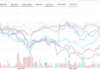
Summary Renewables Round-Up: This article focuses on select clean energy yield/total return companies that trade on the U.S. Exchanges. Performance has been strong over last couple of months, buoyed by recent, positive announcements from PEGI, ABY, NEP, NRG/NYLD, and TERP. President Obama’s 2016 Budget contains some encouraging proposals that, if enacted, would benefit clean energy companies. Waking up in NYC on Monday morning, nobody needed a groundhog to tell us spring’s not headed our way any time soon. But, for investors in the alternative energy/renewables stocks, it was more important to keep an eye on President Obama, and his focus on clean energy in the 2016 budget. While no one can predict what the broader markets will do, or whether specific proposals in the President’s plan will pass, bold statements about upping the budget for clean energy, permanently extending production and investment tax credits (PTCs and ITCs) for wind and solar, as well as calling for the repeal of $50 billion in tax subsidies to the fossil fuel industries, bodes well for alternative energy and renewable companies. And while performance may have been choppy in the past, based on recent performance, it seems investors have warmed to the “yield/total return cos,” a relatively new, dividend paying, subsector, formed from the spin-out of alternative energy/renewables assets of energy, utility, independent, or other infrastructure companies. Timing is Everything…. Looking at the six month chart (several, Abengoa Yield (NASDAQ: ABY ), NextEra Energy Partners (NYSE: NEP ), and TerraForm Power (NASDAQ: TERP ) only went public this summer)) of six clean energy, yield/total return company stocks that trade on U.S. exchanges, one might have mixed feelings. For example, referencing Figure 1, if you’d bought NEP or Brookfield Renewable Energy Partners (NYSE: BEP ), you’d probably be happy with your +17.1% and +12.0% return. But, if you’d opted instead for ABY or Pattern Energy (NASDAQ: PEGI ) during the same period, you be down, stuck with returns of -8.7% and -4.7%, respectively. Figure 1: Six Month Stock Price Performance of Select Clean Energy Yield/Total Return Companies – Source: Yahoo Finance (click to enlarge) What a Difference a Turkey Makes…. More recently, things have changed. So, if we now consider a two-month chart (after the Thanksgiving holiday), as painful a pun as this is, some would wish they’d “gobbled” up many of these names. As shown below, somewhere around mid-December, the stocks began to show more consistent improvement, with the two-month chart showing all companies up in the range between 4.5%-28.8%, versus the broader indices, which were down, -1.1 to -1.6%. And now, despite looking like laggards in the prior chart, ABY and PEGI, come in with some of the best performance over the two month period, up 28.8% and 17.5%, respectively. Figure 2: Two Month Stock Price Performance of Select Clean Energy Yield/Total Return Companies – Source: Yahoo Finance (click to enlarge) It’s Been a Happy New Year So Far! The good news seems to be continuing in January. Some examples include: January 20th, PEGI announced it will partner with Amazon Web Services (division of AMZN) to provide 150MW of wind power to help it achieve the goal of being 100% renewable. Although the project will be renamed “Amazon Web Services Wind Farm,” PEGI will maintain 100% ownership. PEGI further announced on January 28th, that it had taken a majority stake in Green Power Investment (Tokyo-based wind and solar provider), increasing its right of first offer (ROFO) pipeline by 1 GW. ABY announced the opening of its 280MW Mojave solar plant on January 23rd. Given the Mojave Desert is very attractive in terms of its solar power potential (and now, the plant is operational), and Japan represents the second largest solar market behind China, both announcements are positive for these yieldcos. Additionally, both companies also recently announcing public offerings. ABY closed a $285 million secondary for selling shareholder parent, Abengoa (NASDAQ: ABGB ), at $31 per share on January 22nd; on February 2nd, PEGI announced a $351 million common stock offering at $29.25, scheduled to close on February 9th. On January 27, NEP, along with parent company, NextEra (NYSE: NEE ) reported seeing ” stronger than expected demand for new renewables projects;” and “had one of our best years ever in originating new investment opportunities” in terms of contracted renewable projects. On January 28th, NRG Energy (NYSE: NRG ) announced it would work with SunShare to deliver one of the largest community solar projects to Denver. And TERP, along with parent SunEdison (NYSE: SUNE ), announced the closure of the First Wind transaction on January 29th. But Will They Break Our Hearts by Valentine’s Day? Let’s be honest – clean energy companies have not always been the easiest stocks to cuddle up with. In fact, depending upon your time frame and the stock(s) in question, you’re probably more likely to feel you’ve been on a rollercoaster, versus sailing through any tunnel of love. Specific to yieldcos, since debuting with the NRG Yield Co (NYSE: NYLD ) offering in July 2013, there have also been mixed feelings about complex structures, potential governance issues, as well as concerns related to the overall ability to continually find new projects to support dividends, etc. However, just like love, while these stocks may be fickle, there are reasons to believe investors might not get stood up this time. In addition to being an integral part of the clean energy solution, expecting to provide dividend yields in the range of 2-5%, and also having, largely, contracted revenue streams, these yieldcos should benefit from trends in global energy and electricity demand, more competitive pricing among renewable technologies, as well as renewed emphasis on clean energy associated with upcoming 2015 United Nations Climate Change events. Forget the Groundhogs – Focus on Obama’s Clean Energy Proposals While difficult to guess, particularly given the Republican-controlled Congress, how much of it might actually go through, President Obama unveiled his new 2016 budget on Monday, placing a high emphasis on addressing climate change and clean energy solutions. Raising the budget for clean technologies to $7.4 billion (up from $6.9 billion), the proposal also includes $4 billion in the form of a Clean Power State Initiative Fund, the purpose of which is to help states to adopt clean energy more rapidly. Seemingly intent on making clean energy a focal point over the next two years, President Obama also called for the permanent extension of both the PTCs and ITCs for wind and solar. Further, Obama’s proposal calls for the repeal of almost $50 billion in tax subsidies to the oil, gas, and coal industries. Although he has encouraged several of these points in prior budgets (like the repeal of fossil fuel subsidies which hasn’t gone through), the fact that he came out so strongly, combined with other recent positive announcements, should bode well for companies providing clean energy solutions. Hopefully, More to Come…. So, maybe Punxsutawney Phil didn’t brighten your week. But hopefully, some of the clean energy news (and bad holiday references made herein) made you smile! Although we may be stuck with six more weeks of winter,* it appears clean energy yieldco stocks have been seeing some sun recently. And based on what we’ve seen so far, if it continues, investors have the potential for some more Easter Eggs in their clean energy investment baskets! Note: For those not in the loop on groundhog forecasts, Punxsutawney Phil saw his shadow on Monday, February 2 (Ground Hog Day); not really sure why that means six more weeks of winter, but thinking he’s probably right! (click to enlarge) Associated Press Photo -February 2, 2015 Disclaimer: The statements, views, or opinions expressed herein are my own, and should not be relied upon by anyone. While, hopefully, readers will find the discussion insightful and entertaining, the post is provided exclusively for your reading enjoyment. Although care was taken to do reasonable research when gathering information herein, and was believed to be accurate at the time, there is no representation made, or assurance given, that it is either comprehensive or accurate. Additionally, any comments from other respondents/posters are their own; I am neither responsible nor liable for their comments. If there are any issues with this post, please feel free to contact me, and I will try to address your concerns. Disclosure: The author has no positions in any stocks mentioned, and no plans to initiate any positions within the next 72 hours. (More…) The author wrote this article themselves, and it expresses their own opinions. The author is not receiving compensation for it. The author has no business relationship with any company whose stock is mentioned in this article. Additional disclosure: I do own 200 shares in a related entity, Nextera Energy Capital Holdings Inc. Subordinated Debt, in an inherited beneficiary IRA account (NEE.PR.I).