Tag Archives: barclays

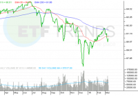
Best Performing Bond ETFs Of 2015

The 33-year bull run in the bond market may totter next year after the Fed hiked the key U.S. interest rate after almost a decade. Though the initial rise was widely expected and meager in measure, 2016 will likely see four more hikes, provided the current global economic conditions remain intact. So the market is abuzz with the speculation that 2016 may mark the end of the prolonged bull run in the bond market and initiate the ‘great rotation’ from bonds to high quality stocks. For as long as the Fed remained dovish with rock-bottom interest rates, both bonds and equities rallied. But the first U.S. rate hike in a decade may make fixed-income investors jittery in 2016. Though the threat doesn’t look too scary at the current level given the Fed’s repeated assertion of going steady with hikes, the process may speed up if inflation perks up and wage growth gains momentum. In short, the backdrop of bond investing is likely to be dull ahead. Yet bond investors may see some hope in global growth worries, plummeting oil prices, slouching commodities, surging greenback and its effect on U.S. corporate earnings that might compel many to look for safety, shun risky assets and once again park their money in the relatively safer fixed-income securities. However, the chances of this tailwind are dimmer than the impending headwinds. In such a situation, it would be interesting to note the ETFs that were the leaders in the bond space during 2015. Returns are as per xtf.com . Market Vectors CEF Municipal Income ETF (NYSEARCA: XMPT ) – Up 7.11% Muni bonds are nice choices for investors seeking a steady stream of tax-free income. Munis are safer bets compared to corporate bonds and yield higher than treasuries. This overlooked choice looks to track the S-Network Municipal Bond Closed-End Fund Index. The product is composed of shares of municipal closed-end funds listed in the U.S. that are principally engaged in asset management processes designed to produce a federally tax-exempted annual yield. Notably, closed-end products are best suited for those who seek higher income (read: Is 2015 The Year for Municipal Bond ETFs? ). The product charges165 bps in fees. The fund is up 7.1% year to date (as of December 24, 2015) and has a dividend yield of 5.26% as of the same date. iPath US Treasury 5-year Bull ETN (NASDAQ: DFVL ) – Up 6.30% The fund is linked to the performance of the Barclays Capital 5Y US Treasury Futures Targeted Exposure Index. The index looks to track movements in the yields from buying 5-year U.S. Treasury Notes. The index looks to increase in response to a decrease in 5-year Treasury note yields and decrease in response to an increase in 5-year Treasury note yields. ProShares Short-Term USD Emerging Market Bond ETF (BATS: EMSH ) – Up 6.30% The fund looks to track the DBIQ short duration emerging market bond index, which is composed of a diversified portfolio of USD-denominated emerging markets bonds that have less than five years remaining to maturity that are issued by emerging markets sovereign governments, non-sovereign government agencies and entities, and corporations with significant government ownership. The fund yields 5.81% annually and is a good vehicle to earn solid current income on a regular basis. The fund rules out extreme volatility as the underlying securities are sovereign in nature. Secondly, the fund is USD-denominated and thus eradicates the adverse impact of the rising greenback. Moreover, low duration of the fund (about 2.65 years) alleviates the interest rate risks. iPath US Treasury 2-year Bull ETN (NASDAQ: DTUL ) – Up 4.84% DTUL is linked to the performance of the Barclays Capital 2Y US Treasury Futures Targeted Exposure Index. The index seeks to produce returns that track movements in response to an increase or decrease, as applicable, in the yields available to investors purchasing 2-year U.S. Treasury notes. The fund charges 75 bps in fees. Market Vectors High-Yield Municipal ETF (NYSEARCA: HYD ) – Up 4.69% The fund seeks to replicate the price & yield performance of the Barclays Capital Municipal Custom High Yield Composite Index. This benchmark picks securities using a market value weighting methodology and tracks the high yield municipal bond market with a 75% weight in non-investment grade municipal bonds and a 25% weight in Baa/BBB-rated investment grade municipal bonds for liquidity and balance. The fund yields 4.88% annually (read: How the Oil Crash Hit the Junk Bond ETF Market ). Road Ahead Having presented the scorecard of the year, we would like to note that the trend is likely to change ahead. High-yield or junk bond ETFs having considerable exposure to the energy sector are likely to perform miserably as the energy companies are at a high risk of defaulting. Moreover, short-term bond yields are likely to surge ahead with every Fed hike putting more pressure on the shorter end of the yield curve. Since inflation is still subdued, long-term bonds may not perform that glumly. Link to the original post on Zacks.com

Investors Grow Wary Of High-Yield, Junk Bond ETFs

Summary ETF investors are pulling out of high-yield, junk bonds. Rising junk bond issuance may be pressuring high-yield market. However, some bond investors may be turning to low-duration junk bond ETFs to hedge rate risks. After staging a decent rally this year, high-yield speculative-grade bond exchange traded funds are now experiencing large withdrawals. Retail investors pulled $1.96 billion from U.S. high-yield funds for the week ended March 11, with 97% of the total, or $1.91 billion from ETFs, writes Matthew Fuller of S&P Capital IQ on Forbes . Over the week ended March 11, the iShares iBoxx $ High Yield Corporate Bond ETF (NYSEArca: HYG ) experienced $1.5 billion in outflows and the SPDR Barclays High Yield Bond ETF (NYSEArca: JNK ) saw $921.6 million in redemptions, according to ETF.com . The large withdrawals and pullback in high-yield bonds may be in response to the sudden influx of $11 billion in speculative-grade debt to hit the market, the biggest sale of securities in almost a year and 26% ahead of last year’s supply, Bloomberg reports. Over the past week, HYG dipped 0.8% and JNK fell 0.5%. “The market is showing some indigestion,” John McClain, a money manager at Diamond Hill Capital Management Inc., said in the Bloomberg article. “It’s harder to find value with a lot of companies taking a ‘now or never’ approach to the market, pouring a lot of supply into the market.” Additionally, short-duration junk bond options also experienced modest inflows, which suggests that some investors may be hedging against potential rate risks ahead. For instance, the SPDR Barclays Short Term High Yield Bond ETF (NYSEArca: SJNK ) , which has a 2.28 year duration, attracted $96.5 million in assets for the week ended March 11 while the iShares 0-5 Year High Yield Corporate Bond ETF (NYSEArca: SHYG ) , which has a 2.26 year duration, added $4.9 million in assets. In contrast, HYG has a 4.03 year duration and JNK has a 4.22 year duration – duration is a measure of a bond fund’s sensitivity to changes interest rates, so a lower duration corresponds with a smaller sensitivity. iShares iBoxx $ High Yield Corporate Bond ETF (click to enlarge) Max Chen contributed to this article . Disclosure: The author is long HYG, JNK. (More…) The author wrote this article themselves, and it expresses their own opinions. The author is not receiving compensation for it. The author has no business relationship with any company whose stock is mentioned in this article.

Balanced Portfolio By Age: How To Find Your Perfect Portfolio

Does having a balanced portfolio by age lead to a desired portfolio? We have the answer for you. The question of optimum portfolio mixture based on your age comes up frequently. The general concept seems to be that the older we are, the more conservative we have to be because we do not have as long to recover from losses. On average, a 20 year-old has a lot longer to recover from a market downturn than an 80 year-old. We have done some research on how long it took to recover from major downturns with different stock and bond mixtures. What many may find surprising is how similar the recovery time has been for the different portfolio mixtures. See “How to Make an Investment Portfolio: 6 Steps to Better Investing” for a description of portfolio design. Balanced Portfolio by Age – Drawdown and Recovery To represent the stock market, we used the Russell 3000 Index, which makes up a majority of the United States stock market. We used the Barclays Capital Aggregate Bond Index to represent the bond market, which makes up most of the United States bond market. The chart shows the worst time frame (max drawdown) for each mixture from January 1979 to September 2013. Each column shows the percentage in Russell 3000 Index. The unstated remaining portion is the amount in the Barclays Capital Aggregate Bond Index. The chart below shows how long in months each mixture dropped. This is shown in red. Then how many months it took to recover, which is shown in green. Investors can add both the drawdown months and the recovery months to figure out how long it would take to get back to where they started in each of these portfolios. For example, the 70% mixture, which is 70% Russell 3000 Index and 30% Barclays Capital Aggregate Bond Index, fell for 16 months and then took 26 months to recover, which means your investment would have taken 42 months (16 down+26 up) to fully recover during the worst fall, for this mixture, since January 1979. See “Best Method to Evaluate Investment Risk” for complete information on how to evaluate the risk of your portfolio. (click to enlarge) What conclusions can we draw from this research? First, the future may not be like the past, although since we do not have a crystal ball or a time machine, looking back is often the best tool we have available. Next, we find the most interesting portion of this research was to discover how many of the portfolios were so similar in terms of total recovery time. Historically, there were three main groupings: 0 to 10% stock 30 to 70% stock 80 to 100% stock In each one of these groupings, you almost had the same total recovery time. It would seem to make sense to take the higher stock percentage portfolio in each grouping because over a longer period of time, the more stock in the portfolio the more total return. Balance Portfolio by Age – More Stock Market Exposure Equals More Money Over The Long-Term You can see that relationship between more stock market exposure and more money in this next chart, which shows the value of each of the above portfolio if you invested $100,000 in January 1979. Most investors do not think about investing for the next 35 years, but looking at long-term data can be useful because they capture more market cycles. This chart shows a perfect long-term correlation between more stock market exposure and more money. On average, the more stock market exposure you have the more you make. See “The 5 Pillars of Effective Asset Management” for a series of articles on how to maximize your returns. (click to enlarge) For example, you can see historically, it would have been much better to take the 70% stock portfolio than the 30% stock portfolio, especially when you consider the total recovery time was only four months longer for the 70% stock portfolio during the worst time period for each portfolio. Balance Portfolio by Age – Finding Your Personal Risk Tolerance There is a catch. Each person has to consider age, especially when considering how long it will take your portfolio to recover, but more importantly you need to consider personal risk tolerance. How much risk can you take before you panic and sell? This chart shows the low value for a $100,000 investment made just before the max drawdown started in each of the above mixtures. This effectively shows what would have happened if you invested $100,000 in each of the above portfolios just before the worst downturn for each of these portfolios. This chart shows you what your worst monthly statement would have been before it finally recovered many months later. (click to enlarge) As you can see, there is a fairly significant difference in the low value between the 30% stock portfolio and the 70% stock portfolio. Incredibly, even with that difference it only took four months longer for the 70% portfolio to recover, but if the account fell more than you could tolerate, you’re never going to see that recovery. The most important part of finding a balanced portfolio by age is finding your personal risk tolerance at your current age. Examine the historical maximum drawdown periods for the portfolio mixtures you are considering. See how much you can lose and how long it takes to recover. Lastly, see how much you might make. This full examination of the possibilities will help you determine the perfect portfolio for your age.