Tag Archives: alternative

2 High-Yield Utility Stocks To Buy For 2015
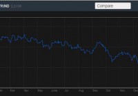
Summary DUK and AEP are set to deliver healthy performances in the coming year. Efforts to increase regulated operations will fuel future growths of both companies. DUK and AEP offer safe dividend yields. Utility stocks have been an admired investment choice for dividend-seeking investors, as they offer high dividend yields. In 2014, the utility sector delivered healthy results and performed better than the S&P 500. The healthy performance of the utility sector can be mainly attributed to a low treasury yield environment. Going forward, I believe utilities will perform well in 2015 due to the prevalent low treasury yield environment, the measures taken by utility companies to improve operational productivity, and continuous efforts by utilities to reduce competitive power operations. As I believe utility sector will deliver a healthy performance next year, I recommend investors to buy two utility stocks, namely American Electric Power (NYSE: AEP ) and Duke Energy (NYSE: DUK ), in 2015. AEP and DUK are positioned well in the industry to deliver a healthy performance in 2015. Also, both stocks offer attractive and safe dividend yields. The following graph shows the declining trend for 10-Year Treasury Yield. Source: Bloomberg.com 2 Stocks for 2015 The utility sector has performed better than the S&P 500 in 2014. And as we head into 2015, I believe the utility sector will deliver a healthy performance next year as well. The low treasury rate environment, efforts to improve operational efficiencies, and lower competitive power operations across the industry will support the utility sector’s performance in 2015. The following table shows the performance of the S&P 500, the utility sector, DUK, and AEP in 2014 year-to-date. S&P 500 Utility Sector ETF (NYSEARCA: XLU ) DUK AEP 2014 – Year-to-date Performance 13% 29% 26% 34.5% Source: Bloomberg.com As the competitive business operations of U.S. utility companies have remained challenging, due to weak capacity revenues and commodity prices, companies have been making efforts to lower their competitive operations. Efforts to lower competitive operations will portend well for companies’ bottom-line numbers and cash flows in future. Many utility companies, including AEP, DUK, PPL Corp. (NYSE: PPL ), Exelon (NYSE: EXC ), have been making efforts to lower their competitive operations. DUK will benefit in the coming year from an increase in its capital expenditures. Also, the company has been addressing the challenges in competitive business operations by selling its unregulated assets. The company, in 4Q’14, sold its competitive power assets in the Midwest for $2.8 billion. The transaction will positively affect the bottom-line numbers of the company in future, as the Midwest assets were posting weak results and were weighing on the company’s total EPS. The company intends to use the cash from the assets sale to expand its regulated operations. The company plans to make capital expenditures of $18 billion (midpoint) from 2014-2018, which includes $7 billion (midpoint) for new generation facilities. The capital expenditures that DUK has planned will help it expand its regulated operations and fuel its top and bottom-line growth. Analysts are anticipating a healthy next five-year growth rate of 4.8% for DUK. Along with healthy growth prospects, the stock offers a high dividend yield of 3.90% . DUK has consistently increased dividends over the years, and the healthy future growth prospects promises further increases in dividends. Also, the dividends offered by DUK are backed by its cash flows, evident from its healthy dividend coverage ratio. Moreover, the company has been successfully increasing its ROE in recent years. The following table shows the increase in dividends per share and ROE over the years, the dividend payout ratio, and the dividend coverage ratio for DUK. (Note * Dividend coverage ratio = operating cash flow/annual dividends, and 2014 figures below are based on estimates). Dividend Per Share ($) Dividend Payout Ratio Dividend Coverage* ROE 2012 $3.03 70% 3x 9.5% 2013 3.12 71% 2.9x 10.7% 2014 * 3.15 70% 3.1x 11.5% Source: Company Reports and Calculations AEP is among the leading utility companies in the U.S. As the competitive business operations remain challenging, AEP has been making efforts to decrease its competitive operations and expand regulated operations. The increase in regulated operations will provide EPS strength for the company. Also, the capital expenditure that AEP has been making will help it fuel its top and bottom-line numbers growth through rate case hikes. The company, in efforts to increase its regulated business, is expected to make capital expenditures of $12 billion from 2015-2017. Also, AEP is focusing on increasing its regulated transmission business in the coming years, and as a result, its transmission segment’s EPS is expected to grow to $0.67 in 2017, up from $0.30 in 2014. Capital expenditures by AEP to expand regulated operations will fuel its future growth. Due to the company’s healthy growth efforts, analysts are anticipating a healthy next five-year earnings growth rate of 4.95% for AEP. The following chart shows the capital expenditure forecast for AEP from 2015-2017. Source: Company Reports Other than attractive growth opportunities, the company offers a safe dividend yield of 3.6% . Dividends offered by the company have increased consistently over the years, and have been backed by its strong cash flows. In the future, dividends are expected to grow consistently due to the company’s growth efforts. The following table shows the increase in dividends per share over the years, dividend payout ratio and dividend coverage ratio for AEP. (Note * Dividend coverage ratio = operating cash flow/annual dividends, and 2014 figures below are based on estimates). Dividend Per Share ($) Dividend Payout Ratio Dividend Coverage* 2012 1.88 60% 4.1x 2013 1.95 60% 4.5x 2014 * 2.02 55% 4x Source: Company Reports and Calculations Conclusion I believe the utility sector will continue to perform well in 2015. I recommend investors to buy DUK and AEP for 2015, as both stocks are set to deliver healthy performances in the coming year. Both companies are expected to enjoy healthy growth in the next five years, and efforts to increase regulated operations will fuel future growths. Also, DUK and AEP offer safe dividend yields, which make both stocks attractive investment options for dividend-seeking investors. The following table shows the dividend yields and next five-year growth rates for DUK and AEP. Dividend Yield Next 5 Year Growth Rate DUK 3.9% 4.8% AEP 3.6% 4.95% Source: Yahoo Finance and nasdaq.com
A Comparison Of 3 Emerging Market Low Volatility ETFs

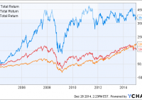
Summary Emerging markets have returned twice the U.S. markets over the last 11 years, but have struggled recently. Emerging markets are now very cheap, but investors may be put off by their higher volatility. Do low volatility emerging market funds deliver? Introduction Some years ago, emerging markets were all the rage. According to MSCI , emerging markets grew from 1% of the global market cap in 1988 to 11% in 2013. An investor who bought into iShares MSCI Emerging Markets ETF (NYSEARCA: EEM ) 11 years ago would have been rewarded with nearly a 400% gain, far ahead of S&P 500 (NYSEARCA: SPY ) (199%) and developed markets ex-U.S. (NYSEARCA: EFA ) (166%). EEM Total Return Price data by YCharts However, the above chart belies the fact that emerging markets have not performed well since the end of the financial crisis. Since 2009, EEM has returned only 72%, compared to 189% for SPY and 94% for EFA. EEM Total Return Price data by YCharts Given their relative underperformance over the past several years, is now the time to take a second look at emerging markets? Most analysts and fund managers are pessimistic on the prospects of emerging markets in 2015, which could actually be a contrarian signal. A recent Seeking Alpha article by Elite Wealth Management reported that in a November survey of fund managers with a combined $700 billion in assets, they were 0% overweight in emerging market equities, compared to 45% Japan, 25% U.S. and 8% Europe. Emerging markets are now very cheap. The table below shows the P/E ratios and dividend yields for the top 10 countries in EEM, compared to selected developing markets (source: Financial Times ). Also shown for the emerging market countries is the weight of that country in EEM. Country Weight % P/E Dividend yield % China 17.52 7.1 4.4 South Korea 13.64 15.6 1.2 Taiwan 12.20 13.9 3.0 Brazil 7.82 12.4 4.6 South Africa 7.75 16.4 3.1 India 6.69 18.2 1.6 Mexico 5.05 21.2 2.0 Russia 3.94 5.5 5.6 Malaysia 3.66 15.7 3.2 Indonesia 2.66 18.3 2.2 U.S. – 19.0 2.3 Japan – 16.5 1.7 U.K. – 15.9 3.3 Germany – 16.1 2.6 Canada – 17.9 2.8 We can see that the 9 out of the 10 emerging market economies have a P/E ratio lower than the U.S. (19.0). Only Mexico (21.2) has a higher P/E ratio than the U.S.; China and Russia have the lowest P/E ratios of 7.1 and 5.5, respectively. The following table shows the valuation ratios for ETFs of major world regions (data are from Morningstar and are forward-looking). Region ETF P/E P/B P/S P/CF Yield % U.S. SPY 18.03 2.48 1.78 7.77 2.08 Europe (NYSEARCA: VGK ) 16.19 1.74 1.04 6.96 3.21 Japan (NYSEARCA: EWJ ) 15.23 1.21 0.77 4.89 1.62 Asia ex-Japan (NASDAQ: AAXJ ) 12.68 1.39 1.17 6.05 2.43 Emerging Markets EEM 12.76 1.49 1.14 4.91 2.56 We can see from the data above that Asia ex-Japan and emerging markets have the lowest valuation metrics amongst the world regions. However, it might be argued that developed markets deserve a valuation premium over emerging markets due to their higher stability (see reasons below). Moreover, emerging markets have always had higher volatility compared to developed markets. This is likely due to a multitude of factors, such as less stable corporate and sovereign governance, less stable currency, smaller economies, reliance on foreign investment, and concentration in cyclical industries such as mining and energy. The below chart shows the volatility and beta values for EEM compared to SPY and EFA over the past 6 years. EEM 30-Day Rolling Volatility data by YCharts Low-volatility emerging market funds Would low-volatility emerging market (EM) funds be ideal for investors wanting some exposure to emerging markets, but with lower volatility? To my knowledge, there are three low-volatility EM funds on the market: EGShares Low Volatility EM Dividend ETF (NYSEARCA: HILO ), PowerShares S&P Emerging Markets Low Volatility Portfolio (NYSEARCA: EELV ) and iShares MSCI Emerging Markets Minimum Volatility (NYSEARCA: EEMV ). In a previous series of articles , we compared several high-dividend low-volatility U.S.-based funds. We found that those funds were able to achieve their dual objectives of high dividends and low volatility by overweighting mature and defensive industries such as utilities, healthcare and real estate. This article seeks to compare the three low-volatility EM funds. Note that this will be more of an overview of the three funds and rather than an in-depth analysis of a single fund. Fund details Details for the three low-volatility EM funds and EEM are shown in the table below (data from Morningstar). HILO EELV EEMV EEM Yield 4.63% 2.68% 2.59% 1.69% Expense ratio 0.85% 0.29% 0.25% 0.67% Inception Aug 2011 Jan 2012 Oct 2011 April 2003 Assets $32.1M $206.2M $1.90B $31.96B Avg Vol. 28.4K 49.9K 306K 60.6M No. holdings 30 187 243 817 Annual turnover 137% 101% 34% 22% EEM is by far the most massive fund, with nearly $32B in assets. The other three low-volatility EM funds have a wide variation in size. EEMV has $1.90B in assets, followed by EELV at $206.2M in assets. Surprisingly, HILO only has $32.1M assets even though it is the oldest of the three low-volatility funds. The volumes of HILO and EELV border on the low end, with only 28.4K and 49.9K shares changing hands a day, respectively. We can also see that HILO has the highest yield (4.63%) out of the three low-volatility EM funds and EEM, which is not surprising given that it’s also a dividend fund. The other two low-volatility EM funds, EELV (2.68%) and EEMV (2.59%), also have higher dividends than EEM (1.69%). Both HILO and EELV have very high turnovers of 137% and 101%, respectively. EEMV and EEM have lower turnovers of 34% and 22%, respectively. In terms of expense ratio, HILO is the most expensive ETF, with a fee of 0.85% per annum. EELV and EEMV are much cheaper, with expense ratios of 0.29% and 0.25%, respectively. EEM charges 0.67% in expenses, which seems very high for a “vanilla” equity fund. This is probably why Vanguard FTSE Emerging Markets ETF (NYSEARCA: VWO ) has outgrown EEM even though it was incepted two years later. VWO charges only 0.15% in fees and has accumulated over $45B in assets. Overlap The following table illustrates the overlap between the three low-volatility EM funds and EEM. Overlap statistics were obtained from ETF Research Center . HILO EELV EEMV EEM HILO – 5% 7% 2% EELV 5% – 37% 27% EEMV 7% 37% – EEM 2% 27% 31% – We can see that HILO has the lowest overlap compared to the other two low-volatility EM funds. This is probably because HILO also has a dividend focus in addition to its low-volatility theme. EELV and EEMV have the highest overlap, at 37% of total assets. Performance The graph below shows the performance of the three low-volatility EM funds and EEM since Jan 2012 (2 years). HILO Total Return Price data by YCharts We see quite a disparity between the performance of the three funds and EEM over the past 2 years. Both EEMV and EELV have managed to beat the benchmark EEM (6.23%). EEMV exhibited the best 2-year performance of 20.64%, while EELV returned 8.87%. On the other hand, HILO recorded the worst performance of -9.53%. The following table shows further performance and risk data for HILO, EELV, EEMV and EEM. Data are from Morningstar, except for volatility (2Y) and beta (2Y) which are from InvestSpy . HILO EELV EEMV EEM 1-year return % -12.21 -4.14 1.96 -0.94 3-year return (ann.)% -3.42 – 6.18 2.91 Volatility (2Y) % 15.6% 13.5% 13.7% 18.0% Beta (2Y) 0.94 0.80 0.87 1.17 Sharpe ratio (3Y) 0.01 – 0.77 0.37 We can see from the data above that despite their disparate performances, all three low-volatility funds have succeeded in achieving lower volatility than EEM over the past 2 years. Valuation The table below shows various value and growth metrics for HILO, EELV, EEMV and EEM. Data for all funds are from Morningstar (value metrics including dividend yield are forward looking). The first five rows can be considered as value metrics while the last five rows can be considered as growth metrics. HILO EELV EEMV EEM Price/Earnings 11.31 14.45 15.69 12.76 Price/Book 1.27 1.48 1.86 1.49 Price/Sales 0.99 1.18 1.51 1.14 Price/Cash Flow 5.42 5.18 7.38 4.91 Dividend yield % 9.96 3.09 2.81 2.56 Projected Earnings Growth % 11.23 12.34 10.97 11.76 Historical Earnings Growth % 0.73 11.05 5.06 -1.68 Sales Growth % 12.97 -17.34 -15.60 -13.79 Cash-flow Growth % 7.40 3.77 6.36 7.85 Book-value Growth % 8.70 -22.75 -26.56 -21.57 We can see from the table above that EELV has similar valuation metrics to EEM, while EEMV is slightly more expensive than EEM. On the other hand, HILO appears to be the cheapest out of the four funds. Interestingly, the current valuation of the four funds is inversely proportional to their performance over the past two years. HILO, the most “valuey” fund, has had the worst performance in the last two years, while EEMV, the most expensive fund, has done the best. The funds also appear to have many negative growth metrics, which could be due to the effect of a global slowdown on the growth of many emerging market economies that rely heavily on exports or foreign investment. Countries Perhaps the most important factor that would affect the performance of these EM funds is the distribution of the constituent countries in the fund. The following table shows the top 10 countries in each of the three low-volatility EM funds and EEM (data from ETF Database ). HILO EELV EEMV EEM Country Weight Country Weight Country Weight Country Weight Thailand 13.23% Taiwan 27.68% China 22.74% China 17.52% Malaysia 12.61% Malaysia 18.62% Taiwan 17.37% South Korea 13.64% China 12.54% South Africa 13.66% South Korea 9.40% Taiwan 12.20% Brazil 9.60% South Korea 9.30% Malaysia 8.80% Brazil 7.82% Mexico 8.23% Other 9.23% South Africa 5.50% South Africa 7.75% Czech Republic 7.36% China 5.08% Indonesia 4.88% India 6.99% Indonesia 6.96% Brazil 4.47% Brazil 4.44% Mexico 5.05% Chile 6.57% Mexico 3.83% Chile 4.21% Russia 3.94% Poland 5.10% Thailand 2.97% Philippines 3.75% Malaysia 3.66% United Arab Emirates 4.01% Chile 2.83% Qatar 2.80% Indonesia 2.66% The following graph shows the allocation of the four funds to the ten most represented countries in the funds. Size The table below shows the size distribution for the four EM funds (data from Morningstar). HILO EELV EEMV EEM Giant 24.18 26.03 34.16 50.62 Large 11.85 51.75 49.84 37.00 Mid 52.55 22.22 15.40 11.87 Small 9.20 0 0.61 0.44 Micro 2.22 0 0 0.08 And in graphical form: We can see that HILO has a rather interesting size distribution, with more giant and medium-cap stocks compared to large-cap stocks. EELV and EEMV have similar size distributions, with about 50% in large-cap stocks, 30% in giant-cap stocks and 20% in mid-cap stocks. On the other hand, EEM is tilted towards giant-cap stocks. Sector The final aspect to look at for the EM funds is their sector diversification. The following table shows the sector composition of HILO, EELV, EEMV and EEM. Data are from Morningstar. HILO EELV EEMV EEM Basic Materials 8.47 9.41 3.9 7.93 Consumer Cyclical 5.74 10.71 6.32 8.46 Financial Services 16.64 37.14 26.44 25.43 Real Estate 5.68 3.05 1.06 2.44 Communication Services 19.52 8.97 12.98 7.76 Energy 6.08 4.1 3.13 7.51 Industrials 24.19 7.87 7.66 5.73 Technology 0 3.77 13.03 20.9 Consumer Defensive 0 9.21 11.54 8.3 Healthcare 3.64 1.46 6.62 2.24 Utilities 10.05 4.31 7.92 3.31 And in graphical form: We can see from the data that financials make up a high allocation of all four EM funds, with EELV having the highest allocation at 37.14% and HILO having the lowest at 16.64%. HILO has the highest allocations to industrials (24.19%) and communication services (19.52%). The following graph shows the sector distribution of the four funds (individual sectors are not marked). We can see that EEMV and EEM have the most even sector distributions of the four funds. Conclusion All three low-volatility EM funds have managed to deliver lower volatilities over the past 2 years (compared to EEM), but with wildly disparate performances. EEMV exhibited the best 2-year performance of 20.64%, while EELV returned 8.87% and HILO returned -9.53%. If I had to pick a low-volatility EM fund, I would probably pick EEMV for the following reasons: It has the best performance record over the past two years while still recording lower volatility than EEM. Its three highest allocations are to China, Taiwan and South Korea, which are all in the top 5 of the cheapest emerging market countries. It has the lowest expense ratio (0.29%) out of all the EM funds studied. It has better sector distribution compared to HILO or EELV.

ACIM Appears To Have Incredibly Low Risk, But That’s Inaccurate

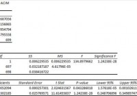
Summary I’m taking a look at ACIM as a candidate for inclusion in my ETF portfolio. The correlation appears to be very low, but the low liquidity caused days with no trades. The same liquidity issues might have improved the standard deviation of returns. The premium to NAV makes it look like a potential short candidate. I’m not assessing any tax impacts. Investors should check their own situation for tax exposure. Investors should be seeking to improve their risk adjusted returns. I’m a big fan of using ETFs to achieve the risk adjusted returns relative to the portfolios that a normal investor can generate for themselves after trading costs. I’m working on building a new portfolio and I’m going to be analyzing several of the ETFs that I am considering for my personal portfolio. One of the funds that I’m considering is the SPDR® MSCI ACWI IMI ETF (NYSEARCA: ACIM ). I’ll be performing a substantial portion of my analysis along the lines of modern portfolio theory, so my goal is to find ways to minimize costs while achieving diversification to reduce my risk level. What does ACIM do? ACIM attempts to track the total return of the MSCI ACWI IMI Index. At least 80% of funds are invested in companies that are part of the index, or in ADRs (American Depositary Receipts). ACIM falls under the category of “World Stock”. Does ACIM provide diversification benefits to a portfolio? Each investor may hold a different portfolio, but I use (NYSEARCA: SPY ) as the basis for my analysis. I believe SPY, or another large cap U.S. fund with similar properties, represents the reasonable first step for many investors designing an ETF portfolio. Therefore, I start my diversification analysis by seeing how it works with SPY. I start with an ANOVA table: (click to enlarge) The correlation is an absurdly low 40%. If an investor stopped here, they would be dramatically misinformed about the risks of ACIM. The correlation is very low as a statistical measure, but the metric is being substantially enhanced by a lack of liquidity in the stock which caused several days to report no change in the price of securities. Standard deviation of daily returns (dividend adjusted, measured since March 2012) The standard deviation is excellent for the international exposure. For ACIM it is .9981%. For SPY, it is 0.7419% for the same period. SPY usually beats other ETFs in this regard, so having a lower standard deviation is excellent. Frequent readers should be aware that I have measured returns from March 2012 instead of my normal starting point of January 2012. I can’t measure values until the ETF is trading and Yahoo is tracking the dividend adjusted close values. Unfortunately, the standard deviation may appear substantially smaller than it should because several days (especially in 2012) reported no change in price. When no sales are reported, the price is not changed and it looks like a low standard deviation of returns. Investors should be aware that there is substantial liquidity risk. The average volume for the last 10 days is only 6,837. Mixing it with SPY I also run comparisons on the standard deviation of daily returns for the portfolio assuming that the portfolio is combined with the S&P 500. For research, I assume daily rebalancing because it dramatically simplifies the math. With a 50/50 weighting in a portfolio holding only SPY and ACIM, the standard deviation of daily returns across the entire portfolio is 0.7320%. If an investor wanted to use ACIM as a supplement to their portfolio, the standard deviation across the portfolio with 95% in SPY and 5% in ACIM would have been .7263%. However, due to the very low correlation, a position of 80% SPY combined with 20% ACIM results in a standard deviation for the portfolio of only .6982%. Investors hoping to capitalize on this low standard deviation of returns would need to have a relatively low need for liquidity since the price stability only works if no large sell orders are being introduced. Why I use standard deviation of daily returns I don’t believe historical returns have predictive power for future returns, but I do believe historical values for standard deviations of returns relative to other ETFs have some predictive power on future risks and correlations. Yield & Taxes The distribution yield is 1.84%. The yield is almost high enough for a retiring investor, in my opinion. Generally, I want to see yields over 2% when considering an ETF for retirement planning. This is close enough that I could still consider it from the perspective of a retiree, but only if the retiree was certain they did not have liquidity needs. I’m not a CPA or CFP, so I’m not assessing any tax impacts. Expense Ratio The ETF is posting .25% for an expense ratio. I want diversification, I want stability, and I don’t want to pay for them. The expense ratio on this fund is higher than I want to pay, but isn’t unbearable for the incredible diversification. Market to NAV The ETF is at a 1.85% premium to NAV currently. Premiums or discounts to NAV can change very quickly so investors should check prior to putting in an order. I wouldn’t want to pay a premium greater than .1% when investing in an ETF. There might be some situations where I would pay .2%, but you won’t see me agreeing to pay that premium. Not happening. If I took a position in this ETF it would be with a carefully monitored limit buy order that adjusted for the premium. If sell orders dropped it to my price, great, if not, I’d rather avoid the ETF entirely than pay that premium. Largest Holdings ACIM has great diversification when you look at the percent in each asset, but the top of the portfolio still has a huge tilt towards the U.S. economy. (click to enlarge) These aren’t bad stocks to hold, but I can get them by holding any of several major ETFs that hold major U.S. companies. The appeal of a world portfolio is having substantial exposure to other markets to help balance out the geographic risks of a U.S. based portfolio. This collection of top holdings supports my belief that the correlation is understated because favorable impacts from days where reported closing price did not change. If ACIM drops to trade at a discount to NAV, I may become very interested in it. Otherwise, regardless of the statistics, I’m not interested in paying a premium for an ETF that holds several of the same companies I can acquire without the premium. Conclusion I’m currently screening a large volume of ETFs for my own portfolio. The portfolio I’m building is through Schwab, so I’m able to trade ACIM with no commissions. I have a strong preference for researching ETFs that are free to trade in my account, so most of my research will be on ETFs that fall under the “ETF OneSource” program. I think the statistics for the ETF are misleading and premium to NAV looks like a poor bet for future returns. When this ETF trades near NAV, it may have some value to investors. I may take a deeper look at it in the future, but for now I think the low liquidity and premium NAV present a real challenge to including it in my portfolio. Due to low liquidity and the potential need to execute a trade over multiple days to create or sell a reasonable position, I would not consider this ETF at all from any account that was required to pay trading commissions on the ETF. If I can short ETFs that are overpriced (without commission), it might become appealing to initiate shorts on the ETF when it is trading over book value if I can own substantially the same securities through other ETFs without paying a premium to acquire them. Additional disclosure: Information in this article represents the opinion of the analyst. All statements are represented as opinions, rather than facts, and should not be construed as advice to buy or sell a security. Ratings of “outperform” and “underperform” reflect the analyst’s estimation of a divergence between the market value for a security and the price that would be appropriate given the potential for risks and returns relative to other securities. The analyst does not know your particular objectives for returns or constraints upon investing. All investors are encouraged to do their own research before making any investment decision. Information is regularly obtained from Yahoo Finance, Google Finance, and SEC Database. If Yahoo, Google, or the SEC database contained faulty or old information it could be incorporated into my analysis. The analyst holds a diversified portfolio including mutual funds or index funds which may include a small long exposure to the stock.