Coming Energy ETF Price Changes, As Seen By Market-Makers
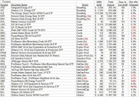
Summary Transitions in energy economics continue as extraction technology of source fuels progresses, their transportation capacity to demand sites expands, conversion technology of sources to improved use forms evolves. It can’t happen instantly, so bets made on the rate and extent of advances are being made and modified daily in the convenient, diversified forms of Exchange Traded Funds, ETFs. Energy’s pervasive presence in contemporary civilization provides a wide range of opportunities for profit gains in investment capital. The choices are so overwhelming that focus is needed. ETFs do that. Investors must be careful about their energy ETF choices since progress prospects can be quite uneven in the common denominators of time required, odds of success, and extent of payoffs. Knowledgeable investment organizations, in their attempts at best choices, cause market-makers to put their firms’ capital temporarily at risk, facilitating volume trades. Risk-aversion measures reveal the players expectations. Observers can piggy-back on knowledgeable investor expectations Energy is an enormous, complex, evolving, opportune scene. Finding reliable guides to condense and focus attention and evaluation comparisons is a daunting task. Our strategy is to let large organizations, ones that are well-resourced in experienced people who are kept currently informed by extensive information gathering systems, do the heavy lifting research of developing and maintaining comparative data. These are the buy-side movers. That flood of essential minutia leads to value judgments about likely future prices of commodities and securities prices. Uncertainty infects all expectations, making ODDS of achievement an essential component in the valuation process. Scorekeeping in the investing competition is done by rate of return, making TIME a powerful element in the equation, potentially more important than size of PAYOFFS. The buy-side movers have their own conclusions about likely specific scores and attempt to implement them by changes in investment portfolio holdings. To have significant impact on their portfolios, the changes typically are too large to be accomplished in regular-way trades of single buyer confronting single seller. These volume trade programs pursue a variety of avenues, but the most significant price-setting ones are known as block trades. Block trades are single transactions typically involving one initiator and an anonymous group of “other side of the trade” reactors organized by a market-making [MM] negotiator, where a single per-share price is achieved for all participants, with a trade spread for the MM applied against the trade initiator’s receipt or cost. Usually markets do not provide the opportunity for a “cross” where available buyers equal sellers and the MM earns an effort-free spread. Instead, to achieve a price per share acceptable to the trade initiator, the MM usually must become party to the transaction, taking a position, long or short, to balance the volume of shares between buyers and sellers. That action puts the MM firm’s capital at risk of subsequent undesired price change until the acquired position can be unwound one way or another. Actual risk-taking is not the MM’s desired activity, nor practice. Their competitive skills are in risk avoidance – hedging and arbitrage – setting up combinations of securities positions that offset unwanted price changes in at-risk capital commitments. That intellectual art form tends to dominate the markets for many derivative securities. It usually can’t be done without cost because those markets are competitive in themselves. The MM seeking protection won’t get it for free, because the sellers of the price insurance are accepting their own risk exposures in the process, and insist on being paid. What cost can be paid comes back to the judgment of the trade originator, because the hedge is part and parcel of the market liquidity being provided by the MM and gets folded into the single per share price of the block trade. A small enough cost fills the trade, too big a cost kills the trade. This is the discipline of the marketplace. Live experience of market price changes subsequent to the implied price range forecasts by MMs verifies their ongoing judgments about what may be coming for energy ETFs. What Energy ETFs are Available? Over 30 actively-traded ETFs have a focus on the energy sector, more than in any other activity of the world economy. They are very diverse in nature, ranging from fuel producers with broad product lines to the commodity prices themselves, to electric Utility converters and distributors of energy, to explorers and developers of fuel resources, to transporters and in-the-field support service organizations . Figure 1 lists these ETFs, sorted by their principal holdings focuses. It further examines the size of investor capital commitments in each, and what kind of trading activity defines the liquidity of an investor’s ability to enter or exit from the game. Transaction trade spreads give further insights into the costs of participating. Figure 1 (click to enlarge) Source: Yahoo Finance For many of the sectors of interest there are multiple ETF choices available to the investor. As usual, those attracting the largest capital commitments, Assets Under Management, or AUM, tend to have the most liquidity in terms of turnover, and lowest cost in terms of bid-offer trade spreads. Negative or inverse-acting ETFs are indicated in red, as are costly trade spreads of 2% or more. Liquidity in ETFs is a major concern because of the huge number of ETFs that have small commitments and infrequent trading at large spread costs. A few of these are indicated here, but many hundreds more are extant. Investors should take care to be able to extricate their capital in short notice when things turn unpleasant by using ETFs with quicker turnover of AUM where alternative choices are present. From this list it is clear that XLE, XLU, and AMJ have the biggest investor commitments, but that AMJ is relatively illiquid. So are the two Vanguard ETFs, VDE and VPU. USO, UCO, XOP, and OIH, despite billion-$ commitments, have good AUM turnover. But how do these ETFs compare on Risk vs. Reward? Figure 2 provides a graphic comparison of MM upside price change forecasts (reward) with prior experiences of worst-case price drawdowns (risk) during holdings of forecasts similar to today’s. It is often at such points the need for cash or the confidence in price recovery is under most stress. Figure 2 (used with permission) In this picture higher rewards and lower risks are down and to the right, with the opposite up and to the left. Equal risk and reward, in percent price change terms, are along the dotted diagonal. The most favorable combination of prospects is for the Vanguard Energy ETF (NYSEARCA: VDE ) at location [16]. The market average proxy, the SPDR S&P 500 Trust ETF (NYSEARCA: SPY ) is at [30] with the same upside prospect as VDE, but some larger drawdown exposure. Along with SPY is the First Trust Natural Gas Exploration and Production ETF (NYSEARCA: FCG ). Reaching out for higher rewards at the cost of larger risk exposure are the The United States Brent Oil ETF, LP ( BNO) [11], and the The United States 12 Month Oil ETF, LP ( USL) [10]. Big commitment ETFs, the Energy Select Sector SPDR ETF (NYSEARCA: XLE ) [20] and the iShares U.S. Energy ETF ( IYE) [3] are on the wrong side of the R~R balance just above the diagonal. Fuller details on the comparative criteria of Risk, Reward, Odds, and Payoffs for this list of ETFs is contained in Figure 3. The historical experience data shown there is from hypothetical holdings at prior dates of forecasts similar to today’s, managed under our standard TERMD T ime- E fficient R isk M anagement D iscipline. Figure 3 (click to enlarge) What is important in the table is the balance of upside prospects (5) in comparison to downside concerns (6). That ratio is expressed in the Range Index [RI] (7), whose number tells what percentage of the whole range (2) to (3) lies below the then current price (4). Today’s Range Index is used to evaluate how well prior forecasts of similar RIs for this ETF have previously worked out. The size of that historic sample is given in (12). The first items in the data line are current information: The current high and low of the forecast range, and the percent change from the market quote to the top of the range, as a sell target. The Range Index is of the current forecast. Other items of data are all derived from the history of prior forecasts. They stem from applying a T ime- E fficient R isk M anagement D iscipline to hypothetical holdings initiated by the MM forecasts. That discipline requires a next-day closing price cost position be held no longer than 63 market days (3 months) unless first encountered by a market close equal to or above the sell target. The net payoffs (9) are the cumulative average simple percent gains of all such forecast positions, including losses. Days held (10) are average market rather than calendar days held in the sample positions. Drawdown exposure indicates the typical worst-case price experience during those holding periods. Win odds (8) tells what percentage proportion of the sample recovered from the drawdowns to produce a gain. The credibil(ity) ratio (13) compares the sell target prospect (5) with the historic net payoff experiences (9). These ETFs have been ranked by (15) an odds-weighted blend of reward and risk in light of the frequency of opportunities in the sample, as a figure of merit [FOM] to include the results of prior relevant experiences. Averages of the 10 best FOM-ranked ETFs and of the set of 32 have been compiled for comparative purposes with the market proxy SPY, and with the day’s equity population average of some 2500 stocks and ETFs. Conclusion The best ten Energy ETFs as a subset offer poor comparisons to the market proxy SPY, with slightly larger upside prospects but markedly worse price drawdown experiences. Their drawdown recovery back to profitability of 79 out of 100 positions was worse than SPY’s 86 of 100. Their forecast credibility was just as poor as the market average, but with a much worse reward-to-risk ratio. Looked at as the larger set of 32, these ETFs have a pretty horrible comparison with the overall equity population. But that should not be much of a surprise, given a 50% drop in the common denominator for the entire sector, the price of crude oil. Still, there is recent hope that we may be seeing a bottom area in that price of $50-$65 per barrel. We will be producing a series of single ETF analyses on those energy ETFs where the present and coming better investment prospects may lie. Disclosure: I/we have no positions in any stocks mentioned, and no plans to initiate any positions within the next 72 hours. (More…) I wrote this article myself, and it expresses my own opinions. I am not receiving compensation for it (other than from Seeking Alpha). I have no business relationship with any company whose stock is mentioned in this article.