Scalper1 News
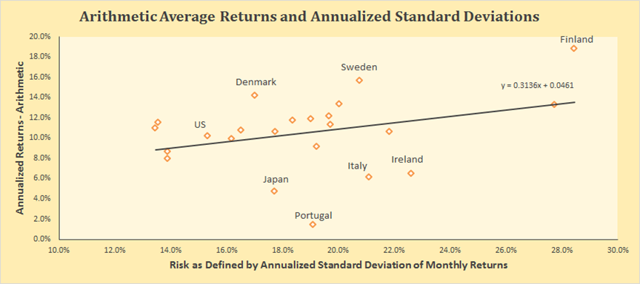
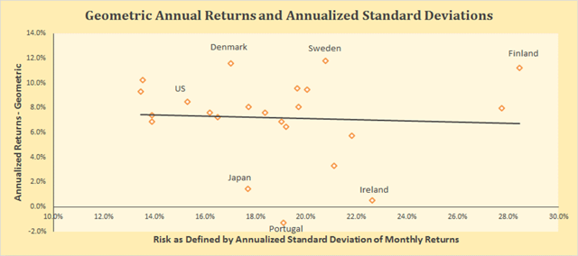 By Baijnath Ramraika, CFA In a paper I co-authored with Prashant Trivedi, we constructed all stock market-cap weighted indices for each one of the twenty-three developed markets included in the MSCI Developed Markets Index as of December 31st, 2014. In the paper, we showed each country’s all-stock index in U.S. dollars as well as local currency terms and also reported the number of companies that were included in the country’s index every year. Every country’s annual local currency returns and the annualized standard deviation of these returns were plotted on a scatter graph. A line of best fit was drawn to check if investors were compensated for the risk they took, i.e., did higher risk as defined by standard deviation of returns correspond with higher returns. Figure 1 below shows this relationship with returns on y-axis and risk on x-axis. Note that returns for the purposes of this chart have been defined as arithmetic average of annual returns. As is seen, the line is upward sloping, i.e., higher the risk, higher the return. Figure 1 (click to enlarge) Developed Markets – Risk vs. Arithmetic Returns So does that mean that markets were efficient in the sense that high returns are accompanied with high risk. Not so fast. Remember, I pointed out earlier that Figure 1 was based on arithmetic average of annual returns. This is where you have to pay attention. An important quirk here relates to the fact that equity markets tend to produce negative returns every once a while. Consider a simple hypothetical problem with two year investment returns being +50% in Year 1 and -50% in Year 2. If you invested $100 at the beginning of Year 1, you will end Year 1 with $150 (+50% return). The 50% loss in the second year means that you will end Year 2 with $75, i.e., at the end of the Year 2, your cumulative loss is -25%. However, the arithmetic average of the two annual numbers is 0% [(+50%-50%)/2]. The lesson here is that if there are negative returns in any of the measurement periods, arithmetic average overstates investment performance. Figure 2 below shows the relationship between realized risk and returns in developed markets, similar to Figure 1. However, instead of using arithmetic average, Figure 2 uses geometric average of annual returns. Interestingly, the upward slope has given way to a slight downward slope with the distribution around the line of best fit widening substantially. (click to enlarge) Developed Markets – Risk vs. Geometric Returns While the correlation between risk and arithmetic average return as plotted in Figure 1 was positive at +34%, the correlation between risk and geometric average return as plotted in Figure 2 is negative at -6%. In fact, the correlation is so low as to suggest that realized returns had no relationship with realized risk. That’s another way of saying that higher risk did not translate in higher returns. Scalper1 News
Scalper1 News