Tag Archives: returns

Making Sense Of Long-Term Returns

By Michael Batnick, CFA All advisers face the same challenge: How can we best help investors understand what sort of long-term returns they can rationally expect? This is an extremely important topic. It forms the basis of Social Security projections, pension estimates, and determining how much a household needs to save to retire comfortably. What’s often absent from a discussion on stock returns is the many ways in which returns can be measured. There are a lot of questions: What is the appropriate time period? Does one year make more sense than three years? What about a rolling return versus an annual return? When do we start measuring? Should we include the Great Depression or look at post World War II numbers? If you can’t see the importance of this conversation yet, it may be time for a quick reminder. Let’s go over a couple of different ways that we could measure the return of the S&P 500 Index. Remember as you’re reading this that it’s our job to make sure investors understand these nuances. Price Return vs. Total Return If you invested one dollar in the S&P 500 in 1928 (no, this was not possible at the time), it would have been worth ~$109 by the end of August 2015. If you were to measure the total return, however, that $1 jumps from $109 to $3,362! Nominal Return vs. Real Return It’s always important to account for inflation. If we do that, our $1 invested in 1928 becomes $342 in 2015. Compounding at 6.8% after inflation is still an impressive long-term return, even if it is just a tenth of what the total return looks like before inflation is accounted for. Average Return vs. Compound Return The S&P 500 (total return) has averaged nearly 12% a year since the mid-1920s, however, investors’ wealth would have compounded at just under 10%. The reason there is such a large gap between arithmetic and compound returns is because the 12% average returns are not earned in a straight line. There were years like 2008, when the index fell 37%. Once stocks lose 37%, they need to gain 58% to get back to even. As we often find ourselves explaining to the investing public, there are major differences between average annual returns and the returns of any individual year. In the chart below, you’ll notice that the average return of 7.5% (price only) was rarely seen in any one year. Only about 5% of the time did investors generate returns even close to the average. S&P 500 (Price Only) Perhaps a better way to present this data is the distribution of returns. S&P 500 Distribution of Annual Returns (Price Only) This can provide investors with a better idea of what the range of possibilities is. Expecting an average return of X% over a 20-year period is one thing, but being prepared for the outlier years and surviving them is something else entirely. And, of course, these outlier years can happen one after another. How does it change the way that you look at the world if you learned about markets during a year when they performed terribly? It’s a helpful exercise to break returns into different time periods to demonstrate the life-cycle experience an investor might have had. The chart below shows “bull” (green) and “bear” (red) market regimes throughout history. S&P 500 (Log Scale) People born in 1900 would probably count the Great Depression as the formative experience of their investing life cycle. It’s hard to imagine that living and working through it would not leave an indelible impression. Although every period in history is unique, one thing we can say with certainty is that bull and bear markets are permanent features of investing. Take a look at the returns in the table below. In the last 90 years, there were several periods of time when investors’ wealth compounded at very low rates. Pointing to average historical returns is little comfort to investors in the depths of a protracted bear market. Likewise, when markets get overextended, people tend to throw caution to the wind, learning nothing from history. Of course, we have to consider the reliability of the data itself. In an eye-opening paper published in The Journal of Investing, entitled ” The Myth of 1926: How much Do We Know about Long-Term Returns on US Stocks ?” Edward McQuarrie looks at the Center for Research in Security Prices (CRSP) database , which many argue is the gold standard for historical stock returns. He writes: “1) The CRSP time frame, which begins in 1926, excludes more than 50% of the historical record of widespread, large-scale stock trading in the United States, which goes back almost 200 years; and 2) for more than 50% of its time frame, the CRSP dataset excludes the majority of stocks trading in the United States, especially the smaller and more vulnerable enterprises. Putting these two facts together, we may say that CRSP provides comprehensive price series data for less than 20% of the total US stock trading record, aggregating across time period and type of stock.” McQuarrie shares some interesting insights about the way we think about historical stock returns. While not suggesting that the CRSP has failed in its due diligence, he makes the point that there are listing requirements that have undoubtedly omitted stocks from the database. We have seen that different starting periods and different ways of measuring returns can have significant implications for investors. So what if anything can we conclude and suggest to our clients? Here are a few things to remember: Past performance is absolutely not predictive of future results. Data can be manipulated! Sticking with an investment plan during a bad year (or a series of bad years) is what will make them successful. The results of diversification are predictable even if the results of an investment are not. Having a command of these issues and laying them out for our clients beforehand will make for a much more enlightening – and realistic – presentation. Disclaimer: Please note that the content of this site should not be construed as investment advice, nor do the opinions expressed necessarily reflect the views of CFA Institute.
Realized Risk And Returns In Developed Markets

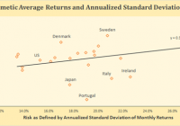
By Baijnath Ramraika, CFA In a paper I co-authored with Prashant Trivedi, we constructed all stock market-cap weighted indices for each one of the twenty-three developed markets included in the MSCI Developed Markets Index as of December 31st, 2014. In the paper, we showed each country’s all-stock index in U.S. dollars as well as local currency terms and also reported the number of companies that were included in the country’s index every year. Every country’s annual local currency returns and the annualized standard deviation of these returns were plotted on a scatter graph. A line of best fit was drawn to check if investors were compensated for the risk they took, i.e., did higher risk as defined by standard deviation of returns correspond with higher returns. Figure 1 below shows this relationship with returns on y-axis and risk on x-axis. Note that returns for the purposes of this chart have been defined as arithmetic average of annual returns. As is seen, the line is upward sloping, i.e., higher the risk, higher the return. Figure 1 (click to enlarge) Developed Markets – Risk vs. Arithmetic Returns So does that mean that markets were efficient in the sense that high returns are accompanied with high risk. Not so fast. Remember, I pointed out earlier that Figure 1 was based on arithmetic average of annual returns. This is where you have to pay attention. An important quirk here relates to the fact that equity markets tend to produce negative returns every once a while. Consider a simple hypothetical problem with two year investment returns being +50% in Year 1 and -50% in Year 2. If you invested $100 at the beginning of Year 1, you will end Year 1 with $150 (+50% return). The 50% loss in the second year means that you will end Year 2 with $75, i.e., at the end of the Year 2, your cumulative loss is -25%. However, the arithmetic average of the two annual numbers is 0% [(+50%-50%)/2]. The lesson here is that if there are negative returns in any of the measurement periods, arithmetic average overstates investment performance. Figure 2 below shows the relationship between realized risk and returns in developed markets, similar to Figure 1. However, instead of using arithmetic average, Figure 2 uses geometric average of annual returns. Interestingly, the upward slope has given way to a slight downward slope with the distribution around the line of best fit widening substantially. (click to enlarge) Developed Markets – Risk vs. Geometric Returns While the correlation between risk and arithmetic average return as plotted in Figure 1 was positive at +34%, the correlation between risk and geometric average return as plotted in Figure 2 is negative at -6%. In fact, the correlation is so low as to suggest that realized returns had no relationship with realized risk. That’s another way of saying that higher risk did not translate in higher returns.

And The Winner Is…

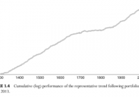
Until recently, the longest back test using stock market data was Geczy and Samonov’s 2012 study of relative strength momentum called “212 Years of Price Momentum: The World’s Longest Backtest: 1801-2012”. The length of that study has now been exceeded by an 800 year backtest of trend following absolute momentum in Greyserman and Kaminski’s new book, Trend Following with Managed Futures: The Search for Crisis Alpha . The authors looked at 84 equities, fixed income, commodities, and currencies markets as they became available from the years 1200 through 2013. They established long or short equal risk sized positions based on whether prices were above or below their 12-month rolling returns. The annual return of this strategy was 13% with an annual volatility of 11% and a Sharpe ratio of 1.16. Anyone who had doubts about the long-run efficacy of trend following momentum should no longer be doubtful. However, let’s not just look at trend following on its own. Let’s also compare it to other possible risk reducing or return enhancing approaches and see what looks best. We will base our comparisons on the performance of U.S. equities because that is where long-run risk premium and total return have been the highest. We also have U.S. stock market data available from the Kenneth French data library all the way back to July 1926. We will compare trend following to seasonality and then to the style and factor-based approaches of value, growth, large cap, and small cap. We will also see if it makes sense to combine these with trend following. For seasonality, we look at the Halloween effect, sometimes called “Sell in May and go away…” This has been known to practitioners for many years. There have also been a handful of academic papers documenting the positive results of holding U.S. stocks only from November through April. The following table shows the results of this strategy compared with absolute momentum applied to the broad U.S. stock market from May 1927 through December 2014. With 10-month absolute momentum, we are long stocks when the excess return (total return less the Treasury bill rate) over the past 10 months has been positive.[1] Otherwise, we hold Treasury bills. We also hold Treasury bills when we are out of U.S. stocks according to the Halloween effect (in stocks November-April, out of stocks May-October). We see that the 6-month seasonal filter of U.S. stock market returns substantially reduces volatility and maximum drawdown, but at the cost of reducing annual returns by over 200 basis points. Trend following absolute momentum, on the other hand, gives a greater reduction in maximum drawdown than seasonality with almost no reduction in return. There is no reason to consider seasonal filtering when absolute momentum gives a greater reduction in risk without diminished returns. The table below shows the U.S. market separated into the top and bottom 30% based on book-to-market (value/growth) and market capitalization (small/large). We see that value and small cap stocks have the highest returns but also the highest volatility and largest maximum drawdowns. Style US Mkt Value Growth Large Small Annual Return 11.8 16.2 11.3 11.5 16.6 Annual Std Dev 18.7 25.1 18.7 18.1 29.3 Annual Sharpe 0.42 0.46 0.39 0.42 0.41 Maximum DD -83.7 -88.2 -81.7 -82.9 -90.4 Most academic studies ignore tail risk/maximum drawdown, but these can be very important to investors. Not many would be comfortable with 90% drawdowns.[2] On a risk-adjusted basis (Sharpe ratio), neither small cap nor value stocks appear much better than growth or large cap stocks. This is consistent with the latest academic research showing no small size premium and a value premium associated only with micro cap stocks.[3] Let’s now see what happens now when we apply absolute momentum to these market style segments: Style w/Absolute Momentum AbsMom ValAbsMom GroAbsMom LgAbsMom SmAbsMom Annual Return 11.5 13.3 10.3 11.5 13.9 Annual Std Dev 12.9 17.2 13.3 12.5 21.1 Annual Sharpe 0.58 0.53 0.48 0.60 0.46 Maximum DD -41.4 -66.8 -42.3 -36.2 -76.9 In every case, adding absolute momentum reduces volatility, increases the Sharpe ratio, and substantially lowers maximum drawdown. The biggest impact of absolute momentum, however, is on large cap stocks, followed by the overall market index. The use of a trend following absolute momentum overlay further reduces the relative appeal of value or small cap stocks. We may wonder why large cap stocks respond better to trend following. The answer lies in a study by Lo and MacKinlay (1990) showing that portfolio returns are strongly positively autocorrelated (trend following), and that the returns of large cap stocks almost always lead the returns of small cap stocks. Since trend following lags behind turns in the market, investment results should be better if you can minimize that lag by being in the segment of the market that is most responsive to changes in trend. That segment is large cap stocks, notably the S&P 500 index, since they lead the rest of the market. In my book, Dual Momentum Investing: An Innovative Strategy for Higher Returns with Lower Risk , I give readers an easy-to-use, powerful strategy incorporating relative strength momentum to select between U.S. and non-U.S. stocks and absolute momentum to choose between stocks or bonds. I call this model Global Equities Momentum (GEM). And what index is the cornerstone of GEM? It’s the S&P 500, the one most responsive to trend following absolute momentum and that gives the best risk-adjusted results. Einstein said you should keep things as simple as possible, but no simpler. One can always create more complicated models or include more investable assets. But as we see here, trend following momentum is best when it is simply applied to large cap stocks. [1] We use 10-month absolute momentum instead of the more popular 10-month moving average because absolute momentum gives better results. See our last blog post, ” Absolute Momentum Revisited “. [2] The next largest maximum drawdown was 64.8 for value and 69.1 for small cap on a month-end basis. Intramonth drawdowns would have been higher. [3] See Israel and Moskowitz (2012) for empirical results. Delisting bias and high transaction costs can also reduce any small cap premium. Results are hypothetical, are NOT an indicator of future results, and do NOT represent returns that any investor actually attained. Indexes are unmanaged, do not reflect management or trading fees, and one cannot invest directly in an index. Please see our Disclaimer page for more information.