Scalper1 News
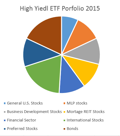
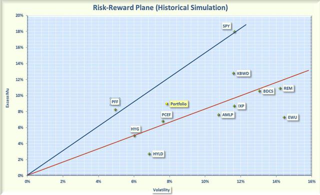
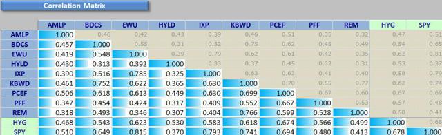
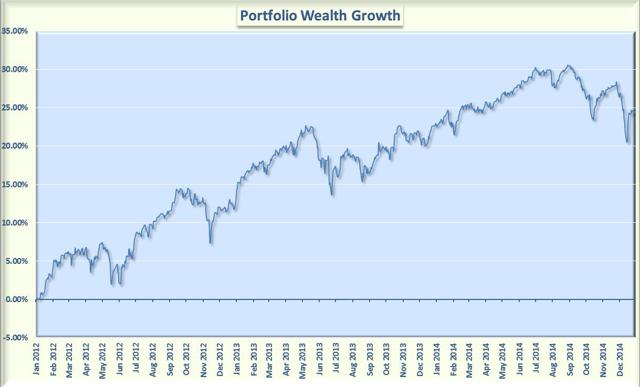
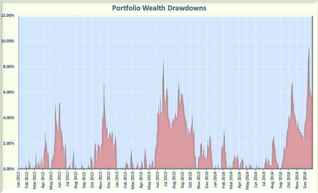 Summary The ETF Portfolio yielded 9% with a relatively low volatility. Over the past 3 years, the ETF Portfolio outperformed high yield bonds on a risk-adjusted basis. Over the past 3 years, the ETF Portfolio under-performed the S&P 500 on a risk-adjusted basis. January is a traditional time to reassess the markets and position your portfolio for the New Year As a retiree, I am continually looking for sources of high income, but I also don’t want to court excessive risk. I recently wrote an article on constructing a high income, lower risk, CEF portfolio for 2015. This article will attempt to construct a similar portfolio using Exchange Traded Funds (ETFs) that provides high yields at a reasonable risk. My first step was to screen the ETF database for high yielding funds. I used the FinViz website and selected 6% as the minimum yield. This is a high bar for an ETF, which does not use leverage and usually tracks a passive index. There were only 20 ETFs that satisfied the 6% yield criteria. I wanted the ETFs to be relatively liquid, so I also required that the fund have an average volume of at least 50,000 shares per day. Eighteen ETFs passed both screens, but many of these had been recently launched, so I narrowed the field by requiring at least a 3 year history. I would have preferred a longer history, but 3 years seemed to a good compromise. The 9 ETFs summarized below passed all my criteria. The quoted yields were sourced from Morningstar and the holdings were sourced from ETFdb . Alerian MLP (NYSEARCA: AMLP ). The ETF tracks the Alerian MLP Infrastructure Index, which tracks 25 energy infrastructure Master Limited Partnership [MLP] firms. This is one of the fastest growing MLP funds. It issue a standard 1099 at tax time rather than the more complex K-1 forms usually associated with partnerships. The ETF is structured as a C-corporation rather than as a Regulated Investment Company [RIC], because a RIC is prohibited from having more than 25% of the portfolio in MLPs. As a C-corporation, AMLP may invest exclusively in MLPs, but must also pay corporate income tax. This is the reason for the high expense ratio of 8.56% (the management fee is only 0.85%). This fund does however yield 6.46%, which is better than most other MLP ETFs. E-TRACS Wells Fargo Business Development Company Index (NYSEARCA: BDCS ). This is an ETN that tracks the Wells Fargo Business Development Company [BDC] Index, which tracks 114 BDCs selected from the NYSE and Nasdaq. BDCs obtain high yields by lending money to small and midsized businesses. BDCs may also take an active equity stake in some of the companies. This fund has an expense ratio of 0.85% and yields 8.18%. iShares MSCI United Kingdom (NYSEARCA: EWU ). This ETF tracks the MSCI United Kingdom Index, which measures the performance of the British market for large and midsized companies. The fund objective is to provide exposure to 85% of the UK stock market. The portfolio is allocated to sectors as follows: 21% in financials, 17% in energy, 16% in consumer stables, 9% in materials, 9% in healthcare, and 8% in consumer discretionary. The remaining 20% of the portfolio is spread over other sectors. The fund has an expense ratio of 0.48% and yields 7.51%. Peritus High Yield (NYSEARCA: HYLD ). This ETF is not linked to a specific benchmark. The portfolio holds 75 securities, with 4% in U.S. stocks, 4% in international stocks, and 92% in bonds (65% in U.S bonds with the other 27% in international bonds). All the bonds are below investment grade, with the majority invested in corporate bonds. The fund has an expense ratio of 1.18% and yields 9.66%. iShares Global Telecom (NYSEARCA: IXP ). This ETF seeks to match the performance of the S&P Global 1200 Telecommunications Sector Index. The fund contains 46 companies in the telecommunications sector. About 34% of the holdings are domiciled in the U.S. with the rest primarily spread across companies in Europe, Japan, and Canada. About 75% of the companies are diversified telecommunication services with the other 25% are focused on wireless services. Almost all (97%) are from large-cap to giant companies, and the top ten holdings make up 70% of the total assets. The expense ratio is 0.48% and the yield is a whopping 12.32%. KB High Dividend Yield Financial Portfolio (NYSEARCA: KBWD ). This ETF utilizes a dividend-weighted methodology to track companies in the financial and real estate sectors. The portfolio consists of 38 firms with 56% in financial services and 42% in real estate. All companies are domiciled in the U.S and most have small to medium market capitalizations. The fund has an expense ratio of 1.55% and yields 8.3%. CEF Income Composite Portfolio (NYSEARCA: PCEF ) . This ETF is intended to provide a means for investors to track a global index of closed end funds (CEFs). The portfolio consists of 149 CEFs, with a composite asset allocation of 19% U.S stocks, 5% international stocks, 69% bonds (about two thirds domestic and one third international), and 7% preferred stocks. The bond portfolio is almost all investment grade. The fund has an expense ratio of 1.77% and yields 8.02%. iShares U.S. Preferred Stock (NYSEARCA: PFF ). This ETF holds a portfolio of 284 preferred stocks, each of which have a market cap of at least $100 million and have at least 12 months to maturity. About 87% of the portfolio are stocks from financial firms (banks, insurance, and real estate). About 63% of the holdings are rated BBB or better. The fund has an expense ratio of 0.47% and yield 6.33%. i Shares Mortgage Real Estate Capped (NYSEARCA: REM ). This ETF tracks the FTSE NAREIT All Mortgage Capped Index. This fund has 39 holdings with the top 10 comprising about 68% of the assets. Most of the holdings are either medium or small capitalization. The fund is capped so that no company can constitute more than 25% of the portfolio. The fund has an expense ratio of 0.48% and yields a spectacular 14.5%. Reference ETFs To compare this portfolio to the general stock market and to other high-yielding assets, I included the following two funds for reference: iShares iBoxx $ High Yield Corporate Bonds (NYSEARCA: HYG ) . This ETF tracks the high yield corporate bond market and has a portfolio of about 1000 bonds. It has an expense ratio of 0.50% and yields 5.7%. I understand that this bond fund is not a good benchmark for equities, but it does provide an alternative for many investors seeking yield. SPDR S&P 500 (NYSEARCA: SPY ). This ETF tracks the S&P 500, so it is a good proxy for the equity stock market. It has an expense ratio of 0.09% and yields 1.9%. ETF Composite Portfolio If you equal weight the selected ETFs, the allocations for the composite portfolio are shown graphically in Figure 1. Numerically, the allocations are: 7% for general U.S stocks, 11% for MLPs, 11% for business development firms, 11% for companies specialized in mortgage REITs, 11% for companies in the financial sector, 19% international stocks, 12% preferred stocks, and 18% bonds. Summing these individual allocations gives an overall mix of about 70% equities, 12% preferred stocks, and 18% bonds. Figure 1 Composition of ETF Portfolio The composite portfolio has an average distribution of 9%, which certainly meets my criteria for high income. But total return and risk are as important to me as income, so I plotted the annualized rate of return in excess of the risk free rate (called Excess Mu in the charts) versus the volatility for each of the component funds. I used a look-back period from January, 2012 to January, 2015, a period of 3 years. The Smartfolio 3 program was used to generate this plot that is shown in Figure 2. (click to enlarge) Figure 2. ETF Portfolio risks versus rewards (3 years) The plot illustrates that these high yielding ETFs have booked a wide range of returns and volatilities over the past 3 years. To better assess the relative performance of these funds, I calculated the Sharpe Ratio. The Sharpe Ratio is a metric developed by Nobel laureate William Sharpe that measures risk-adjusted performance. It is calculated as the ratio of the excess return over the volatility. This reward-to-risk ratio (assuming that risk is measured by volatility) is a good way to compare peers to assess if higher returns are due to superior investment performance or from taking additional risk. In Figure 2, I plotted a red line that represents the Sharpe Ratio associated with HYG, the high yield bond ETF. If an asset is above the line, it has a higher Sharpe Ratio than HYG. Conversely, if an asset is below the line, the reward-to-risk is worse than HYG. Similarly, the blue line represents the Sharpe Ratio associated with SPY. Some interesting observations are evident from the plot. With the exception of preferred stocks, all the other ETFs were more volatile than the high yield bond fund. Most of the ETFs were less volatile than the S&P 500. However, business development firms, mortgage REITs, and United Kingdom stocks were slightly more volatile. Over the last 3 years, the S&P 500 has been in a strong bull market. Thus, it is not surprising that the total return associated with SPY was substantially greater than any of the other funds in the analysis. On a risk-adjusted basis, only preferred stocks were able to keep pace with SPY. On a risk adjusted basis, high yield bonds performed well compared to the other high yielding ETFs. Only three of the ETFs (PFF, PCEF, and KBWD) outperformed HYG. Most of the other ETFs were below but close to the “red line”. The exceptions were HYLD and EWU, both of which lagged in performance. Somewhat surprising, HYG outperformed HYLD on both an absolute and risk-adjusted basis. When I combined the high yielding ETFs into an equally weighted portfolio, the composite portfolio had a reasonably good return with a relatively low volatility. The risk and reward associated with this composite portfolio are denoted by the yellow dot on the figure. This is an illustration of an amazing discovery made by an economist named Markowitz in 1950. He found that if you combined certain types of risky assets, you could construct a portfolio that had less risk than the components. His work was so revolutionary that he was awarded the Nobel Prize. The key to constructing such a portfolio was to select components that were not highly correlated with one another. In other words, the more diversified the portfolio, the more potential volatility reduction you can receive. To be “diversified,” you want to choose assets such that when some assets are down, others are up. In mathematical terms, you want to select assets that are uncorrelated (or at least not highly correlated) with each other. I calculated the pair-wise correlations associated with the funds. I also included SPY to assess the correlation of the funds with the S&P 500 and HYG to check the correlations with high yield bonds. The data is presented in Figure 3. As you might expect, the equity funds were the most correlated with SPY (correlations in the 50% to 80% range). Mortgage REITs and high yield bonds had smaller correlations with SPY. It is interesting that HYLD and HYG were only 53% correlated. It should also be noted that HYG was 68% correlated with SPY, which is consistent with the idea that high yield bonds typically respond similar to equities. Overall, these results were consistent with a well-diversified portfolio. (click to enlarge) Figure 3. Correlations over past 3 year. Bottom Line As seen from Figure 2, the ETF composite portfolio returned more than HYG, but had a higher volatility than high yield bonds. The reverse was true when compared to S&P 500. The ETF portfolio had lower volatility, but also had significantly less return. On a risk adjusted basis, the ETF portfolio outperformed high yield bonds but underperformed the S&P 500. If you had decided to invest in ETF portfolio in January, 2012, Figure 4 provides a graphic of how your wealth would have increased. This plot assumes that the portfolio is re-balanced frequently in order to maintain the equal weighting over the look-back period. The figure indicates a relatively smooth accumulation of wealth with a few periods of sharp draw-downs. (click to enlarge) Figure 4 ETF Portfolio wealth growth Figure 5 focuses on the potential draw-downs on the past 3 years. The draw-downs were typically relatively small (less than 6%). Over the period of the analysis, there were only 2 instances where the draw-downs exceeded 7%. The largest drawdown occurred late last year when the portfolio lost over 9%. (click to enlarge) Figure 5 ETF Portfolio wealth draw-downs. No one knows how this portfolio will perform in the future, but based on past history, if you are a risk adverse investor looking for income, the ETF portfolio may be worthy of consideration. It outperformed the reference high yield bond fund on a risk-adjusted basis and also provided significantly higher income. On the other hand, if you can handle more risk, the S&P 500 was hard to beat in terms of total return. Scalper1 News
Scalper1 News