Scalper1 News
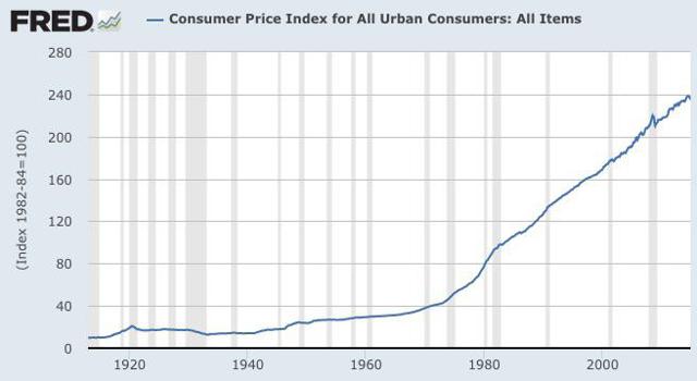
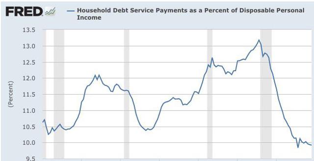
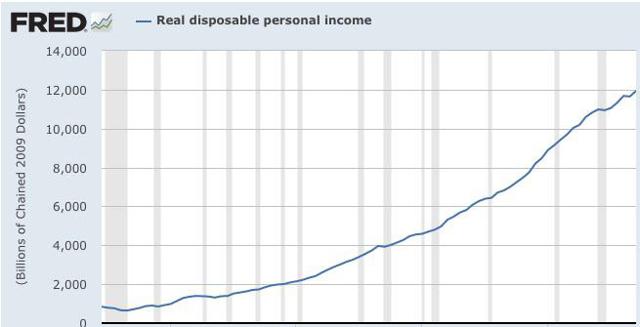
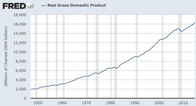
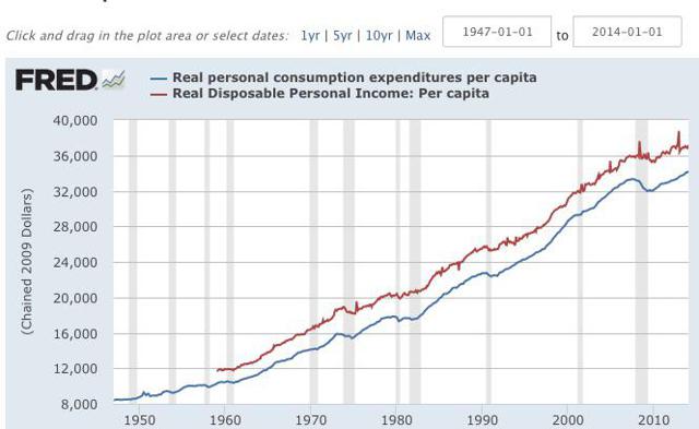
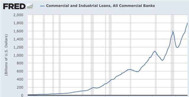
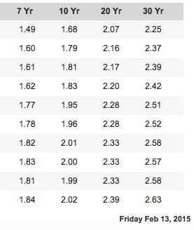
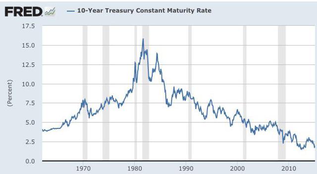 My first purchase of an electric utility stock was 400 shares of Duke Energy (NYSE: DUK ) around 1978. Somewhere along the way, I sold those shares for reasons that I no longer recall. I am not expressing a word of caution about the long term benefits that have flowed through buying and holding quality utility stocks and reinvesting the dividends. The ten year annualized total return numbers for a number of electric utility stocks are superior to the 7.83% annualized total return of the S&P 500 ETF (NYSEARCA: SPY ) through 2/13/15. Some examples include the ten year annualized performance numbers of American Electric Power (NYSE: AEP ), Dominion Resources (NYSE: D ), Edison International (NYSE: EIX ), NextEra Energy (NYSE: NEE ) and Wisconsin Energy (NYSE: WEC ) Ten Year Annualized Total Returns Through 2/13/15 Computed by Morningstar: AEP +8.09% D + 9.93% EIX + 8.72% NEE +12.15% WEC +13.03% Several other well known “utility” stocks have come close to matching the S & P 500 ten year annualized total return without the same decree of drama. AT&T +7.69% SCANA +6.86% Southern Co +6.75% Verizon Communications +7.54% The question that I am addressing now is whether new buys can be justified based on current yields and valuations. I started to look at this question a few days ago when making a comment here at SA about the impact of rising rates on REIT and utility stocks. Both of those industry sectors have attracted a large number of investors searching for yield. For many investors, REITs and utility stocks are viewed as “bond substitutes”. I started an analysis simply be looking at the current yield of the Utilities Select Sector SPDR ETF (NYSEARCA: XLU ), a low cost sector fund that owns primarily electric utility stocks. Yield: As of 2/12/15, the sponsor calculated the dividend yield at 3.28%. The attractiveness of that yield will depend on an investor’s view about the direction of interest rates. Notwithstanding the abundance of contradictory evidence, the Bond Ghouls have been predicting that a Japan Scenario will envelope the U.S. until the end of days, a slight exaggeration, based on the pricing of a thirty year treasury bond at a record low 2.25% yield recently. If an investor believes that deflation will alternate with periods of abnormally low inflation for the next 30 years, then the pricing of several long term sovereign bonds may at least appear to be rational rather than delusional. The current yields of a U.S. electric utility stock, with modest earnings and dividend growth, may even look good compared to those yields and the dire future predicted by those sovereign bond yields (U.S., Germany, Switzerland, Netherlands, Japan, etc.) The 30 year German government bond closed last Friday at a .92% yield. German Government Bonds – Bloomberg The average annual inflation rate in Germany between 1950-2015 was 2.46%. Just assume for a moment that the future will be similar to the past, with some hot and low inflation numbers and possibly a brief period of slight deflation. The .92% 30 year German government bond would produce a 1.54% negative annualized real rate of return before taxes. The average annual U.S. inflation rate between 1914-2015 was 3.32%. When the 30 year treasury hit a 2.25% earlier this year, and assuming the historical average annual rate of inflation, the total annualized return before taxes would be -1.07%. The first item for investors to consider is why are so many predicting the Japan Scenario given the recent U.S. economic numbers and the non-existence of a single annual deflation number since 1955 other than the understandable -.4% reported for 2009. Consumer Price Index, 1913- | Federal Reserve Bank of Minneapolis When looking a long term charts, it is hard to see the underlying support for what the Bond Ghouls are saying about the future. (click to enlarge) (click to enlarge) (click to enlarge) The DSR ratio highlights that U.S. households have more disposable income after debt service payments to pay down debt, to spend, or to save. I view this chart as bullish long term for stocks but not far bonds. I have been making the same point here at SA for over three years now without convincing a single bear of my point. An example of banging my head against the wall was a series of comments to this SA article published in February 2013: Sorry Bulls, But This Is Still A Secular Bear Market-Seeking Alpha It is interesting to go back and read some of those comments from other investors. Yes, I am referring to the bears here who were predicting a bear market starting in 2012 just before the S & P 500 took off on a 700 points move up, not down by the way. (click to enlarge) (click to enlarge) (click to enlarge) (click to enlarge) (click to enlarge) Links to some other relevant charts: Financial Stress-St. Louis Fed Household Financial Obligations as a percent of Disposable Personal Income-St. Louis Fed Mortgage Debt Service Payments as a Percent of Disposable Personal Income-St. Louis Fed Charge-Off Rate On All Loans, All Commercial Banks-St. Louis Fed Retail Sales: Total (Excluding Food Services)-St. Louis Fed E-Commerce Retail Sales-St. Louis Fed Light Weight Vehicle Sales: Autos & Light Trucks- St. Louis Fed Corporate Net Cash Flow with IVA -St. Louis Fed ISM Non-manufacturing-St. Louis Fed And what are the current economic statistics (not the ones generated through reality creations) that support the long term Japan Scenario prediction that underlies current intermediate and long term bond prices? I will just drag and drop here my recent discussions of this data. Is that dire long term U.S. inflation and growth forecasts embedded in those historically abnormal yields justified by the 5% real Gross Domestic Product growth in the 3rd quarter perhaps slowing to 3% in the 2014 4th quarter with personal consumption expenditures accelerating; the lowest readings on record in the debt service payments to disposable income ratio (DSR) ; the decline in the unemployment rate to 5.7% with 257,000 jobs added in January with a 12 cent rise in average hourly earnings and a 147,000 upward revision for the prior two months; a decline in the 4-week moving of initial unemployment claims to the historical lows over the past four decades; the long term forecasts of benign inflation; a temporary decline in inflation caused by a precipitous drop in a commodity’s price, the consistent and long term movement in the ISM PMI indexes in expansion territory; capacity utilization returning to its long term average where business investment has traditionally increased by 8% , or perhaps some other “negative” data set. That kind of data has to be negative rather than positive, right? Even the government’s annual inflation numbers for 2014 showed a + 3.4% increase in food prices; a 2.4% increase in medical service costs, a 2.9% increase in shelter expenses, and a 4.8% increase in medical commodities. The BLS called the rise in food prices “a substantial increase” over the 1.1% rate for 2013. While I am not predicting here a return to $80+ crude, the price may have already bottomed and the disinflationary impact created by the 50%+ decline is consequently a temporary abnormality that will self correct with supply and demand moving back into balance. Consumer Price Index Summary While it is too early to know whether intermediate and long term rates have started to turn back up, the recent movement is certainly cautionary and resembles the lift off in interest rates that started in May 2013, when the ten year was at a 1.68% yield, and culminated in a rate spike to 3.04% for that note by year end. 7 to 30 Year Treasury Yields 2/2/15 to 2/13/15 Daily Treasury Yield Curve Rates When looking at that table, it is important to keep in mind that a ten year treasury yield of 2.00% is abnormally low by historical standards since 1962: (click to enlarge) 10-Year Treasury Constant Maturity Rate – FRED – St. Louis Fed And this brings me to my word of caution about utility stocks. A 3% dividend yield is not too hot using history as a guideline. To be justified, the investor will have to buy into most of the Bond Ghouls Japan Scenario unfolding in the U.S. rather than a gradual return to something close to normal inflation and GDP growth. Valuation: For me, valuation is the kicker. What S & P sector currently has the highest P.E.G. ratio? Back in the late 1990s, I would have said technology stocks without looking to verify the answer. I said utility stocks now and I took the time to verify that response. An investor can download the current E.P.S. estimates for the S & P 500 and the various sectors from S & P in the XLS format. I can not link the document here, but anyone interested can find it using the exact google search phrase “XLS S & P Dow Jones Indices”. It should be the first result. As of 2/12/15, the estimated forward 5 year estimated P.E.G. for the utility sector is a stunningly high 3.65, and this sector has traditionally been one of the slowest growing sectors. Technology is at a 1.27 P.E.G. The P/E based on estimated 2015 earnings is 17.12. The data given by the sponsor of XLU immediately set off alarm bells when I looked at it recently. In addition to the vulnerability of stock prices due to a rising interest rate environment, the sponsor calculated the forward P/E at 17.14, which is normally a non-GAAP ex-items number, a 7.23 multiple to cash flow, and a projected 3 to 5 year estimated E.P.S. growth rate of only 4.86%, or a similar P.E.G. to one calculated by S & P and mentioned above. The Vanguard Utilities ETF (NYSEARCA: VPU ) has another set of data that is even more concerning than the XLU valuation information: As of 1/31/15, this fund owned 78 stocks, with a P/E of 20.8 times and a 2% growth rate. Portfolio & Management Taking into consideration the possible or even probable rise in rates, the low starting yields for utility stock purchases now, the high P/E and abnormally high P.E.G. ratio, I am just saying be careful out there. I will be discussing in my next blog a reduction in my position in the Duff & Phelps Global Utility Income Fund Inc. (NYSE: DPG ), a closed end fund that has performed well for me since my purchases. I may not start writing that blog until Monday after taking the time to write this one in my usual stream of consciousness writing mode. CEFConnect Page for DPG According to Morningstar, the Utilities Select Sector ETF ( XLU ) had a 2014 total return based on price of 28.73%, much better than SPY, and was up YTD 2.33% through 1/31/15. The tide has turned with the recent rise in rates since the end of last month. The total return for XLU is now at -4.34% YTD through 2/12/15. Just as a reminder, I only have cash accounts and consequently do not short stocks. I do not borrow money to buy anything. I have never bought an option or a futures contract. I am not paid anything to write these SA Instablogs or SA articles or any of my almost 2000 blogs written since early October 2008, mostly very long ones, published at Stocks, Bonds & Politics . I do not own any of those short ETFs. I am currently substantially underweighted in the Utility sector. Scalper1 News
Scalper1 News