Tag Archives: transactionname

Risk Is The Dark Matter Of Portfolio Management

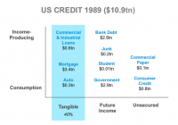
By Ron Rimkus, CFA In 1932, a Dutch astronomer measuring the motion of the stars in the Milky Way noticed something odd in his calculations: The orbital velocities didn’t match up with the visible amount of mass in the galaxy. In response to this observation, he theorized that dark matter – invisible, undetectable matter – must be present in massive quantities to explain the observed movement of heavenly bodies. This is a lot like risk management in the field of investing. Many investors today use a broad array of mathematical tools to track the movements of security prices, sectors, factors, benchmarks, portfolio characteristics, alpha, beta, smart beta… you name it. Yet these tools failed to predict the last crisis in 2008. In fact, historically, they have failed to predict every crisis. And they will fail to predict any crisis in the future. There is much more to risk than the observed movement of security prices. Quite simply, measuring risk is not what such tools do – at least not in any absolute sense. Tools like factor exposures, tracking error, value-at-risk (VaR), growth, value, momentum, and smart beta only measure the relationship of one group of securities relative to another group of securities. But they do serve a purpose. Many investors use them to better understand how their portfolio behaves relative to another portfolio, or to compare relative exposures to interest rates, oil prices, etc., which of course are perfectly valid uses. But they also tell you something about historical relationships that can and frequently do change – often implying that the observed relationship will continue. In statistical parlance, when it comes to the future, these tools are often applied “out of sample.” Typically, these tools work just fine… until they don’t. They’re great when comparing a client’s portfolio with the S&P 500 Index, for example. But what happens if the S&P 500 goes over a cliff? Is it sufficient to say, “Yeah, but our portfolio model went over the cliff with less volatility and a lower tracking error, too!” The real risk, of course, is that clients fail to meet their goals. Don’t get me wrong; these tools have their place. But many investors believe they can adequately measure and describe risk with them. Unfortunately, the tools of risk management are inadequate to describe risk in any absolute sense. What these tools really measure is relative risk, not absolute risk. Consequently, absolute risk is like dark matter. It governs the behavior and performance of securities markets but is not easily measured. So, we often ignore it. But we do so at our own peril. Of course, understanding relative risk can be both interesting and useful. But success is judged against the goals one is trying to achieve. If an investment manager uses these tools to understand his intended and unintended bets against the market, they can be quite helpful. If the manager uses them to create closet index funds, however, then it is simply self-serving. What happens is that the portfolio might closely mirror – or even beat – the performance of the index for many periods, but the two are in essence the same. All too often portfolios using these tools disguise a sad reality: They deliver market-like performance at active management prices. So, where today can we find examples of rising absolute risk that is likely undetected by today’s tools of relative risk? I’m glad you asked. Consider for a moment the broad stretch of financial history. It used to be that currency was backed by gold and loans were backed by tangible assets (e.g., mortgages are typically backed by homes). Both instruments gave their owners legal claims to real assets in the event of default. This approach helps establish trust between two parties in a transaction. During much of the 19th century, the world operated on what is known as the classical gold standard, in which currencies were backed more or less one-for-one with gold. Why did this come about? Why did any country ever have a gold standard? Because people can trust gold – in an absolute sense. Governments can’t print gold. But the world has long since abandoned the classical gold standard, so the fundamental trust and stability conveyed by gold is almost always out of sample in the context of today’s data and mathematical tools. Likewise, back in the 19th century, loans were fully backed by tangible assets. Lenders would let other people borrow only if they had the right to recover money if a borrower defaulted. And government debt typically traded with a risk premium over corporate bonds. By backing loans with collateral, borrowers don’t need income to fulfill their obligations to lenders. Collateral creates trust in the financial system. Over time, however, the use of real assets to back these claims, whether currency or loans, has been whittled away by numerous small changes. Today, currency is no longer backed by anything, and loans are increasingly backed by nothing but the earning power of the borrower. So, the fundamental reason for people to trust currency and credit has slowly shifted from a sound claim on tangible assets to a speculative claim on future income. Now, so long as future income is healthy, there isn’t necessarily a problem. Trust is intact. But what happens when the future income fails to materialize? That’s right: default. So, the transition from relying on tangible assets to future income increases the risk to the entire system. This is systemic risk. Where exactly does this systemic risk show up? Is it in time series data of security prices or spreads from the past 10, 20, or 30 years? No. Is it in your factor exposures relative to the benchmark? How could it be? Is it even showing up in interest rates or spreads? Hardly. Curiously, over the last 25 years, the United States has seen a marked increase in credit without collateral in the form of credit cards, student loans, bank financing, junk bonds, government bonds, etc. With these instruments, borrowers repay by using their future income to meet obligations. By charging high rates of interest, lenders anticipate a percentage of borrowers won’t have adequate future income and will default. Therefore, lenders charge interest rates in excess of the expected default rate to earn a spread (among other things). But this comes with a cost. Borrowers must have income in order to repay. At the macro level, personal income must grow and jobs must be abundant in order to have healthy credit markets. In the absence of a healthy economy, it all comes racing back to trust. And without income or collateral, trust becomes scarce. Consider now the debt profile of the United States over the last 25 years. The first chart shows that about 40% of debt in the United States was backed by tangible assets in 1989. The second graph shows that only about 29% of debt in the United States was backed by tangible assets in 2014. Moreover, collateral requirements in the system have been weakened as loan-to-value (LTV) ratios have risen substantially in mortgages, for instance. According to the Federal Reserve Bank of Dallas, LTV ratios increased from roughly 83% in 1989 (meaning the average borrower put 17% down and borrowed the rest) to about 93% as of 2010 (the latest date for which these data were published). An LTV of 93% means that the home price need only fall by more than 7% in order for the loan to be underwater and the bank to be at risk of losses of principal (equity). Because LTV ratio data capture home values at date of purchase and do not capture current values of homes (which fluctuate in the market), the picture could be much worse than the data suggest. For instance, in a down market like the one the United States had from 2007-2011, the LTV ratios are much higher and the buffers in the financial system are consequently much lower. And this is for the one-quarter of U.S. debt that is backed by tangible assets. So, what about the rest of the debt? About three-quarters of U.S. debt is now supported solely by future income. This means a massive increase in systemic risk over time. These changes have occurred incrementally over many decades, so much of the increases in systemic risk are out of sample. Few people recognize the totality of the change from beginning to end. Small, incremental changes that add up to big changes over time are typically missed by the market. And this is due, at least in part, to the investment profession relying statistical tools like standard deviation, factor exposures, VaR models, etc. But make no mistake: The safety and soundness of the system has fundamentally changed. How is this possibly reflected in the day-to-day volatility of benchmarks? Or how about the covariance of a portfolio with oil prices over the last 10 years? Ten years is, after all, a small fraction of the time it took for today’s financial system to evolve. We now have an economy and money supply that grows with credit expansion. But credit is expanding rapidly while economic growth is faltering. A premise of modern central banking is that lower interest rates drive credit growth, which in turn drives economic growth. But what happens if credit expansion reaches a tipping point and lower rates fail to grow the economy? Isn’t that risk? Are we there now? Over the last 100-plus years, the United States has shifted the security of its currency and credit from fully backed collateral to promises based on the future income of borrowers. And in doing so, it has largely abandoned the idea that obligations can be made whole with tangible assets. At the very bottom of it all, the reason to trust U.S. currency and credit has declined. So, the risk in the system has markedly increased, but where is that risk captured and calculated? How exactly does that manifest itself in market prices? What about a portfolio manager whose strategy is based on investing in illiquid assets in a liquid world? What happens if liquidity changes should stop economic growth? Perhaps when the economy stops growing, we will all find out how much absolute risk has grown over the years regardless of what your relative risk tools are telling you. In the end there is but one question to consider: Is there some dark, mysterious force holding the financial universe together? Or will it all come flying apart?

Taking A Look At Kevin O’Leary’s New ETF

Kevin O’Leary is venturing into the ETF world with his new fund-OUSA. The ETF tracks a new multi-factor index by FTSE Russell which focuses on bigger companies with good dividends and low volatility. With an expense ratio of .48, this ETF is a decent choice but it will be hard to compete with Vanguard’s lower cost funds. Kevin O’Leary has just introduced his first ETF through O’Shares, after running a family of mutual funds for several years. The O’Shares FTSE U.S. Quality Dividend ETF (NYSEARCA: OUSA ). The focus of this particular fund is on dividend paying stocks with low volatility. The target index that this ETF tracks the performance of is the FTSE U.S. Qual/Vol/Yield Factor 5% Capped Index, and this index was just released by FTSE Russell. The design of this multi-factor index is to include quality large-cap and mid-cap U.S. companies that have high dividends and lower volatility. Also, the index is designed to keep a cap of 5% on any one company, which will keep it from being too concentrated. Ron Bundy, who is the CEO Benchmarks North America, FTSE Russell, explains : We are seeing growing demand in the investment community for more sophisticated indexes that can tap into market exposures efficiently and, in many cases, combine multiple factors. We are excited to introduce factor indexes that help clients like O’Shares target the specific exposures they seek. Here is what Kevin O’Leary has to say on this index: We believe now is the time to provide our time tested investment principles through a simple, transparent, efficient and cost effective index-based investment product. So we are launching our new family of global index-based ETFs for investors and joining forces with leading global index provider FTSE Russell. This is not the only new fund though, as O’Leary will be rolling out four more ETFs within the next 90 days: O’Shares FTSE Europe Quality Dividend ETF O’Shares FTSE Europe Quality Dividend Hedged ETF O’Shares FTSE Asia Pacific Quality Dividend ETF O’Shares FTSE Asia Pacific Quality Dividend Hedged ETF Here are more details of OUSA. The holdings are diversified into 10 different sectors. (click to enlarge) These are the top 10 holdings in the fund: Johnson & Johnson (NYSE: JNJ ) Exxon Mobile Corp. (NYSE: XOM ) Apple Inc. (NASDAQ: AAPL ) AT&T (NYSE: T ) Microsoft Corp. (NASDAQ: MSFT ) Verizon Comm. (NYSE: VZ ) Pfizer (NYSE: PFE ) Proctor & Gamble (NYSE: PG ) Phillip Morris Intl. (NYSE: PM ) Chevron (NYSE: CVX ) Here is a look at how OUSA stacks up against other dividend ETFs in regards to yield and expenses. ETF Ticker Symbol 12-Mo Yield Expense Ratio OUSA 3.2%* 0.48% Vanguard High Dividend Yield ETF ( VYM) 3.05% 0.10% iShares Select Dividend ETF (NYSEARCA: DVY ) 3.26% 0.39% Vanguard Dividend Appreciation ETF (NYSEARCA: VIG ) 2.23% 0.10% iShares MSCI USA Quality Factor ETF ( QUAL) 1.50% 0.15% Global X Super Dividend U.S. ETF (NYSEARCA: DIV ) 6.03% 0.45% WisdomTree U.S. Dividend Growth ETF ( DGRW) 2.01% 0.28% WisdomTree LargeCap Dividend ETF ( DLN) 2.59% 0.28% *Average yield of holdings While choosing to go with an ETF instead of mutual funds is definitely more in line with what investors are wanting these days, the expense ratio is still a bit high for my liking and it just shows what a competitive advantage that Vanguard has with it’s low fees. With that said, this ETF is a decent choice for what it offers and investors looking for a simple buy and hold ETF to compound the dividends or receive income might be pleased with this new choice. There is not much that makes this fund extremely unique though, and there are better choices out there. Disclosure: I/we have no positions in any stocks mentioned, and no plans to initiate any positions within the next 72 hours. (More…) I wrote this article myself, and it expresses my own opinions. I am not receiving compensation for it (other than from Seeking Alpha). I have no business relationship with any company whose stock is mentioned in this article.

HEWW: An Currency Hedged Version Of EWW

A currency hedged version of a long established fund. A carefully weighted fund through the use of a 25/50 ‘capping methodology’. The fund selects from the full range of Mexican companies: small, medium and large caps. The iShares Currency Hedged MSCI Mexico ETF (NYSEARCA: HEWW ) is the most recent of Mexico focused funds, having been incepted on June 29, 2015. Since the fund has been trading only a few weeks, it offers no real return metrics to compare. However, by examining a nearly identical fund, the fund’s allocation, the structure of the Mexican economy and the relative stability of the Mexican Peso, the interested investor will have a gauge of the future potential of the fund. Name and Symbol Description Inception iShares Currency Hedged MSCI Mexico Tracks the MSCI Currency Hedged IMI Mexico 25/50 Capped Index June 29, 2015 SPDR MSCI Mexico Quality Mix ETF (NYSEARCA: QMEX ) Tracks the Total Return performance of the MSCI Mexico Quality Mix A-Series Index September 17, 2014 Deutsche X-trackers MSCI Mexico Hedged Equity ETF (NYSEARCA: DBMX ) Tracks the MSCI 25/50 U.S. Dollar Hedged Index January 23, 2014 iShares MSCI Mexico Capped ETF (NYSEARCA: EWW ) Tracks the MSCI unhedged IMI Mexico 25/50 Capped Index Data from iShares, SPDR, DeutschebankMarch 12, 1996 (Data from iShares, SPDR, Deutschebank) The new fund tracks the Morgan Stanley Capital International Indices (MSCI) Mexico Investible Market Index (IMI) 25/50 100% U.S. Dollar Hedged Index . According to the prospectus , the fund is passively managed. The fund is ‘capped’: it is a capitalization weighted index . The 25/50 ‘capping methodology’ means that no single issue exceeds 25%. All issues with a weight above 5% do not cumulatively exceed 50% of the underlying index weight. The index includes large, mid and small cap companies. (click to enlarge) (Data from iShares, SPDR, Deutschebank) The careful investor is sure to ask how necessary is it to have a currency hedge? There’s a clear answer to this question. In a nutshell, central banks are obligated to maintain a stable currency. Having a too strong or too weak currency will create negative effects on any economy. For example, the usual way for a central bank to slow inflation is to raise short term interest rates. However, this runs the risk of slowing the economy too much; something the recently emerged Mexican economy would not want to do. Banco de Mexico has come up with an innovative solution. It regularly auctions U.S. Dollars from its currency reserves. This enables the central bank to strengthen the currency by reducing the supply of Pesos in the economy, while at the same time maintaining sustainable lending rates. Because of the scope and scale of the top global reserve currency U.S. Dollar, Mexico’s export product prices to the U.S. are hardly affected. However, large swings in relative currency values could negatively impact the dollar value conversion of a portfolio, a Mexican focused fund for instance, even though the portfolio’s fundamentals are unchanged. (Data from iShares) As mentioned above, HEWW has just recently been listed for trading. Fortunately, there’s a way to accurately gauge market performance by examining the identical but ‘unhedged’ capped index fund, the iShares MSCI Mexico Capped ETF and compare that with other Mexico focused funds. It was a simple matter to download the holdings of each fund to a spreadsheet, alphabetizing them and then comparing entry by entry. Indeed the holdings of EWW and HEWW are identical with the exception that the dollar hedged fund has positions for currency forward contracts, naturally. (Data from iShares) There are two other funds for comparison. DBMX also tracks the MSCI 25/50 capped index, although it omits a consumer discretionary and a financial holding which occur in the iShares funds. QMEX tracks about half of the companies in the 25/50 capped index, 34 in total, along with two others not listed in the 25/50 capped index. QMEX also holds a position of liquid U.S. Dollars reserves. Fund Net Assets (millions) Shares Outstanding Number of Holdings Average Volume Premium to Discount Expense Ratio P/E Equity Beta 12 month Trailing Yield EWW $1479.953 26,100,000 60 734,113 0.00% 0.48% 31.11 1.09 1.62% DBMX $4.5399 200,001 57 2,621 0.29% 0.50% 17.7 0.76 2.79% QMEX $2.44 100,000 33 224 -0.16 0.40% 22.99 1.61 1.43 (Data from iShares, SPDR, Deutschebank) Investing in a country focused fund is essentially investing in the overall economy. So a basic understanding of what drives the Mexican economy is needed. As mentioned, Mexico has an export economy and it’s clear from the chart below, it is heavily dependent on its NAFTA partner U.S. economy. (Data from iShares) Bilateral trade with the U.S. is just over $500 billion comparable to bilateral U.S.-Canadian trade of about $600 billion. In total, bilateral trade with both Canada and the U.S. well exceeds trade with any other individual nation; however, Mexico has other large regional partnerships and free trade agreements. The Mexican government has focused on building an extensive free trade network. Nearly 90% of Mexico’s global trade transacts through free trade agreements. According to the Secretariat of Economy, other free trade partnerships in force exist with Australia, Korea, Singapore, Israel, India and the European Free Trade Association. Mexico is a participant in the future Trans-Pacific Partnership. In the America’s, aside from NAFTA, Mexico has free trade agreements throughout Latin America, South America and with Cuba. The point of the matter is that even though Mexico’s largest trading partner is the U.S.; Mexico has an extensive free trade network outside of North America. The Mexican economy has been affected by the collapse of global oil prices. However, Mexico is not a petro-economy. Surprisingly, 14% of total power production is derived from renewable resources: 11% from hydro plants and 3% from geothermal and biomass, according to U.S. EIA data. The government is expanding wind generation projects including plants on the Baja peninsula for power exports to the U.S. Mexico is a net exporter of crude petroleum, producing about 2.5 million bbl of crude oil per year and consuming about 2 million bbl; the remainder is exported. Mexico has proven reserves of 9.8 billion bbl, approximately. Mexico is a net importer of natural gas, producing about 1.64 billion ft 3 consuming almost 2.3 billion ft 3 . Lastly it is a net importer of coal, mining 16.7 million tons and consuming 20.7 million tons. What it adds up to is that the economy is somewhat affected by global petroleum markets, but it is certainly not totally dependent on volatile global petroleum markets. (Data from iShares) In the recent downturn in global oil prices, the government responded accordingly by reducing government spending, which is about 0.7% of GDP. The Ministry of Finance estimates GDP growth to be within the range of 2.2% to 3.2% in 2015; 2.9% to 3.9% for 2016. The Bank of Mexico expects inflation to remain at the 3% target rate. The important point is that the fiscally responsible government is doing a good job keeping inflation very close to the target, keeping the Peso stable and maintaining slow but steady growth. As it stands now, an increase in demand from the U.S. will bode well for the Mexican economy. To be sure, Mexico has many domestic and international concerns which must be solved. However, while negative news might make attention getting headlines, those headlines obscure the years of positive achievements of the Mexican government and Banco de Mexico since the currency crises of 1994-1995. Those achievements include maintaining a sustainable inflation rate and a stable currency in spite of a global credit crisis, still reverberating in Europe and Asia. Also, the Ministry of Trade has done a remarkable job in establishing what might be the most comprehensive ‘free trade network’ in the world. In the private sector, banks are well capitalized and regulated. Industry isn’t just manufacturing but also includes research and development with global partners. Unhedged EWW Returns After 1 Year After 3 Years After 5 Years After 10 Years Since Inception 3/12/1996 Total -14.14% -0.73% 5.00% 9.48% 11.46% Market Price -14.45% -1.08% 5.04% 9.41% 11.43% Benchmark Index -13.86% -0.73% 4.75% 9.03% 12.12% (Data from iShares, SPDR, Deutschebank) According to iShares the currency hedged ETF H EWW fund has net assets of $2,466,407. The expense ratio is rather high at 1.10%; however, there is a ‘fee waiver’ which results in an expense ratio of 0.51%. The fund is virtually identical to the long established iShares EWW fund with the addition of a currency hedge. To sum up, several Mexico focused funds have been created over the past two years. This most recent addition is virtually identical to the long established iShares Mexico Capped ETF. Recently, the returns reflect the still recovering global economy but returns of EWW since inception are respectable. Naturally, the investor must choose between competing funds, however, upon close examination, the brand new iShares currency hedged fund actually has a long established track record. Disclosure: I/we have no positions in any stocks mentioned, and no plans to initiate any positions within the next 72 hours. (More…) I wrote this article myself, and it expresses my own opinions. I am not receiving compensation for it (other than from Seeking Alpha). I have no business relationship with any company whose stock is mentioned in this article. Additional disclosure: “CFDs, spread betting and FX can result in losses exceeding your initial deposit. They are not suitable for everyone, so please ensure you understand the risks. Seek independent financial advice if necessary. Nothing in this article should be considered a personal recommendation. It does not account for your personal circumstances or appetite for risk.”