Tag Archives: management

Pioneer High Income Trust’s 45% Premium Looks Ripe For Contraction In 2015
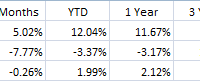
Summary PHT’s 45% premium is three standard deviations above its 1-year average premium. NAV performance has struggled this year, while the market price has increased 12%. 20% of PHT’s portfolio is invested in energy-related securities, increasing the portfolio’s risk. Overview: The Pioneer High Income Trust (NYSE: PHT ) is a high yield bond closed-end fund with a solid track record and a strong management team. High yield funds have struggled recently, as slumping oil prices have raised concerns that highly levered energy companies could default on their debt. Energy companies have been some of the largest issuers of high yield debt in recent years. Expectations of rising interest rates in 2015 have also pressured the high yield market. PHT’s strong performance and high yield have caused shares to trade at a persistent premium since 2009. The fund has a five-year average premium of 23.53%. Recently, the premium has expanded. PHT’s price performance has remained strong, while the underlying NAV performance has struggled along with its high yield peers. The premium has increased to 45.54%. This premium is near the highest ever for this fund and looks vulnerable to a pullback. Key Investment Highlights: High Premium: PHT is currently trading at a 45.54% premium to NAV. This is significantly higher than its 1-year average premium of 29.05% and its 5-year average premium of 23.53%. Evidence of the wider than normal discount, the Z-Statistic of 3.20 shows the current premium is trading more than 3 standard deviations wider than normal. High Yield Performance: Spreads on high yield bonds have contracted as the Fed’s zero interest rate policy has driven investors to reach for yield. Spreads have started to widen as investors contemplate higher interest rates and the potential for increased defaults. These factors have pressured the returns of high yield bonds. PHT’s premium has grown during the years since the financial crisis, driven by consistent strong returns. If returns from high yields are pressured, it is likely PHT’s premium will be pressured as well. Energy Exposure: PHT has significant exposure to energy-related high yield bonds in its portfolio. As of 9/30/2014, 20.02% of the portfolio is invested in energy related holdings. For comparison, the iShares iBoxx High Yield Corporate Bond ETF (NYSEARCA: HYG ) currently has 13.47% of its assets invested in the energy sector. If energy prices remain compressed, PHT’s performance may suffer. Key Investment Risks: Continued Economic Recovery: High yield bonds tend to have strong performance during economic recoveries due to lower default risk. If the economy continues to chug along, high yield bonds may show strong performance, allowing PHT to continue to trade at a significant premium. Energy Price Recovery: A recovery in energy prices would relieve concerns of energy company defaults, allowing energy-related bond prices to recover. Due to PHT’s exposure to energy-related issues a recovery in energy prices would benefit PHT’s NAV performance. Key Portfolio Metrics: Premium/Discount: 45.54% Z-Statistic 3.20 Market Distribution Rate: 9.46% Current Monthly Distribution: $0.1375 Average Earnings/Share: $0.1200 Average Earnings/Distribution: 87.27% UNII Per Share: $0.2238 Effective Leverage: 30.42% Effective Duration: 3.06 Performance: Using ETFs with a similar investment objective can give a good comparison to evaluate management’s performance. HYG is a widely used high yield bond ETF that offers a good comparison for PHT. PHT has a long track record and compares favorably to HYG over the 3- and 5-year periods based on both price and NAV performance. The 10-year track record of 10% per year is attractive and shows the strength of this fund. However, PHT has underperformed over recent time periods likely due to the fund’s riskier holdings and higher energy exposure. The recent divergence between NAV and market performance is what has driven the premium. Data as of 12/26/2014 Source: Morningstar Premium/Discount: (click to enlarge) Source: CEFConnect The fund closed 12/26/2014 at a 45.54% premium to the NAV, or underlying value of the portfolio. This is above the 52-week average premium of 29.05%. The recent divergence between NAV performance and market performance has driven the premium higher. PHT has a strong performance track record that has caused the fund to trade at a persistent premium since 2009. However, the current premium is very high for this fund and investors may want to look elsewhere for their high yield exposure at least until the premium drops down below historical levels. Expense Ratio: PHT pays 0.60% of daily managed assets to Pioneer Investment Management for investment management. The annual expense ratio for PHT as of 3/31/2014 was 1.04. This is a relatively low fee for a high yield closed-end fund. The fee is particularly attractive when considering the strong work that management has done over time. Distribution: PHT pays a monthly distribution of $0.1375/share. The distribution equates to an annual distribution yield of 9.46% based on current market prices and 13.77% based on NAV. PHT’s earnings only cover 87% of the distribution. The fund does have $0.2238 in UNII so the distribution shouldn’t be at risk for a while. If interest rates remain low, PHT may have to reduce its distribution in the future. Leverage: PHT employs leverage through a margin account with Credit Suisse. The fund borrows at three-month LIBOR plus 0.70%. This is a relatively low cost form of leverage in the current market. This does cause concern over the long-term cost of leverage. If interest rates rise, it could increase the cost of leverage to the fund since PHT doesn’t have fixed cost leverage in place. Liquidity: PHT is a moderately sized CEF with $496.37 million in net assets. PHT has 80,000 shares traded on average a day. This represents $1.4 million in daily volume at current prices. This is reasonable liquidity for a CEF and should allow investors to fill orders without problems. It is always wise to use limit orders to purchase or sell shares of closed-end funds, as the bid/ask spread can be wide. Management: PHT is managed by Pioneer Investment Management, a wholly owned subsidiary of UniCredit S.p.A. Pioneer is a well respected fund family with significant fixed income resources and a long track record. The fund appears to be in good hands. Portfolio: Geographic Allocation Source: Pioneer as of 11/30/2014 Most of PHT’s portfolio is based in the United States. PHT has assets invested in several other countries, but none of these countries make up more than 5% of assets. Sector Allocation Source: Pioneer as of 11/30/2014 PHT has broad sector exposure, but the majority of the portfolio is invested in U.S. high yield corporate bonds. One area to watch is the exposure to event-linked bonds. Many of the event-linked bonds in the portfolio are catastrophe bonds. Several of Pioneer’s other funds have significant exposure to catastrophe bonds. These bonds can offer non-correlated high yields, but investors should be conscious of the risks of investing in these bonds. Of particular interest is their non-correlation with high yield bonds. The exposure to catastrophe bonds isn’t high enough to cause concern here, but should be watched to make sure it doesn’t increase over an individual’s risk tolerance. Credit Ratings Source: Pioneer as of 11/30/2014 As would be expected, PHT is mostly invested in high yield bonds. The fund is on the riskier side with 28% of the portfolio invested in CCC rated bonds. Maturity Breakdown Source: Pioneer as of 11/30/2014 The portfolio is invested in relatively short-term bonds. Only 5.7% of the portfolio matures beyond 10 years. The short maturity should help reduce portfolio volatility. However, short maturities increase the risk that yields will not be maintained when proceeds from maturing securities are reinvested. Source: Pioneer as of 11/30/2014 PHT has a diverse portfolio with 363 different securities. The top ten holdings represent only 9.50% of the total portfolio. The portfolio turnover has been low. PHT had a 16% turnover as of 9/30/2014. The highest portfolio turnover in the past five years was 30%. Strategy: PHT’s primary investment objective is to seek high current income with a secondary objective to seek capital appreciation. The fund is able to invest up to 50% of the assets in illiquid securities. The fund is also able to invest in securities of issuers that are in default or that are in bankruptcy. Tax Issues: As of September 30, 2014, the fund had $12,223,142 of net unrealized appreciation in the portfolio. These gains are offset by $46,261,236 in capital loss carryforwards. Conclusion: PHT is a strong fund with capable management. However, the current premium to NAV reduces the attractiveness of the investment at this point. Additionally, portfolio risks don’t appear to be accounted for in the market price. Higher interest rates could pressure high yield returns. The fund’s high exposure to energy related holdings could hurt performance if oil prices remain depressed. If negative NAV performance continues, the fund’s premium would likely erode. This is a fund that I would avoid until there is a significant reduction in the premium.
Floating Rate ETFs For Rising Rates Protection

Summary Interest rates have declined this year. Fixed-income investors who want to hedge against rising rates can take a look at floating-rate bond ETFs. Floating-rate bond ETF options and how they work. As was the case at this time a year ago, plenty of investors are banking on the new year bring an interest rate hike from the Federal Reserve. Should expectations of higher interest rates gain momentum, it would not be surprising to see investors embrace floating rate exchange traded funds as additions to fixed income portfolios. ETFs such as the iShares Floating Rate Bond ETF (NYSEArca: FLOT ) , SPDR Barclays Investment Grade Floating Rate (NYSEArca: FLRN ) and the Market Vectors Investment Grade Floating Rate (NYSEArca: FLTR ) have floating interest rates . Specifically, floating rate notes have a so-called reset period with interest rates tied to a benchmark, such as the Fed funds, LIBOR, prime rate or U.S. Treasury bill rate. Carolyn Bigda reports for Kiplinger , FLOT owns variable-rate, investment-grade bonds that banks issue to companies; the interest rates adjust every quarter. Unlike most “bank loan” funds, though, Floating Rate holds only bonds that have been extended to high-quality companies, so it has less credit risk than a typical bank-loan fund does. Floating Rate Bond yields just 0.4%. But if the Federal Reserve begins to raise short-term interest rates in 2015, as seems likely, you’ll get the full benefit of fatter yields with little risk to your principal. The fund, which launched in 2011, returned a minuscule 0.3% over the past year and 1.8% annualized over the past three. FLOT, the largest of the floating rate ETFs, has seen increased demand this year as investors have prepared for an interest rate increase that has yet to arrive. The ETF, which debuted in June 2011, has hauled in $355.6 million of its $3.9 billion in assets under management since the start of the year. Still, competition in the floating rate ETF space is intense. In November, Van Eck lowered the fees on FLTR to 0.14% per year from 0.19%. FLTR tracks the Market Vectors US Investment Grade Floating Rate Index (MVFLTR), which consists of U.S. dollar-denominated floating rate notes issued by corporate issuers and rated investment grade by at least one of the three rating services: Moody’s, S&P or Fitch, according to Market Vectors . FLOT charges 0.2% per year and has a 30-day SEC yield of 0.4%. FLTR’s 30-day SEC yield is 0.59%. Market Vectors Investment Grade Floating Rate (click to enlarge) ETF Trends editorial team contributed to this post.

A Comparison Of 3 Emerging Market Low Volatility ETFs

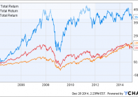
Summary Emerging markets have returned twice the U.S. markets over the last 11 years, but have struggled recently. Emerging markets are now very cheap, but investors may be put off by their higher volatility. Do low volatility emerging market funds deliver? Introduction Some years ago, emerging markets were all the rage. According to MSCI , emerging markets grew from 1% of the global market cap in 1988 to 11% in 2013. An investor who bought into iShares MSCI Emerging Markets ETF (NYSEARCA: EEM ) 11 years ago would have been rewarded with nearly a 400% gain, far ahead of S&P 500 (NYSEARCA: SPY ) (199%) and developed markets ex-U.S. (NYSEARCA: EFA ) (166%). EEM Total Return Price data by YCharts However, the above chart belies the fact that emerging markets have not performed well since the end of the financial crisis. Since 2009, EEM has returned only 72%, compared to 189% for SPY and 94% for EFA. EEM Total Return Price data by YCharts Given their relative underperformance over the past several years, is now the time to take a second look at emerging markets? Most analysts and fund managers are pessimistic on the prospects of emerging markets in 2015, which could actually be a contrarian signal. A recent Seeking Alpha article by Elite Wealth Management reported that in a November survey of fund managers with a combined $700 billion in assets, they were 0% overweight in emerging market equities, compared to 45% Japan, 25% U.S. and 8% Europe. Emerging markets are now very cheap. The table below shows the P/E ratios and dividend yields for the top 10 countries in EEM, compared to selected developing markets (source: Financial Times ). Also shown for the emerging market countries is the weight of that country in EEM. Country Weight % P/E Dividend yield % China 17.52 7.1 4.4 South Korea 13.64 15.6 1.2 Taiwan 12.20 13.9 3.0 Brazil 7.82 12.4 4.6 South Africa 7.75 16.4 3.1 India 6.69 18.2 1.6 Mexico 5.05 21.2 2.0 Russia 3.94 5.5 5.6 Malaysia 3.66 15.7 3.2 Indonesia 2.66 18.3 2.2 U.S. – 19.0 2.3 Japan – 16.5 1.7 U.K. – 15.9 3.3 Germany – 16.1 2.6 Canada – 17.9 2.8 We can see that the 9 out of the 10 emerging market economies have a P/E ratio lower than the U.S. (19.0). Only Mexico (21.2) has a higher P/E ratio than the U.S.; China and Russia have the lowest P/E ratios of 7.1 and 5.5, respectively. The following table shows the valuation ratios for ETFs of major world regions (data are from Morningstar and are forward-looking). Region ETF P/E P/B P/S P/CF Yield % U.S. SPY 18.03 2.48 1.78 7.77 2.08 Europe (NYSEARCA: VGK ) 16.19 1.74 1.04 6.96 3.21 Japan (NYSEARCA: EWJ ) 15.23 1.21 0.77 4.89 1.62 Asia ex-Japan (NASDAQ: AAXJ ) 12.68 1.39 1.17 6.05 2.43 Emerging Markets EEM 12.76 1.49 1.14 4.91 2.56 We can see from the data above that Asia ex-Japan and emerging markets have the lowest valuation metrics amongst the world regions. However, it might be argued that developed markets deserve a valuation premium over emerging markets due to their higher stability (see reasons below). Moreover, emerging markets have always had higher volatility compared to developed markets. This is likely due to a multitude of factors, such as less stable corporate and sovereign governance, less stable currency, smaller economies, reliance on foreign investment, and concentration in cyclical industries such as mining and energy. The below chart shows the volatility and beta values for EEM compared to SPY and EFA over the past 6 years. EEM 30-Day Rolling Volatility data by YCharts Low-volatility emerging market funds Would low-volatility emerging market (EM) funds be ideal for investors wanting some exposure to emerging markets, but with lower volatility? To my knowledge, there are three low-volatility EM funds on the market: EGShares Low Volatility EM Dividend ETF (NYSEARCA: HILO ), PowerShares S&P Emerging Markets Low Volatility Portfolio (NYSEARCA: EELV ) and iShares MSCI Emerging Markets Minimum Volatility (NYSEARCA: EEMV ). In a previous series of articles , we compared several high-dividend low-volatility U.S.-based funds. We found that those funds were able to achieve their dual objectives of high dividends and low volatility by overweighting mature and defensive industries such as utilities, healthcare and real estate. This article seeks to compare the three low-volatility EM funds. Note that this will be more of an overview of the three funds and rather than an in-depth analysis of a single fund. Fund details Details for the three low-volatility EM funds and EEM are shown in the table below (data from Morningstar). HILO EELV EEMV EEM Yield 4.63% 2.68% 2.59% 1.69% Expense ratio 0.85% 0.29% 0.25% 0.67% Inception Aug 2011 Jan 2012 Oct 2011 April 2003 Assets $32.1M $206.2M $1.90B $31.96B Avg Vol. 28.4K 49.9K 306K 60.6M No. holdings 30 187 243 817 Annual turnover 137% 101% 34% 22% EEM is by far the most massive fund, with nearly $32B in assets. The other three low-volatility EM funds have a wide variation in size. EEMV has $1.90B in assets, followed by EELV at $206.2M in assets. Surprisingly, HILO only has $32.1M assets even though it is the oldest of the three low-volatility funds. The volumes of HILO and EELV border on the low end, with only 28.4K and 49.9K shares changing hands a day, respectively. We can also see that HILO has the highest yield (4.63%) out of the three low-volatility EM funds and EEM, which is not surprising given that it’s also a dividend fund. The other two low-volatility EM funds, EELV (2.68%) and EEMV (2.59%), also have higher dividends than EEM (1.69%). Both HILO and EELV have very high turnovers of 137% and 101%, respectively. EEMV and EEM have lower turnovers of 34% and 22%, respectively. In terms of expense ratio, HILO is the most expensive ETF, with a fee of 0.85% per annum. EELV and EEMV are much cheaper, with expense ratios of 0.29% and 0.25%, respectively. EEM charges 0.67% in expenses, which seems very high for a “vanilla” equity fund. This is probably why Vanguard FTSE Emerging Markets ETF (NYSEARCA: VWO ) has outgrown EEM even though it was incepted two years later. VWO charges only 0.15% in fees and has accumulated over $45B in assets. Overlap The following table illustrates the overlap between the three low-volatility EM funds and EEM. Overlap statistics were obtained from ETF Research Center . HILO EELV EEMV EEM HILO – 5% 7% 2% EELV 5% – 37% 27% EEMV 7% 37% – EEM 2% 27% 31% – We can see that HILO has the lowest overlap compared to the other two low-volatility EM funds. This is probably because HILO also has a dividend focus in addition to its low-volatility theme. EELV and EEMV have the highest overlap, at 37% of total assets. Performance The graph below shows the performance of the three low-volatility EM funds and EEM since Jan 2012 (2 years). HILO Total Return Price data by YCharts We see quite a disparity between the performance of the three funds and EEM over the past 2 years. Both EEMV and EELV have managed to beat the benchmark EEM (6.23%). EEMV exhibited the best 2-year performance of 20.64%, while EELV returned 8.87%. On the other hand, HILO recorded the worst performance of -9.53%. The following table shows further performance and risk data for HILO, EELV, EEMV and EEM. Data are from Morningstar, except for volatility (2Y) and beta (2Y) which are from InvestSpy . HILO EELV EEMV EEM 1-year return % -12.21 -4.14 1.96 -0.94 3-year return (ann.)% -3.42 – 6.18 2.91 Volatility (2Y) % 15.6% 13.5% 13.7% 18.0% Beta (2Y) 0.94 0.80 0.87 1.17 Sharpe ratio (3Y) 0.01 – 0.77 0.37 We can see from the data above that despite their disparate performances, all three low-volatility funds have succeeded in achieving lower volatility than EEM over the past 2 years. Valuation The table below shows various value and growth metrics for HILO, EELV, EEMV and EEM. Data for all funds are from Morningstar (value metrics including dividend yield are forward looking). The first five rows can be considered as value metrics while the last five rows can be considered as growth metrics. HILO EELV EEMV EEM Price/Earnings 11.31 14.45 15.69 12.76 Price/Book 1.27 1.48 1.86 1.49 Price/Sales 0.99 1.18 1.51 1.14 Price/Cash Flow 5.42 5.18 7.38 4.91 Dividend yield % 9.96 3.09 2.81 2.56 Projected Earnings Growth % 11.23 12.34 10.97 11.76 Historical Earnings Growth % 0.73 11.05 5.06 -1.68 Sales Growth % 12.97 -17.34 -15.60 -13.79 Cash-flow Growth % 7.40 3.77 6.36 7.85 Book-value Growth % 8.70 -22.75 -26.56 -21.57 We can see from the table above that EELV has similar valuation metrics to EEM, while EEMV is slightly more expensive than EEM. On the other hand, HILO appears to be the cheapest out of the four funds. Interestingly, the current valuation of the four funds is inversely proportional to their performance over the past two years. HILO, the most “valuey” fund, has had the worst performance in the last two years, while EEMV, the most expensive fund, has done the best. The funds also appear to have many negative growth metrics, which could be due to the effect of a global slowdown on the growth of many emerging market economies that rely heavily on exports or foreign investment. Countries Perhaps the most important factor that would affect the performance of these EM funds is the distribution of the constituent countries in the fund. The following table shows the top 10 countries in each of the three low-volatility EM funds and EEM (data from ETF Database ). HILO EELV EEMV EEM Country Weight Country Weight Country Weight Country Weight Thailand 13.23% Taiwan 27.68% China 22.74% China 17.52% Malaysia 12.61% Malaysia 18.62% Taiwan 17.37% South Korea 13.64% China 12.54% South Africa 13.66% South Korea 9.40% Taiwan 12.20% Brazil 9.60% South Korea 9.30% Malaysia 8.80% Brazil 7.82% Mexico 8.23% Other 9.23% South Africa 5.50% South Africa 7.75% Czech Republic 7.36% China 5.08% Indonesia 4.88% India 6.99% Indonesia 6.96% Brazil 4.47% Brazil 4.44% Mexico 5.05% Chile 6.57% Mexico 3.83% Chile 4.21% Russia 3.94% Poland 5.10% Thailand 2.97% Philippines 3.75% Malaysia 3.66% United Arab Emirates 4.01% Chile 2.83% Qatar 2.80% Indonesia 2.66% The following graph shows the allocation of the four funds to the ten most represented countries in the funds. Size The table below shows the size distribution for the four EM funds (data from Morningstar). HILO EELV EEMV EEM Giant 24.18 26.03 34.16 50.62 Large 11.85 51.75 49.84 37.00 Mid 52.55 22.22 15.40 11.87 Small 9.20 0 0.61 0.44 Micro 2.22 0 0 0.08 And in graphical form: We can see that HILO has a rather interesting size distribution, with more giant and medium-cap stocks compared to large-cap stocks. EELV and EEMV have similar size distributions, with about 50% in large-cap stocks, 30% in giant-cap stocks and 20% in mid-cap stocks. On the other hand, EEM is tilted towards giant-cap stocks. Sector The final aspect to look at for the EM funds is their sector diversification. The following table shows the sector composition of HILO, EELV, EEMV and EEM. Data are from Morningstar. HILO EELV EEMV EEM Basic Materials 8.47 9.41 3.9 7.93 Consumer Cyclical 5.74 10.71 6.32 8.46 Financial Services 16.64 37.14 26.44 25.43 Real Estate 5.68 3.05 1.06 2.44 Communication Services 19.52 8.97 12.98 7.76 Energy 6.08 4.1 3.13 7.51 Industrials 24.19 7.87 7.66 5.73 Technology 0 3.77 13.03 20.9 Consumer Defensive 0 9.21 11.54 8.3 Healthcare 3.64 1.46 6.62 2.24 Utilities 10.05 4.31 7.92 3.31 And in graphical form: We can see from the data that financials make up a high allocation of all four EM funds, with EELV having the highest allocation at 37.14% and HILO having the lowest at 16.64%. HILO has the highest allocations to industrials (24.19%) and communication services (19.52%). The following graph shows the sector distribution of the four funds (individual sectors are not marked). We can see that EEMV and EEM have the most even sector distributions of the four funds. Conclusion All three low-volatility EM funds have managed to deliver lower volatilities over the past 2 years (compared to EEM), but with wildly disparate performances. EEMV exhibited the best 2-year performance of 20.64%, while EELV returned 8.87% and HILO returned -9.53%. If I had to pick a low-volatility EM fund, I would probably pick EEMV for the following reasons: It has the best performance record over the past two years while still recording lower volatility than EEM. Its three highest allocations are to China, Taiwan and South Korea, which are all in the top 5 of the cheapest emerging market countries. It has the lowest expense ratio (0.29%) out of all the EM funds studied. It has better sector distribution compared to HILO or EELV.