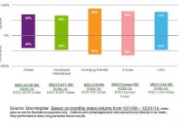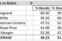
Summary Most retirees need/want some of their portfolio allocated to bond funds. For those with “about right” total assets for retirement, institutions recommend bond allocation of 40% to 60%. Numerous factors will tend to keep intermediate and long-term interest rates “lower for longer”. The middle of the bond yield curve is probably the best place to be. Corporate bonds and municipals make more sense than Treasuries for most individual accounts. Many retirees or near retirees need help deciding how to allocate between bonds and stocks, or how to prepare for a productive discussion about allocation and security selection with their advisor. This is intended to help those investors with the bond fund element of the decision. Fund Allocations: This table shows institutional recommendations for asset allocation for investors in the withdrawal stage of their financial lives, and with assets approximately sufficient for their needs (not great excess assets and not great deficiency – relative to lifestyle costs). Adjusting for Your Circumstances: According to the experts, retirees should be at or between these bond/stock allocation limits: 60/40 and 40/60. That allocation makes the global assumption that retiree assets are “just about right” – not way too little, or “way more than needed”. If assets are “way too little”, then retirement postponement, part-time work, and/or proportional reductions in standard of living is probably necessary; and the 60/40 to 40/60 allocation probably still makes sense. If assets are “way more than needed”, there are two reasonable alternatives to the 60/40 to 40/60 allocation. One alternative is to be more conservative, because the gradual loss of earning power in a heavy fixed income portfolio is seen as an acceptable trade-off to have a smoother ride. The other alternative is to be more aggressive – probably by investing “sufficient” assets in the 60/40 to 40/60 allocation, and then investing the balance in equities to grow the overall portfolio. Historical Results of 11 Bond/Stock Allocation Risk Levels: Using our 11 levels of allocation, experts recommend that you be in what we have labeled “Balanced-Conservative”, “Balanced Moderate” or “Balanced Aggressive”. This chart shows the 39-year historical returns for all 11 allocation levels, including mean return, best return and worst return, as well as the returns statistically expected at +/- 1, 2 and 3 standard deviations from the mean (roughly representing these probability ranges: 67%, 95% and 99.7%). This chart shows the returns of each allocation over multiple short and long-term periods. This chart shows the calendar year returns for 2008 through 2014 for each allocation. US Bond Funds Don’t Come In Just One Flavor, or Have One Outcome: Once you decide on the bond allocation level that makes sense, you might then want to consider what type, duration and quality of bonds to use. The allocation data above assumes aggregate US bonds (which has morphed over time as the relative level of government and corporate issuance changed, and as the relative levels of maturities have changed). You may wish to lock-in more predictably to a type or duration or quality for your portfolio, or to manage the mix as you see fit, instead of taking whatever the aggregate provides. You can do that with funds. Given that, let’s look at some of your choices: Corporate and Municipal Bonds Typically Best For Individuals: Corporate bonds or muni bonds are most likely to be suitable for you. Treasuries are generally best for tax-exempt investors (pensions, foundations, and foreign governments), while corporate and municipal bonds, with higher after tax returns are generally best for individuals. Corporate high yield did very well after the crash, but that party is over, and they have been faltering as of late, since the yield spread to Treasuries had reached a very low level. High-yield bonds have a high correlation with stocks and are not good counter cyclical diversifiers. Long-term corporates have done best as rates fell, and will continue to do well if interest rates decline, but will do poorly if rates increase. Short-term corporates have contributed least to return, and probably have more downside risk than normal, due to the Fed planning to exit QE by gradually raising short-term rates. Intermediate-term bonds are probably best bet. The muni charts are for nominal returns, which you have to gross up for your tax bracket. They have been more consistent in their returns, and their high-yield bonds have not suffered as corporate high yields have done – making them less correlated with stocks than high-yield corporate bonds. Yield, Duration and Quality Metrics for Bond Fund Types: Here are some metrics for the specific bond funds shown in the charts above. These two tables show yield, duration, quality, and quality composition of each representative fund. How Interest Rate Changes Impact Bond Prices: Here is how changes in interest rates impact bond values: Which Way Are Rates Likely to Go Near-Term? Some big names expect intermediate and long rates to decline, and short rates to rise, but not to historical “normal” levels. The inflation crowd expects rates to rise due to inflation. The anti-Fed crowd expected rates to rise when Fed bond buying ceased, but that did not happen. Most experts last year forecasted rising rates (I bit on that), but we were wrong. The “lower for longer” crowd (including Bill Gross, Jeff Gundlach and Robert Shiller) point out these factors: US Treasury rates are the highest among major developed market issuers – creating demand for our bonds, which raises prices and lowers yields. US currency is the strongest at this time among major currencies – creating demand for our bonds, which raises prices and lowers yields. Aging Baby Boomers, who have most of the money, are net savers (formerly net borrowers) reducing demand for loans, which tend to reduce bank offered rates, and they want to own bonds, raising prices and lowering yields. Aging Baby Boomers, are reaching for yield, and will rotate out of dividend stocks into bonds as rates rise, dampening rate increases. US corporations approach saturation debt, with lower net issuance, reducing supply vs. demand, which raises prices and reduces rates. Federal deficits are declining, which lowers Treasury issuance, reducing supply vs. demand, which raises prices and reduces rates. Municipal issuance is down, lowering supply vs. demand, raising prices and reducing rates. Why Foreign Money Will Flow to US Bonds: Here is data showing how much higher US rates are than German and Japanese rates, for example: Speculators, who believe the dollar will remain strong, can borrow in Germany or Japan in local currency, and use the money to buy US bonds and make a nice spread similar to the spread that banks make on their deposits. That increases Treasury prices and lowers yields. What Does The Treasury Yield Look Like Now? Here is where the US Treasury yield curve stands today (the black line). You can see that the yield on the long end of the curve has been declining, while the short end of the curve has been rising. Rates are far below the 2007 level (gray line), but are not expected to get back to that level any time soon. How Are The Pros Viewing The Path of Very Short-Term Rates? How far will the short end rise? Here is the Fed Funds futures curve, which forecasts a 1.9% short end 2 years from now. If the intermediate-term Treasuries stay as they are, the yield curve above would be flat, but that is some time away. It is unknown whether intermediate rates will rise to keep the curve steep or whether it will go flat. This forecast suggests that short-term bonds are probably not good opportunities. They do little good if rates stay the same, and they suffer if rates rise. Conclusion: Even for aggressive investors, some small allocation to bonds has historically improved total return and risk/reward. Knowing about the range of bond fund options, and how various bond allocations relate to your specific circumstances is an important step in setting up a retirement portfolio. There is a lot more to think about than what is presented in this short article, but for a huge number of retirees or near retirees, this is something they still have to get under their belt before they manage their own money, or prepare themselves for a productive discussion with their investment advisor. Disclosure: The author and clients have some of these funds in their portfolios in varying degrees based on individual specific circumstances. General Disclaimer: This article provides opinions and information, but does not contain recommendations or personal investment advice to any specific person for any particular purpose. Do your own research or obtain suitable personal advice. You are responsible for your own investment decisions. This article is presented subject to our full disclaimer found on the QVM site available here . Disclosure: The author has no positions in any stocks mentioned, and no plans to initiate any positions within the next 72 hours. (More…) The author wrote this article themselves, and it expresses their own opinions. The author is not receiving compensation for it (other than from Seeking Alpha). The author has no business relationship with any company whose stock is mentioned in this article. Additional disclosure: Disclosure: The author and clients have some of these funds in their portfolios in varying degrees based on individual specific circumstances.