Scalper1 News
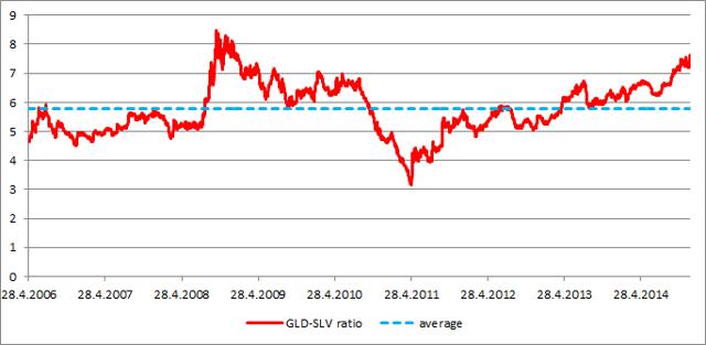
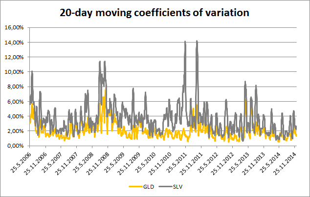
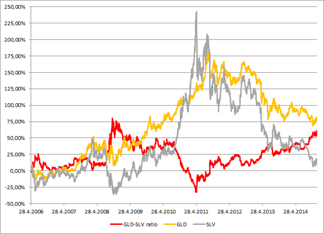
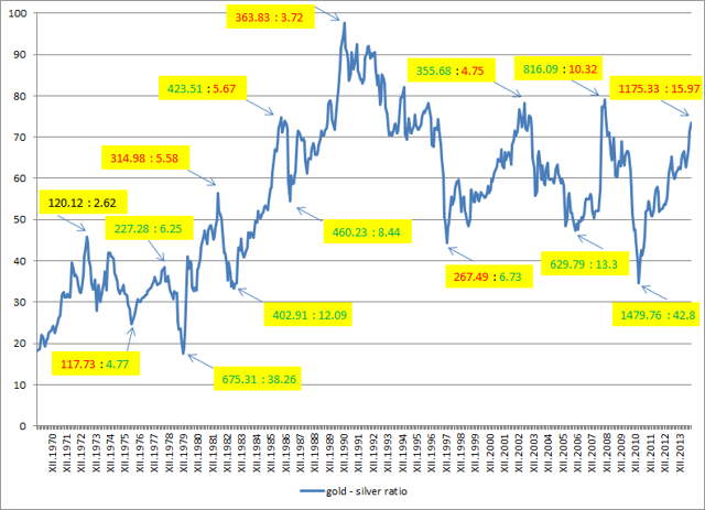 Summary The historical analysis of the gold-silver ratio shows that silver price should start to grow. The value of the gold-silver ratio is almost 75 which is significantly above the long term average. The last two tops (2003 and 2008) were just shy of the 80 level and they were followed by significant increases of the silver price (180% and 315%). There is a significant potential of another huge gains for the iShares Silver Trust ETF shareholders. Historical analysis shows that the iShares Silver Trust ETF (NYSEARCA: SLV ) shareholders may see some interesting gains in the coming years. There are two generally recognized wisdoms that contradict each other. The first one says that the historic results are no guarantee of future performance; the second one says that only a fool repeats the same thing and expects different results. Both of them are applicable to financial markets. Although you can be never sure what the markets will do, there are some patterns that tend to repeat themselves. When you follow such a pattern there is a high probability that the performance of the asset will be similar to the previous cases. There is approximately 19 times more silver than gold in nature. This number was somehow reflected in the historical fixed gold-silver ratios. The ratio was set at 12 in the Roman Empire and at 15 during the era of bimetallism in the 19th century. Today the ratio is not fixed, but moves according to the actual gold and silver prices. The average gold-silver ratio was approximately 55 during the last 44 years. But this is only the average value, the actual values ranged from 17 in January 1980 to 97 in February 1991. The current high valuations don’t reflect the difference in the abundance of gold and silver in the nature and moreover they, don’t reflect even the difference in the abundance of the disposable mined silver and gold. Almost all of the mined gold is being hoarded and most of the mined silver is being consumed by various industrial applications. As a result there is less disposable silver than gold in the world. The GLD-SLV ratio The gold-silver ratio can be tracked also using the SPDR Gold Trust ETF (NYSEARCA: GLD ) and the iShares Silver Trust ETF. During the lifetime of both (chart below), the average GLD-SLV ratio has been 5.77. The highest value was recorded on October 10th, 2008. The GLD price of $83.22 and SLV price of $9.8 resulted in the GLD-SLV ratio of 8.49. The lowest value (3.20) was recorded on April 25th, 2011 at the GLD price of $146.87 and SLV price of $45.83. As we can see, the way from the top to the bottom took 639 trading days. During this time period GLD gained 76.5% and SLV increased by whopping 440%. On the other hand, from April 2011 to present SLV lost 67% of its value while GLD declined only by 22%. (click to enlarge) Source: own calculations The outperformance of SLV during precious metals bull markets and its underperformance during precious metals bear markets is caused by its volatility, which is significantly higher compared to gold. The chart below shows the 20-day moving coefficients of variation for GLD and SLV. The volatility of SLV is significantly higher compared to GLD, regardless of the actual market trend. Source: own calculations But the changing GLD-SLV ratio itself doesn’t tell us anything about the market direction without a further analysis. It is a ratio which means that it is impacted by the price moves of both of the assets. When the GLD-SLV ratio grows it doesn’t mean that the GLD price must grow. The ratio can grow when GLD price declines, but the SLV price must decline even stronger and vice versa. The behavior of both of the assets during particular phases of the GLD-SLV ratio development are shown by the chart below. The chart shows that the declines of the GLD-SLV ratio are related to the growth phases of the gold and silver price cycle and the increases of the ratio usually happen during the decline phases of the gold and silver price cycle. (click to enlarge) Source: own calculations The Long term picture The chart below shows the long term development of the gold-silver ratio calculated from the average monthly gold and silver prices. The chart shows the major tops and bottoms of the gold-silver ratio as well as the metal prices related to the particular local extremes (gold price : silver price). The color of the number shows whether the price of the metal increased or decreased compared to the preceding extreme. (click to enlarge) Source: own calculations Thanks to this chart we can come to three important conclusions: The most important tops of the ratio are almost always associated with a decline of the silver price. The most important bottoms of the ratio are always related with an increase of the silver price. While the direction of the silver price is quite reliably predictable (as shown by points 1. and 2.), predictions of the gold price direction based on the gold-silver ratio development are much less reliable. We can also see that the ratio is approaching 80 right now. The last two approaches to this border were followed by strong declines of the gold-silver ratio and huge silver bull runs, when the silver price increased by 180% and 315% respectively. Conclusions The historical records show that the gold-silver price ratio as well as the GLD-SLV ratio should start to decline in the coming months and years. The major declines of this ratio are always accompanied by a strong silver bull market. The current value of the ratio is approximately 75. The last two times when the ratio attacked the level of 80, the value of the ratio collapsed and silver achieved triple digit gains. If the history should repeat itself once again, the holders of physical silver, SLV or another ETF that tracks the price of the physical silver, should record significant profits. Additional disclosure: The author is long physical silver. Scalper1 News
Scalper1 News