Tag Archives: total

There Is Nothing Total About Total Return

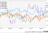
Summary There are several methods for calculating total return, and the results of the different calculations can vary greatly. Total return is an important concept, and for many an indicator of how wisely they invest. Funds, advisors and even individual investors use total return to compare success and profit. Do you as an individual investor know what lies behind the total return concept, and does the number you get actually provide something meaningful to you? We all like to keep a score, and as investors total return is the score to talk about and show off. Unless you are an income-oriented investor, and actually are disciplined enough to only focus on income, your portfolio’s total return will fuel your hubris or smack you down all depending on Mr. Market. So considering the apparent importance of this number we should be talking about the same thing and measure the outcomes that really matter to us. But do we really do that? What is it that you measure when you calculate total return for your portfolio, and can you use the numbers the investment advisors and brokers give you? (click to enlarge) Total return is something I have found a bit difficult to wrap my head around. It is especially hard to calculate total return for a portfolio with cash flowing in and out. I have studied the different total return calculations to try to spot the differences, and decide which one I would use myself. In this article I will sum up my findings, and I hope to initiate a discussion to cast further light on this topic. I’m going to show how total return can be completely different values depending on what you want to measure and how you calculate it. And the “what do you want to measure” part is important – do you want to know how much your portfolio actually grew over a period, or how it performed versus other investment strategies? If you do not have an idea of what and how to measure total return you can end up with numbers that are totally irrelevant , as I have argued before. I will try to show the practical implications of the different calculations using examples. Hopefully that will make it easier to understand why different calculations give different answers. For the examples in this article I will use the daily closing prices from 2015 for Apple Inc. (NASDAQ: AAPL ). There has been quite a bit of volatility in this stock in 2015, so it will serve well as an example of how sequence of returns and cash flow influences total return calculations. Data is downloaded from Yahoo Finance. The simplest form of return: Dollar return Investors are building portfolios to make money grow into more money. Since more money is the ultimate goal, why could we not just measure the return as how much the portfolio value increased? If you started the year with $10,000 and ended with $12,000, with no contributions or withdrawals, the value of your portfolio would have increased with $2,000. You are in fact $2,000 richer at the end of the year. Even accounting for the cash flow is quite simple – just subtract from the year-end value any contributions and add any withdrawals. You will have full control of the increase or decrease in portfolio value. So why are we not happy with just looking at dollar returns? The main issue is that dollar returns cannot be compared across portfolios, and we want to be able to compare our performance against other portfolios. For many individual investors it’s a matter of comparing the performance of a financial advisor or portfolio manager against other providers of these services. To be able to compare we calculate the return as a percentage of portfolio value. In the example mentioned above the percentage return would be 20%. When you have no cash flow this simple calculation will provide your portfolio’s total return. But when we add cash flow to the portfolio the calculation becomes a bit more complex, and you actually have to make a choice regarding the calculation method. How cash flow is handled is actually the only thing separating the different approaches to calculating total return. Single purchase vs. dollar cost averaging Total return for a single purchase of stock is not very complicated. You take the sell price, subtract the buy price, add any dividend received, and divide that total by the buy price. There is no cash flow to complicate the calculations, and you don’t have to worry about reinvesting dividends. If you had bought shares of Apple on January 2nd and held them until October 30th you would have made a nice profit. P 0 = 109.33 (close price on January 2nd 2015) P 1 = 119.50 (close price on October 30th 2015) D = $0.47 + $0.52 + $0.52 = $1.51 Total stock return = ($119.50 – $109.33 + $1.51) / $109.33 = 10.68% This is the return without reinvesting dividends. We can complicate the calculation and reinvest dividends, but still have no other cash flow. Here is the result from a great dividend reinvestment calculator you can find at dividendchannel.com. For this short period (and modest dividend) reinvestment of dividends did not have any effect on the total return. But if you calculate over a longer period it will make a difference if you choose to reinvest dividends or not. We can do another calculation going back to 2012 when Apple started to pay dividends. In this example the total return from Apple increased from 113.27% to 117.52% when dividends were reinvested. We still have only one contribution of cash and a single stock portfolio, but already we have two different numbers for total return. The concept of total return gets more complicated when we start to look at a portfolio that receives monthly contributions, reinvests dividends and where money is withdrawn from the account occasionally. The cash flow will influence the total return calculation, and the sequence of contributions, withdrawals and dividend reinvestment will have significant effect on return calculations along with the stock’s sequence of return. There are two main approaches to this. The first is to ignore the cash flows and sequence of returns – this is called a time-weighted return. The other main approach is to account for both the cash flow, adjusted by the time the cash is at work in the portfolio and the sequence of returns. This is called a value-weighted return. So which one should you use? And which is it that you get from your broker? The short answer is that it depends on what you want to do with your total return. Do you want to compare it to an index or to other investors? Then a time-weighted return is the number you want, and this also is usually the total return you will get from your financial advisor or broker. But not all brokers think this is the best approach. Here’s a screen shot from Motif.com regarding return calculation. (click to enlarge) If you want your total return to more realistically represent the actual performance, in terms of loss or gain of your portfolio, you would have to use a value-weighted return. To show this I will use a portfolio investing $1,000 in Apple stock every month in 2015. As we previously saw, Apple is up over 10% for the year. Below is a table showing the portfolio value for each month of 2015. Date Period Portfolio   cash flow Value 01/30/15 $1,000.00 $1,071.62 02/27/15 $1,000.00 $2,184.22 03/31/15 $1,000.00 $3,111.54 04/30/15 $1,000.00 $4,116.69 05/29/15 $1,000.00 $5,314.46 06/30/15 $1,000.00 $6,104.88 07/31/15 $1,000.00 $6,860.34 08/31/15 $1,000.00 $7,368.10 09/30/15 $1,000.00 $8,155.92 10/30/15 $1,000.00 $9,904.50 A total of $10,000 was invested in the portfolio, but the portfolio value was only 9,904.50 at the end of October. The dollar return was -$95.50 for the portfolio despite the 10% appreciation of Apple in 2015. The reason for this is the sequence of returns. The table above shows how the price of Apple soared during the first five months of 2015, and then fell back during the next four months, before the final rally in October. For the portfolio this was most unfortunate. During the “good” months in the beginning of the year the shares from only a few months of contributions benefited from the rise in stock price. For the next few months, new shares were bought at peak prices before the stock tumbled. More shares were bought at a lower cost over the next few months, but even with those fortunate purchases and the October rally the portfolio ended up with a minor loss. Rearranging the sequence of the monthly returns will provide a different return. Many factors clearly have an effect on the return of a portfolio. And the gain or loss of a portfolio is the definitive measure of success or failure as an investor. I have calculated the total return of this portfolio using different approaches to total return to see how well they reflect the experienced success/failure for the investor. Apple stock return 10.68% Portfolio dollar return -$95.50 Simple return on invested capital -0.96% Time-weighted return (monthly periods) 9.07% True time-weighted return 10.64% Value-weighted return (Internal rate of return) 1.85% Value-weighted return (Modified Dietz) 1.87% A bit confusing isn’t it? But it seems quite clear that the value-weighted returns better represent the actual gain/loss of the portfolio than the time-weighted returns. The two different value-weighted returns results from two different methods of calculation. The results in this case were quite similar, but the discrepancies can be significant. Given the finding that the value-weighted return better reflects the actual return of the portfolio, why is the time-weighted return so popular? Imagine you are a financial advisor who told a client to buy Apple in January. The value of Apple appreciated 10% until the end of October, so it was quite good advice. But due to the client’s monthly purchases the portfolio actually ended up losing money. As a financial advisor you might find it a bit unfair if you were compared to other financial advisors based on that loss rather than on the 10% potential gain from the advice. That is the reason for why time-weighted return is the industry standard it allows for comparison based on the advisor’s performance without the client’s influence on the result through cash flow. But as you see from the different time-weighted returns in the table above, there are some traps in the time-weighted return calculation you have to be aware of. The only thing separating the two time-weighted returns above is the choice of sub-periods, but that resulted in a notable difference. Conclusion As an individual investor you might not have a financial advisor. You make your own decisions based on your own research. You are your own financial advisor. You will have to decide yourself what kind of total return you want to calculate for your portfolio. One thing is certain – there is nothing total about total return! Here are some factors that will influence how you calculate total return and the resulting number: Single stock or portfolio? Single purchase or several purchases? Cash flow and purchase dates Time-weighted return or value-weighted return? For time-weighted return: Choice of sub-periods For value-weighted return: Choice of calculation method I will follow up on this article with a few articles that takes a closer look at the different types of total return, how you calculate them and the potential mistakes you can make. Thank you for reading, and please do comment and ask questions! Remember I am just another individual hobby investor. I appreciate all forms of feed-back so I can widen my horizons and learn more about investing!

An Update On UBS’s ETRACS 2X Leveraged ETNs

Summary Since my last article, UBS has launched two more 2X Leveraged ETRACS ETNs. The mid-year spike in interest rates has pulled down many of these income-generating funds to more attractive levels. Relevant data for all of the funds are updated. Introduction In a Mar. 2015 article entitled ” A Quick Overview Of UBS ETRACS 2X Leveraged ETNs “, I gave a brief introduction to the line-up of 2X leveraged ETNs offered by UBS (NYSE: UBS ). These ETNs cover a broad range of investment classes, including traditional equity as well as alternative investment types such as real estate investment trusts [REITs], mortgage REITs [mREITs], master limited partnerships [MLPs], business development companies [BDCs] and closed-end funds [CEFs]. The use of 2X leverage allows these ETNs to offering alluring headline yields. For further general information regarding the pros and cons of leverage, as well as specific risks regarding these ETNs, please see my previous article . New offerings In May 2015, UBS launched the ETRACS Monthly Pay 2xLeveraged MSCI US REIT Index ETN (NYSEARCA: LRET ), an ETN that tracks twice the monthly return of the MSCI US REIT Index (the same index tracked by the giant Vanguard REIT ETF (NYSEARCA: VNQ )). LRET charges 1.96% in total fees (see below for how this is calculated), and sports a headline 2X index yield of 7.45%. In July 2015, UBS launched ETRACS 2xMonthly Leveraged S&P MLP Index ETN (NYSEARCA: MLPV ), which tracks twice the monthly return of the S&P MLP index. MLPV charges 2.26 in total fees, and sports a headline 2X index yield of 12.49%. The funds UBS currently offers fifteen 2X leveraged ETNs. The following table shows the fund name, ticker symbol, 12-month trailing yield, inception date, the corresponding 1X leveraged fund (where available), average trading volume and total expense ratio [TER] of the ETNs. The TERs were obtained from the funds’ pricing supplements and the remaining data are from Morningstar . Where 12-month trailing yields are not available (for more recent launches), the 2X index yield provided by UBS has been presented. UBS engages in the (rather dubious, in my opinion) practice of hiding their financing spread within their pricing supplement, which makes their headline management fee (known as “tracking rate”) look lower. For example, the UBS ETRACS Monthly Pay 2x Leveraged S&P Dividend ETN (NYSEARCA: SDYL ) has an annual tracking rate of 0.30%, a figure that is displayed prominently on the fund’s website, but you have to dig into the pricing supplement to see that you are being charged an additional 0.40% financing spread, which means that the total financing rate will be 0.40% + 3-month LIBOR (currently 0.31%). Adding all three fees together gives a total expense ratio of 0.30% (tracking rate) + 0.40% (financing spread) + 0.31% (3-month LIBOR) = 1.01%. Since LIBOR is subject to change, in my previous article I excluded LIBOR when quoting the TER of the funds (while reminding readers to be aware of this expense). However, in this article I have decided to quote TER to be inclusive of LIBOR (currently 0.31%) to give investors a better idea of the total fees that are currently paying. Additionally, note that because the funds are 2X leveraged, one should divide the TER by two if one wish to compare the expense ratios with unleveraged funds. I have also rearranged the categories of the funds somewhat compared to the last article. All broad equity, dividend equity, small-cap equity and homebuilder equity ETNs are grouped under “Equity”. The “Alternative Equity” class includes MLP, REIT, mREIT, and BDC funds. “Balanced” includes CEF and multi-asset funds. Fund Ticker Yield Inception Volume TER* 1X Alternative Equity             Monthly Reset 2xLeveraged S&P 500 Total Return ETN (NYSEARCA: SPLX ) N/A(1) 3/2014 9K 1.56% SPDR S&P 500 Trust ETF (NYSEARCA: SPY ) Monthly Pay 2xLeveraged S&P Dividend ETN SDYL 5.43% 5/2012 1.8K 1.01% SPDR Dividend ETF (NYSEARCA: SDY ) Monthly Pay 2xLeveraged Dow Jones Select Dividend Index ETN (NYSEARCA: DVYL ) 8.09% 5/2012 8K 1.06% iShares Select Dividend ETF (NYSEARCA: DVY ) Monthly Pay 2xLeveraged US High Dividend Low Volatility ETN (NYSEARCA: HDLV ) 10.02%^ 9/2014 15K 1.76%   Monthly Pay 2xLeveraged US Small Cap High Dividend ETN (NYSEARCA: SMHD ) 17.70%^ 3/2015 23K 1.96%   Monthly Reset 2xLeveraged ISE Exclusively Homebuilders ETN (NYSEARCA: HOML ) N/A(1) 3/2015 23K 1.96% ISE Exclusively Homebuilders ETN (NYSEARCA: HOMX ) Alternative Equity             Monthly Pay 2xLeveraged Wells Fargo MLP Ex-Energy ETN (NYSEARCA: LMLP ) 13.56% 6/2014 23K 1.76% Wells Fargo MLP Ex-Energy ETN (NYSEARCA: FMLP ) Monthly Pay 2xLeveraged MSCI US REIT Index ETN LRET 7.45%^ 5/2015 63K 1.96% Vanguard REIT ETF [VNQ] Monthly Pay 2xLeveraged Mortgage REIT ETN (NYSEARCA: MORL ) 26.52% 10/2012 289K 1.11% Market Vectors Mortgage REIT Income ETF (NYSEARCA: MORT ) Monthly Pay 2xLeveraged Dow Jones International Real Estate ETN (NYSEARCA: RWXL ) 4.99% 3/2012 24K 1.31% SPDR Dow Jones International Real Estate ETF (NYSEARCA: RWX ) 2xMonthly Leveraged Long Alerian MLP Infrastructure Index ETN (NYSEARCA: MLPL ) 15.02% 7/2010 103K 1.16% Alerian MLP Infrastructure Index ETN (NYSEARCA: MLPI ) & ALPS Alerian MLP ETF (NYSEARCA: AMLP ) 2xMonthly Leveraged S&P MLP Index ETN MLPV 12.49%^ 7/2015 1.6K 2.26% iPath S&P MLP ETN (NYSEARCA: IMLP ) 2xLeveraged Long Wells Fargo Business Development Company Index ETN (NYSEARCA: BDCL ) 20.24% 5/2011 164K 1.16% Wells Fargo Business Development Company ETN (NYSEARCA: BDCS ) Balanced             Monthly Pay 2xLeveraged Closed-End Fund ETN (NYSEARCA: CEFL ) 22.04% 12/2013 150K 1.21% YieldShares High Income ETF (NYSEARCA: YYY ) Monthly Pay 2xLeveraged Diversified High Income ETN (NYSEARCA: DVHL ) 16.56% 11/2013 15K 1.56% Diversified High Income ETN (NYSEARCA: DVHI ) * Includes 3-month LIBOR (currently 0.31%). ^ 2X index yield provided by fund sponsor. Actual yield may be different. (1) No dividends are paid out as this is a total return fund. Recent performance A chart of the total return performance of the 6 equity-based 2X leveraged ETNs (excluding SMHD, which for some reason doesn’t show on YCharts) since my last article is presented below. SPLX Total Return Price data by YCharts The graph above shows that the 2X homebuilder ETN HOML has outperformed with a total return of 9.88% since Mar. 2010, followed by SPLX with 3.78%. HDLV had a slight positive return of 2.76%, while the two “vanilla” dividend ETNs, SDYL and DVYL, had the lowest total returns of -1.05% and -2.57%, respectively. However, if SMHD had been included in this graph, it would have been by far the worst-performing fund, with a total loss exceeding -15%. A chart of the total return performance of the 7 alternative equity-based 2X leveraged ETNs (excluding LRET and MLPV whose histories are too short) since my last article is presented below. LMLP Total Return Price data by YCharts Unfortunately, all five of the alternative equity ETNs shown in the chart have had negative returns since Mar. 2015. This is not surprising because many of these asset types are considered to be income-generating vehicles that suffered significantly during the interest rate spike in the first half of 2015. MLPL had the worst total return of -21.7%, a consequence of collapsing oil prices, while MORL had the second-lowest total return of -12.8%. The best (relative) performance was turned in by the 2X international real estate ETN RWXL, at -7.17%, followed by BDCL at -7.87%. LMLP had a total return of -8.06% over this period. Finally, a chart of the total return performance of the 2 balanced 2X leveraged ETNs since my last article is presented below. CEFL Total Return Price data by YCharts We can see from the chart above that CEFL had a total return of -9.68% while DVHL had a total return of -12.0%. The total return performances of the 2X leveraged ETNs since Mar. 2015 is shown in the chart below, arranged in order of highest to lowest return. Equity funds are in green, alternative equity funds are in blue, and balanced funds are in yellow. We can see from the chart above that the equity ETNs have had the best total return performances since Mar. 2015. In fact, the five best-performing funds were all equity ETNs. The notable exception of this class was SMHD, which performed poorly. Distributions Most of the funds have “Monthly Pay” in their title, and therefore these funds pay monthly. BDCL, MLPL and MLPV pay quarterly, while SPLX and HOML are total return funds and so they pay out nothing at all. However, investors should be aware that the monthly payments can be quite lumpy. This is especially true when the majority of the underlying constituents of the fund pay quarterly dividends on the same month. An extreme example is MORL, where the “big month” distributions are approximately 10 times as large as the two “small month” distributions. The yields of the funds are also displayed graphically below, arranged in order of smallest to highest yield. Equity funds are in green, alternative equity funds are in blue, and balanced funds are in yellow. We can see from the graph above that MORL has the highest yield, at 26.52%, while CEFL and BDCL have the second and third-highest yields of 22.04% and 20.24%, respectively. At the other end of the spectrum, RXWL, SDYL and LRET have the lowest yields of 4.99%, 5.43% and 7.45%, respectively. Expense ratios As explained above, the headline expense ratio (or “tracking rate”) stated on the UBS website for the ETRACS products is not the total fee charged by the ETNs. One must delve into the pricing supplement to ascertain the additional “financing spread” charged by the issuer. The sum of the two expense ratios is then added to the 3-month LIBOR (currently 0.31%) to calculate the TER of the funds. Additionally, and as mentioned above, the TER should be divided by two if one wishes to compare the expense ratios of these ETNs to non-leveraged funds. The TERs ( including 3-month LIBOR, currently 0.31%) of the funds is also depicted graphically below, from lowest to highest. The breakdown of the TERs are also shown. In my previous article, I wrote that: Finally, we observe that the TERs of the funds span a wide range of values, from 0.80% to 1.65%, with the somewhat unsettling observation that the more recent funds have been launched with higher expense ratios. That statement turned out to be somewhat prophetic as the two funds launched since my last article, LRET and MLPV, have the highest TERs of 1.96% and 2.26%, respectively (HOML and SMHD, two other recent launches, are tied for second at 1.96%). For LRET, the financing spread is shown in the “pricing supplement”, which can be accessed from the fund website : (click to enlarge) For the newest launch, MLPV, there is no pricing supplement. This was the case for two of UBS’ earliest funds, BDCL and MLPL, who do not possess the veiled financing spread. I was ecstatic. I thought “maybe UBS was reading my articles that shed light on their shenanigans and finally decided to lower their expense ratios for the benefit of their investors.” Alas, I was wrong. Instead of a pricing supplement, the financing spread was detailed, for the first time, in the prospectus supplement, which can be accessed from the fund website . The cynic in me thinks that the reason that UBS moved the financing spread from their pricing supplement to their prospectus supplement is to further obfuscate investors about the presence of said spread. After all, why would someone invest in their new launch MLPV, which charges 2.26% in expense ratio, when they could invest in the similar 2X leveraged MLP ETN MLPL, which charges only 1.16% in fees? However, the unwitting investor would not know about this difference because the headline tracking rate displayed for MLPV (0.95%) is only 0.10% higher than that for MLPL (0.85%). I therefore call on UBS to display all relevant expenses clearly on their fund website instead of in fine print within the pricing or product supplements. Conclusion The 2X leveraged funds allow investors to obtain leveraged participation in traditional equity as well as alternative equity classes such as REITs, mREITs, BDCs, MLPs and CEFs. For the average investor, this leverage can be obtained much more cheaply compared to a margin loan from a broker. For example, for the smallest account size, Charles Schwab (NYSE: SCHW ) charges 8.50%, Fidelity 8.575%, Scottrade 7.75%, Merrill Edge 8.625%. Only Interactive Brokers (NASDAQ: IBKR ) (which I use) offers a competitive margin rate at 1.61% for their smallest accounts. This article also provides an update on the two newest issues, LRET and MLPV. Regrettably, the expense ratios of these two funds are the highest or tied-highest of all the ETNs launched so far. While several of these leveraged ETNs offer sky-high yields, investors need to be aware of the drawbacks of these funds, which include leverage decay (which is somewhat ameliorated by the monthly reset), significant expense ratios and credit risk of the fund sponsor [UBS]. Of course, these risks are on top of the inherent risks of investing in each asset class. For example, MLPs are sensitive to commodity prices while REITs/mREITs are sensitive to interest rates. Interested readers may also consult my recent articles on HDLV and CEFL . Disclosure: I am/we are long CEFL, BDCL, MLPL, MORL, LMLP. (More…) I wrote this article myself, and it expresses my own opinions. I am not receiving compensation for it (other than from Seeking Alpha). I have no business relationship with any company whose stock is mentioned in this article.

Tactical Asset Allocation: Beware Of Geeks Bearing Formulas

By Wesley R. Gray, Ph.D. How Should I Tactically Allocate my Assets? A lot of investors ask this question as their wealth grows and the number of financial products grows exponentially. In order to generate a response, investors pay money to professional finance geeks who often present complex formulas as a solution to the asset allocation problem. Last year, when I was asked to present a seminar on the subject at the Morningstar ETF conference , I developed a tongue-in-cheek title for it: ” Beware of Geeks Bearing Formulas .” In this short research piece, we explore this seminar in detail. Our goal as evidence-based investors, and not story-based investors, is to set the record straight on the value of complexity in the context of asset allocation. Bottom line: simple seems to be better. Defining Tactical Asset Allocation (TAA) What exactly is tactical asset allocation? I like to work backward to forward, since it helps to build the concept. Allocation (A) : Our baseline, or static allocation to assets in our universe. E.g., 50% stocks, 50% bonds, rebalanced annually. Asset (A) : Financial assets that can be traded with reasonable liquidity. A key component of being “tactical” is being liquid, which implies that hedge funds, private equity, and other asset classes with limited liquidity rights should be avoided in the context of “tactical” asset allocation. E.g. Stocks, bonds, commodities, alternatives (if liquid). Tactical (T) : Changing our baseline allocation based on some tactical rules. E.g., 50% stocks, 50% bonds -> 30% stocks, 70% bonds based on a market valuation signal . So there you have it, tactical asset allocation is tactically investing in liquid assets in order to beat a static benchmark allocation. Basic Asset Classes: There is an old investor adage that you shouldn’t put all of your eggs in one basket. For my classes, I dive into correlation mathematics to prove this point (see below), but the conceptual benefit of diversification is grounded in common sense. (click to enlarge) But how do we identify the eggs that go into our diversification basket? Meb Faber highlights in his Ivy Portfolio book, and reemphasizes in his new book Global Asset Allocation , that you don’t need to get fancy when it comes to asset class selection. One can capture the big muscle movements of the world by simply allocating across 5 asset classes: Domestic Equity = S&P 500 Total Return Index International Equity = MSCI EAFE Total Return Index Real Estate = FTSE NAREIT All Equity REITS Total Return Index Commodities = GSCI Index Fixed Income = Merrill Lynch 7-10 year Government Bond Index (click to enlarge) We label the return series as follows throughout the analysis: S&P 500 = S&P 500 Total Return Index EAFE = MSCI EAFE Total Return Index REIT = FTSE NAREIT All Equity REITS Total Return Index GSCI = GSCI Index LTR = Merrill Lynch 7-10 year Government Bond Index Common Asset Allocation Techniques We discuss five common asset allocation techniques that are commonly utilized in one form or the other by academics and/or practitioners. 1. Tangency Portfolio/ Max Sharpe Portfolio Modern portfolio theory, inspired by Markowitz ‘s work on mean-variance-analysis in the early 1950s, identified the optimal trade-off between risk and reward for a portfolio. Of course, the underlying assumptions serving as the foundation for this so-called “optimal” algorithm stretch the imagination, but the intellectual construct and concepts are rock solid. The punchline from modern portfolio theory is the so-called “tangency portfolio.” This portfolio is identified by the “x” with a vertical line through it and sits on the CAL (capital allocation line). For those of you who haven’t taken an investment management course in a while, the CAL represents all combinations of risk-free rate and the tangency portfolio. These are “optimal” portfolios because there is no possible way to achieve a higher risk/reward. The optimal allocation weights for a 100% risk investor (i.e., no allocation to risk-free bonds) are the tangency portfolio weights. (click to enlarge) The results are hypothetical results and are NOT an indicator of future results and do NOT represent returns that any investor actually attained. Indexes are unmanaged, do not reflect management or trading fees, and one cannot invest directly in an index. Additional information regarding the construction of these results is available upon request. 2. Minimum Variance Portfolio Many readers are probably familiar with minimum variance portfolios. As the name implies, minimum variance portfolio weights are identified such that the portfolio’s expected variance is minimized. We can’t get too excited over the minimum variance portfolio – being low variance doesn’t necessarily mean something is a good investment. We need to consider expected return. In a modern portfolio theory context, the minimum variance portfolio (represented by the diamond below) is actually sub-optimal and should never be used. Instead, an investor can simply hold a small portion in risk-free bonds and the tangency portfolio to achieve a result with the same risk, but higher return. (click to enlarge) The results are hypothetical results and are NOT an indicator of future results and do NOT represent returns that any investor actually attained. Indexes are unmanaged, do not reflect management or trading fees, and one cannot invest directly in an index. Additional information regarding the construction of these results is available upon request. Interestingly, even though there is no theoretical basis for its use, the minimum variance algorithm is often used in practice… 3. Risk Parity Portfolio Risk parity has been widely advocated recently, partly due to the success of the strategy’s largest proponent – Bridgewater Associates, LP. The basic concept behind risk parity is to equalize risk allocations across asset classes. For example, consider a traditional 60/40 stock/bond portfolio allocation. The “problem” with this allocation is that a large portion of the portfolio’s risk is driven by the stock allocation. Let’s say 90 percent of the risk is driven by the 60 percent allocation to stocks, and only 10 percent of portfolio’s risk is driven by the 40 percent allocation to bonds. Risk parity argues that we should allocate to stocks and bonds such that 50 percent of the portfolio’s risk is driven by the stock allocation and 50 percent is driven by the bond allocation. For example purposes, let’s say that a 50/50 risk contribution implies an 80 percent allocation to bonds and a 20 percent allocation to stocks. The figures below attempt to explain this via illustrations. Also, here’s a post that explains risk parity logistics. 4. Momentum Portfolio Momentum strategies overweight assets that have relative strength over the mid-term (e.g., 1 year) and underweight assets that have performed relatively poorly over the mid-term. This basic concept has been applied across asset classes, asset sectors, and on individual securities. As an example, the chart below shows the invested growth of high momentum portfolios and low momentum portfolios back to 1927. The data is from the French library . The historical performance of momentum strategies speaks for itself. In an asset allocation context, a momentum strategy will allocate more to relatively strong performing assets and relatively less to poor performing assets. (click to enlarge) The results are hypothetical results and are NOT an indicator of future results and do NOT represent returns that any investor actually attained. Indexes are unmanaged, do not reflect management or trading fees, and one cannot invest directly in an index. Additional information regarding the construction of these results is available upon request. 5. Simple Trend-Following Portfolios Simple moving averages represent a classic trend following strategy. The rule is simple: If the market is above the 200-day moving average rule, hold, otherwise go to cash. Wharton Professor Jeremy Siegel found that this simple technical rule outperforms a buy-and-hold approach, both in absolute terms and on a risk-adjusted basis. In general, while efforts to time the market should be viewed with skepticism, certain systematic timing strategies that have been explored in academia appear to reduce risk, without significantly impacting long-run returns. In particular, the application of simple moving average rules has been demonstrated to protect investors from large market drawdowns, which is defined as the peak-to-trough decline experienced by an investor. Siegel, in his book, “Stocks for the Long Run,” explores the effect on performance on the Dow Jones Industrial Average from 1886 to 2006, when applying a 200-day moving average rule. (click to enlarge) Red circles highlight episodes where the current market price breaks the 12-month moving average. The results are applied on the S&P 500. The results are hypothetical results and are NOT an indicator of future results and do NOT represent returns that any investor actually attained. Indexes are unmanaged, do not reflect management or trading fees, and one cannot invest directly in an index. Additional information regarding the construction of these results is available upon request. Performance of Common Techniques Let’s run a horse race on the various asset allocation strategies described above. The back test period is from 1/1979 to 12/2013. Our core 5 assets are: S&P 500 = S&P 500 Total Return Index EAFE = MSCI EAFE Total Return Index REIT = FTSE NAREIT All Equity REITS Total Return Index GSCI = GSCI Index LTR = Merrill Lynch 7-10 year Government Bond Index (prior to 6/1982, Amit Goyal Data) Our back test asset allocation strategies are: RISK_PARITY = Risk parity on core 5 asset classes, 3-year rolling windows MOM_TAA = Relative momentum on core 5 asset classes, calculated using 12-month momentum MAX_SHARPE = Tangency portfolio weights on core 5 asset classes, 3-year rolling windows (weights constrained [-1,1]) MIN_VAR = Minimum variance portfolio weights on core 5 asset classes, 3-year rolling windows EW_INDEX = Equal-weight, monthly rebalanced across core 5 asset classes EW_INDEX_MA = Equal-weight, monthly rebalanced across core 5 asset classes, with 12-month moving average rule RANDOM = ¼ random chance of moving to risk-free rate, monthly rebalanced across core 5 asset classes Results are gross of management fee and transaction costs and for illustrative purposes only. These are simulated performance results and do not reflect the returns an investor would actually achieve. All returns are total returns and include the reinvestment of distributions (e.g., dividends). Max Sharpe weights are constrained between -1 and 1. Data is from Bloomberg and publicly available sources. Summary Statistics: Benchmarks (click to enlarge) The results are hypothetical results and are NOT an indicator of future results and do NOT represent returns that any investor actually attained. Indexes are unmanaged, do not reflect management or trading fees, and one cannot invest directly in an index. Additional information regarding the construction of these results is available upon request. Over the time period, the S&P 500 and 10-Year bond exposures perform the best. It is no wonder that a 60/40 portfolio is so popular these days-the strategy cherry picks the best performing assets over the past 30+ years. Summary Statistics: Asset Allocation with Core 5 The EW_INDEX strategy and the RANDOM strategies serve as benchmarks for the tactical asset allocation models (their construction is outlined above). The results can be summarized as follows: The tangency portfolio, or “max-sharpe” method perform the worst and cannot even compete with the benchmarks. Minimum variance beats the tangency portfolio, which is ironic, given the theoretical underpinnings for the tangency portfolio. Nonetheless, the strategy, while risk-managed, does poorly on upside returns, underperforming the simply 10-Year bond CAGR. The risk parity methodology performs admirably, with strong risk-adjusted statistics and strong drawdown containment. Momentum also performs admirably, with the highest CAGR, however, the strategy has to contend with large drawdowns. The EW index with trend-following performs the best, capturing much of the upside, but preventing large drawdowns. (click to enlarge) The results are hypothetical results and are NOT an indicator of future results and do NOT represent returns that any investor actually attained. Indexes are unmanaged, do not reflect management or trading fees, and one cannot invest directly in an index. Additional information regarding the construction of these results is available upon request. Overall, risk parity, momentum and EW w/ MA look like the top performers. Summary Statistics: Asset Allocation with Core 4 As a robustness test, we run all our tests for all tactical asset allocation models with and without 10-Year Treasury Bond exposure. We do these tests because the 10-Year has been on an epic tear over the past 30 years, which makes it challenging to ascertain whether a tactical strategy is lucky or good when a system chooses a large position in Treasury Bonds. If a tactical system is robust it should work on 2 assets, 4 assets, 5 assets, or 50 assets. Again, similar to the last table, we present the summary statistics for the EW_INDEX and RANDOM, which serve as benchmark performance guidelines when fixed-income is not included as an asset class. (click to enlarge) The results are hypothetical results and are NOT an indicator of future results and do NOT represent returns that any investor actually attained. Indexes are unmanaged, do not reflect management or trading fees, and one cannot invest directly in an index. Additional information regarding the construction of these results is available upon request. The results can be summarized as follows: Risk parity completely blows up and no longer works. Clearly, the results associated with risk parity are dependent on 10-Year Treasury exposure. Minimum variance and tangency portfolios do not beat the benchmarks. Momentum squeaks out a small gain on a risk-adjusted basis relative to the benchmarks, but the edge is much lower. The EW index with trend-following performs the best, capturing much of the upside, but preventing large drawdowns. We highlight the drawdowns associated with the top-performing asset allocation systems, but exclude 10 years as an allocation choice. The only system that provides robust drawdown protection is the trend-following system. (click to enlarge) The results are hypothetical results and are NOT an indicator of future results and do NOT represent returns that any investor actually attained. Indexes are unmanaged, do not reflect management or trading fees, and one cannot invest directly in an index. Additional information regarding the construction of these results is available upon request. So Trend-Following looks to be the winner – Time To Go All-In? Based on the results over the past 30+ years, trend-following looks to be the most effective and the most robust form of tactical asset allocation… But how has the trend-following system performed since the 2008 financial crisis? Well, in a word, terribly. The chart below highlights the performance path of the EW buy & hold strategy versus the EW w/ trend-following index. (click to enlarge) The results are hypothetical results and are NOT an indicator of future results and do NOT represent returns that any investor actually attained. Indexes are unmanaged, do not reflect management or trading fees, and one cannot invest directly in an index. Additional information regarding the construction of these results is available upon request. Conclusion There is no panacea when it comes to tactical asset allocation. The evidence seems to suggest that trend-following rules are the most effective and the most robust, but as the recent 5-year run highlights, NOTHING WORKS ALL THE TIME. Original Post