Another Most Competitive Wealth-Builder ETF Investment
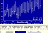
Summary From a population of some 350 actively-traded, substantial, and growing ETFs this is a currently attractive addition to a portfolio whose principal objective is wealth accumulation by active investing. We daily evaluate future near-term price gain prospects for quality, market-seasoned ETFs, based on the expectations of market-makers [MMs], drawing on their insights from client order-flows. The analysis of our subject ETF’s price prospects is reinforced by parallel MM forecasts for each of the ETF’s ten largest holdings. Qualitative appraisals of the forecasts are derived from how well the MMs have foreseen subsequent price behaviors following prior forecasts similar to today’s. Size of prospective gains, odds of winning transactions, worst-case price drawdowns, and marketability measures are all taken into account. Today’s most attractive ETF Is the iShares Nasdaq Biotechnology ETF (NASDAQ: IBB ) The investment seeks to track the investment results of an index composed of biotechnology and pharmaceutical equities listed on the NASDAQ. The fund generally invests at least 90% of its assets in securities of the underlying index and in depositary receipts representing securities of the underlying index. The underlying index contains securities of NASDAQ® listed companies that are classified according to the Industry Classification Benchmark as either biotechnology or pharmaceuticals and that also meet other eligibility criteria determined by the NASDAQ OMX Group, Inc. The fund is non-diversified. The fund currently holds assets of $9.04 billion and has had a YTD price return of +21.65%. Its average daily trading volume of 1,601,730 produces a complete asset turnover calculation in 15 days at its current price of $383.81. Behavioral analysis of market-maker hedging actions while providing market liquidity for volume block trades in the ETF by interested major investment funds has produced the recent past (6 month) daily history of implied price range forecasts pictured in Figure 1. Figure 1 (used with permission) The vertical lines of Figure 1 are a visual history of forward-looking expectations of coming prices for the subject ETF. They are NOT a backward-in-time look at actual daily price ranges, but the heavy dot in each range is the ending market quote of the day the forecast was made. What is important in the picture is the balance of upside prospects in comparison to downside concerns. That ratio is expressed in the Range Index [RI], whose number tells what percentage of the whole range lies below the then current price. Today’s Range Index is used to evaluate how well prior forecasts of similar RIs for this ETF have previously worked out. The size of that historic sample is given near the right-hand end of the data line below the picture. The current RI’s size in relation to all available RIs of the past 5 years is indicated in the small blue thumbnail distribution at the bottom of Figure 1. The first items in the data line are current information: The current high and low of the forecast range, and the percent change from the market quote to the top of the range, as a sell target. The Range Index is of the current forecast. Other items of data are all derived from the history of prior forecasts. They stem from applying a T ime- E fficient R isk M anagement D iscipline to hypothetical holdings initiated by the MM forecasts. That discipline requires a next-day closing price cost position be held no longer than 63 market days (3 months) unless first encountered by a market close equal to or above the sell target. The net payoffs are the cumulative average simple percent gains of all such forecast positions, including losses. Days held are average market rather than calendar days held in the sample positions. Drawdown exposure indicates the typical worst-case price experience during those holding periods. Win odds tells what percentage proportion of the sample recovered from the drawdowns to produce a gain. The cred(ibility) ratio compares the sell target prospect with the historic net payoff experiences. Figure 2 provides a longer-time perspective by drawing a once-a week look from the Figure 1 source forecasts, back over two years. Figure 2 (used with permission) What does this ETF hold, causing such price expectations? Figure 3 is a table of securities held by the subject ETF, indicating its concentration in the top ten largest holdings, and their percentage of the ETF’s total value. Figure 3 source: Yahoo Finance In contrast to the approach taken elsewhere of a wide net of holdings among early-development biotech companies, IBB focuses more than half its holding investments in strongly-resourced market-established companies serving flourishing product markets and related step-out demand opportunities. Each of these holdings frequently appears among our daily intelligence lists of the top 20 odds-on wealth-building stocks and ETFs out of an active population of 2,500+ securities. Figure 4 is a table of data lines similar to that contained in Figure 1, for each of the top ten holdings of XBI. Figure 4 (click to enlarge) In an industry as unpredictably dynamic as this, wide variations in market experience seem to be the rule. Column (5) contains the upside price change forecasts between current market prices and the upper limit of prices regarded by MMs as being worth paying for price change protection. The average of +10.7% of the top ten IBB holdings is above the average of our daily intelligence list ranking of the top 20 odds-on wealth-building stocks and ETFs. That population of 2500+ equities has ambitious MM upside price change forecasts of +12.6%. The IBB largest holdings prospects, according to the MMs is about 1 ½ times the upside forecast for SPY price change. The other side of the coin is column (6), which shows what actual worst-case price drawdowns have been typical in the 3 months following each time there has been a forecast like those of the present day. Those risk exposures have been only -6.7% in the holdings top ten, less than -8.6% by equities at large. But these holdings are attractive reward tradeoffs between returns and risks, with the top ten (column 14) at a ratio of 1.6, compared to equities overall at 1.5 times. The market-proxy of SPY provides a best ratio of 2.1 times risk avoidance, but is based on an upside of only +6.8%, deficient in comparison to the alternatives . Another qualitative consideration is the credibility of the ten IBB big holdings after previous forecasts like today’s. The net average price change (column 13) of the ten has been 0.8 times the size of the upside forecast average, +8.1% compared to +10.7%. The equity population’s actual price gain achievement, net of losses has been a pitiful +3.4% compared to promises of 12.6%. The ability of IBB holdings to recover from those worst-case drawdowns and achieve profits occurred in 81% of experiences. The equity population only recovered less than two thirds of the time, and while the SPY recovery experiences were more consistent like the ten IBB holdings, the achieved gains were much smaller. SPY has had only +3.7% gains previously from like forecasts of +6.8%. Conclusion IBB provides attractive forecast price gains, supported by equally appealing largest holdings. Both the ETF and many of its major holdings offer very attractive prospects in near-term price behaviors, demonstrated by previous experiences following prior similar forecasts by market makers. The ETF provides an excellent holdings balance to other biotech ETFs that cover early-stage developing companies. Disclosure: I/we have no positions in any stocks mentioned, and no plans to initiate any positions within the next 72 hours. (More…) I wrote this article myself, and it expresses my own opinions. I am not receiving compensation for it (other than from Seeking Alpha). I have no business relationship with any company whose stock is mentioned in this article.