Tag Archives: seeking-alpha

This 9.5% Yielding CEF Is The Gift That Keeps On Giving

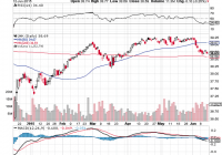
“Taper tantrums” in the credit markets are giving investors another ideal buying opportunity with junk bonds. The “smart money” remains bullish on junk bonds for 2015. Junk bond ETF’s make sense, but bargains and higher yields are possible with closed end funds that trade at a discount. My favorite closed end fund trades for a 7% discount to net asset value, it yields 9.5%, and it pays shareholders every month. Here we go again, the markets are having another “taper tantrum” and that has caused some selling pressure in junk bonds. We have seen pullbacks in the junk bond sector many times in the past few years and each one has been a great buying opportunity. This recent sell-off appears to be another golden opportunity to buy high-yielding assets from investors who are either uninformed or just plain overly focused with short-term thinking. Let’s take a look at the chart of a popular junk bond ETF below: (click to enlarge) As the chart above shows, the SPDR Barclays High Yield Bond ETF (NYSEARCA: JNK ) is now trading near the 200-day moving average of $38.59, which is a potentially strong support level. At this level, the potential downside risk could be limited and that makes this an even more attractive buying opportunity. Furthermore, there are other good reasons to be buying junk bonds now: The market has been so overly focused on this potential rate hike that it seems like many investors are acting very irrational over the fear of any rate hike. However, a closer look reveals that there is really nothing to fear, because like just about everything in this economic “recovery”, any rate hike is likely to be very minimal. One analyst in a recent Washington Post article describes the potential rate hike as being “bupkis” or “absolutely nothing” in terms of the size. The article states: “I don’t expect that they’ll do more than a quarter point,” said Ed Yardeni, president and chief investment strategist of his own advisory firm Yardeni Research. ” Bupkis as we say in New York,” he added, using a Yiddish word that has come to mean ‘absolutely nothing’ in English. “I think they’ll do the bare minimum,” he added, “for credibility sake. To show they can. They haven’t had any practice.” He predicted that the Fed’s action will be described as “one and done.” The reality is that the stock market and high yield bonds could rally as soon as the “rate hike” takes place as the certainty of this event could calm irrational investor fears and allow the market participants to realize that even after a quarter point hike, stocks and high yield bonds are still the only game in town. All this hand-wringing over a quarter point hike is irrational because it is nowhere near enough to make savings accounts, money market accounts or CD’s, a competitive asset class when compared to dividend stocks or high yield bonds. It appears that the “smart money” sees this and that is why firms like Goldman Sachs (NYSE: GS ) are bullish on junk bonds for 2015 . Another long-term positive factor is that the European Central Bank’s new bond buying program is creating more demand for high yield assets. A recent Bloomberg article , states that the European Central Bank’s bond buying program (quantitative easing) is pushing yields below zero on nearly $1.7 trillion worth of debt and that is also creating more demand for high yield assets. Furthermore, the fact that interest rates can move up a little (ok, barely) is a bullish sign for the overall economy. A stronger economy means that junk bond default rates could decrease and credit ratings could increase thereby making the bonds more valuable and lower risk. I believe it makes sense for investors to accumulate shares in JNK but there is another way to get an even higher yield and a bargain…… and that is to consider closed end funds, or CEF’s, which can trade for a discount to net asset value. In this sector, my favorite closed end fund is the Pioneer Diversified High Income Trust (NYSEMKT: HNW ). This is a CEF which primarily invests in high yielding bonds. For numerous reasons, this remains one of my favorite ways to invest in junk bonds: It is well diversified, it trades at a discount to net asset value, it pays a dividend every month, the payout appears secure, plus it yields 9.5%. The Pioneer Diversified High Income Trust has around 432 holdings which indicates it is well diversified. This fund has an average duration of just 3.02 years, which means that duration risk is very low and that is another reason why this fund is very attractive. The Pioneer Diversified High Income Trust has average earnings per share of more than 16 cents per month . This means the monthly payout of 13.5 cents per months appears very solid. (click to enlarge) The chart above shows that the share price is now a bargain at just about $17, because the net asset value (as of June 11, 2015) is $18.32. The current share price represents a discount of about 7% below net asset value. That is a large discount and it is one that has not historically lasted for long as rebounds have typically quickly followed these types of pullbacks. I believe that the market is overly focused on a “bupkis” rate increase and that means investors will once again be looking to buy high yield assets. A quarter point increase is not enough to make the generous 9.5% yield that the Pioneer Diversified High Income Trust any less attractive to most investors who desire income. The 7% discount to net asset value makes it a real bargain. Plus, with the generous yield, and with the dividend payout being made to investors every month, this closed end fund is like a gift that keeps on giving. Here are some key points for the Pioneer Diversified High Income Trust: Current share price: $17.10 The 52 week range is $16.43 to $21.63 Annual dividend: $1.62 per share (or 13.5 cents per month), which yields about 9.5% Here are some key points for SPDR Barclays Capital High Yield Bond: Current share price: $38.69 The 52 week range is $37.26 to $41.82 Annual dividend: about $2.40 or (20 cents monthly) per share which yields 6% Data is sourced from Yahoo Finance. No guarantees or representations are made. Hawkinvest is not a registered investment advisor and does not provide specific investment advice. The information is for informational purposes only. You should always consult a financial advisor. Disclosure: The author is long JNK, HNW. (More…) The author wrote this article themselves, and it expresses their own opinions. The author is not receiving compensation for it (other than from Seeking Alpha). The author has no business relationship with any company whose stock is mentioned in this article.

Improve Your Sector Returns With Equal Weighting

Summary Sector ETFs are great trading vehicles, but they are not weighted the best way for you. Equal weighting is always better than capitalization weighting. The problem with the existing equally-weighted ETFs is that they have too many stocks. You can do it yourself with fewer stocks and get better returns. There is no doubt that ETFs are a good way to invest. They reduce your exposure to the ups and downs of a single stock and avoid having to choose which stock in a sector is going to be the best next year. It turns out there is an easy way to get the same protection, better returns, and lower risk, doing it yourself. It goes back to understanding equal weighting versus capitalization weighting, but it doesn’t try to replicate the entire sector, it just focuses on the larger, more liquid stocks. Sector SPDRs are capitalization weighted, the same as the S&P. They deliver exactly what is expected, the portion of the S&P representing that sector, using the same calculations. We can’t evaluate every sector, so we’ll look at the best, Health Care (via the Health Care Select Sect SPDR ETF (NYSEARCA: XLV )) and one of the worst, Energy (via the Energy Select Sector SPDR ETF (NYSEARCA: XLE )). The chart below shows the performance of the major sector SPDRs since late 2006. If you combine them all, you get returns similar to the SPDR S&P 500 Trust ETF (NYSEARCA: SPY ). Equal weighting is not a new idea and the advantages are well known. Equal weighting maximizes diversification; therefore, it reduces risk. If you weight by capitalization, or any other scheme, then some stocks have greater exposure in the portfolio. For that to work, those stocks must have proportionately greater returns. Unfortunately, we don’t know that. It may turn out, strictly by chance, that the stock with the largest exposure also had the biggest returns. But the chances of that are small. The safest portfolio, and normally the most stable, is the one that has equal dollar exposure to each stock. In 2006, Guggenheim introduced ETFs that matched the sector SPDRs but were equally weighted. If there are 55 Health Care stocks in XLV then there are 55 stocks in the Guggenheim S&P Equal Weight Health Care ETF (NYSEARCA: RYH ). Similarly, there are 49 stocks in XLE and 49 in the comparable Guggenheim S&P Equal Weight Energy ETF (NYSEARCA: RYE ) . When we compare the returns of the SPDRs and the Guggenheim sectors, we see that the equally-weighted sectors performed slightly better. The information ratio, the annualized returns divided by the annualized risk, shows a similar pattern. Data source : CSI Is this what the investor, you and me, really wants? I would rather have a sector ETF that performed better than the weighted average of all the stocks in that sector, and we can do that. Components of XLV and RYH The Health Care SPDR, XLV, has 55 components, shown in the chart below in order of descending weights, with Johnson & Johnson (NYSE: JNJ ) at the top of the list with an allocation of 9.68%, and the 26 companies on the right all below allocations of 1%. Let’s look at the 9 on the left, representing 50% of the total weight of the XLV. Their performance from January 2010 is also shown below. (click to enlarge) Data source : sectorspdr.com Data source : CSI Nine stocks represent 50% of the index and the remaining 46 make up the other 50%. The smaller 50% are generally much less liquid, which tends towards greater relative volatility. More important, if we use them in an equally-weighted portfolio, will we be emphasizing companies that are very small and not representative of the performance we are seeking? Remember, we don’t care about duplicating the S&P, we are looking for better returns. Equally Weighting the Top 50% We’re going to select only a few of the stocks with the highest capitalization in the XLV, those that make up 50% of the index. Those are the 9 stocks shown in the previous chart. We’ll dollar weight them equally, then compare the results of XLV with the capitalization and equally-weighted versions using the smaller group of 9 stocks. The results are impressive. By discarding the smallest components of the index, you can increase returns significantly and reduce risk at the same time. The numbers can be seen in the Table below. Besides looking at the rate of return (AROR), the ratio of returns to risk shows that equal weighting had the best investment profile. Data source : CSI The Health Care Industry has taken off since 2008, not coincidentally timed with the passing of the Affordable Care Act. We’re not judging the merits or good intentions of that Act, but it gave the health care companies an opportunity to raise prices in advance of services, and maintain those high prices; hence, large and continued profits. Given the aging population, the industry should continue to prosper, although it seems unlikely that it could continue at this rate. The Energy Sector: XLE and RYE The Health Care sector may be an outlier, given its exceptional performance. While the energy stocks have seen wide ranging price swings, the net effect is nearly the worst performance of all sectors, certainly the highest risk. Does equally weighting the top members of this sector also improve returns? In this case we’ll choose the top 10, representing 60% of the allocations, because it’s a similar number of stocks and the allocations to energy stocks vary much more. We don’t think it makes any real difference if you use 50% or 60% of the weighting. Going through the same steps as with Health Care, we first compare the SPDR XLE with Guggenheim’s RYE in the chart below. In this case the XLE outperforms since 2010; however, the pattern is very similar. Data source : CSI We then take the 10 stocks that represent the top 60% of the XLE allocation and equally weight them. We construct cap-weighted and equally-weighted portfolios from 2010 using the same weighting as XLE. The results, in the chart below, show that equal weight again outperforms cap weighting. The numbers, also in the table that follows, shows a similar picture of higher returns and a better reward to risk ratio. Data source : CSI Doing It Yourself There is no magic in equally weighting a small number of stocks. You want enough companies to give diversification, but none of the low-cap ones. The weighting of the XLV and XLE will change regularly, but since we will be equally weighted, that won’t matter. Only the specific stocks in the top 9 for Health Care, and the top 10 for Energy will be used. “Equal” means allocating an equal dollar amount for each stock. Then an investment of $100,000 in 9 stocks means putting $11,111 into each, not much of a strain on the liquidity of these companies. JNJ at $99 would get 112 shares and Pfizer (NYSE: PFE ) at $34.50 would be allocated 322 shares. They should be rebalanced quarterly. Current Holdings The current top 50% holdings of the Health Care and 60% Energy sector ETFs are: (click to enlarge) Disclosure: The author is long XLV. (More…) The author wrote this article themselves, and it expresses their own opinions. The author is not receiving compensation for it (other than from Seeking Alpha). The author has no business relationship with any company whose stock is mentioned in this article.

Lipper Fund Flows: Equity Funds Post Gains Amidst Greece News

By Patrick Keon The broad market equity indices rallied on the last trading day of the fund-flows week ended Wednesday, June 10, 2015, to reduce their overall losses for the week. The Dow Jones Industrial Average and the S&P 500 Index gained 236.36 and 25.05 points, respectively, on that day. This spike enabled both the Dow (-75.87 points) and S&P 500 (-8.87 points) to close the week with losses of only 0.41% each. Speculation about an impending Federal Reserve interest rate hike and about Greece dominated the financial news for the week. Stronger economic data pointed to an interest rate hike by the Fed this fall. The Labor Department reported that the economy had generated 280,000 new jobs for May – far more than anticipated. U.S. data services hinted at a possible upward revision to Q1 GDP as data suggested consumer spending was higher than initially estimated. And, New York Federal Reserve President William Dudley commented that he still expects there to be a rate hike this year. Greece started the week off on a down note, informing the International Monetary Fund on Thursday, June 4, that it intended to combine the four loan payments due in June into one lump-sum payment on June 30 (with the first payment due on Friday, June 5, being skipped). The markets did not react favorably to this news; both the Dow and the S&P 500 shed 0.9% on June 4. But the key piece of news contributing to this past Wednesday’s rally was that Greece, Germany, and France had agreed to ramp up negotiations in order to avoid a default by Greece. Turning our attention to the week’s fund-flow activity, Lipper’s fund macro-groups (including both mutual funds and exchange-traded funds [ETFs]) had aggregate net outflows of $7.5 billion for the week. Money market funds (-$7.2 billion), taxable bond funds (-$2.6 billion), and municipal bond funds (-$412 million) all suffered net outflows, while equity funds grew their coffers by $2.8 billion net. The majority of the outflows from taxable bond funds came from ETFs (-$2.0 billion), while mutual funds had $653 million leave. Within the ETF universe the two biggest individual net outflows came from high-yield products iShares iBoxx $ High Yield Corporate Bond ETF ((NYSEARCA: HYG ), -$1.1 billion) and SPDR Barclays High Yield Bond ETF ((NYSEARCA: JNK ), -$763 million). High yield was also the main culprit for mutual funds; the group saw $809 million leave. Municipal bond mutual funds had negative flows of $409 million net for the week. Continuing the trend we saw in taxable fixed income funds, high-yield muni debt funds were the single largest contributor (-$239 million) to the net outflows. ETFs (+$2.0 billion) accounted for the majority of net new money into equity funds, while mutual funds contributed $800 million to the inflows. The two largest net inflows among individual ETFs were into SPDR S&P 500 ETF ((NYSEARCA: SPY ), +$812 million) and Financial Select Sector SPDR ((NYSEARCA: XLF ), +$530 million). For mutual funds, nondomestic equity funds (+$1.6 billion) were responsible for all the positive net flows, while domestic equity funds (-$800 million) once again saw money leave their coffers. After taking in $8.0 billion of net new money the previous week, money market funds had net outflows of approximately the same amount (-$7.2 billion) this past week. Institutional money market funds were responsible for $5.5 billion of the week’s outflows.