Tag Archives: power

Equity CEFs: How To Play Sector Rotations By Investing In CEFs

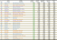
Summary What started as a rotation in 2015 has become more of the same over the last couple weeks as leading sectors such as technology and healthcare have reasserted themselves. But beneath the surface, there are tell tale signs of a rotation going on, particularly in interest rate sensitive sectors such as utilities and REITs. Equity CEFs are a great way to play a rotation because opportunities can arise regardless of which sectors are doing well and which sectors are falling out of favor. Well, it appears we’re back to the races on the major market averages after a short 5-week funk in which leading sectors such as technology and healthcare struggled while a rotation into energy, gold and commodities gained steam. But that didn’t last very long and once again, a rising tide appears to be lifting all boats as the markets look poised to take another leg up to new highs yet again. It’s become an old habit but the key is not so much to know which way the markets are going as it is to have investments that can take advantage of whichever way the markets are going and equity CEFs offer some of the best opportunities for that since they are constantly going in and out of favor along with the sectors they invest in. So let’s first look at what equity CEFs are performing the best after six weeks into the new year and see if we can glean any opportunities from these tables. The first table sorts all of the funds I follow (only 30 out of about 100 can be shown in a screen shot) by their total return NAV performances YTD through February 13th. Total return means all distributions are added back though not on a reinvested basis. Fund’s shown in green have outperformed the S&P 500, which is up 2.06% over the same period YTD. (click to enlarge) At the top of the list are two funds I recommended at the end of last year, the Gabelli Global Gold, Natural Resource & Income fund (NYSEMKT: GGN ) and the Gabelli Natural Resources, Gold & Income fund (NYSE: GNT ) . I recommended them not so much because I knew their sectors would come back into favor but purely because of their historical market price performance that tended to flip flop at the end of one year to the beginning of the next. This is a good example of what you can find in equity CEFs and even if you’re wrong about market direction or sector rotation, you can still be right about the direction of the equity CEFs you invest in. As it turned out, gold prices helped support both fund’s NAVs as well as their market prices but it doesn’t always work that way. Take a look at the next two funds on the list, the Cohen & Steers Quality Income Realty fund (NYSE: RQI ) and the Cohen & Steers Total Return Realty fund (NYSE: RFI ) . Their NAV’s have performed well so far in 2015, as have most REITs, but yet their market prices are telling you something very different, especially more recently. But at a -13.7% market price discount for RQI and -10.1% discount for RFI, do they represent good value even after a strong January jobs and wage report released earlier this month which is putting pressure on all interest rate sensitive sectors? I think so and I would be more inclined to pull some profits out of GGN and GNT and rotate them over to RQI and RFI at this point even if this rotation out of interest rate sensitive sectors continues. REITs had been one of the strongest sectors in the markets over the past year though you wouldn’t know it by looking at RQI’s and RFI’s Premium/Discount charts. RQI’s 1-Year Premium/Discount Chart RFI’s 1-Year Premium/Discount Chart Certainly, investors are trying to get ahead of the curve in REITs in anticipation of any Federal Reserve moves on interest rates later this year but sometimes they can get too far ahead, particularly in CEFs, and I believe this is one of those situations. I would also be looking at the Alpine Global Premier Property fund (NYSE: AWP ) , which has seen negative market price performance YTD despite a strong NAV performance as well (see table below). When Sector Rotations Give You Opportunities In CEF Prices One of the best ways to find opportunities in equity CEFs is to look at the difference between a fund’s NAV price performance and its market price performance since this can often tell you and what sectors are going in or out of favor by investors, often incorrectly. And in a year like 2015, you can often find wide variations in these two performances. Here is the same table from above sorted by the NAV & Market Price Difference column. Note: Fund’s in green have seen their NAV performance outdistance their market price performance whereas fund’s in red have not (table at bottom) . As you can see, AWP along with RQI and RFI are towards the top of the list as are a couple of energy MLPs, the Tortoise MLP fund (NYSE: NTG ) and the ClearBridge Energy MLP fund (NYSE: CEM ) . The energy MLP CEFs are a great way to play a rotation back into the energy sector though these funds can be quite volatile. I include three of the largest and most well known energy MLP CEFs in my tables to be representative of the group, so I’m not necessarily recommending NTG or CEM over the others, of which there are about 25 MLP CEFs available to investors, but these give you an idea of how the sector has performed so far in 2015 and despite lagging market prices compared to their NAVs, many of these energy MLP CEFs are actually seeing improvement in their premium/discount levels of late. A NASDAQ-100 Index Play For those who would rather not take a gamble on sector rotations and would rather stick with what has worked in the past, one equity CEF is giving you an opportunity to play off of one of the strongest indexes over the last few years. The NASDAQ-100, as represented by the PowerShares QQQ Trust (NASDAQ: QQQ ) , is the most popular technology ETF and represents the largest 100 non-financial stocks on the NASDAQ. Since the end of 2011, which is about the time in which this uninterrupted ramp up for the US markets got started, QQQ is up almost 100%. Not too many funds have been able to compete with that. However, what if I told you you could buy an index CEF that correlates with QQQ, but you could buy it at an historically large discount and a 7.3% market yield? The Nuveen NASDAQ-100 Dynamic Overwrite fund (NASDAQ: QQQX ) is an option-income CEF which mimics the QQQ but with less volatility. By selling NASDAQ-100 index options against its NASDAQ-100 stock portfolio, QQQX may not have the NAV upside of QQQ in a strong technology market but it also will hold up better at the NAV level should the NASDAQ-100 struggle, like it did in January. So why is QQQX struggling at the #9 position in the table above just when QQQ is breaking out to new highs? Because Nuveen recently restructured all of their option-income CEFs last year and in the case of QQQX, there is a large overhang of shareholders from another fund that merged into QQQX that have been lightening up their exposure, either because they already owned QQQX or for some other reason. In any event, this has resulted in continued selling pressure on QQQX since the merger was completed on December 22nd, 2014 resulting in this Premium/Discount chart since then. Now QQQX, at a -6.5% discount, is not what I would consider to be at an uber wide discount, but for an index correlated fund in which you can be pretty confident that if the index it follows does well, then the fund’s NAV will also do well, a -6.5% discount combined with a windfall 7.3% market yield, is attractive. Note: I was actually short QQQX up until recently since I had a very large position in the fund that merged into QQQX and it made sense to arbitrage that large position by shorting QQQX. Conclusion Opportunities in equity CEFs can arise at any time and in any sector. You just have to keep watch. You can also find equity CEFs that are getting ahead of themselves at the market price level either because investors believe the sectors they invest in are coming back in vogue or just because investors think they may be undervalued. I’ll go over some of those funds in my next article since some of them are headscratchers but here’s a taste of what to expect by reversing the table above by the funds whose market prices have outperformed their NAVs so far in 2015. Any fund whose market price has outperformed its NAV by more than 5% is shown in red. Disclosure: The author is long QQQX, GGN, GNT, RFI, AOD, AGD. (More…) The author wrote this article themselves, and it expresses their own opinions. The author is not receiving compensation for it (other than from Seeking Alpha). The author has no business relationship with any company whose stock is mentioned in this article.

How Cash Can Boost Long-Term Returns

Summary Liquidity management is one of the most critical aspects of investment. Cash earns a 0% nominal return, but allows investors to take advantage of higher-return opportunities that may emerge. By holding more cash, one is betting that the purchasing power will increase at a future point. Moderation is key with holding cash; it’s rarely advisable to go to 100% cash or 0% cash. I’d recommend a cash position in the 20% – 40% range for most investors right now due to higher than average risks in the market. Buying stocks at depressed prices (i.e. with a large “margin of safety”) is the best way to generate superior returns over time. Cash, on the other hand, generates a 0% return. Absent a highly unlikely episode of hyper-deflation, you cannot become wealthy holding cash. In spite of this, I’d recommend holding 20% – 40% of your portfolio in cash right now. The reason for this is that there is value to liquidity, particularly in an inflated market environment. By holding cash, what you are actually doing is betting that the future value of your money in the market will be worth more than the present value. How can cash help you generate better returns? The key is to understand intrinsic value and the mathematics of investing. Intrinsic Value Price is what you pay for an asset. Intrinsic value is the fundamental worth of an asset. Therefore, an asset could be priced at $20,000, but have an intrinsic value of $30,000. In that instance, you are getting a bargain, because you are paying 33% less than the intrinsic value. In reality, it’s impossible to know the exact intrinsic value of a stock. None of us can see the future. Yet, we can come up with reasonable estimates of intrinsic value through a fundamental analysis of a company. That said, in order to explain why holding cash can be beneficial, we’ll first need to assume we can read the future. In this scenario, let’s say we know with absolute certainty that the intrinsic value of XYZ Company’s stock is $20. Now, we’re going to be able to live in five different alternate realities. In the first scenario, XYZ Company’s stock is selling at the depressed price of $5. In the second scenario, the stock sells at a still somewhat depressed price of $10. The third scenario will allow us to purchase the stock for $20; which is precisely the intrinsic value. In the fourth scenario the stock will sell at an inflated price of $25, and in the fifth scenario, it will sell at an even more inflated price of $30. Now, we’ll say that in each of our five alternate realities, we will purchase the stock and hold it for five years. We also know for a fact that the intrinsic value will grow 10% per year. You can see how the intrinsic value grows in the chart below. With that, let’s take a look at what happens. The Power of Compounding Now that we’ve created the set-up, you can see the return figures for all five scenarios below for a five-year holding period. It immediately becomes clear how dramatic the difference is between purchasing XYZ’s stock at a depressed price versus an inflated price. The “inflated price” only yields a 1.4% annual return, while the “depressed price” yields an astronomical 45.1% annual return! To put this further in perspective, if you started with $10,000 and generated a 45.1% annual return for the indefinite future, you would have $100,000 in a little over 6 years. On the other hand, if you generated a 1.4% for the foreseeable future, it would take you 166 years for you to turn that $10,000 into $100,000. That’s not a misprint! That’s the power of compounding. This is also the reason why an investor that generates a 17% annual return over 10 years is significantly better than one generating a 15% annual return. It may seem like a very small difference, but over a long-term timeframe, it really adds up. An investor making 15% annually on a $10,000 initial investment for 25 years would have $329,000 at the end of that timeframe. An investor generating a 17% annual return, on the other hand, would have $507,000; roughly 54% more. Why Cash is Valuable Given this math, it starts to become clearer why holding cash can sometimes led to higher long-term returns. Let’s say that XYZ’s stock was selling at the inflated price of $30, but you could see the future, and knew it could fall back down to $15 in 3 years. For simplicity’s sake, we’ll still assume that you plan to sell off at the end of Year #5 at the intrinsic value of $32.21. What would be your best option? (1) Buying the stock immediately and earning the 1.4% return for 5 years, (2) Holding cash for 3 years and then buying in at the semi-depressed price of $15 The answer is that option #2 is much more profitable. After five years, you’ll only generate a total return of 7.2% in Scenario #1, but you’ll achieve a 114.7% return in Scenario #2, in spite of the fact that you made a 0% return the first three years. This example showcases why the relationship between price and value are so important. It also shows why value investing works so well. What may seem like small differences in price can drive very large differences in return. Hold Some Cash Given the inflated market environment we are currently seeing, I believe it’s prudent to hold 20% – 40% of one’s portfolio right now. It’s true that you’ll likely underperform in the short-term (e.g. 1-3 years) as a result of this strategy. However, in the long-term, it makes more sense to take the 0% return now (on a part of your portfolio), and then use the liquidity to strike later when the returns become much more attractive. Of course, this should not dissuade you from taking advantage of bargains as you see them become available. And while I believe the broad market is overpriced, on a micro level, there will always be bargains out there. Yet, even if you can find a lot of bargains, I’d still recommend holding a good clip of cash, because even better bargains could become available the next time we find ourselves in a recession or a falling market environment. How much cash you hold in your portfolio depends upon your preferences and personal situation. If you’re in a situation where you can’t afford to lose much right now (i.e. you might need your cash for other purposes), I would recommend playing things fairly conservatively and holding a very large cash position. Even if you’re not worried about pulling out cash, I do think a minimum 10% cash position is prudent; and frankly, I wouldn’t dip below 20%. Conclusions Holding cash and generating a 0% return may seem like a poor option on the face of it, but once you understand the math behind returns, it makes a lot sense. By holding cash now, you’re hoping that you can generate higher returns in a future environment with lower prices. It’s never wise to go 100% cash, because at that point, you’re merely speculating. In an environment where stock prices seem inflated and there are few bargains out there, it makes sense to hold an elevated cash position in the range of 20% – 40% of your portfolio. On the other hand, in a depressed stock environment (such as the one we saw in late 2008 and early 2009), you should try to be as fully invested as possible, holding no more than 5% cash. Right now, I view us as being in an inflated environment and holding a 20% – 40% cash position is a prudent strategy. Your returns will lag in the short-term, but if there’s a market correction, you’ll more than make up for it in the long-term. This article appears in the February 2015 edition of Jake Huneycutt’s Contrarian Value Newsletter Disclosure: The author has no positions in any stocks mentioned, and no plans to initiate any positions within the next 72 hours. (More…) The author wrote this article themselves, and it expresses their own opinions. The author is not receiving compensation for it. The author has no business relationship with any company whose stock is mentioned in this article.

2014 Diversified ETF Portfolio: Annual Performance, Replacing BOND With TLT And 2015 Estimates

Summary The S&P 500 had another great year with 14% annual return (including dividends). The diversified portfolio only returned 3.6%, held back by Business Development Company ETF. Portfolio yield exceeded the S&P 500 by 118 basis points. Pimco’s BOND ETF was replaced by TLT. TLT chosen based on correlation. S&P 500 Fundamentals need to continue to grow to have a positive 2015 year. Here are the fourth quarter and full-year results of a diversified ETF portfolio. The holding in BOND was replaced with TLT because of a change in my thesis. BOND was included to cover the bond portion of the portfolio because my thesis was that the expertise of Bill Gross would help BOND perform during calendar year 2014. Once Bill Gross quit Pimco, it was time for a change. Q1 Update: Link Q2 Update: Link Q3 Update: Link MARKET PERFORMANCE The S&P 500, as measured by the Vanguard S&P 500 ETF (NYSEARCA: VOO ), was up 13.97% (including dividends) for CY2014. Not too shabby. (click to enlarge) Eight of the nine sectors were positive for the year. Energy was the one sector that was negative. Technology, health, and utilities all outperformed the S&P 500. The utilities sector was the best performer, up 24.4%, which is usually considered a safe harbor investment. According to my calculations, a portfolio equal weighted in each sector would have returned 11% for the year. Throughout CY2014, bond yields fell. Yields closed the year at 2.2%. There was a significant drop during Q4, which is reflected in the performance of TLT. A drop in yields results in a price increase for the bonds. PORTFOLIO PERFORMANCE For Q4, the portfolio was up 2% while the S&P 500 was up 4.89%. For the year, the portfolio was up 3.62% while the S&P 500 was up 13.97%. PowerShares Buyback Achievers (NYSEARCA: PKW ), PowerShares Fundamental Pure Small Value (NYSEARCA: PXSV ), and the iShares 20+ Year Treasury Bond ETF (NYSEARCA: TLT ) all outperformed the S&P 500 for the quarter. Market Vectors BDC Income ETF (NYSEARCA: BIZD ), Vanguard FTSE Emerging Markets ETF (NYSEARCA: VWO ), and SPDR Barclays High Yield Bond (NYSEARCA: JNK ) all posted negative returns for the quarter. (click to enlarge) For the year, only the Market Vectors BDC Income ETF was down; even with its high dividend yield, it was not able to generate a positive return. No one fund outperformed the S&P 500 for the year. The Buyback Achievers came close and the Small Value fund posted a decent rally at year’s end, along with the Bond ETF. (click to enlarge) Here is the performance of the portfolio for the year: BOND FUND REPLACEMENT Why did I replace PIMCO Total Return ETF with iShares 20+ Year Treasury Bond ETF? The purpose of the bond fund is to give some negative correlation to the portfolio and help smooth out some returns over a long time frame (I know, I am monitoring the portfolio on a quarterly basis). As soon as it was announced that Bill Gross was leaving Pimco, I ran a correlation matrix on several possible bond funds. I used the following funds: iShares TIPS Bond (NYSEARCA: TIP ) Vanguard Short-Term Infl-Prot Secs ETF (NASDAQ: VTIP ) iShares Core Total U.S. Bond Market ETF (NYSEARCA: AGG ) Vanguard Intermediate-Term Corp Bd ETF (NASDAQ: VCIT ) SPDR Barclays Capital Convertible Bond ETF (NYSEARCA: CWB ) iShares 20+ Year Treasury Bond Vanguard Short-Term Corporate Bond ETF (NASDAQ: VCSH ) Vanguard Long-Term Corporate Bond ETF (NASDAQ: VCLT ) Here are the results of the correlation matrix (as of 3-Oct-2014): (click to enlarge) TLT has the largest negative correlation to the three equity funds (PKW, BIZD, and PXSV) and therefore, I choose it as the replacement for BOND. Note: The ETF share price used for the correlation matrix was sourced from Yahoo! Finance. TIP came in a very close second. As an exercise, I took the 10 worst days for PXSV (01-Jan-2014 through 03-Oct-2014) and compared that with TLT and TIP. TIP actually had the least correlation over this time frame. LOOKING FORWARD Last year at this time, I estimated a 10% return for the S&P 500. The S&P 500 outpaced that estimate. I estimated a 4.5% increase in sales per share with an 8.5% EPS margin. The actual sales per share increase was only 3.5%, but the EPS margin was 9.18%, which resulted in an actual EPS of $105.96, as compared with my $99.07 EPS estimate. I estimated a 20.5 multiple but the multiple (for the trailing twelve months) came in at 19.4, still allowing a greater than 10% return for the S&P 500. How about for 2015? I looked at three scenarios below. With the continuing improving employment numbers and the recent robust GDP numbers, I would expect the S&P to return between 2.5% and about 14% for the year. Large range, I know. Looking at the three scenarios below, it does not take much degradation in the fundamentals to get a negative return for the year. I was surprised how easy it would be to get a -11% annual return, using what I would still consider to be some decent fundamental performance. (click to enlarge) Disclosure: The author is long VOO, VWO. (More…) The author wrote this article themselves, and it expresses their own opinions. The author is not receiving compensation for it (other than from Seeking Alpha). The author has no business relationship with any company whose stock is mentioned in this article.