Tag Archives: load

‘Betterer’ Investing For A Tired Bull Market

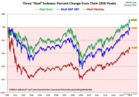
Robo-advisors may not be a “betterer” idea than traditional advisors if all you get is a diversified buy-and-hold approach. If you are a long-term buy-and-hold investor, you should be prepared to weather an occasional four- to seven-year period of diminished portfolio value. If that troubles you, perhaps you should rethink your strategy. At age 33, tennis great Roger Federer trains hard to get “betterer” to keep up with the challenges of staying at the top of the ATP World Tour. While watching a match I saw an ad for robo-advisor Betterment, which suggested that their method of diversified, passive investing is better than more costly traditional advisor services. That got me thinking about what is truly better. Mutual funds were created as a better way to invest in a diversified portfolio of assets aimed at a selected market or market segment. ETFs were created as a lower cost way to do what mutual funds do. Robo-advisors were created as a lower cost way to do what human advisors do, largely with mutual funds and ETFs. All of this has been done to drive the cost out of a “buy and hold” diversified investing approach promulgated by Modern Portfolio Theory (MPT). If a relatively higher-priced wealth advisor implementing MPT on your behalf is like smoking an excellent Cuban cigar, then using a robo-advisor is like smoking a generic cigarette. It’s cheaper, but smoking is still bad for you. I’m not going to go into the cascading unrealistic characterizations, false assumptions and inappropriately applied elegant math that underlies MPT. Nor am I going to explain why it has been so feverishly adopted by the financial products and services industry. There is plenty of that around to read, and you can decide for yourself if the king has no clothes. In the end, you should decide if your investing priority is to beat the market (relative performance) or to make steady positive gains (absolute return). It seems to me that most wealth is created by savings and/or by well-timed concentrated investment positions. Every wealthy person I know got that way either because they inherited wealth, or they spent less than they made (saved), or they had a concentrated investment in a corporation where they worked or in their own business. As Warren Buffett once said, ” Diversification is protection against ignorance. It makes little sense for those who know what they are doing.” While there are likely many exceptions to this generalization, there are some important factors working against wealth creation via long term holding of diversified financial assets? They include: The timing of contributions to investment portfolios; Unforeseen periodic major market corrections that put investment portfolios underwater (or in “drawdown”): Repeated reactions to market advances and declines, wherein many investors enter selected markets only after they have risen and exit only after they gave fallen; and The precept of MPT that the trends of market pricing cannot be known, and are therefore not addressed. The inability of most individual investors and their advisors to protect against market downside variation (drawdown) is obfuscated with the marketing of long-term average market return statistics and assertions about the risk-reduction value of diversification. The market cycles and the investor behavior they illicit contribute heavily to low average investor returns . US equities have risen each year since 2009. Since 1871 US equities have never risen for seven consecutive years. Are you betting that 2015 will break the record? Even though there are secular bull and bear markets that can last 20-30 years, there are dramatic cyclical market downturns that occur about twice a decade which can have severe negative impacts on one’s cumulative investment return. It took 30 months for the S&P 500 to fall 49% between March 2000 and October 2002, and about seven years to recover (total return). It took 17 months for the S&P 500 to fall 57% in the 2007-2008 financial crisis and 5.4 years to recover (total return). More significantly, this last recovery has been fueled by central banks flooding markets with liquidity and forcing money out of savings and into risk assets to find a return. How long could your exposure to equities be in drawdown after the next crisis, if “the Fed” (that’s Federal Reserve, not Roger Federer) is not there to bail you out? So, if you are wealthy and trying to protect what you have, or if you are trying to build wealth over time, you should be wary of applying the generic diversified long-only MPT approach, no matter if you are implementing it with a big bank wealth advisor or with a robo-advisor. How much of a drawdown are you comfortable with? How long do you have before you may have to use some of those invested funds? Liquidation of investments in drawdown is permanent wealth impairment. Absolute return may be a better investment goal for many, especially today. Unfortunately, it is not available from an online robo-advisor for 20 basis points a year. The skills and proprietary analysis required for well-timed concentrated investment positions usually comes with higher fees. If it can help you to consolidate the gains you have made since 2009, maybe it is worth a higher fee. After all, it’s not only what you make, but what you keep that matters. And if your forward investment time horizon is likely to include another major market correction, you will keep more (after paying higher fees) by side-stepping most of the drawdown (assuming the advisor times the market well). By putting your faith in a selected absolute return strategy, you may protect yourself against natural inclinations for unprofitable reactions to changing market trends. It is said that markets climb up the stairs, but come down the elevator. Absorbing the full impact of the next major market correction will be a lot more painful than paying a higher advisory fee. Just as the great Federer has to train hard and switch to a new racquet to stay near the top, maybe your forward results will be “betterer” with an absolute return investment approach in this tired bull market. (click to enlarge) Absolute Return, a publication of Hedge Fund Intelligence, maintains a database of equal weighted hedge fund performance separated into 16 strategies. The Composite Index is an equally weighted index which represents the median performance of all funds in the Absolute Return Database. Returns are net of fees. Trendhaven makes no claims regarding the accuracy of the data reported by hedge funds or compiled and reported by Absolute Return or Hedge Fund Intelligence. Additional disclosure: The author is an investment advisor representative applying an absolute return strategy in separately managed accounts.

How To Build A ‘Lifetime’ Portfolio, Step 2 Of 2

In step 1, we focused on asset classes and how asset allocation can make us better investors. Now we take a look at how these asset classes are correlated to each other (or not!). And we offer for your due diligence the ETFs and funds we believe are superior to the “usual suspects’. The Asset Allocation chart we showed in Step 1 of this series ( here ) engendered considerable valuable discussion in the comments section of that article. While I addressed all issues raised in that area, I want to say here, as well, that when I transferred the chart from our monthly investment publication, the text box crediting the source of that chart did not come through on what I submitted to SA. Mea culpa! I take others’ hard work as seriously as I do my own and appreciate their willingness to share the results of their research. That chart came from Novel Investor ( novelinvestor.com .) If you’d like to see the full-year ended 2014, that is now posted there as well. Until the Swiss Swooping Swan (we can’t really call it a Black Swan; it was wholly unexpected given the Swiss central bank’s protestations of just 48 hours prior, but it is not a cataclysmic event for US investors) the prevalent investing mantras went something like this: ^ “Be long the dollar, short the euro. There is no stopping the juggernaut that is the US dollar. Where else can you go?” ^ “Europe, China, Australia, Asia, et al are struggling. There’s no upside there.” ^ “Interest rates must rise now since the Fed must control inevitable inflation.” ^ “Emerging markets are dead, or at least in an extended coma.” ^ “Utilities, bonds and REITs must fall this year as rates rise.” ^ “Commodities are dead. Copper, iron, cotton, oil, gas, you name it – if it is subject to supply and demand, it is dead.” As further evidence that an Asset Allocation model protects you from market risk more effectively than simply buying a benchmark index fund, I believe that every one of those assumptions are now called into question as the Swiss, the Danes, and others have now tried to protect themselves from the inevitable and finally announced QE from the European Central Bank (working with and through the various national central banks, of course.) The point is that we never know when there will be a shot out of the blue that upsets our most treasured assumptions and calls into question our investing direction. Owning different asset classes reduces that risk considerably. With market history on our side, we will continue to allocate assets in a diverse manner, placing some funds into the areas that offer the most compelling valuations no matter what the CNBC talking-their-book talking heads expect. For instance, we don’t buy or sell something called “the EC.” We buy great European companies / multinationals that will continue to be great European companies / multinationals. We have tried to position our family and client portfolios for what we believe will be the sweet spot of this aging bull market, but we still diversify “just in case.” I believe the confluence of low rates, low inflation, institutions with money to spend, the typical small stock bias for the first two quarters, and the third year of the presidential election cycle will make for a most wonderful time of the year and possible a timely denouement for the bull, with the final year (if it proves to be) typically the one with the greatest volatility and the greatest overall returns. For those who believe the bull is too old and too tired to continue, I provide the chart below from Doug Short ( dshort.com ) which shows that, allowing for inflation, the “real” returns on the S&P 500 and the Nasdaq haven’t even yet returned to the highs they reached back in the year 2000. That’s why we view any pullback in January, like last year’s January decline, to be an opportunity to reallocate to our most favored sectors. Talking “Big Picture” Before I discuss some specific mutual funds, closed-ends and ETFs that our research has led us to consider in our asset allocation portfolios, I think it’s important to illustrate one other tool we use to ensure that we have appropriate diversification among asset classes. Some investors believe they are “diversified” because they split portfolio assets between Large Cap Growth, Blend and Value, Mid Cap Growth, Blend and Value, and Small Cap Growth, Blend and Value. There! 9 categories; that’s diversified! Except that it isn’t. These categories are all positively correlated. When the Dow is up, most often the S&P, the Nasdaq and the Russell are all up. Sadly, the opposite is also true. When one goes down, they all go down. That’s why most “diversified” portfolios were decimated in the 2008-2009 decline. It’s also why our portfolios lost only half as much. Are you willing to give up bragging rights at a cocktail party in order to see your portfolio increase more steadily? Willing to accept that you won’t “beat the market” (or at least one of its benchmarks) every year? Then you are ahead of the pack – way ahead. The relationship between various investments illustrated below makes all the difference between a few good years followed by a few disastrous years followed by a few good years followed by… well, you get the idea. If you truly want to get off that roller-coaster, you must pay attention to the long-term correlations among various asset classes. (click to enlarge) These correlations change over time, of course, and each year will likely be slightly different than the previous and the next. It’s the Big Picture that counts. That’s why I have selected an historical chart, this one from the website doughroller.com in an article by Rob Berger, “Are Correlation Coefficents Converging Among Previously Disparate Asset Classes?” wherein the author cites work by William J. Coaker II covering the 25 years from 1970-2004. To my point above, please note how tightly correlated, large growth, large value, mid growth, mid blend and mid value are correlated: the lowest value obtained was a 73% correlation between mid-cap growth and mid-cap value. On the other hand, adding an asset like real estate ETFs had only a 52% correlation with the S&P 500, global bonds a negative 0.3% and a long/short fund a negative 0.1%. This does not mean that if the S&P 500 is up 10% in a given year, that real estate would only be up 5.2%. Indeed it might mean real estate outperforms the S&P 500. The correlations between asset classes simply imply independence from each other. They are not a predictor of performance! We don’t care what the markets do on any given day. But if we discern the need to lighten up on our long exposure to large caps like the S&P 500, we would increase our holdings of asset classes poorly correlated with large caps, like global bonds, long/short Funds, and natural resources. If we just aren’t sure but our indicators tell us something is beginning to go amiss, we will typically at least move into more REITs and international stocks. What Might You Want to Consider Owning? Our research and analysis leads us to conclude that what follow are some of the best proxies for the asset classes we choose to diversify with. Your mileage may vary. Be sure to conduct your own due diligence and decide what works best for you. For us… US Large Caps are typically covered in most asset allocation portfolios by the SPDR S&P 500 ETF (SPY.) We are willing to seek niches within the asset class that may be more biased to equal weighting or more aggressive during times of market recovery, etc. For that reason our universe is considerably larger than SPY and includes ETFs like Schwab US Large-Cap Growth (SCHG,) iShares S&P 500 Growth (IVW,) Vanguard S&P 500 Growth (VOOG,) and Guggenheim S&P 500 Equal Weight. For a blend of US large cap growth and value, we’ll consider, among others, PowerShares S&P 500 High Quality (SPHQ,) Vanguard Russell 1000 (VONE,) and iShares Morningstar Large-Cap (JKD.) If we’re looking more on the value end of this spectrum, a couple we like are Wisdom Tree Dividend ex-Financials (NYSEARCA: DTN ) and PowerShares Dynamic Large Cap Value (PWV.) Among funds, we also use Smead Value Investor (SMVLX.) In the US Small / Mid Cap growth arena, we might prefer to look at iShares S&P Small-Cap 600 Growth (NYSEARCA: IJT ) or two of our favorite mutual funds, Aston/LMCG Small Cap Growth (MUTF: ACWDX ) or Akre Focus Retail (AKREX.) Among small cap blends, we like Guggenheim Spin-Off (CSD,) Schwab US Small-Cap (SCHA,) and mutuals Hodges Small Cap (MUTF: HDPSX ) and Mairs & Wasatch Strategic Income (WASIX.) For pure value, we lean toward WisdomTree SmallCap Dividend (NYSEARCA: DES ) and WisdomTree MidCap Dividend (DON.) In Real Estate, we like our choices of Schwab US REIT (NYSEARCA: SCHH ) and IQ US Real Estate Small Cap (NYSEARCA: ROOF ) more than the more-frequently selected Vanguard REIT (NYSEARCA: VNQ ) and SPDR Dow Jones REIT (RWR.) And we particularly like one fund, Baron Real Estate (BREFX.) Among International Large Cap alternatives, our favorites are all mutual funds: Artisan Global Equity (ARTHX,) Deutsche Global Infrastructure (TOLLX,) and Leuthold Global Industries (MUTF: LGINX ) are among our holdings. We also own some Deutsche X-trackers MSCI EAFE Hedged Equity (NYSEARCA: DBEF ) and WisdomTree Europe Hedged Equity ETF (HEDJ.) For International Small Caps, WisdomTree Europe Hedged Equity (NYSEARCA: DFE ) percolates to the top, with Tweedy Browne Global Value (MUTF: TBGVX ) a consistent top performer. Emerging Markets offers a plethora of ETFs. We prefer Schwab Emerging Markets Equity (NYSEARCA: SCHE ) to the better-known EEM and VWO, and would prefer funds like Driehaus Emerging Markets Small Cap (MUTF: DRESX ) and HSBC Frontier Markets (MUTF: HSFAX ) for the more difficult to research Emerging Markets small caps. We also sometimes rotate into our mix some sectors we believe might be better than straight capitalization-based asset class selection, a few long/short ETFs and mutual funds, US and foreign bonds and, for clients who will benefit most by them, municipal bonds and closed-end bond funds. At this point, our total bond allocation is smaller than normal. Why do we typically carry some of these positions even during the best of times for the S&P 500? Because slow and steady wins the race. I can think of no better way to end this discussion of our way of investing than with the timeless wisdom of Ecclesiastes 9:11… “The race is not to the swift or the battle to the strong, nor does food come to the wise or wealth to the brilliant or favor to the learned; but time and chance happen to them all.” As Registered Investment Advisors, we believe it is our responsibility to advise that we do not know your personal financial situation, so the information contained in this communiqué represents the opinions of the staff of Stanford Wealth Management, and should not be construed as personalized investment advice. Past performance is no guarantee of future results, rather an obvious statement but clearly too often unheeded judging by the number of investors who buy the current #1 mutual fund one year only to watch it plummet the following year. We encourage you to do your own due diligence on issues we discuss to see if they might be of value in your own investing. We take our responsibility to offer intelligent commentary seriously, but it should not be assumed that investing in any securities we are investing in will always be profitable. We do our best to get it right, and we “eat our own cooking,” but we could be wrong, hence our full disclosure as to whether we own or are buying the investments we write about.

Divergence Of Oil And Gas Prices Offers Golden Pair Trade Opportunity

Summary Natural gas has slumped 33% over the last six months, but crude oil has fallen further, by 53%. As a result , the oil-gas ratio has tumbled 40% to 15.5, in the 4th percentile over the last five years. Theoretically, as gas becomes relatively more expensive to oil, drilling should shift away from oil and even into gas, if prices remain competitive, resulting in a normalization of the ratio. A long USO, short UNG pair trade will capitalize on this ratio returning to historical levels without net exposure to the tenuous commodity sector as a whole. Should the ratio return to its five year average of 25, a long USO/short UNG trade will net approximately 23%. A leveraged long UWTI/short UGAZ trade will yield approximately 70%. Investing in natural gas has been a challenge over the last year. After spiking to multi-year highs last winter thanks to the coldest winter in the past 20 years, the price of the commodity has been decimated over the past six months due to a combination of a mild summer and autumn that suppressed demand and record production. At Friday’s closing price of $3.12/MMBTU, the commodity is down 32.5% since June 1, 2014. As hard as it’s been to be a bull in the natural gas space, crude oil traders have an ever rougher deal. Thanks to record-setting U.S. production and OPEC willing to play a dangerous game of chicken with U.S. producers, the normally less-volatile crude oil is down 52.5% during the same period. Figure 1 below compares oil and natural gas prices over the last six months. (click to enlarge) Figure 1: 6-Month Oil/Gas Price Change (Pricing Data Sources EIA: NYMEX Futures Prices & Natural Gas Futures ) Depending on what source you read, oil is bound for either a rapid bounce to $60/barrel or doomed to slog around at $40/barrel for the next year or two. Likewise, for every article dooming natural gas to $2.00/MMBTU for the foreseeable future, another is predicting a new polar vortex that will send price soaring back to $4.00/MMBTU. Admittedly, there is an abnormally large degree of uncertainty in both sectors. Instead of trying to predict price movements in either commodity, this article will discuss a strategy to capitalize on a divergence from the historical relationship between the price of natural gas and oil. While natural gas has had a poor six-month performance, it is crude oil that has really been taken to the cleaners. As a result, natural gas has become more expensive relative to crude oil. Figure 2 below shows the Crude Oil-to-Natural Gas ratio over the last six years dating back to 2008. (click to enlarge) Figure 2: Oil-To-Gas Ratio 2008-Present (Source as above) The first half of 2008 marked the end of the era of vertical well drilling. In 2009 and beyond, directional drilling and fracking technology made the cost of hydrocarbon production significantly cheaper. However, the technology disproportionately benefited natural gas drillers. The crude oil-to-natural gas ratio therefore ballooned from around 12 in 2008 to a peak of 50 in early 2012 as natural gas prices plummeted to briefly under $2.00/MMBTU and oil prices stabilized around $100/barrel. The ratio has generally oscillated between 20 and 30 thereafter. However, as oil prices have tanked much faster than natural gas over the last six months, the ratio has plummeted over 40% from 27 in mid-July 2014 to 15.5 as of Friday’s close. This represents the 25th percentile since 2008 and the 4th percentile since 2010-the rough start of the fracking era. Rather than betting on a recovery in either natural gas or oil prices, an alternative strategy is a pair trade that bets on the recovery of this ratio to the historical range. This entails taking a short position in a natural gas ETF such as the United States Natural Gas ETF (NYSEARCA: UNG ) and a long position in an oil ETF such as the United States Oil ETF (NYSEARCA: USO ) such that a recovery in the crude oil-to-natural gas ratio will result in a net profitable position. If natural gas slumps and oil rallies-resulting in a rapid recovery in the ratio-both positions profit. If both natural gas and oil rally, but oil rallies more-resulting in a slower recovery in the ratio-the profits from the long oil position will outweigh the losses from the natural gas short. Likewise, should both fall but natural gas fall faster, the opposite will be true-profits from the natural gas short will outweigh losses from the oil long. Of course, should natural gas outperform oil, the pair trade will be a losing one-and because there is a short position involved, the losses may be extensive. However, this will result in the crude oil-to-natural gas ratio falling towards 10 and deviating even further from the historical averages. Approximate returns of this trade going long USO and short UNG are shown below in Figure 3 based on crude oil-to-natural gas ratio. I say “approximate” because the exact profitability varies slightly depending the exact prices of the two commodities (i.e. Oil at $60 and Gas at $3 vs. Oil at $40 and Gas at $2, both for a ratio of 20). These calculations assume a price of crude at $60/barrel, which represents the median of current analyst estimates for a 6 month price target, and natural gas at the corresponding value to satisfy the given ratio. Of note, real world returns may actually be boosted compared to these projections. It is well-established that rollover losses from contango can decimate an ETF. This is something that has plagued natural gas ETFs given the frequency at which this commodity trades with a large contango. Oil traditionally trades at a much smaller contango. Thus “excess” profits in the UNG short due to contango not affiliated with organic price movements will likely outweigh much smaller “excess” losses in the USO long due to contango. (click to enlarge) Figure 3: Projected profitability of a Long USO/Short UNG Pair Trade depending on Oil/Gas Ratio Should the ratio bounce just 30% to 20, the trade will return 14%. Should the ratio return to its 5-year historical average of 25, the trade returns 23%. I am currently invested in this trade using a position size that comprises 15% of my portfolio. Should the ratio slump under 15, I will look to slowly add to my positions. These returns can be boosted by using leveraged ETFs. Figure 4 below shows the same curve using a long Velocity Shares 3x Crude Oil ETN (NYSEARCA: UWTI ) and short Velocity Shares 3x Natural Gas ETN (NYSEARCA: UGAZ ) pair trade. (click to enlarge) Figure 4: Projected profitability of a Long UWTI/Short UGAZ Pair Trade depending on Oil/Gas Ratio Using this trade, profits will be around 41% should the ratio recover to 20 and 70% should the ratio climb to 25. However, this trade is not without risk. The excess leverage boosts losses such that should the crude oil-to-natural gas ratio fall to 10, losses will comprise the entire position due to the ballooning value of the short UGAZ short position. Secondly, the leveraged ETFs are not designed to track their underlying commodities in the long term. These ETFs tend to underperform, particularly in a choppy trade environment. Thus, should it take the oil-to-gas ratio > 6 months to reach a target level, expect actual returns to be less than projected. Beyond simple technicals-oil is due for a bounce after a nearly linear 6-month decline-the fundamental rational behind this trade is simple. As natural gas becomes more expensive relative to crude oil, it becomes less and less profitable to drill for liquid hydrocarbons versus gaseous hydrocarbons and rigs are gradually shunted from oil-directed to gas-directed. This trend is already reflected in the Baker Hughes Rig count. Figure 5 below shows the % change in oil-directed and gas-directed rigs over the past 6-months. (click to enlarge) Figure 5: Baker Hughes Rig Count Change In Oil And Gas Rigs Over The Last Six Months (Source: Baker Hughes ) Natural Gas-directed rigs have fallen 4.9% to 310 as of last Friday while Crude Oil rigs have fallen by 11.0% to 1366, or by 170 oil rigs and 16 gas rigs. Should this trend continue, it is likely that the crude oil supply will gradually stabilize while natural gas supply is more likely to remain near record levels, increasing the odds that the oil-to-gas ratio normalizes to historical levels. Additional disclosure: The author is also short UNG as discussed in the article.