Tag Archives: lists

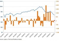
Forget Gold, Invest In Dollar ETFs For Safety

Investors’ perception of gold as a store of value and a safe haven in times of turmoil seems to be changing. This is especially true as the looming interest rate hike and the persistent slowdown in China are weighing heavily on the demand for the yellow metal. Additionally, global growth concerns, Greece turmoil and China meltdown failed to reignite the allure of the metal. Apart from these, a spate of positive economic data, waning gold demand and weak overseas trends continued to tarnish the gold bullion. As a result, gold has mostly been trading in the tight range around $1,200 per ounce in 2015. In fact, the bullion plunged to the five and a half year low of below $1,100 per ounce last week and experienced the longest streak of decline in 15 years. The metal is clearly underperforming the other safe haven assets like German bunds and U.S. Treasuries since last September. This trend is likely to continue for the rest of the year, dulling the prolonged safe haven status of gold over the U.S. dollar. Why the U.S. Dollar? The dollar has been surging against the basket of major currencies. The U.S. Dollar Index is up nearly 8% from a year-to-date look and investors are flocking to it as a flight to safety amid the rising rate environment and diverging policies. The Fed is on track to raise interest rates for the first time in almost a decade in its next FOMC meeting to be held in September. If this happens, it would pull in more capital into the world’s largest economy and lead to further appreciation of the dollar. Further, stepped up economic activities as well as rising consumer confidence are fueling the greenback. The U.S. economy is on a modest growth path, having expanded 2.3% in the second quarter after the first quarter sump. The job market is showing clear signs of acceleration with jobless claims at the lowest level since June 2008 and unemployment at a seven-year low. If this wasn’t enough, ultra-cheap money flows in Europe, Japan and some emerging economies will continue to weaken their respective currencies against the greenback. Given this, the U.S. dollar is now viewed as a safe haven asset for 2015 and investors could definitely play this trend by considering any of the following ETFs: PowerShares DB US Dollar Bullish Fund (NYSEARCA: UUP ) This fund offers exposure to the U.S. dollar against a basket of six world currencies – the euro, Japanese yen, British pound, Canadian dollar, Swedish krona and Swiss franc. This is done by tracking the Deutsche Bank Long US Dollar Index Futures Index Excess Return plus the interest income from the fund’s holdings of U.S. Treasury securities. In terms of holdings, UUP allocates nearly 58% in the euro while 25.5% together in the Japanese yen and British pound. The fund has so far managed an asset base of $1.3 billion while it sees an average daily volume of 2.6 million shares. It charges 80 bps in total fees and expenses and has gained 6.5% in the year-to-date time frame. The product has a Zacks ETF Rank of 2 or ‘Buy’ rating with a Medium risk outlook. WisdomTree Bloomberg U.S. Dollar Bullish Fund (NYSEARCA: USDU ) This product offers exposure to the U.S. dollar against a basket of 10 developed and emerging market currencies by tracking the Bloomberg Dollar Total Return Index. It allocates higher to the Eurozone currency at 31.9%, closely followed by the Japanese Yen (19.0%) and the Canadian dollar (11.2%). Other currencies like the Mexican Peso, the British Pound, the Australian dollar, the Swiss franc, the South Korean Won, the Chinese Yuan and the Brazilian Real receive single-digit allocation in the fund’s basket. The ETF has amassed $403.8 million in its asset base and charges 50 bps in annual fees and expenses. Volume is good as it exchanges nearly 200,000 shares a day on average. The fund charges 50% in expense ratio. The fund has added about 6.3% so far this year. Bottom Line These U.S. dollar ETFs could be worthwhile for investors seeking safe investments for the rest of the year given a stronger domestic economy, increasing consumer confidence, diverging policies, and the looming interest rate hike. Original Post

Contrarians Buying Up XLE

By Jeff Tjornehoj From the start of 2015 to roughly the beginning of May, crude oil prices bounced between $50 and $60 per barrel. But with mounting concerns over China’s slowdown as well as the potential for Iranian crude to hit the market post-sanctions, prices have been in freefall and by August 6 they pierced the $45/bbl support level. But a funny thing has been seen in fund flows data for the oil industry proxy, the Energy Select Sector SPDR ETF (NYSEARCA: XLE ) : flows have picked up. Way up. (click to enlarge) With a year-to-date return of negative 23.4% through August 6, one might have thought investors would flee the equity energy sector’s largest ($11.4 billion) exchange-traded fund, but instead it’s become a contrarian’s playground. Consider this: the 35 months before XLE’s peak price in June 2014 saw cumulative net inflows of just $69 million – barely anything for a fund of this size. But since June 2014, when the price of XLE hit its all-time high of just over $101/share, net inflows have totaled nearly $3.1 billion. For the recent flows week ended August 5, another $74 million was added (red column in chart), despite XLE touching its lowest price in three years. Share this article with a colleague

Q3 2015 Investment Style Ratings For ETFs And Mutual Funds

Summary Our style ratings are based on the aggregation of our fund ratings for every ETF and mutual fund in each style. The primary driver behind an Attractive fund rating is good portfolio management (stock picking) combined with low total annual costs. Cheap funds can dupe investors and investors should invest only in funds with good stocks and low fees. At the beginning of the third quarter of 2015, only the Large Cap Value and Large Cap Blend styles earn an Attractive-or-better rating. Our style ratings are based on the aggregation of our fund ratings for every ETF and mutual fund in each style. Investors looking for style funds that hold quality stocks should look no further than the Large Cap Value and Large Cap Blend styles. These styles house the most Attractive-or-better rated funds. Figures 4 through 7 provide more details. The primary driver behind an Attractive fund rating is good portfolio management , or good stock picking, with low total annual costs . Attractive-or-better ratings do not always correlate with Attractive-or-better total annual costs. This fact underscores that (1) cheap funds can dupe investors and (2) investors should invest only in funds with good stocks and low fees. See Figures 4 through 13 for a detailed breakdown of ratings distributions by investment style. All of our reports on the best & worst ETFs and mutual funds in every investment style are available here . You can see our investment style ratings for Q2’15 here . Figure 1: Ratings For All Investment Styles (click to enlarge) Source: New Constructs, LLC and company filings To earn an Attractive-or-better Predictive Rating, an ETF or mutual fund must have high-quality holdings and low costs. Only the top 30% of all ETFs and mutual funds earn our Attractive or better rating. The Schwab U.S. Dividend Equity ETF (NYSEARCA: SCHD ) is the top rated Large Cap Value fund and overall top rated style ETF. It gets our Very Attractive rating by allocating over 61% of its value to Attractive-or-better-rated stocks. Microsoft Corporation (NASDAQ: MSFT ), is one of our favorite stocks held by SCHD. Over the last decade, Microsoft’s after-tax profit ( NOPAT ) has grown by 13% compounded annually. The company currently earns a top-quintile return on invested capital ( ROIC ) of 48% and has generated positive free cash flow every year since 2002. Investors have failed to recognize Microsoft’s position as a cash-generating machine and the stock remains undervalued. At the current price of ~$47/share, Microsoft has a price to economic book value ( PEBV ) ratio of 1.1. This ratio implies that the market expects the company’s profits to only grow by 10%. However, if Microsoft can grow NOPAT by just 5% compounded annually for the next decade , the stock is worth $69/share – a 47% upside. Despite the slowing PC market, Microsoft should be able to surpass such low market expectations as they focus on monetizing their cloud services and software offerings. The Chartwell Small Cap Value Fund (MUTF: CWSVX ) is the worst rated Small Cap Blend fund. It gets our Very Dangerous rating by allocating over 62% of its value to Dangerous-or-worse-rated stocks. Making matters worse, it charges investors total annual costs of 5.22%. ESCO Technologies (NYSE: ESE ) is one of our least favorite stocks held by CWSVX. ESCO’s NOPAT has fallen by 8% compounded annually since 2011. The company earns a ROIC of only 6%, which is well below the 10% achieved in the mid 2000’s. While ESE is down 3% year to date, the stock price is still overvalued. To justify its current price of ~$38/share, ESCO must grow NOPAT by 14% compounded annually for the next 17 years . This expectation is very optimistic considering the business has not grown profits at all the past four years. Investors would be better off looking at quality stocks, such as Microsoft, and avoiding ESE. Figure 2 shows the distribution of our Predictive Ratings for all investment style ETFs and mutual funds. Figure 2: Distribution of ETFs & Mutual Funds (Assets and Count) by Predictive Rating (click to enlarge) Source: New Constructs, LLC and company filings Figure 3 offers additional details on the quality of the investment style funds. Note that the average total annual cost of Very Dangerous funds is more than three times that of Very Attractive funds. Figure 3: Predictive Rating Distribution Stats (click to enlarge) * Avg TAC = Weighted Average Total Annual Costs Source: New Constructs, LLC and company filings This table shows that only the best of the best funds get our Very Attractive Rating: they must hold good stocks AND have low costs. Investors deserve to have the best of both and we are here to give it to them. Ratings by Investment Style Figure 4 presents a mapping of Very Attractive funds by investment style. The chart shows the number of Very Attractive funds in each investment style and the percentage of assets in each style allocated to funds that are rated Very Attractive. Figure 4: Very Attractive ETFs & Mutual Funds by Investment Style (click to enlarge) Source: New Constructs, LLC and company filings Figure 5 presents the data charted in Figure 4. Figure 5: Very Attractive ETFs & Mutual Funds by Investment Style (click to enlarge) Source: New Constructs, LLC and company filings Figure 6 presents a mapping of Attractive funds by investment style. The chart shows the number of Attractive funds in each style and the percentage of assets allocated to Attractive-rated funds in each style. Figure 6: Attractive ETFs & Mutual Funds by Investment Style (click to enlarge) Source: New Constructs, LLC and company filings Figure 7 presents the data charted in Figure 6. Figure 7: Attractive ETFs & Mutual Funds by Investment Style (click to enlarge) Source: New Constructs, LLC and company filings Figure 8 presents a mapping of Neutral funds by investment style. The chart shows the number of Neutral funds in each investment style and the percentage of assets allocated to Neutral-rated funds in each style. Figure 8: Neutral ETFs & Mutual Funds by Investment Style (click to enlarge) Source: New Constructs, LLC and company filings Figure 9 presents the data charted in Figure 8. Figure 9: Neutral ETFs & Mutual Funds by Investment Style (click to enlarge) Source: New Constructs, LLC and company filings Figure 10 presents a mapping of Dangerous funds by fund style. The chart shows the number of Dangerous funds in each investment style and the percentage of assets allocated to Dangerous-rated funds in each style. The landscape of style ETFs and mutual funds is littered with Dangerous funds. Investors in Small Cap Blend have put over 73% of their assets in Dangerous-rated funds. Figure 10: Dangerous ETFs & Mutual Funds by Investment Style (click to enlarge) Source: New Constructs, LLC and company filings Figure 11 presents the data charted in Figure 10. Figure 11: Dangerous ETFs & Mutual Funds by Investment Style (click to enlarge) Source: New Constructs, LLC and company filings Figure 12 presents a mapping of Very Dangerous funds by fund style. The chart shows the number of Very Dangerous funds in each investment style and the percentage of assets in each style allocated to funds that are rated Very Dangerous. Figure 12: Very Dangerous ETFs & Mutual Funds by Investment Style (click to enlarge) Source: New Constructs, LLC and company filings Figure 13 presents the data charted in Figure 12. Figure 13: Very Dangerous ETFs & Mutual Funds by Investment Style (click to enlarge) Source: New Constructs, LLC and company filings D isclosure: David Trainer and Max Lee receive no compensation to write about any specific stock, sector or theme. Disclosure: I/we have no positions in any stocks mentioned, and no plans to initiate any positions within the next 72 hours. (More…) I wrote this article myself, and it expresses my own opinions. I am not receiving compensation for it. I have no business relationship with any company whose stock is mentioned in this article.