Tag Archives: earnings-center

Northland Power – A Renewable Energy Giant In The Making

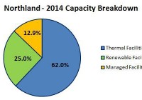
Summary Northland is an independent power producer with a total capacity of 1,356 MW. The company has two giant offshore wind farm projects under construction. These projects should turn the company into one of the world’s biggest renewable energy producers. Currently, Northland shares are undervalued. Northland Power (OTCPK: NPIFF ) is a Canada based independent power producer. As of March 31, 2015, the company owns or has a net economic interest in power producing facilities with a total capacity of approximately 1,356 MW. Northland’s facilities produce electricity from natural gas and renewable resources. Apart from that, the company is developing a few renewable energy projects, which, in a few years, should transform Northland into one of the biggest green companies in the world. In this article I am trying to provide a short description of these projects; in the final section I will try to assess the value of the company’s shares. Capacity As of the end of 2014, the company’s facilities had a total capacity of 1,356 MW, of which the biggest share belonged to thermal facilities (62% of total capacity). The chart below shows the capacity breakdown: source: Simple Digressions and the company’s reports In a few years this situation is going to change. The company has four renewable energy projects under construction (discussed below), which should commence their operations in the next three years. Therefore at the end of 2017, when these projects are finished, the overall company’s capacity should stand at 2,428 MW with renewable energy facilities generating as much as 58.1% of the electricity (chart below). source: Simple Digressions and the company’s reports Northland is turning from thermal generation to renewable energy Looking at the company’s electricity sales it is easily spotted that Northland perceives renewable energy as its main growth driver. Since 2009 the electricity sales generated by thermal facilities have been rising at the rate of 24.7% a year. But in the same time span the electricity sales generated by renewable energy facilities have been rising at much higher rate of 65.8% a year. This trend is going to strengthen in the next three years because all projects under construction are renewable energy ones (wind and solar). Let me discuss these projects in detail. Gemini Gemini is an offshore wind development project located 85 km off the North East coast of the Netherlands. The project will consist of 150 Siemens wind turbine generators, each with a capacity of 4 MW (600 MW in total). Gemini is one the biggest offshore wind projects in the world – the total capital expenditures are expected to be €2.8 billion. Despite these large expenditures, Gemini is an example of a successful non-recourse project financing where expenditures of €2.2 billion will be financed by debt (senior debt of €2.0 billion and subordinated debt of €0.2 billion). The Northland stake in Gemini accounts for 60% – it means that the company’s portion of the equity and junior debt is estimated to be €288 million. The project was awarded up to €4.4 billion of public funding to supplement market revenues from electricity sales. This 15-year award is called SDE Grant and has been issued by the government of the Netherlands. Simply put, the SDE Grant is a contract-for-differences, which supplements market electricity prices traded on the Amsterdam Power Exchange. In order for Gemini to earn the market based component of revenue, a power off-take balancing agreement has been signed with Delta Energy BV, a subsidiary of a Dutch utility company. Currently the financing is closed and Gemini entered its construction phase. The project is expected to be finished in 2017. Northland estimates that Gemini will be producing 2,600 giga-watt hours per year. The company also estimates that the annual EBITDA generated by the project should stand at C$560 – 570 million. Nordsee One Nordsee One, similarly to Gemini, is another offshore wind development project. It is located 40 km north of Juist Island in the North Sea. The project will consist of 54 Senvion wind turbines generators, each with capacity of 6.15 MW (332.1 MW in total). The Nordsee One capital costs are estimated to be €1.2 billion – similarly to Gemini, these expenditures will be financed by non-recourse debt and equity. According to the company’s announcement on the financing close: “Approximately 70% of the project’s required costs will be provided from an EUR840 million non-recourse secured construction and term loan and related loan facilities from ten international commercial lenders. Reflecting the strength of Nordsee One, the financing was oversubscribed. The lending group includes ABN AMRO, Bank of Montreal, Commerzbank, Export Development Canada, Helaba, KfW IPEX, National Bank of Canada, Natixis, Rabobank and The Bank of Tokyo-Mitsubishi” The Northland’s stake in the project accounts for 85%, which means that the company’s portion of equity is estimated to be €288 million. As in the case of Gemini, Nordsee One qualifies for a revenue subsidy. This time it will be a subsidy from the German government granted for 9.6 years (called EEG). It is once again a contract-for-differences, which guarantees a fixed electricity sale price over the subsidy duration. Northland estimates the Nordsee One average annual energy production at 1,200 giga-watt hours; the annual EBITDA generated by the project should stand at C$300 – 310 million. The project is expected to be finished in 2017. Grand Bend Wind Project It is a jointly held (with a 50% stake belonging to the Aamjiwnaang and Bkejwanong First Nations) wind project with a capacity of 100 MW located in Grand Bent, Ontario, Canada. Northland is a developer, construction manager, co-owner and operations manager. The project has a 20-year power purchase agreement with Ontario Power Authority. Project financing is completed and all construction contracts have been signed. The company expects the project to commence operations in spring 2016. The project budget is estimated at C$384 million. Ground-mounted Solar Projects The project consists of 4 individual ground-mounted solar projects with a total capacity of 40 MW. This is a third phase of a partly finished operation, which should be completed in 2015. Northland estimates the project costs to stand at C$329 million, which is around C$83 million higher than previously estimated (this increase is due to legal claims against the former project contractor). The annual EBITDA generated by the project should stand at C$ 22 million. Financial results Since its 2011 conversion from an income trust to a corporation, Northland has been steadily improving its financial results. The company has been increasing its revenue and operating income. On the other hand, due to a very ambitious investment plan realized by Northland, the company’s bottom line looks worse. Finance costs and unrealized losses on derivative contracts are the main contributing factors. For example, in 2014 Northland reported finance costs (interest on debt, borrowings and bank fees) of C$119.9 million. Additionally, Northland reported a loss of C$296.6 million on foreign exchange hedges (these losses were non-cash issues). Therefore, in 2014 the company showed a net loss of C$177.7 million. Now, let me discuss an issue, which is one of the most important metrics in evaluation of any dividend-paying energy company, namely its free cash flow. The chart below evidences free cash flows and dividends paid by the company: (click to enlarge) source: Simple Digressions and the company’s reports As the chart shows, since 2010 Northland has been increasing its dividends. Unfortunately, in the period 2010 – 2012 these increases were not backed by higher free cash flows – the company was over paying its dividends, which was evidenced by the so-called payout ratio, which was higher than 100% (if a payout ratio is higher than 100% a company is paying higher dividend than its free cash flow allows – in the long term such a situation is unsustainable). But since 2013 the company’s dividends have been backed by its free cash flow, with payout ratios of 70 % and 76% in 2014 and 2013 respectively. In the coming years the company expects that its payout ratio will rise over 100% once again. Till 2017 Northland will be involved in construction of two large wind projects (Gemini and Nordsee One). This process demands a lot of money therefore the company, which is determined to sustain its dividends, will have to increase its payout ratio above 100% once again (free cash flow, due to higher investment, will decrease). When both projects are in operation (in 2017) the payout ratio should go well below 100% (due to the increased free cash flow from Gemini and Nordsee One) – please, look at the slide below: (click to enlarge) source: the company’s presentation (page 84) Valuation To estimate value of Northland shares I am using the ratio of EV / EBITDA (enterprise value / earnings before interest, taxes, depreciation and amortization). Because it is quite difficult to find current and reliable EV / EBITDA ratios reported in the renewable energy sector, I am calculating the Northland value using two available ratios: multiple of 9.2 assumed by the Ernst&Young report for base-load independent power producers in the Americas multiple of 14.32 assumed by Aswath Damodaran for Green and Renewable Energy sector In my opinion, the multiple published by professor Damodaran seems to be more appropriate for Northland because this company is currently in a transitory period, which should bring it from a base-load energy producer to a renewable energy company. Another assumption – my calculations are divided into two blocks: Value calculated for current operations Value calculated for two the most important wind projects: Gemini and Nordsee One. Total value is calculated through adding up value of current operations and value of Gemini and Nordsee One. The tables below show the way I have calculated value of Northland: source: Simple Digressions and the company’s reports As the last table shows, I estimate that one share of Northland is worth between $19.9 and $44.6 . Currently the Northland’s shares are trading around C$16 per share, which means undervaluation. Editor’s Note: This article discusses one or more securities that do not trade on a major U.S. exchange. Please be aware of the risks associated with these stocks.

Comparing Healthcare Price Range Forecasts Of Market-Makers

Summary Holdings of healthcare ETFs provide widely varied focuses on aspects of this broad ranging, important industry’s activities. ETFs and their separate holdings all can be directly compared as wealth-building investment candidates. Price-change prospects are seen in the hedging actions of market-makers at work. Qualitative criteria: Odds for investor profit, size of price change payoff, credibility of forecast, likely extreme price drawdown exposure, and anticipated holding period requirements. All have prior experience histories. Meaningful risk/reward comparisons and other personal-preference qualitative investing considerations provide the investor with an array of appropriate choices of securities positions. Contained here are specific price sell targets, holding period time limits, and prior price-risk exposure experiences. These guidelines encourage investor-set boundary disciplines for portfolio management. Healthcare is an important, wide-ranging industry ETFs with healthcare-provider holdings have very different emphases. Knowing what is involved, and the emphasis contained, is essential to addressing investment objectives of completeness and diversity. Just as the energy industry has a wide array of participants with differing principal activities, so too does the healthcare field have its important essential specialties and integrators in supportive-competitive relationships with one another. Parallels between the two distinctly different economic sectors are suggestive. Energy wildcatters of the Exploration & Production dimension have their functions in healthcare among the Biotechnology developers. Oilfield services providers have some healthcare similarities in the roles played by healthcare insurance companies. Medical equipment producers and developers have their counterparts in the energy scene. Transportation and delivery of energy products are paralleled by healthcare services organizations. Significant similarity of role exists between integrated international oil companies and major pharmaceutical organizations. We will not attempt precise categorization in an industry where we have limited experience or familiarity. The point is that the diversity of activities in each field comes together at the point of making investment choices. Those choices may, and in our opinion should, be more influenced by the investor’s objectives and perspective, than by a morass of minute distinctions between participants in their related fields. In every case what counts for the investor is whether or not the subject of an investment choice will be seen to be an effective competitor, for the period of the investment holding. Effective not only among the direct competing participants in the field of concern, but also among the full range of competitors for the use of the investor’s capital. Where investing “rubber meets the road”, capital meets commitment. Critically, with investments, perspective and opinion play a dominant role. Why this information is different from the usual It is intended to be a current update for active investors who have an awareness of what kinds of RATES of return they need to build wealth deliberately for specific purposes that tend to have inflexible need dates. For investors aware that normal price fluctuation in good-quality equity investments during the course of a year regularly provides capital appreciation opportunities which are multiples of the trend growths of those same securities. While not intended principally for long term, buy-and-hold investors salting away capital for an indeterminate general purpose sometime in the indefinite future, it may well be of help for those who have arrived at a decision time for portfolio strengthening in the healthcare area. All investors are, or should be, aware of the need to make comparisons between alternatives in their quest for objective satisfactions. Our intent is to urge a focus on the kind of universal investing dimensions that make comparisons valid across a wide range of subjects. The matter of price is a pervasive issue in any type of investment decision. Active investors need to know that the market professionals who assist portfolio managers of billion-dollar investment funds in adjusting their holdings have a special insight into the likely market actions that are making prices move. Moreover, because the pros must put firm capital at risk temporarily to do their job, they make price-hedging transactions in derivative markets to protect themselves. What they will pay for that insurance, and the way the deals are structured, tell just how far it appears likely that prices may move, both up and down. Analysis of their behavior is performed systematically, daily, on over 3,000 equity securities, stocks, ETFs, and market indexes. As it has been since Y2K. Careful record-keeping provides an actuarial history of how well the market-making community can anticipate price changes, issue by issue, in coming weeks and months. Here we apply that analysis and its perspective to six of the Exchange Traded Funds, ETFs, that hold securities of healthcare corporations. Subjects of the study The ETFs of interest here are Health Care Select Sector SPDR ETF (NYSEARCA: XLV ), Vanguard Health Care ETF (NYSEARCA: VHT ), First Trust Health Care AlphaDEX ETF (NYSEARCA: FXH ), iShares U.S. Healthcare ETF (NYSEARCA: IYH ), iShares U.S. Healthcare Providers ETF (NYSEARCA: IHF ), and Direxion Daily Healthcare Bull 3x ETF (NYSEARCA: CURE ). Considerable differences exist between these 6 ETFs. One has been around since 1998 while another barely has a 4-year history. Another is structured in its makeup and holdings to cause its prices to have changes 3 times as large as the industry index. One is very concentrated in its holdings with ten names making up nearly two-thirds of its value. Another’s top ten holdings make up less than a quarter of its worth. The biggest ETF has investor commitments of over $14 billion; the smallest, less than a half-billion. One trades 9 million shares a day, another only does 90,000. Figure 1 provides the fundamentals: Figure 1 Most sell at P/Es just above 20, and at near 4x book value, save for IHF and less so, FXH. XLV and CURE are actively traded, with their entire capitalizations able to be turned over in 4-5 weeks. VHT and FXH both have considerably less liquid situations. What do they each hold? In Figure 2, the ten largest holdings of each are identified, with considerable duplication in a few names. XLV, VHT, and IYH have the most similar portfolios. FXH and IHF have a far more diverse set of stocks. Figure 2 UnitedHealth (NYSE: UNH ) and Actavis (NYSE: ACT ) are each in 4 of the ETFs. The largest average size holding is Johnson & Johnson (NYSE: JNJ ) with 3 ETFs each committing over 9% of their assets. But 14 stocks are held by only one ETF, out of the 25 issues so identified. The 3x leveraged ETF holds an undesignated mix of derivative securities to accomplish its special price characteristic in relation to the Health Care Select Sector Index. Some of the ETFs focus on big, established healthcare names like big-pharma producers, others like FXH and IYF look to more recent industry innovators. Comparing holdings’ prospects The investment prospects for each ETF should reflect the prospects for its major holdings, but that is not always so. Figure 3 shows how market-makers currently appraise the upside prospects for each of the larger ETF holdings in relation to the actual worst-case price drawdowns following prior forecasts like today’s. Figure 3 (used with permission) This picture plots ETF locations by coordinates of upside price change return forecasts on the lower horizontal scale, and by worst-case downside price change experiences following earlier forecasts like those of the present. The attractive green area contains issues with 5 times or more upside than downside prospects. The diagonal dotted line is the point at which price risk is expected to be equal to return. Issues higher than the diagonal have more risk than return, lower have better price change returns than risk exposure. Several issues share common locations. Comparing ETF risks and rewards Figure 4 provides the same comparisons for the Healthcare ETFs themselves, along with a market index norm in the form of SPDR S&P 500 Trust ETF (NYSEARCA: SPY ): Figure 4 The extreme compression of risk/reward tradeoffs pictured in Figure 4 indicates a market belief that despite high prices (limiting further upward price moves) in the foreseeable near future, these ETFs are market-correction resistant. But they are also viewed as under-performers relative to the market average SPY ETF at location [7]. Even CURE, with a 3x price leverage is seen to have an upside prospect of less than +5%, along with a downside history of some -5%. These valuations for the ETFs are significantly less optimistic than those held for their most important holdings in Figure 3, where upside prospects are all above +5%. None of their downsides have been, at worst, greater than their upsides, and many nowhere near as bad. To see what is driving the ETF situation, look at Figure 5. Figure 5 (click to enlarge) Here are the current MM forecasts for the healthcare ETFs, and the market outcome histories subsequent to similar forecasts. The mystery of compressed return forecasts from persistent high prices is at least partly explained in Figure 5’s columns 8 through 11. Four of the six have NEVER had a loss in their past 5-year histories following Range Indexes like today’s, and the other two are either 8 or 9 wins out of ten. Column 10 provides the real answer for the winning four, with holding periods ranging from only 9 to 17 market days. Even with their miniscule, below +5% gains, the annual rates of profit have been for the big winners multiples of 2x to 11x that of the market average. The other two candidates exceeded SPY’s annual rate of return by 500 to 700 basis points. Conclusion In a market environment highly expectant of a price correction, but one where that concern has been present for months, something that can produce very attractive rates of return one short holding period after another has real appeal for active investors. Here, there is an array of near-term investment candidates with high promise of reward at appealing rates, and prior experiences of fairly trivial price drawdowns during the brief holding periods needed to reach sell targets. Disclosure: The author has no positions in any stocks mentioned, and no plans to initiate any positions within the next 72 hours. (More…) The author wrote this article themselves, and it expresses their own opinions. The author is not receiving compensation for it (other than from Seeking Alpha). The author has no business relationship with any company whose stock is mentioned in this article.

Fed Risk Vs. Grexit: A Volatility-Based Approach

Long-term horizon, energy, currencies “}); $$(‘#article_top_info .info_content div’)[0].insert({bottom: $(‘mover’)}); } $(‘article_top_info’).addClassName(test_version); } SeekingAlpha.Initializer.onDOMLoad(function(){ setEvents();}); The spread of implied volatilities on both the S&P500 (VIX) and the Euro Stoxx 50 (VSTOXX) has widened to a new high. It is clearly attributable to the renewed tensions on a possible Grexit. Yet, the forthcoming Fed tightening might lead to an increase in the VIX, hence my suggestion to play a tightening of the volatility spread. The post-winter acceleration of growth in the U.S. has been a blessing but also a curse since it increases the probability of a liftoff in the second half of 2015. So far, the risk associated to what we could call a traditional cyclical/monetary policy related risk has been overwhelmed by that related to Greece. The chart below shows the spread between implied volatilities on European vs. U.S. stocks. Since the beginning of the year, it has been very responsive to the news flow pertaining to the “Grexit”. The link is also visible on a month-over-month basis, where it shows that the volatility spread might widen a little bit more. The same pattern is also visible in the FX space where the implied volatility on the EUR/USD has risen much more against the CVIX. Interestingly enough, the EUR/USD is well above parity even though the distance to default of Greece has never been that short. The strength of the trade balance of the Euro area is probably part of the explanation. The view here is simple. Any worsening of the Greek crisis should not be rejected but given 1. The width of the spread between Vstoxx and VIX; 2. It’s tendency to mean revert 3. The possibility that Yellen remains evasive enough to increase the uncertainty related to the aggressiveness of the Fed between now and year-end. I would not be surprised by a tightening, over the next few weeks, of the volatility spread across the Atlantic. Disclosure: The author has no positions in any stocks mentioned, and no plans to initiate any positions within the next 72 hours. (More…) The author wrote this article themselves, and it expresses their own opinions. The author is not receiving compensation for it (other than from Seeking Alpha). The author has no business relationship with any company whose stock is mentioned in this article. Share this article with a colleague